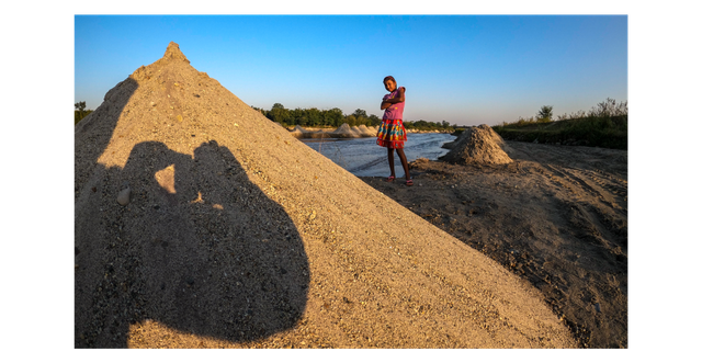
Golden Rules of Composition to enhance your photography skills
Image Courtesy: @saintblindmirror | Location: Guwahati, Assam
Hello friends, I have compiled this post from whatever knowledge I have, to help out all the aspiring photographers to enhance their photography skills. Just let me know if I missed anything important. This is an original post and 8 out of the 9 images used in this post are my own. So, here are a few tips/ rules to follow-
Define three fields (Fore-Mid-Background)
One technique by which we can add depth and dimension to our photographs by using foreground, middle ground and background to . This rule is followed widely in landscape photography. But they can also be applied to other genres of photography.

Image Courtesy: @saintblindmirror | Location: Durpang, Assam
Apply Figure Ground Theory
The principle of figure/ground is one of the most basic laws of perception and one that is used extensively to help us design our photographs. In its basic sense, it refers to our ability to separate elements based upon contrast–that is, dark and light, black and white

Image Courtesy: @saintblindmirror | Location: Samdrup Jongkhar, Bhutan
Apply Rule of odds
According to the "rule of odds" an odd number of subjects in an image is more interesting than an even number,e/g. 3 is more interesting than 4. Thus, if you have more than one subject in your picture, the suggestion is to choose an arrangement with at least three subjects or some odd number.

Image Courtesy: @Aphiwatchuangchoem | Location: Pexels
Apply Rule of Thirds
The “Rule of thirds” states that when composing your photo, place the centre of interest at a junction of the lines that trisect the image.
.png)
Image Courtesy: @saintblindmirror | Location: Sonapur, Assam
Also , when composing landscape shots, the horizon line should be on one of the intersecting lines
.png)
Image Courtesy: @saintblindmirror | Location: Durpang, Assam
Look for Leading lines
Leading lines are lines that appear in a photograph that have been framed and positioned by the photographer to draw the viewer's eye towards a specific point of interest. These lines often draw the viewer's eye in a specific direction or towards a designated portion of the photograph.

Image Courtesy: @saintblindmirror | Location: Mumbai-Pune Expressway, Maharashtra
.jpg)
Image Courtesy: @saintblindmirror | Location: Durpang, Assam
Balance Negative and Positive Space
Negative space is referred to the area that surrounds the main subject in your photo (the empty space). The area occupied by the main subject is known as the "positive space". There must be a proper balance between both the spaces depending upon a variety of factors such as the composition, mood, importance, emphasis, etc.

Image Courtesy: @saintblindmirror | Location: Siliguri, West Bengal
Just let me know if you found it to be helpful. I will be soon coming up with the 'Part II' of this post since it is not possible to put all the points in a single post. Thank you !
