SEC20/WK3: Typography and Practical Application
This is my homework post for Steemit Engagement Challenge Season 20 Week 3 assignment of Professor @lhorgic’s class, Typography and Practical Application.
Note :
- I performed this task on Windows 10 PC, Google Chrome.
Task 1 – Typography – What I Know About It
Text is an integral part of graphic design. It is almost impossible to find a graphic design that is completely “text-free”. Objects in design may very well instill curiosity in the viewer's mind, but text is often the only answer.
So we want to create a design. Well, there are objects or maybe not, and now we need text. So we can just type in the text that we want to include in the design. It looks that easy, indeed. But it's not. Text should go into the design not just to convey something textually, but it should be there as an element that makes the design stand out.
Typography is a study that discusses text in design, a kind of art and technique that regulates the use of letters or text, the goal is that text is not only able to convey information well, but also adds aesthetics (easy to read, and visually appealing). Typography is studied in Communication Studies, Graphic Design, Visual Communication Design, Fine Arts, and - of course - Information Technology and Web Design.
Important elements of typography include, but are not limited to:
- Typeface. The selection of the right font with the message to be conveyed, for example a design that wants to convey a happy message is certainly not appropriate if it uses a “creepy” font that has a scary nuance. there are at least 3 types of fonts that are popular, namely 1) Serif, 2) Sans Serif, and 3) Cursive.
- Font Weight and Font Style such as whether it is bold, black, regular, or italic also visually affect the message to be conveyed;
- Hierarchy. The choice of font size and weight to differentiate the position between two texts is also important in design. This helps the viewer follow the flow of the text in the design more easily.
- Alignment. Text that is placed with attention to neatness will certainly be more visually appealing and pleasing than text that is placed in a haphazard manner in the design. The alignments that can be given are left-aligned, right-aligned, center-aligned, or left-right aligned.
- Contrast. Contrast is one way to direct the viewer's attention to a particular part of the design, and to make elements in the design emphasize each other. Text contrast can be achieved by adjusting the font size, weight (regular, bold, black), font style.

Task 2 – 3 Typefaces and Their Examples
- Display
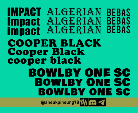
The Display typeface has a bold and striking anatomy. With an appearance designed for special use in large sizes. Letters that fall into this category are only suitable for use in short sentences, for example as titles and are not suitable for use in long sentences. They are also not suitable for writing in small sizes as is common in writing text in official documents or books, because it will interfere with readability. Letters in the typeface category are suitable for use in posters or logos because of their decorative and striking designs. Some examples of letters that fall under the Display typeface are Impact, Cooper Black, ALGERIAN, BEBAS, and BOWLBY ONE SC. The following image shows the posture of the five Display typefaces in ALL CAPS, Title Case and lowercase, respectively.
Created with Adobe Photoshop 2021 - Monospace
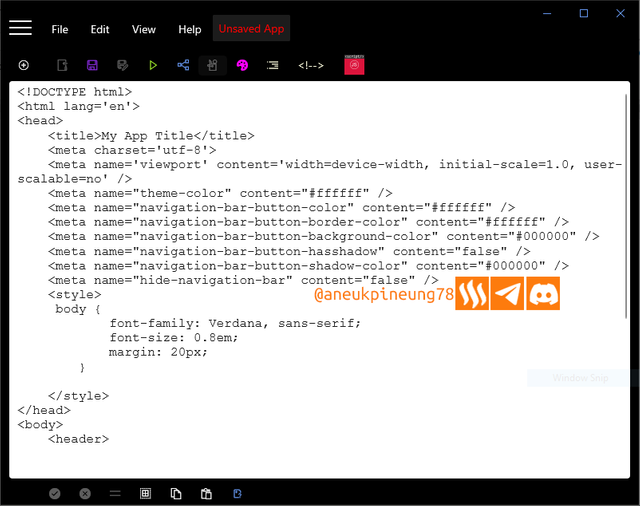
In this category, every character (letters, numbers, punctuation marks, and spaces) has the same width. So while naturally the letterwis wider thani, in Monospace typeface they have the same width. Those who have used old typewriters and computer systems will recognize this category of letters. The letters in this typeface, because of their nature, are among those that are easy to read and enhance the reader's accuracy. Monospace letters are also popular in the programming world, probably because programming requires high accuracy in typing. See the following screenshot of the interface of JavaScript, one of the most popular programming applications, as an example of the use of Monospace letters.
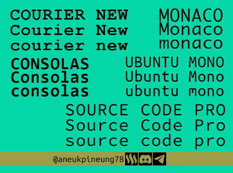
5 examples of Monospace fonts are Courier, Consolas, Ubuntu Mono, Monaco, and Source Code Pro.
Created with Adobe Photoshop 2021 - Geometric
In the Geometric category, the characters follow basic geometric shapes such as circles, triangles, squares or straight lines that are bold and “balanced”. The impression evoked by Geometric letters is a feeling of modernity and minimalism, making them suitable to be placed in designs related to innovation and professionalism as well as technology. Among the Geometric letters, Futura is said to be the most iconic. It has been around since 1927 and was created by a designer named Paul Renner. Besides Futura, the letters that are included in the Geometric typeface are: Century Gothic, Eurostile, Gill Sans, and Gotham.
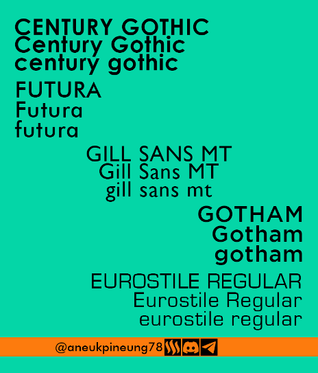
Created with Adobe Photoshop 2021

Task 3 – Putting It Into Practice
In working on this task 3, I combined the knowledge from last week (Color Theory) with the knowledge taught this week (Typography). The fonts used are freely available on the internet and can be used for commercial purposes. The color combinations on all designs are based on different color schemes, and the combinations for all designs I obtained through Canva's Color Wheel, except design 3 (Monochromatic).
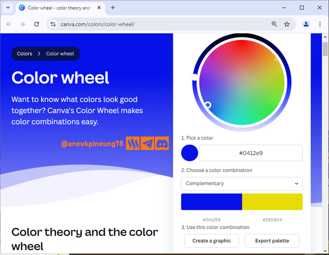
Desain 1 : Strictly Dynamic
My first design is as follows:
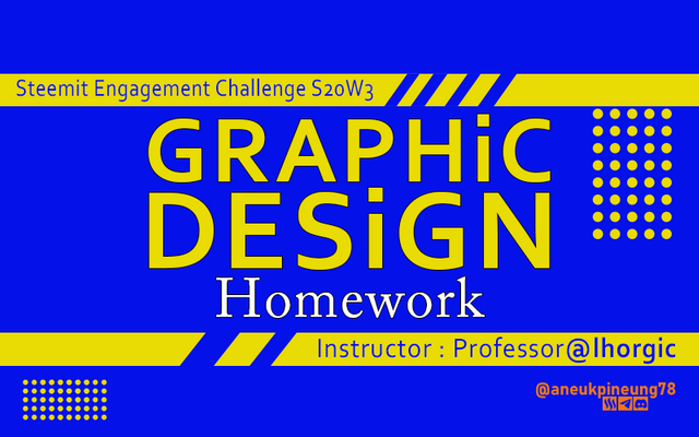
- Typography.
- Font. In this design that purely contains text and simple geometry, I used two fonts from two different typefaces, namely the Corbel font from the Sans-serif typeface and the Adobe Caslon Pro font from the Old Style Serif typeface (a very old variant of the Serif typeface). The Corbel font evokes a modern feel and the Adobe Caslon Pro font brings a dynamic and creative aspect to the design.
- White Space. You can see it is a “clean” design where there is enough space for all element to “breath”.
- Hierarchy. Clearly visible.
- Emphasis. Clearly visible.
- Contrast. The combination of two complementary colors already promises a nice contrast.
- Color Scheme. The basic color scheme of this design is Complementary Colors, where I used colors with the hex codes of
#0412e9and#e9db04. The nice contrast between these two compelentary colors makes the design stand out and the information imparted through the text and geometric shapes stand out. Into the basic color scheme, I also included 2 other colors but in a very small portion, namely#ffffff(white) and#fd7b0d(orange), so in total I used 4 colors. - Table of details:
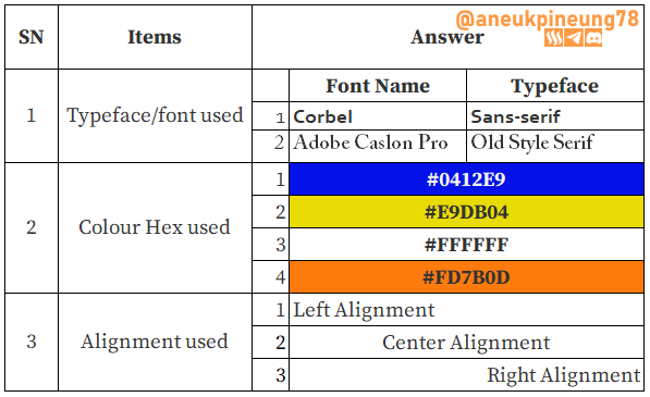
Desain 2 : Calmly Cool
The second one:
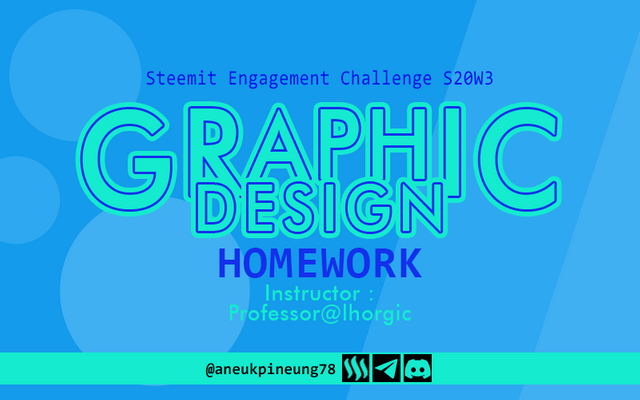
- Color Scheme. Color Scheme used is Analogous, with color hex codes
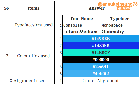
#149BEB,#1430EB, and#14EBCFTo the three analogous colors I added black (#000000) and 2 gradations of color hex#149beb(#2ea9f1and#40b0f2), So there are 6 colours in total. The mix of colors results in a design that looks fresh. - Typography.
- Font. Two fonts were used in creating this design: Consolas of Monospace typeface, Futura Medium of Geometry typeface.
- White Space. There is a slight buildup of the main elements of the design, which displays a sense of “unity”, and the rest of the white space is sufficient and proportionally available for all elements.
- Hierarchy. Clearly visible.
- Emphasis. Clearly visible.
- Contrast. Enough contrast to bring out all the elements.
- The design detail:
Desain 3 : Balancing The Energy
The third one:
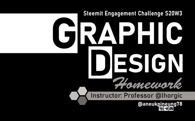
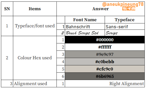
- Color Scheme. I based this design on the Monochromatic color scheme, a design using black (
#000000) and white (#ffffff) as well as the color gradation between them, which is 4 variants of grey. So there are 6 colors in total. - Typography.
- Font. I used in the third design two fonts, Bahnschrift of Sans-serif typeface and Brush Script Std of Script typeface.
- White Space. You can see enough white space, made it a “clean” design.
- Hierarchy. Clearly visible.
- Emphasis. Clearly visible, especially with the added of white rectangel behind the initial letter of words “GRAPHIC DESIGN”.
- Contrast. Black and White? What contrast do we need to talk about?
- The detail:
Desain 4 : Energically Colorful
The last design for this assignmest is a colorful design:
- Typography
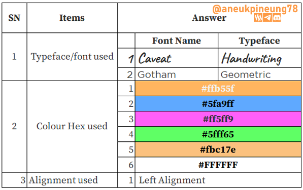
- Font. In this design, I combined the Gotham font from the Geometric typeface with the Caveat font from the Handwriting Script typeface, a combination that resulted a design that combines a modern, neat and firm impression with a relaxed impression.
- White Space. There is enough space for containing elements to “breath”.
- Hierarchy. This design still uses the same hierarchical pattern as the previous 3 designs.
- Emphasis. Emphasis is done in the form of the size of the letters that also form the hierarchy.
- Contrast. The use of a border helps to emphasize the elements against the background, so that the elements look more assertive and stand out.
- Color Scheme
This design uses the Tetradic color scheme. I got the color composition with the color combination of:#ffb55f,#5fa9ff,#ff5ff9.#5fff6, along with one gradation color of one of the four#fbc17eand white (#ffffff). So again, there are a total of 6 colors used. - The detail table.

Thanks
Thanks Professor lhorgic for the lesson. I invite @khursheedanwar, @rayfa, and @seribubulan to join.
Pictures Sources
- The editorial picture was created by me.
- Unless otherwise stated, all another pictures were screenshoots and were edited with Adobe Photoshop 2021.
Sources and Reading Suggestion
- https://lldikti13.kemdikbud.go.id/2022/01/17/3-jenis-font-yang-perlu-anda-ketahui-untuk-membuat-slide-presentasi-anda/
- https://glints.com/id/lowongan/jenis-font/
- https://www.gamelab.id/news/2214-13-jenis-font-paling-sering-digunakan-dalam-desain-grafis-lengkap-dengan-gambar
- http://www.desainstudio.com/2010/04/pengertian-serif-dan-sans-serif.html
- https://en.wikipedia.org/wiki/Monospaced_font
- https://www.kernelfactory.canonical.com/blog/the-monospace-is-coming
- https://fonts.google.com/specimen/Space+Mono
- https://yaytext.com/monospace/
- https://www.myfonts.com/pages/display-fonts
- https://typetype.org/fonts/display/
- https://unblast.com/fonts/display/
- https://www.1001fonts.com/geometric-fonts.html
- https://fonts.adobe.com/fonts/tags/geometric
- https://freefontsfamily.org/gotham-font-family/



Hmm... it looks like you're already a pro in the graphic design field. That Canva color wheel tip is a game-changer—I had no idea about it until I saw your post. Normally, I'd wish you good luck in the contest, but let's be honest, you've already got this in the bag. So instead, I'll just say: congrats in advance, you overachiever! 😄
I'm not a pro. I just like graphic design. And with this class, I am just trying to do the best, same with other classes I participated in. I am implementing everything I learned from previous weeks. You created great designs as well.
Thanks, anyway. For nice words.
https://x.com/aneukpineung78/status/1839505692107165972
Congratulations, your post has been upvoted by @scilwa, which is a curating account for @R2cornell's Discord Community. We can also be found on our hive community & peakd as well as on my Discord Server
Felicitaciones, su publication ha sido votado por @scilwa. También puedo ser encontrado en nuestra comunidad de colmena y Peakd así como en mi servidor de discordia
Amazing homework! 🌟 Your deep dive into typography and the thoughtful application in your designs are impressive. I love how you integrated different typefaces and color schemes to create visually appealing layouts. Your explanations are clear and insightful, showing a strong grasp of design principles. Keep up the fantastic work and best of luck with the Steemit Challenge! 🎨👏🚀
Thanks. Good luck to you too.
My pleasure brother!
Click Here
😶
¡Saludos amigo!🤗
Tienes un gran dominio de la tipografía y te felicito por ello ya que, considero que tú prácticamente quedó muy bien. Te confieso que amé el último ejemplo y voy a utilizar esa tipografía en mis diseños porque la proyección que tiene, se acopla muy bien a mis gustos.
Te deseo mucho éxito en la dinámica... Un fuerte abrazo💚
Yes, fonts from the Geometry typeface class are elegant and carry a firm and professional impression. A good choice when we want a clean design that conveys a formal, non-rigid impression. Among the other impressions brought by this typeface are simple, modern, progressive.
Thanks, @paholags
TEAM 5