[Jul 7, 2017] Old Guy Needs Help ☺
Hey Fellow Steemians
it's @hermitthewriter here with a Question for you…
I just finished Reading a recommended Book called “The Better Angels of Our Nature” by Steven Pinker.
I have this Data that I put together a while back, for a Post I am working on, but likely my Math skills are not what they used to be, (I think it's the second thing to go, as us males get older).
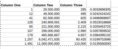
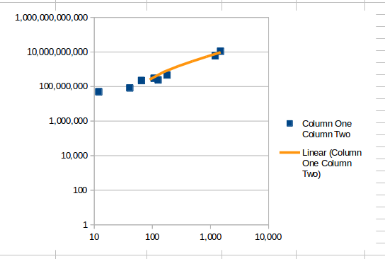
If I create a Graph of Column One with Column Two, I would expect to see something like this, right?
The Correlation of Column One with Column Two gives me 0.9780626464 a Strong Relationship between the two, am I correct?
Here is where I get confused. If I take Column Two and divide it by 100,000 I get Column Three.
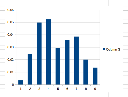
So to compare Column One with just one of those 100,000 sets in Column Three, I would take Column One and divide it by Column Three, and you would expect to see a Graph like this, am I correct?
So this would indicate the Trend was sloping down, a Negative and Weak correlation with Column One, Yes?
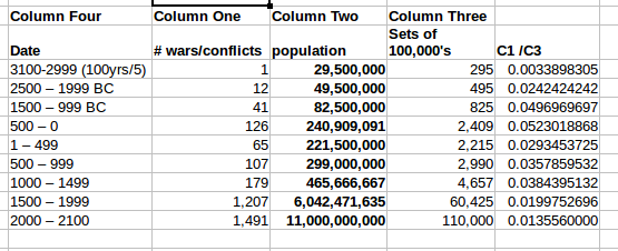
So now, if I add in Column Four, what is the Truth here? Is the Number of Wars and Conflicts in the World going up or down over time?
Can someone please explain my error….☻ ☺
Written with StackEdit.


