SLC21/WK3: Logo Design - Part 2
Hi friends, after reading around I am interested in participating in an amazing challenge this week. The challenge is titled: Logo Design - Part 2 by Mr. @lhorgic following the contest link: SLC | S21W 3 | Logo Design - Part 2
Previously I also invited other friends such as Mr. @irawandedy, Mr @muzack1 , sir @sisol and my friend @cymolan.
| Talk about each type of logo we have and then talk about the conditions of when it should be used and when it should not be used for a brand. You can do a little research to help you out. |
|---|
There are about 7 types of logos in the material, including: Wordmark Logo, Monogram Logo, Trademark Logo, Abstract Logo, Mascot Logo, Coat of Arms Logo and Combination Logo logo.
Now as explained that Wordmark Logo is one type of logo that only prioritizes text or a brand name as a visual element, usually the name is written in a certain font style and color, all of which are useful to be able to reflect the characteristics and identity of a brand or brand. This Wordmark Logo is suitable for a brand with a cool name and the most important thing is to make it easier for someone to remember it, it all happens because it directly describes an identity through typography and color as well. However, some types of brands whose names may be longer or even somewhat difficult when spelled, then we think that the Wordmark logo is less effective in use because it looks too dense so it is less comfortable to read.
Furthermore Logo Monogram, this type of logo will usually utilize the initials or initial letters of a brand name. So with these initials will produce a brief but meaningful symbol, a small example is “HP” which is the Hewlett-Packard brand. So it is suitable for brands that have long names, which are generally able to make the identity look easier to remember and simpler or usually called more elegant. However, if a brand name is very short or the abbreviation is not right, then we find the monogram logo less attractive and even makes it difficult for people to remember.
Trademark logos refer to logos that have been officially registered and protected by law, thus becoming an exclusive identity attached to a particular brand, such as the Nike logo. These logos are ideal for big brands that want to maintain the uniqueness and legal recognition of their symbols. However, for new brands that are not well known, a trademark logo may not be a top priority as it requires a lengthy legal process.
Then there is the Abstract Logo. This type of logo will usually utilize a symbol or a cool shape to represent a brand, for example a circle with a curved line found in the Pepsi logo. Now this type of logo is certainly very good for brands that want to look modern, cooler, and most importantly, have a more unique identity. But for this type of logo that is more abstract in shape, it will certainly take time for people to associate it with the brand, so maybe this type of logo will be suitable for them to build an impression in the long run ahead.
Next there is the Mascot Logo, which in this type of logo will present a character that represents a brand. This logo is often used on a brand when they want to make a good and more familiar relationship with consumers, an example that we often find is Colonel Sanders from the KFC brand. So this mascot logo is more ideal for a brand that has a target goal of families and children who intend to look more friendly and fun. Perhaps this type of logo is less suitable for a brand that wants to look more formal and serious.
An emblem logo is a type of logo that usually has traditional and formal characteristics. So this type of logo we often see in the form of a shield or badge with text and symbols in it, an example is the Starbucks logo. In this logo, it may be more suitable for an institution, an organization, or even a brand that may have plans to display a classic impression. Unfortunately, because the design on this logo is a bit more dense, the emblem logo may feel difficult to read in small sizes.
Lastly there is the Combination Logo, which in this logo will combine text and an icon or a symbol, which makes a brand will choose to display only the text or icon in certain media, an example of this logo is the Lacoste logo. So this type of logo may be suitable for almost all types of brands, all because it can adapt to various media.
| Choose two (2) types of Logos discussed and then practically demonstrate how to make them, showing your detailed process. |
|---|
Here I will create 2 types of logos, namely Wordmark Logo and Monogram Logo.
- Creating a Wordmark Logo
Here are my steps in creating this type of logo.
Step 1: Choose a Design Application
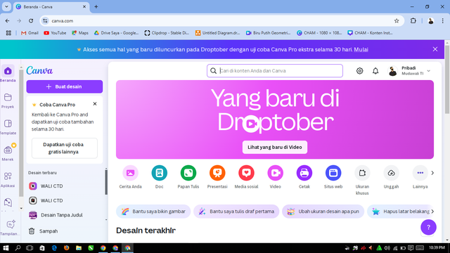
We can open a design application that we have and we are good at, for example Pixellab or Canva. So here I will use Canva only which is free and online.
Step 2: Setting the worksheet size
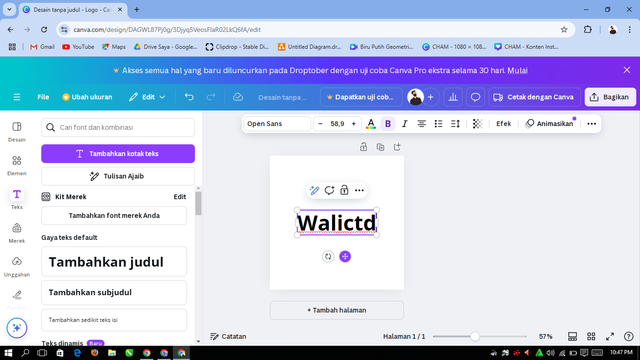
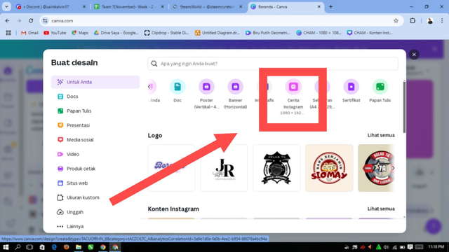
Here I will have the logo size follow as following screenshot shown:
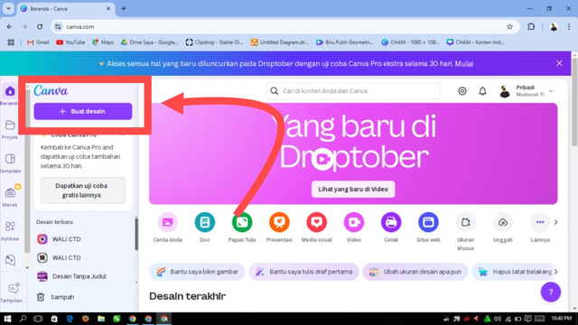 | 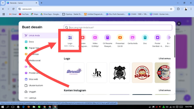 | 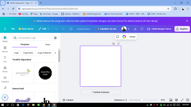 |
|---|
Step 3: Determine the Brand Name and Concept
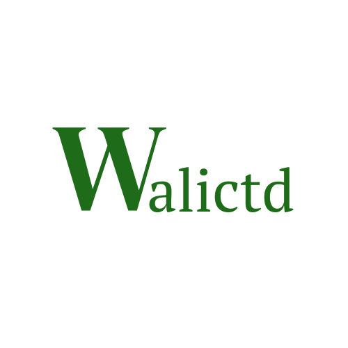
We just need to type the brand name we want to create for the logo. Here I will give an example to give the brand name: “Walictd”.
Step 4: Choosing the Right Font
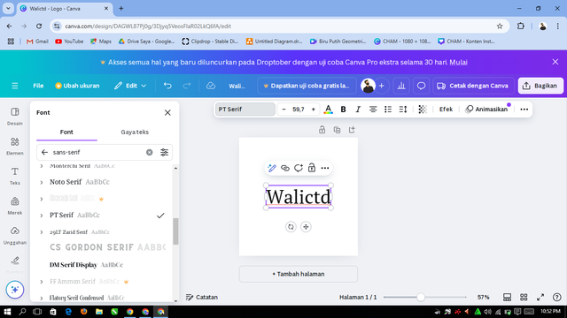
In this step we will look for a font that might reflect the character of our brand. So this time I will choose the PT serif font, because this font will make the appearance more elegant.
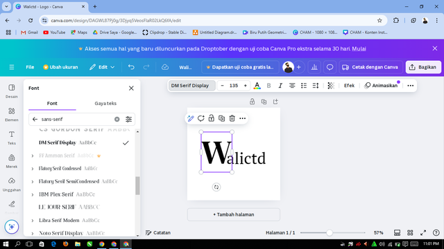
To make the first letter more interesting, I replaced the font with “DM serif Display” and slightly enlarged the letter to make it look cooler.
Step 5: Customize Colors
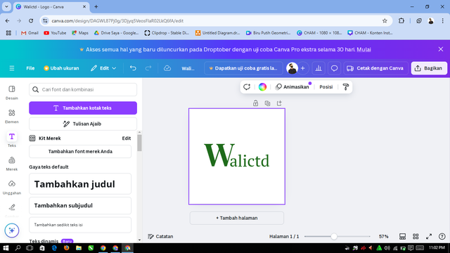
Next we will determine the colors that describe our brand identity. For example, I will give a dark green color for a professional impression or red for energy. Also adjust the color combination, such as the color of the text contrasting with the background.
.png) |  |
|---|---|
.png) | .png) |
Last step: Save
We can save with a .Png file.
- Creating a Monogram Logo
Step 1: Choose Brand Initials
When we want to create a monogram logo, we will start with the initials of our brand name, for example “W” and “T” for the brand of “Walictd Tech” (this is an example of a brand name). Then we will choose these initials to make it easier for someone to remember it and most importantly it looks clear.
Langkah 2: Pilih Font atau Gaya Huruf
Here we will use a bold font and have a style to make our monogram feel stronger.
Step 3: Create a Letter Layout with the editing application used
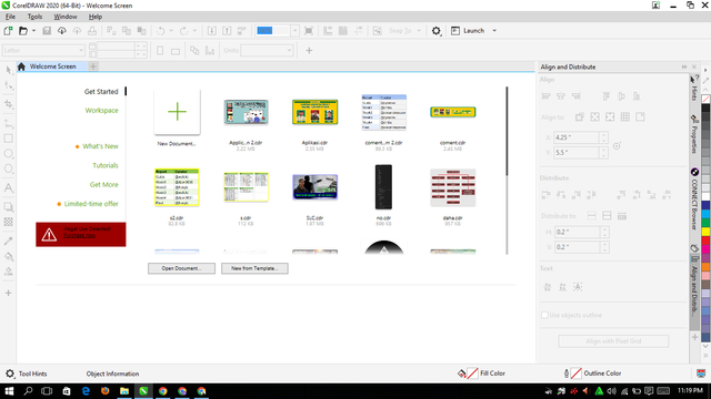
Here I will use Corel Draw to create the letters W and T so that they become a cool logo.
In the first view of the CorelDraw application above, we will proceed in the following way:
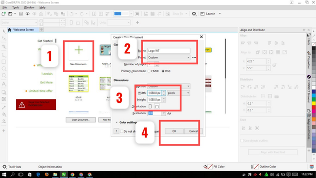
Option 1 will serve to create a new worksheet, number 2 to give the file name, then at number 3 we will set the file size which I chose 1080 px: 1080 px, in number 4 select ok start designing.
Next, I will be guided to design two letters, namely W and T.
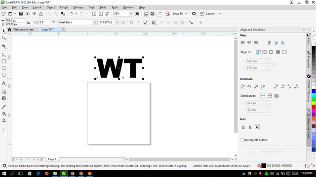
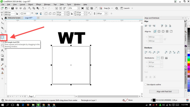
To create the background, I click in the following box to add it according to the worksheet size.
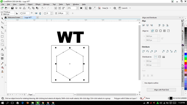
Furthermore, in the worksheet, I also added a hexagon. The purpose is to create a logo in the form of a hexagon only. Here's how it looks after I add the hexagon:
Inside the hexagon, I will create the WT logo with the ideas that I have in mind. First, I will create a logo from the letter W, Here I add a box to form the letter W.
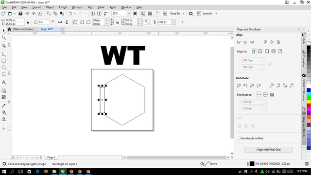 | 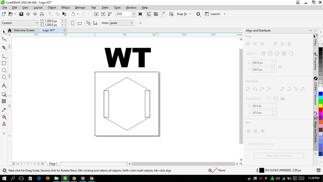 |
|---|---|
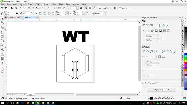 |  |
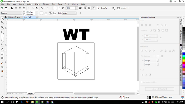
Once the W was formed, it was time for me to make the letter T. So I just added a triangle. Here are the steps I took to make it and combine it with the letter W.
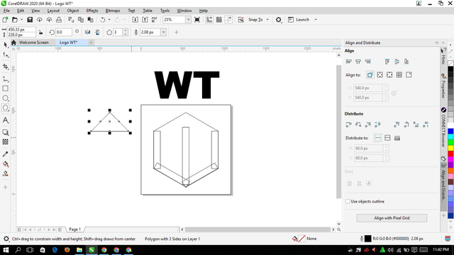 |  |
|---|
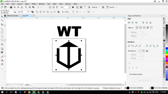
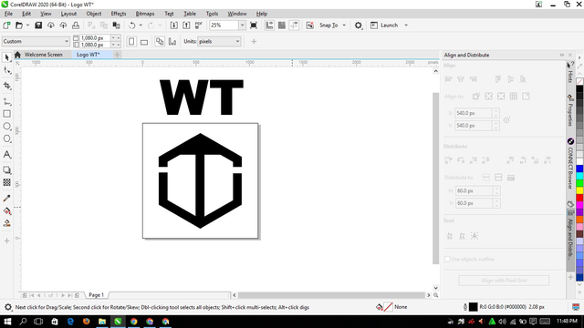
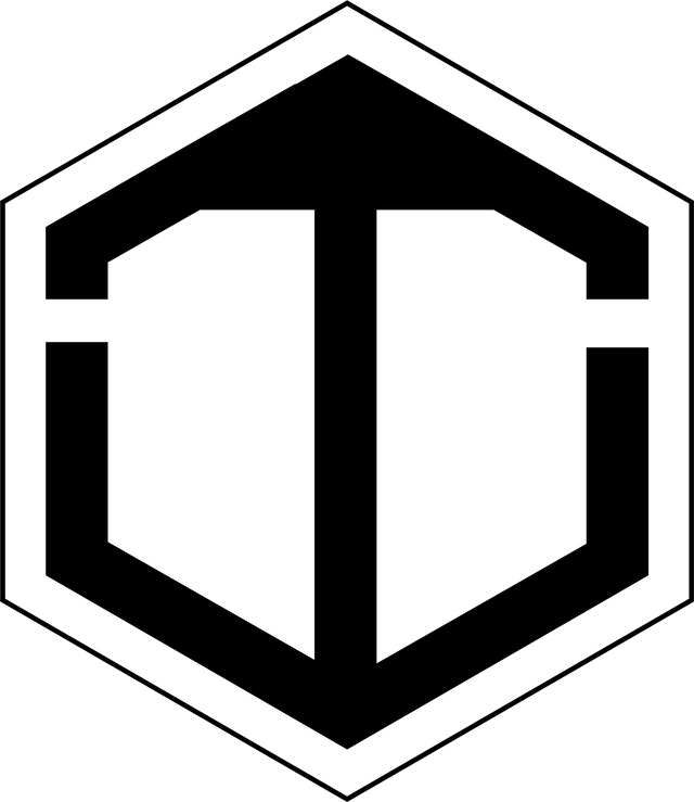
When it has formed the letter T and joined with the letter W, then it's time for me to give it color. That is with one black color only, here after I give the color:
 |  |
|---|
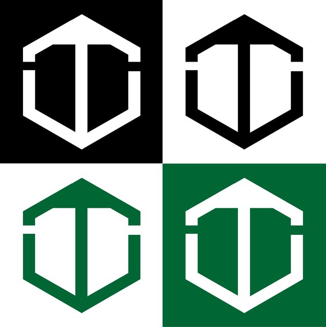
Then I created a logo that looked cooler. I also changed the color so that it can be seen with other colors which one is better. Here is the result of the logo, and don't forget to save it.
| Design a simple brochure for your brand, then strategically place one of the logos you created on the brochure. |
|---|
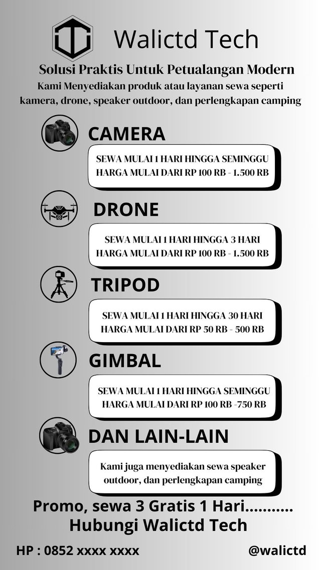
Next is to design a simple brochure where here I focus on my brand. For example, I want to use the brand “Walictd Tech” which in this brand will provide technology equipment rental services to recreation. So the brochure that I make can consist of one page with an attractive and technology-based appearance. Not forgetting to add the monogram logo that I created earlier.
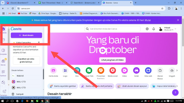
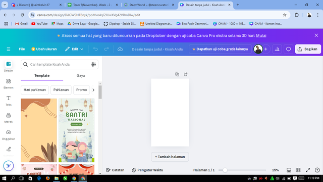
First we will create a worksheet with canva.
Top section (Header):
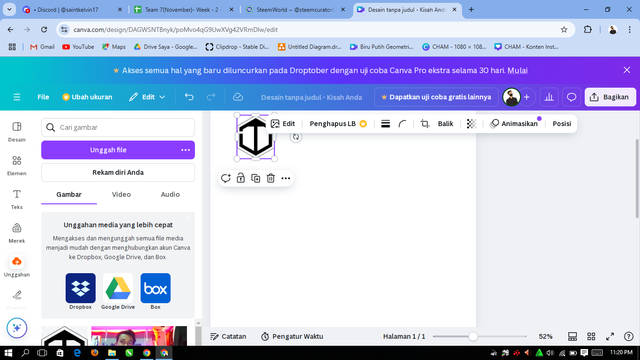
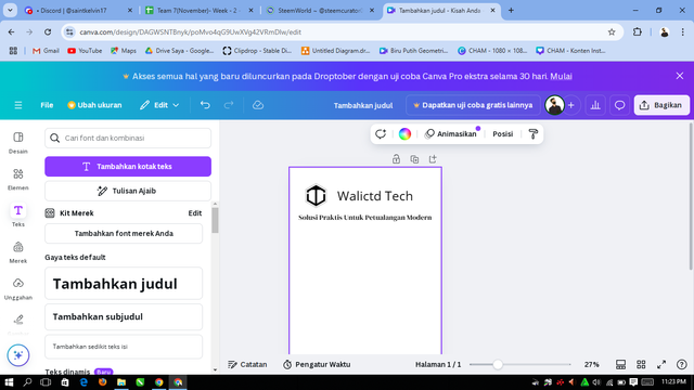
At this very section, I will put the logo monogram “WT” (which is one of the initials of Walictd Tech), its position will be in the upper left corner to introduce the brand in a simple yet attention-grabbing way. Next, next to the WT logo, we will add a short tagline for example the words “Practical Solutions For Modern Adventures”.
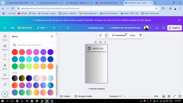
Next I replaced the background, choosing a gradient from gray to white until it looked like this:
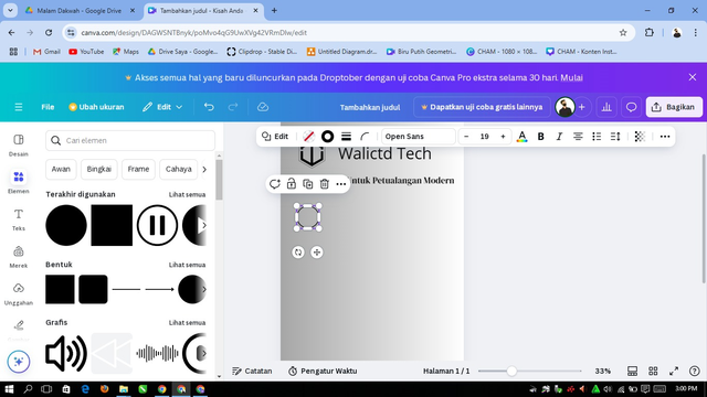
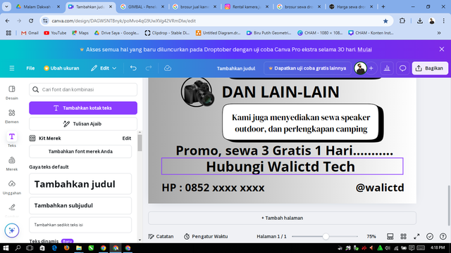
In the center of the brochure, I included key information about the services offered. It contains a list of products or rental services, such as cameras, drones, outdoor speakers, and camping equipment. Here's my process of adding the information one by one until it's complete:
 | 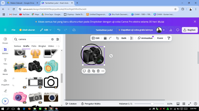 |
|---|---|
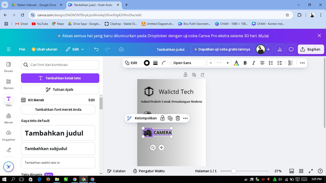 | 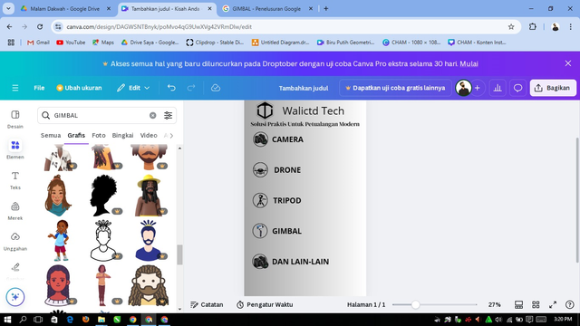 |
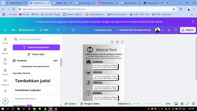 |  |
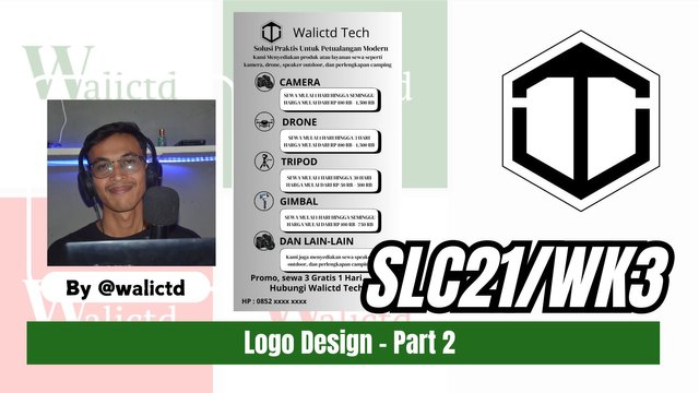
and the following is the result;
@walictd

.jpg)

.jpg)
Terimakasih atas undangannya untuk berpartisipasi dalam pembelajaran ini, tetapi saya tidak punya skill dalam mendesain logo dengan menggunakan Canva.
Jika pun harus mencoba, itu akan memiliki kualitas yang buruk, jadi saya memutuskan untuk tidak menjadi bagian dari pembelajaran ini, kecuali dibenarkan menggunakan aplikasi lainnya.
Terimakasih
Saya pun mendasain logo dengan Coreldraw pak wkwkkw
Ntah diterima atau tidak, ga tau juga 😂
Congratulations!!! because your post has been upvoted by Team 7 using steemcurator09. Keep up the good work and keep making quality posts. Curated By @walictd
https://x.com/walictd/status/1856996449176998353
Congratulations, your post has been upvoted by @scilwa, which is a curating account for @R2cornell's Discord Community. We can also be found on our hive community & peakd as well as on my Discord Server
Felicitaciones, su publication ha sido votado por @scilwa. También puedo ser encontrado en nuestra comunidad de colmena y Peakd así como en mi servidor de discordia
Thankyou @abiga554
Waw sangat panjang rumusnya, mantap .walictd@
Heheh lumayan