SLC21/WK3: Logo Design - Part 2
I am pleased to participate in 3rd week of SLC Season-21. This week we will be learnt Logo Design - Part 2. So Let's start,
Discuss about each of the logo types we have and then talk about conditions when such logo should be used and when not to be used for a brand. You can do a little research to aid you.
In this lesson therenare 7 typea of logos are covered. Below I am sharing what I learn about these.
As It's name it is all about words and typography. It only focuses on words, I meant the name of brand or company. Examples of word mark logos include well-known brands like Google, Coca-Cola, ebay, Bata, Apex, FedEx etc. It is created for simplicity, memorability and clarity. Most of the time every letter of a word mark logo significant meaning. Like one of the renowned brand eBay and it's words logo brand stands for "Echo Bay Technology Group".
This type of Logo should be used when
- A company or brand is new because a less renowned brand can directly introduce it’s name though word logi.
- Okay, In my opinion, another reason for a brand should uese word logo because word logo helps reinforce the name in one's minds which make easier to remember the brand.
- For simplicity and less investment for logo create when it is a newly opened brand.
This type of Logo shouldn’t be used when
- The name of brand is very lengthy because one just stop pronounced your brand mid way.
- If there are already established or any other growing band similar with your brand.
It is also known as Lettermark logo. Basically a monogram logo is the initials of a brand name. For example I would love to mention about Netflix Logo. You can understand what is a monogram logo by this example. The initial N is Netflix. We can mixed up monogram logos with watermark logo but remember **Word mark logo is the full name of your brand and monogram logo is all about a logo of your brand name's initials.
This type of Logo should be used when
- One should uese monogram logo when the name of your brand is complex, difficult to pronounced.
- For Professional look.
This type of Logo shouldn’t be used when
- The name of brand is newly opened.
- If your targeted audience is local.
It is also known as Pictorial Logo. As it's name it contain picture and image. This type of logos don’t need text. For example, world's best renowned brand Apple use brand mark logo. You don’t need to write your brands name in this type of logo.
This type of Logo should be used when
- One want to established a renowned brand
- For visually outstanding, memorable effect on customers.
This type of Logo shouldn’t be used when
- Not ideal for new businesses
- If you start a business from the group you shouldn’t go with it.
Abstract mark logo is a kind of pictorial logo but it is not detailed as pictorial logo. For example you a pictorial logo is Apple's logo and by seeing the logo you can understand the name but when it is about abstract logo then lets talk about the another renowned brand nike where they use abstract logo. You can't find a tick mark means nike. There is no messene but meaningfull. Hope you got it now.
This type of Logo should be used when
- You interact with audience in a unique and creative way.
- If your brand related with fashion, technology or anyother creative sector.
This type of Logo shouldn’t be used when
- When your brand is not already well established.
- If your target is Common and regular user.
It is a logo designed with the brand's characters. Also there are art and modern art with the brands background. For example look at the KFC brand's logo. They create their logo by user the owners image. It is commonly used in food industry.
This type of Logo should be used when
- For food and beverage brands, and entertainment companies too.
- If your want to communicate with your audience with friendly and funny way.
This type of Logo shouldn’t be used when
- When your brand is very Professional or serious.
- As it is not really a professional logo so if your brand is related with finance, healthcare, or legal services then you shouldn’t use it.
This is very common logo but it isn’t mostly used by renowned brands yet it is popular and mostly seen logo. In this type of logo text and image used in a geometric way. For example we can look at the Starbucks logo.
This type of Logo should be used when
- If your want to communicate with your audience with traditional way then use it.
This type of Logo shouldn’t be used when
- Not ideal for the brands prioritizing versatility.
Thus is the most common logo for brands. As It's name, this type of logo is made up with both text and image for clearity. For example we can loik at the brand like Adiddas.
This type of Logo should be used when
- A brand wants flexibility
- For a newly opened brand
This type of Logo shouldn’t be used when
- Not ideal for the brands prioritizing guessing start.
Pick any two (2) of the Logo types discussed and then practically demonstrate how to make them, showing your detailed process.
I will go for very basic. I will pick Word Mark Logo and then combination logo. As I explained detailed that a new startup business should start with a word mark logo so I will go with it. And my brand is a food brand so I will make logo of Cake brand.
Now I practically demonstrate how I make them- showing your detailed process (Word Mark Logo)
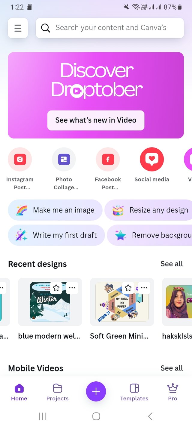
First I log in my mobile Canva app. Then I go to create option. As I will create a logo so I place my deaired dimension which is 250 px X150 px. Then click on the create option.
 |  |
|---|
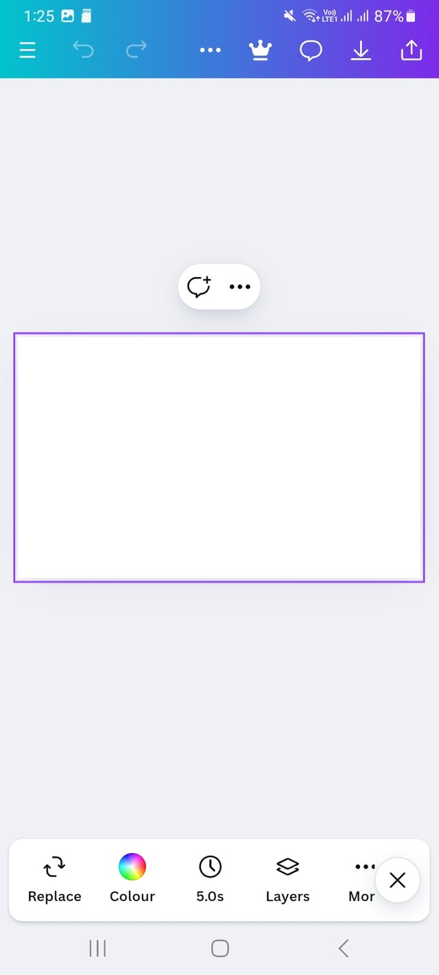
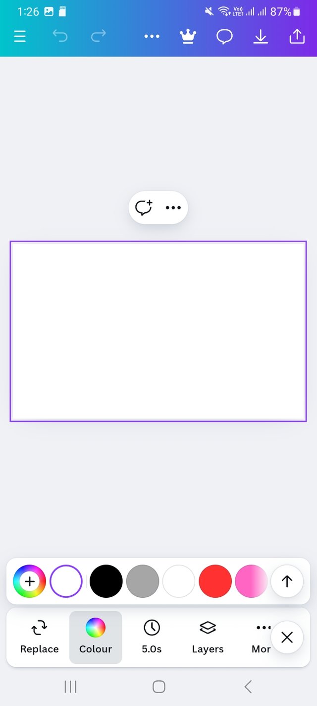
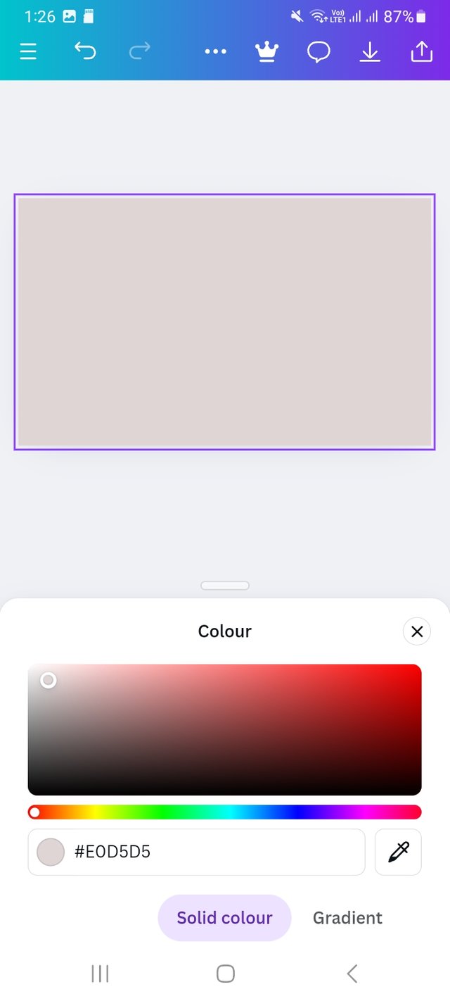
Then I select a background. I click on colour icon and choose a light colour. The background colour hex is #E0D5D5
 |  |  |
|---|
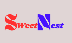
In this logo, I don’t have to do much. I click on text option and write My brands name "SweetNest". I start with s. For this I select red colour and ansing typefront. Then I completed Sweet.
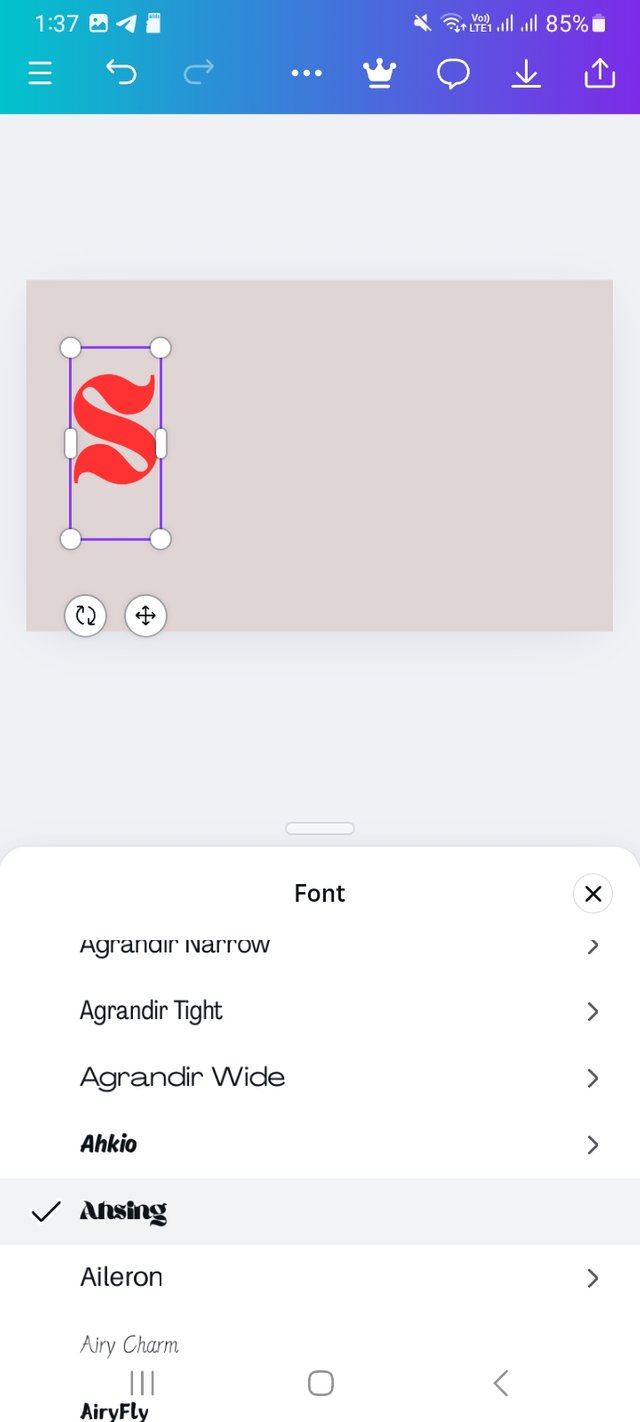 | 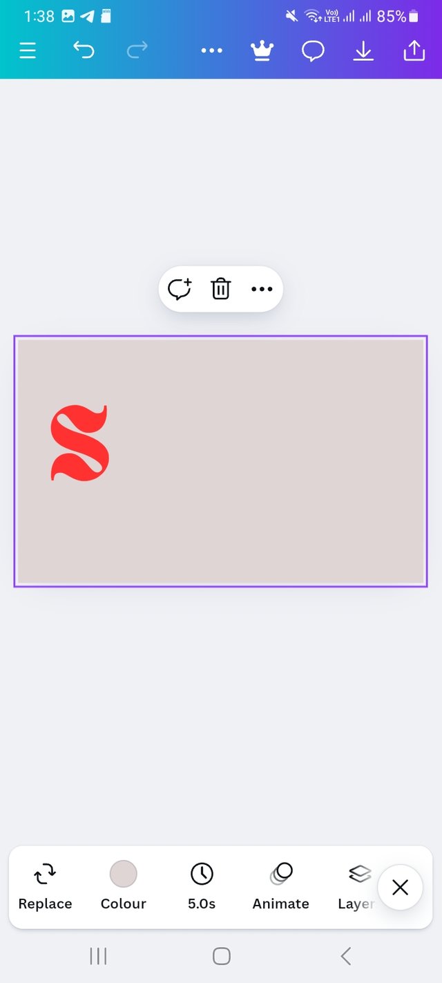 | 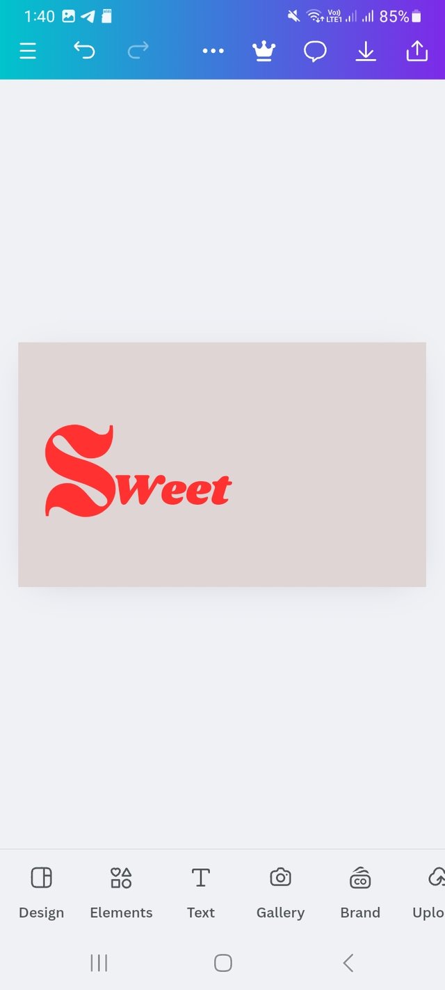 |
|---|
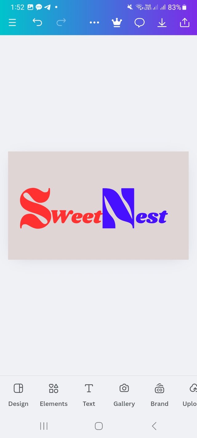
Then I write Nest following the same process and change the colour. The colour hex is #4711FF. Here I used two complementary colour.
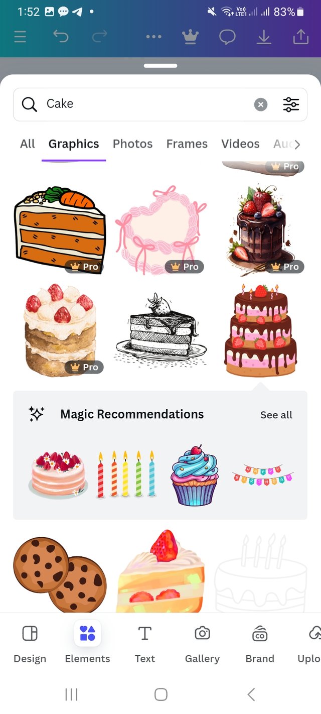
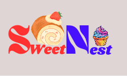
Now I go for combination logo. As we all know combination logo is a logo where image and text both use. So I strart with word mark logo and make ut a combination logo. I click on elements and search cake. There I choose a cake and place it as my desire place.
 |  |
|---|---|
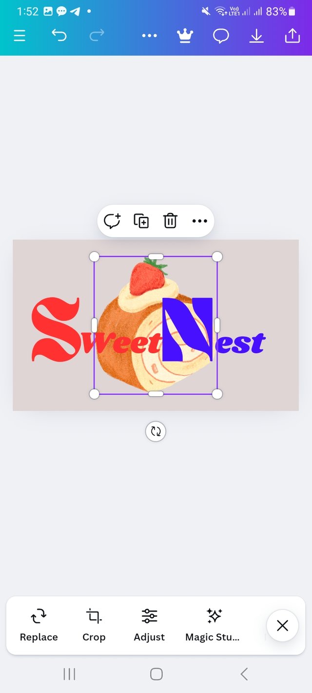 | 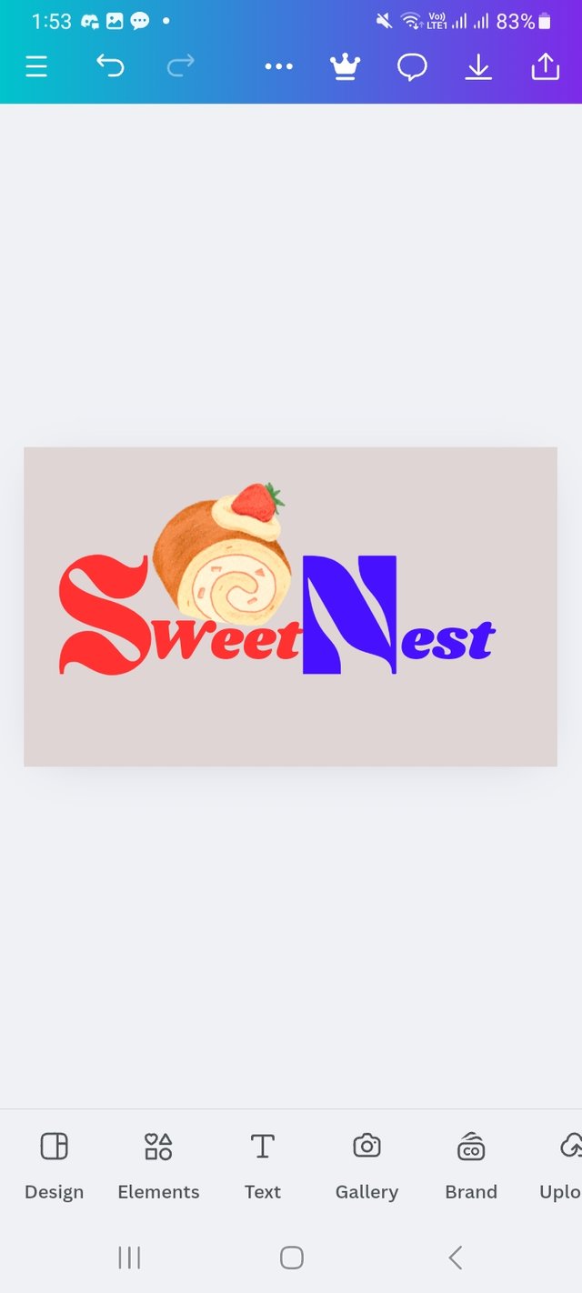 |
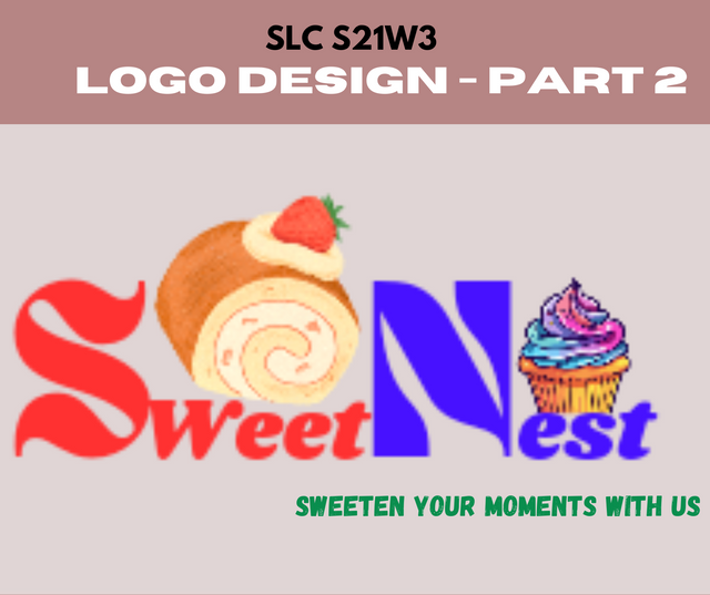
Then Following the same process I again search for a cup cake and place it and my logo is ready for my cake brand.
Design a simple flier for your brand and then strategically place one of the logo you made in the flier..
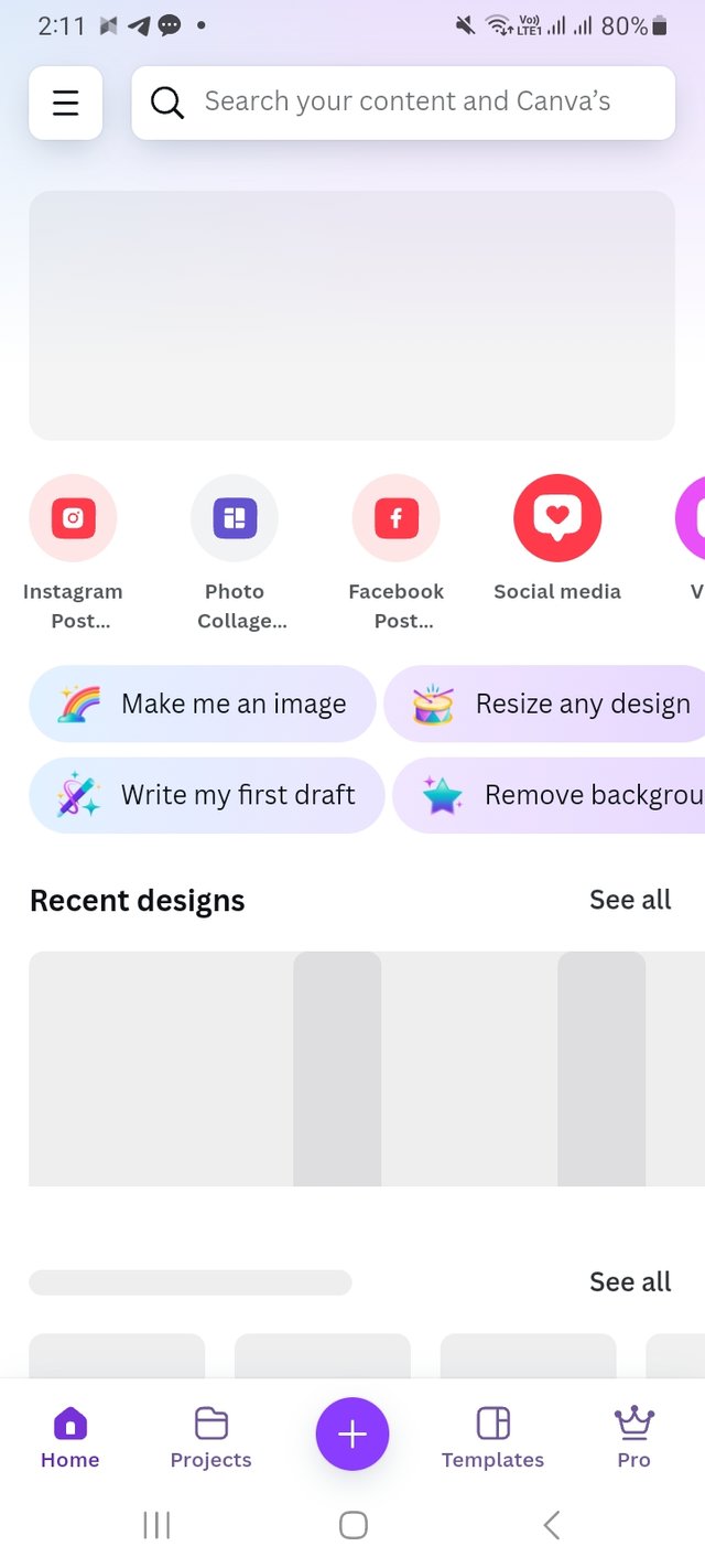
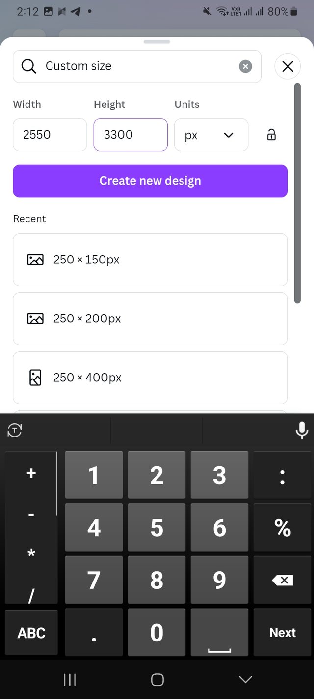
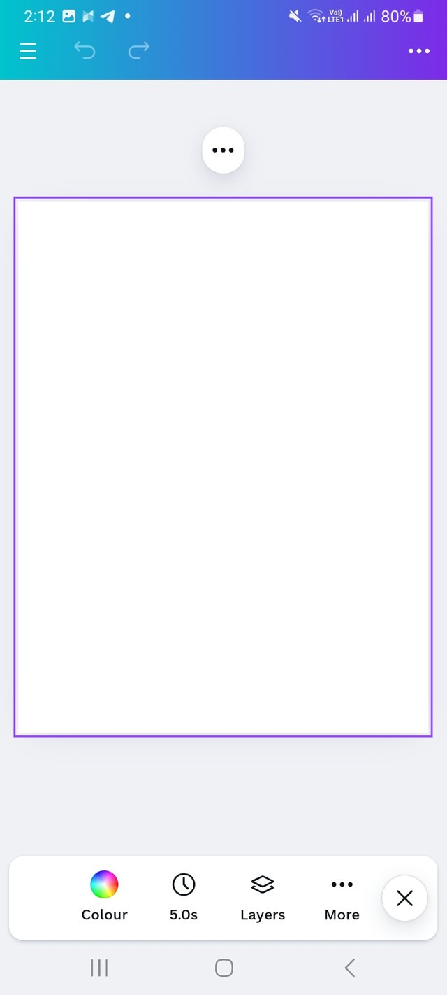
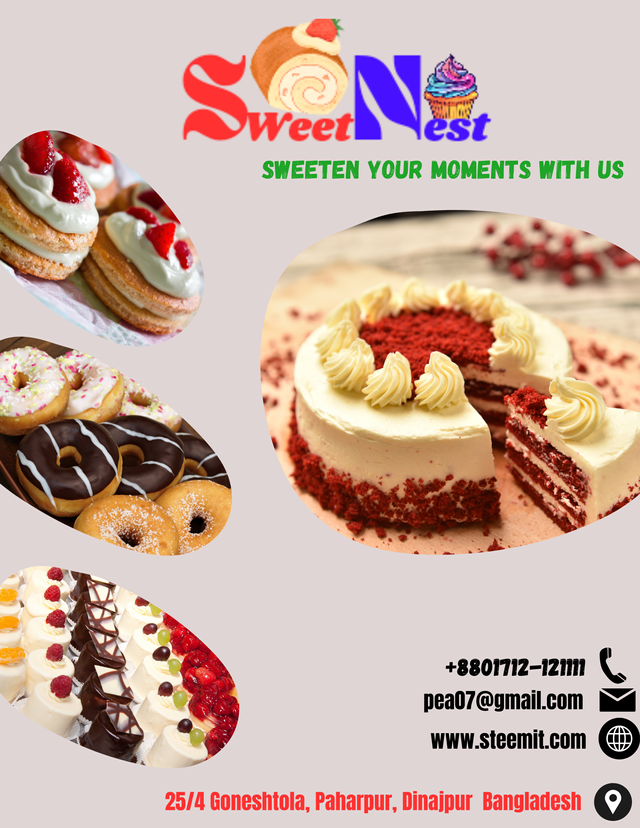
For making a flier for my brand which is a cake brand I again log in to canva. Then I go to create option. As I will create a logo so I place my deaired dimension which is 2550 px X 3300 px. Then click on the create option.
 |  |  |
|---|
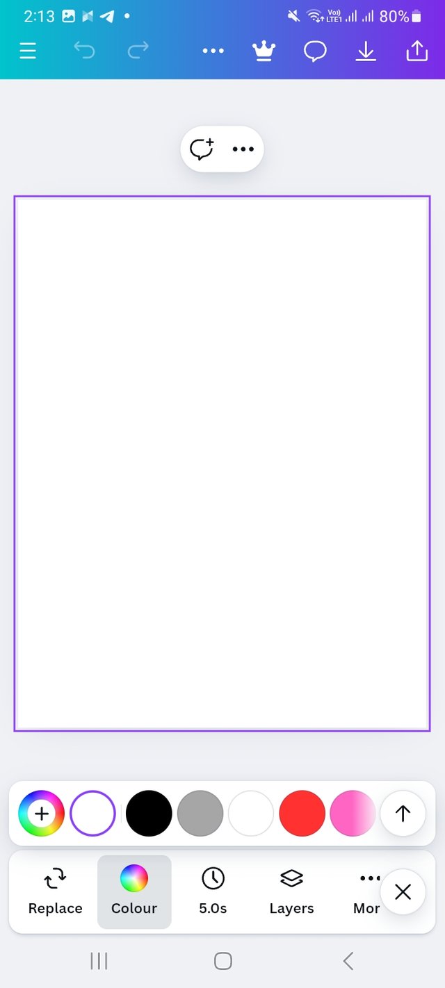
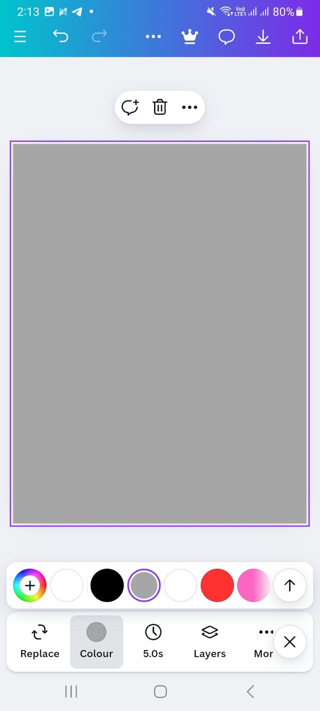
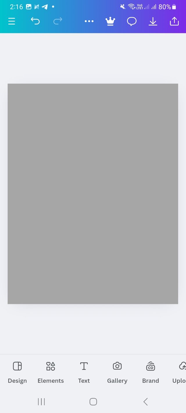
Then I select a background. I click on colour icon and choose a light colour.
 |  |  |
|---|
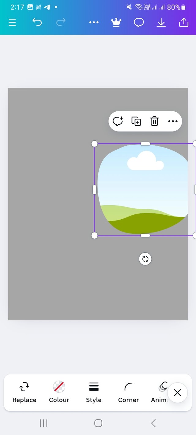
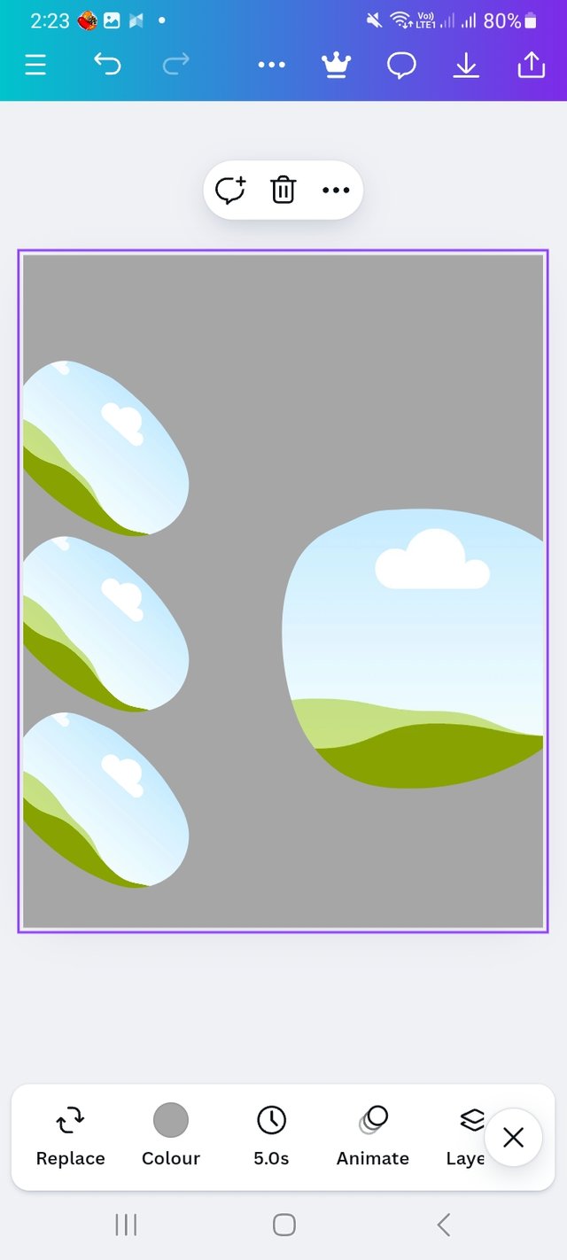
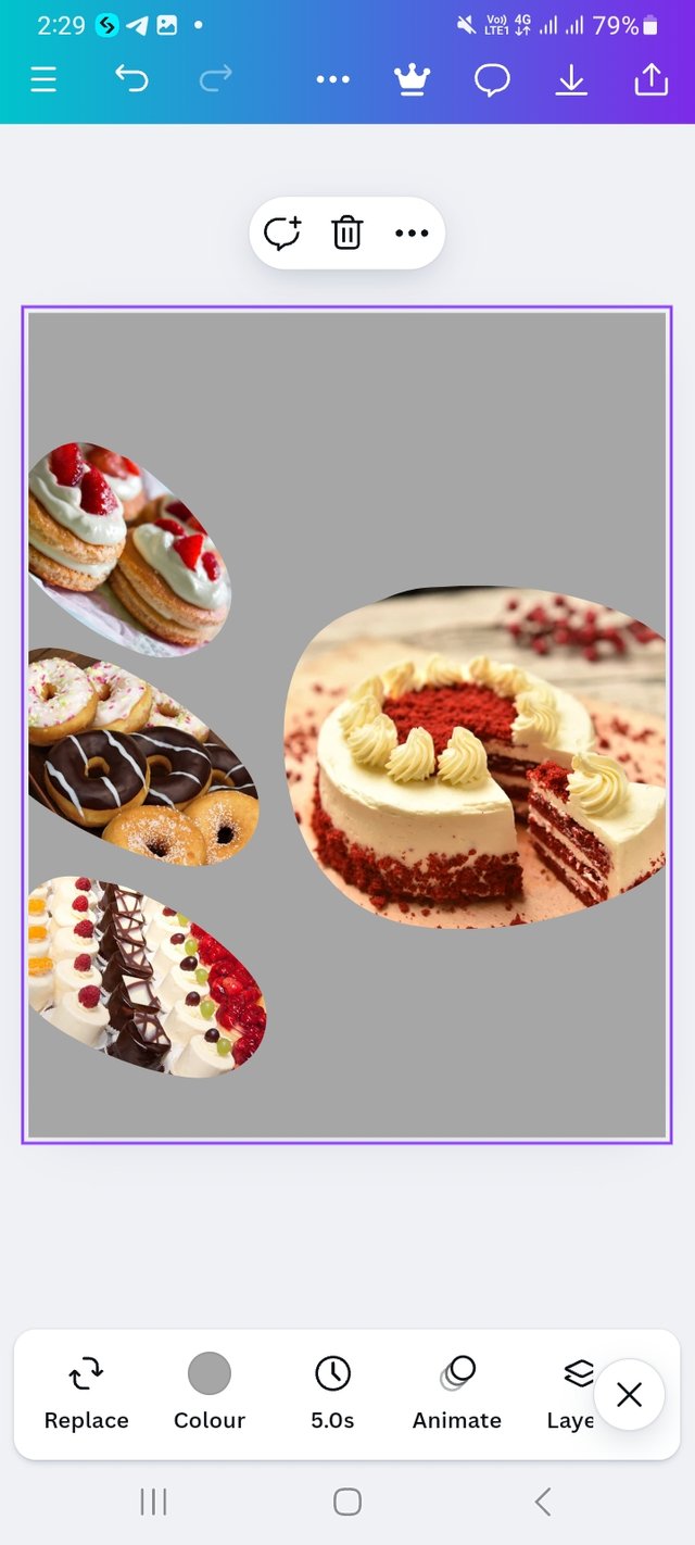
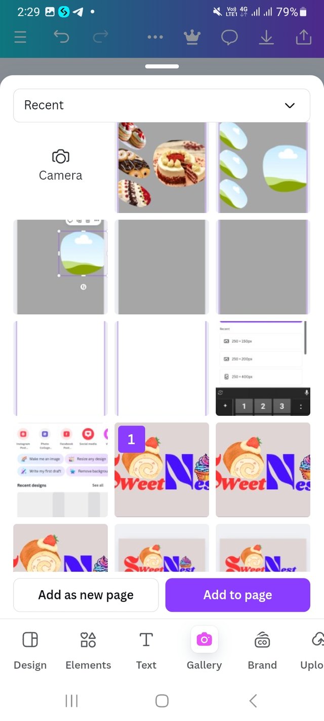
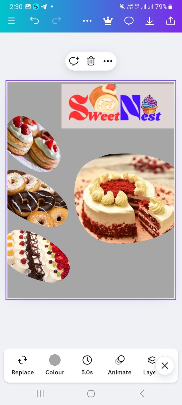
I click on elements option and select some shapes for my design. Place all the design carefully.Then select elements again and choose cake picture in place them all.
 |  |  |
|---|
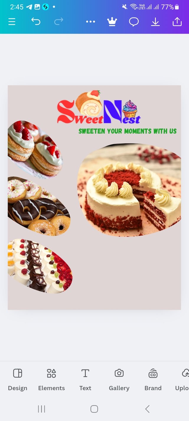
Then I place my logo and change the background colour. and also at a tagline. "Sweeten Your Moments with Us".
 |  |  |
|---|
Then I add my contact details like mobile number, email address, website and location.
I am inviting my friends @mainuna
@deepak @solaymann
Upvoted! Thank you for supporting witness @jswit.
Also adding details about colors and dimensions makes everything clearer and more useful for anyone who wants to create a professional and personalized logo! 🍰💫
Great job with your "SweetNest" brand logo and flyer — it really represents your vision of the brand! Congratulations and keep up the good work!
Thanks for stopping by and your words. I wasn’t good at graphic design but after joining this course I am dooing good. Again thanks my friend.