SLC | S21W 3 | Logo Design - Part 2
Hello steemians,
Today, I am participating in the SLC21 W3 - Logo Design Part2 contest, organized by @lhorgic. Always passionate about graphic design, I find this challenge particularly interesting because it allows me to practice my skills using Canva, a platform that I appreciate for its simplicity and efficiency.
Discuss about each of the logo types we have and then talk about conditions when such logo should be used and when not to be used for a brand. You can do a little research to aid you.
.png)

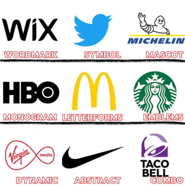
The wordmark logo is based solely on the brand name, using unique and often personalized typography to create a strong visual identity, this type of logo is perfect for brands whose name is distinctive, easy to remember and looking to build awareness around their appellation without resorting to additional visual elements. But wordmarking becomes difficult to use when the brand name is long, complex or undistinctive as it may be difficult to style elegantly and read when displayed at a small size. In these cases, a symbolic logo or other type of logo may be better suited to convey the essence of the brand.

Symbol or icon logos use a simple graphic element that represents the brand’s identity in a minimalist and powerful way. This style of logo works particularly well for established brands that have achieved enough name recognition that the symbol is immediately associated with them, such as the famous Twitter bird. Symbolic logos are also popular for their ability to be memorable and easily integrate into minimalist or visual designs. Nevertheless, for an emerging or lesser-known brand, a purely iconic logo may not be enough to clearly express its field of activity or values, and may leave consumers uncertain about what the company offers. Text or a combination of visual elements may be more appropriate for new brands.

A mascot is an illustrated character that becomes the face of the brand, bringing a warm, friendly, and human touch to the brand identity. Mascots are ideal for companies looking to create an emotional connection with their audience, and are often effective in the food service, entertainment, or children’s market sectors, as they make the brand easily recognizable and more accessible. However, a mascot may not be suitable for brands looking to project a professional, formal, or minimalist image, as it can diminish the brand’s perception of seriousness and authority, especially in industries such as finance, high-tech, or professional services.

The monogram is a stylized representation of the brand's initials, allowing you to simplify a complex name while making it visually appealing and memorable, this type of logo is particularly suitable for companies with long names or those that are difficult to stylize in full such as HBO or IBM where the initials are recognizable enough to represent the company without requiring full text. Monograms work well for brands that already have some recognition and whose initials are already familiar to the public. However, for a new company or one whose initials are not yet known to the public, a monogram may lack impact and risk creating distance with consumers who will not immediately connect the letters to the brand’s industry.

Letterform relies on a single letter, often stylized in a distinct way, which becomes iconic and directly associated with the brand, this style is well suited for businesses where a specific letter is instantly recognizable, providing a visual simplicity which can be powerful if is well executed. In the case of McDonald’s, the gold “M” has become a universally recognized symbol that embodies the essence of the brand. However, the use of a single letter may be ineffective if that letter is not immediately recognizable or distinctive, making association with the brand difficult and for new marks or with a common letter, this approach may fail. of uniqueness and not sufficiently capturing the essence of the company.

Emblems combine text and symbol in an integrated structure, often in the form of a badge or seal, which conveys a sense of prestige, tradition and authority. Emblems are particularly suitable for older brands or institutions that want to project an image of stability and trust such as universities, governments or some luxury brands, Starbucks, for example, uses an emblem that combines its icon and name in a complex but iconic design. But the emblems can pose flexibility issues particularly , when it comes to resizing them for different media as details can be lost or blurred at small sizes or modern businesses that need an adaptable visual identity could find the emblems too rigid and opt for a simpler logo.

Dynamic logos offer increased flexibility by allowing certain elements of the logo to change or evolve over time or in different contexts, while maintaining brand consistency. This type of logo is ideal for brands that want to demonstrate their adaptability, innovation and openness to market developments by playing with variations that maintain overall consistency. However, this style can be less intuitive to consumers, especially if the brand is new, because it doesn’t immediately give an indication of what the company does. An abstract logo may require additional effort to educate the audience and associate them with the brand.

An abstract logo uses geometric shapes or unique graphic elements that do not literally represent the brand but evoke its values, energy or mission. Abstract logos are well suited to companies looking to stand out with a distinctive symbol without a direct link to their name or activity, such as Nike's Swoosh, which represents movement and speed without literally illustrating the sport. However, this style can be less intuitive for consumers, especially if the brand is new, because it does not immediately give an indication of what the company does. An abstract logo may require additional effort to educate and associate the audience with the brand.

Combo marks combine text with a symbol or icon, allowing great flexibility in using each element separately or together, this type of logo is perfect for brands who want to build their notoriety by associating their name with a strong symbol , as in the case of Taco Bell, where the bell icon and the text complement each other. Combined brands are often used by companies that are just starting out or want to establish a strong visual identity, because they allow both the name and the graphic element to be strengthened and, however, if the objective is to keep a clean visual identity or If the design tends to become too busy, it may be wise to simplify by removing one of the elements for a more minimalist use.
Pick any two (2) of the Logo types discussed and then practically demonstrate how to make them, showing your detailed process.
I chose the Wordmark and combo types. I'll walk you through each step, including tips on tools and design considerations, so you can create these types of logos from scratch.
A Wordmark focuses solely on the brand name, using custom typography to create a unique and recognizable style. We'll be creating a logotype for a fictional brand called "Bloom."
Step 1: Start a New Design
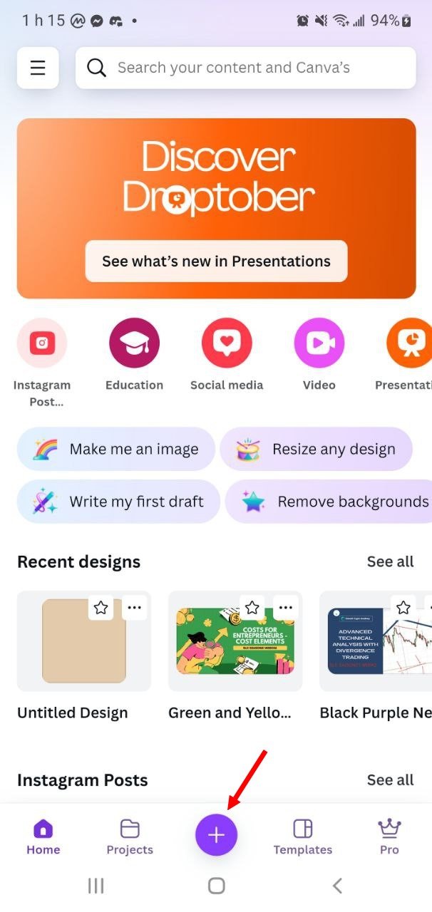
- In Canva, I open the app and tap the + button at the bottom of the screen to create a new design.
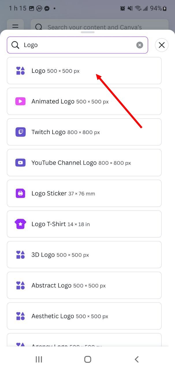
- In the search bar, I type Logo and select the Logo (500 x 500 px) option to have an optimal canvas size for logo creation.
 |  |
|---|
Step 2: Add and Customize Text
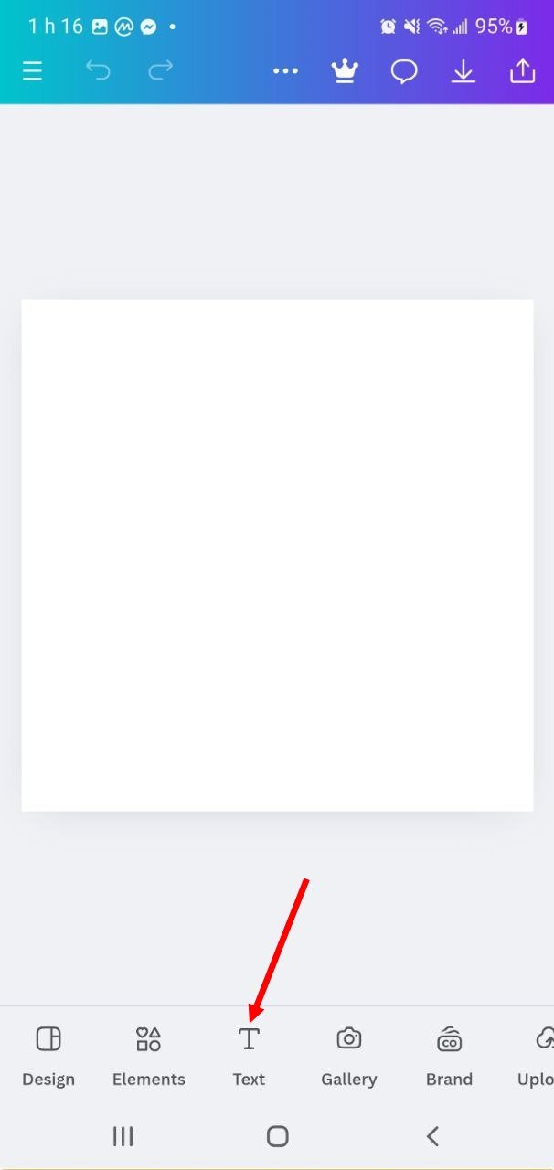
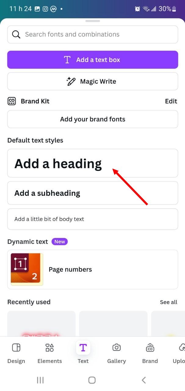
- I go to Text at the bottom of the screen and select Add Header.
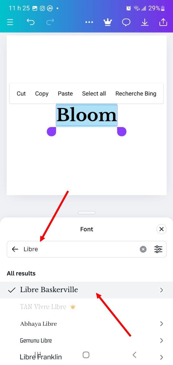
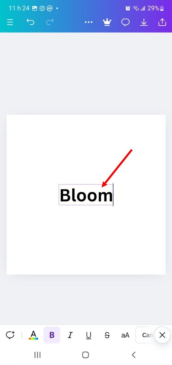
- I type “Bloom” in the text box. At this point, I can adjust the font to match the style I want. For a sleek, natural look, I look for fonts like Libre Baskerville or a serif font to evoke a natural vibe.
 |  |  |
|---|
Step 3: Adjust Letter Spacing
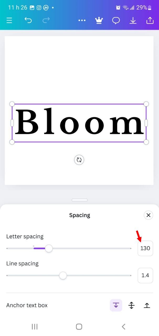
- I select the text "Bloom" and go to the Lettering and Spacing options to adjust the letter spacing. This makes the text more balanced and visually pleasing.
- I adjust the Letter spacing value to give a spaced and neat look, which adds elegance to the logo.
 |  |
|---|
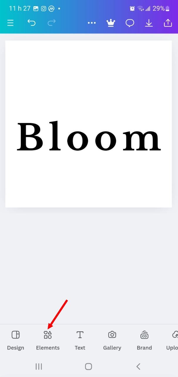
Step 4: Add an Accent with a Leaf
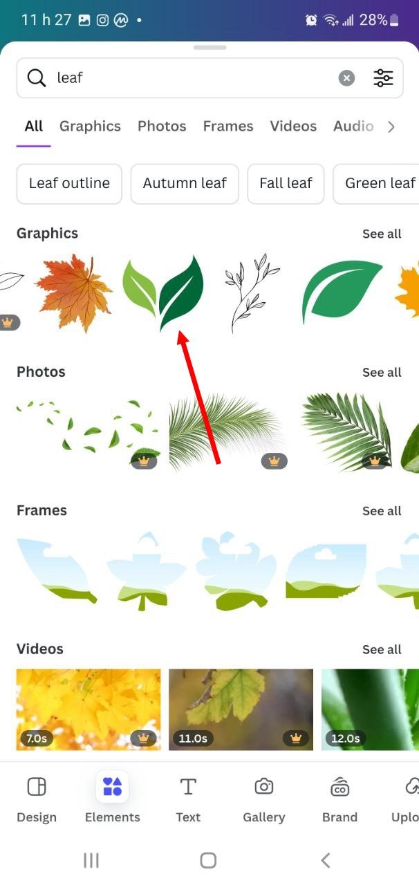
- I go to Elements and search for "leaf". I find different leaf icons that would fit well in the logo.
- I choose a simple leaf and position it near the middle to add a symbolic touch of nature and growth.
- I adjust the size and color of the leaf icon to be consistent with the text, using a green color to reinforce the association with nature.
 |  |
|---|
Step 5: Apply the final color
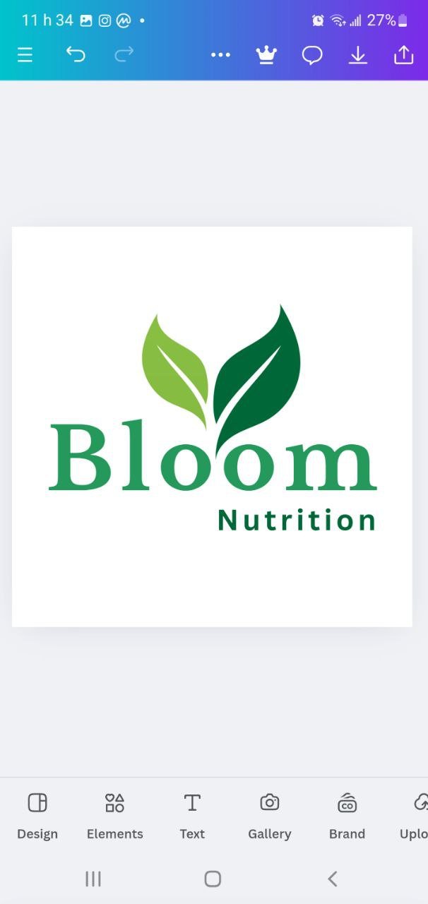
- I choose a soft green color for all the text and the leaf icon, which reinforces the natural and eco-friendly theme of the logo.
- I make sure that the chosen color is harmonious and clearly visible.
 |  |
|---|
Step 6: Export the logo
- I added the subtitle "Nutrition" to show the field targeted by my logo.
- When I am satisfied with the design, I click on Download at the top right and select PNG to obtain a high-quality image. I choose the transparent background option if I want to integrate this logo on different backgrounds.
Final Result
To create a Combo logo for the fictional brand SkyNest, here are the detailed steps I followed to design a harmonious logo that evokes the idea of an eco-friendly airline:
Step 1: Start a New Project
- Open Canva and click the + button at the bottom of the screen.
- Search for “Logo” in the search bar and select a size of 500 x 500 pixels. This size is ideal for a logo because it allows for detail while being compact enough to use online.
 |  |
|---|
Step 2: Add the Brand Name “SkyNest”
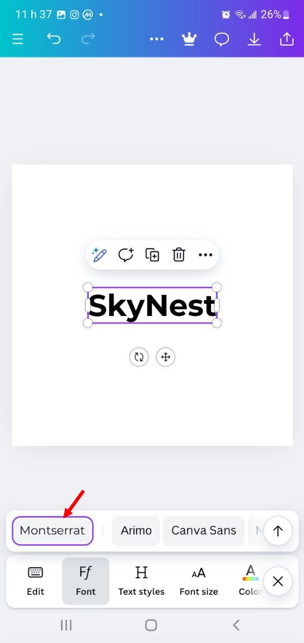
- I start by adding text by clicking the Text option at the bottom of the screen and then selecting Add Header.
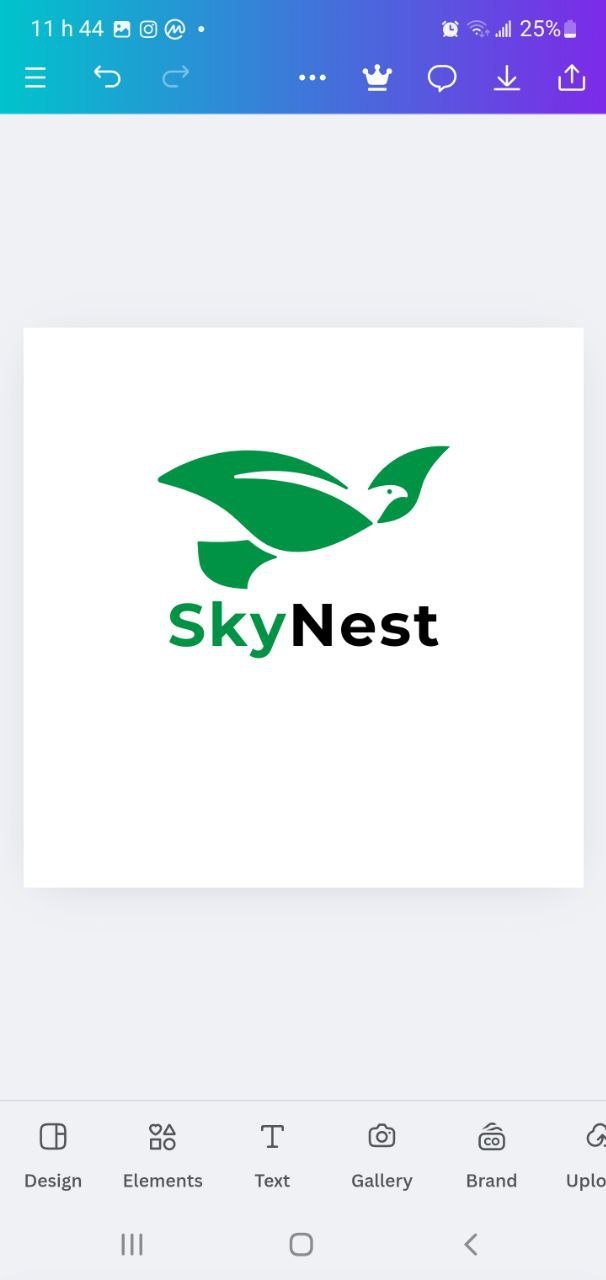
- I type "SkyNest" in the text box and choose the font Montserrat, which has a modern and clean style. This font gives an impression of professionalism, which is suitable for a brand that wants to inspire trust and reliability.
 |  |
|---|
Step 3: Customize the text
- I select the text "SkyNest" and play with the settings to adjust the size and spacing of the letters to improve the readability and balance of the logo.
- To make the name visually appealing, I use a combination of colors. For example, I put "Sky" in light green to represent nature and the environment, and "Nest" in black for a strong contrast and easy reading.
Step 4: Add an ecological symbol
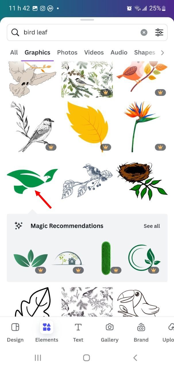
- I go to Elements and type "bird leaf" in the search bar to find an icon that symbolizes both a bird and a leaf.
- I choose a graphic element showing a stylized leaf that forms a bird in flight, symbolizing both nature and movement. This reinforces the idea that SkyNest is an environmentally friendly airline.
- I adjust the size of the icon so that it fits perfectly next to the text and I position it so that it is aligned with the name, creating a visual balance.
 |  |
|---|
Step 6: Frame the Logo with a Green Circle
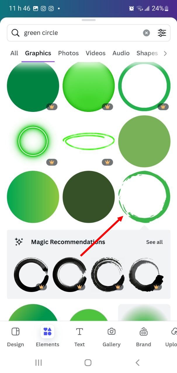
- In Elements, I search for "green circle" to add a frame that gives structure to the logo.
- I select a green circle with a brush effect for an organic and dynamic touch, symbolizing the brand's openness and commitment to nature.
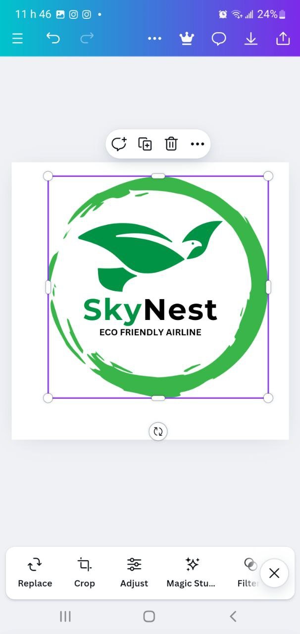
- I position the circle around the text and the bird icon to give the logo a complete and contained appearance.
Step 7: Add a Tagline (optional)
- To reinforce the brand message, I add a tagline under the name "SkyNest" that says "Eco Friendly Airline".
- I use a small font, in black, and align the tagline with the brand name for a clean and readable look.
 |  |
|---|
Step 8: Export the Logo
- Once the logo is complete, I click Download at the top right of Canva.
- I choose the PNG format with transparent background so that the logo can be used on different media without background issues. This allows SkyNest to use the logo flexibly, whether on digital documents or printed media.
Final Result
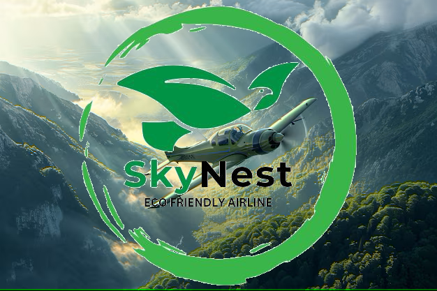
The SkyNest logo uses a Combination Mark that harmoniously combines text and an icon. The choice of the leaf bird evokes flight and nature, reinforcing the image of an airline that values ecology. The green color, the organic circle, and the modern font all contribute to creating a memorable visual identity, which is in line with the values of sustainability and innovation.
This design is ideal for a brand like SkyNest that wants to inspire trust and highlight its commitment to the environment.
Thank you very much for reading, it's time to invite my friends @cruzamilcar63, @mvchacin, @adeljose to participate in this contest.
Best Regards,
@kouba01

Congratulations, your post has been upvoted by @scilwa, which is a curating account for @R2cornell's Discord Community. We can also be found on our hive community & peakd as well as on my Discord Server
Felicitaciones, su publication ha sido votado por @scilwa. También puedo ser encontrado en nuestra comunidad de colmena y Peakd así como en mi servidor de discordia