SLC21/WK3: Logo Design - Part 2
AssalamuAlaikum & Greetings Everyone!
AssalamuAlaikum & Greetings Everyone!
Q.1 - Discuss about each of the logo types we have and then talk about conditions when such logo should be used and when not to be used for a brand. You can do a little research to aid you.
Logo design comes in many forms and types, which makes branding vary depending on the kind that an organization or business requires. Here's a breakdown of the main types of logos, along with guidelines on when to use or avoid them:
1. Wordmark (Logotype) |
|---|
Wordmark is another type of logos that are normally all about the company’s name in some form of unique text. It has a unique approach to brand identity by employing models and fonts in the typography. The most entrant examples of companies with material service brands are Google, Coca-Cola, and Disney.
When to Use:
Favored in companies whose name or abbreviated is not extremely long and can be easily memorized, the new brand name is also short and easy to remember.
Most suitable to the business that wants to convey its image to customers merely by the name.
Most useful when used by new organizations desiring to establish themselves in the market rapidly.
When Not to Use:
Not very suitable for companies with rather large or multifaceted names: the acronym is short, but it is difficult to read the full name after it.
May not be a good choice if you’re thinking of extending operations in foreign countries, especially those with different languages than yours.
2. Lettermark (Monogram) |
|---|
Lettermark logos entail the use of abbreviation or first three letters of the companys name. Some of these are IBM, HBO and CNN. This kind of logos are always simple and can be associated with clean typography.
When to Use:
Actually good for rather long names of brands which cannot easily fit into ad logo.
Excellent for the organizations that are already branded by the first letter of the name.
Good for companies who want their website to have a clean and updated appearance.
When Not to Use:
It is not advisable for new business brands since people might had difficulty associating new brands from just initials.
May not relate much with your brand’s products and services or even its values in the event that the initials used are difficult to decipher.
3. Brand Icon.277 |
|---|
This logo type is an image or symbol that symbolizes the brand, for instance the apple companies logo that represents Apple Inc or the bird that represents twitter. It is an instructive device which uses images for portrayal instead of words.
When to Use:
Best used by companies that have easily illustrated name or product to market.
Beneficial when the brand is well known as the icon can freelance and let people know its origin.
Most suitable to businesses eager to share a message across the world since pictures are easily interpreted all over the globe.
When Not to Use:
- Not suitable for firms that are new in the market since the product requires a lot of publicity to be recognized.
Only works well in situations if your brand expands and offers a variety of items in the future.
4. Abstract Mark |
|---|
These logos employ sharp forms and characterless shapes to design a symbolic image (the Nike’s swoosh, Pepsi’s swirl). They are stereophonic and so do not give a direct representation of the actual subjects.
When to Use:
Good for those firms who want to convey an emotion or brand attribute/ Benefit, yet is not too explicit.
Looks good for brands or businesses with more extensive product portfolios since the concept is quite general.
Suits if you need a unique, easily recognizable sign that can be easily remembered.
When Not to Use:
Can be difficult to develop or create and usually takes a lot of marketing drive to even give meaning to the symbol.
Businesses that require an immediate steadiness of identity will find this branding style less useful.
5. Combination Mark |
|---|
This type of logo incorporates both letters and graphics affording the benefits of bothYL;symbol and text. Just like Adidas or Amazon where a wordmark is accompanied by a graphic mark.
When to Use:
Especially important for startups and business that need to establish their brand since it can be accessed and used in various media platforms.
Is very versatile, a user can simply divide the icon and the textual call to action for other branding purposes.
Able to create both text and image logos that are suited for companies who want a logo that can deliver literal and symbolic or philosophical messages.
When Not to Use:
- Sometimes they can be packed with contents and may not look cool enough if not well developed for the minimalistic brand organization.
May be less effective when used in small portions where all the assembled constituents lose distinctness.
6. Emblem Logo |
|---|
An emblem logo is a logo type with the text placed inside a symbol, resembling badges or crest (e.g., Starbucks, Harley-Davidson). It’s often detailed and can be traditional as well.
When to Use:
Suitable to be used by companies that wish to show a history and/or expertise, such as schools, universities and government offices.
Most appropriate logo design for uniform, badges, and seals branding ICONIC LOGOS.
When Not to Use:
It is not favored in brand designs required to be simplistic and contemporary –especially for new media technologies.
–Can be difficult to read when reproduced in a small font.
7. Mascot Logo |
|---|
These logos feature a symbol or representative character of the brand which are for instance, KFC- Colonel Sanders and Pringles. They make it nice and inviting to approach the brand itself.
When to Use:
Beneficial to companies that market goods and services to families or children for example; food outlets.
Most suitable if the business intends to develop a friendly and familiar face to its brand.
When Not to Use:
sites to which the brand is linked: It is impractical for luxury, formal and top of the pyramid brands since makes the brand look less serious.
– May not be very flexible on all marketing and advertising assets particularly on corporate communications.
Q.2 - Pick any two (2) of the Logo types discussed and then practically demonstrate how to make them, showing your detailed process.
In this part of the task I have decided to choose watermark logo and combination mark logo as I can easily work on both of them.
Water Mark Logo |
|---|
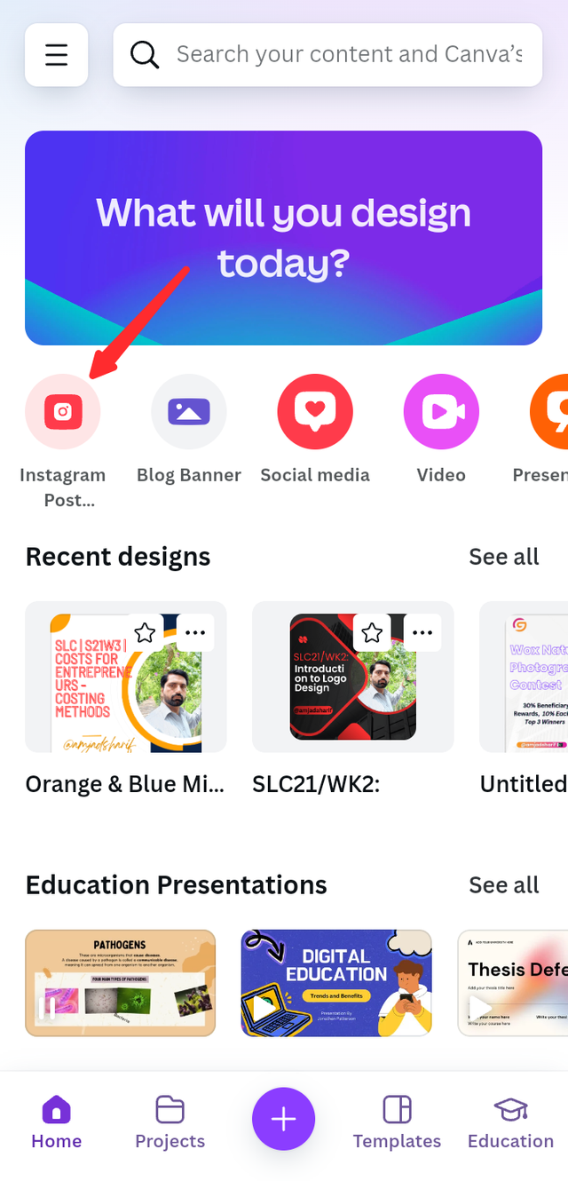
Before starting this task I will open the Canva app from my mobile and select the Instagram template design.
 |  |
|---|
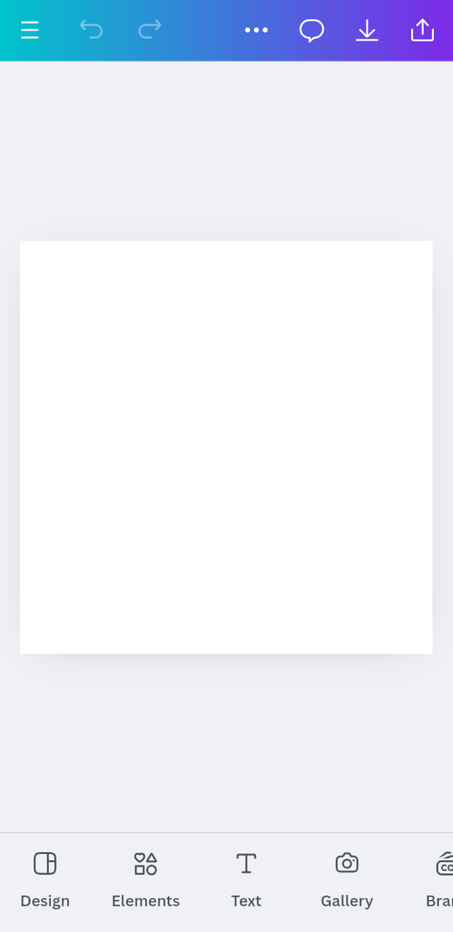
Now I'm going to select the name of the design I'm going to create here, which will represent the watermark logo.
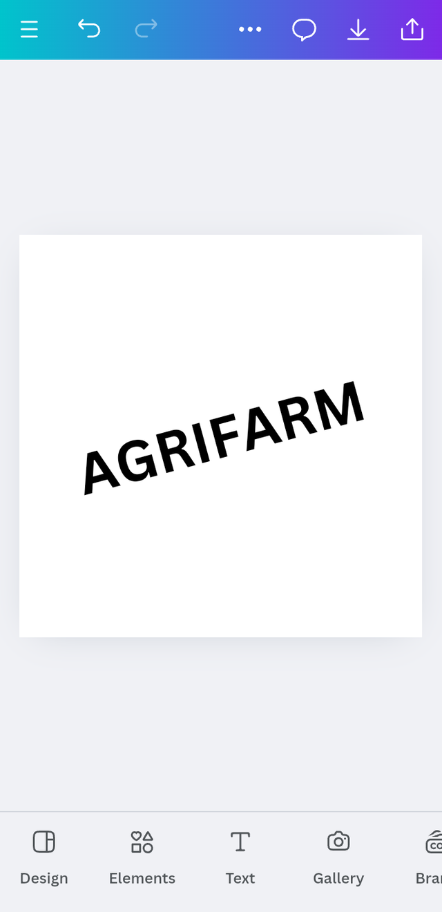
The brand name I have just selected is AGRIFARM. Now we will type it to create the water mark logo of this brand name.
 | 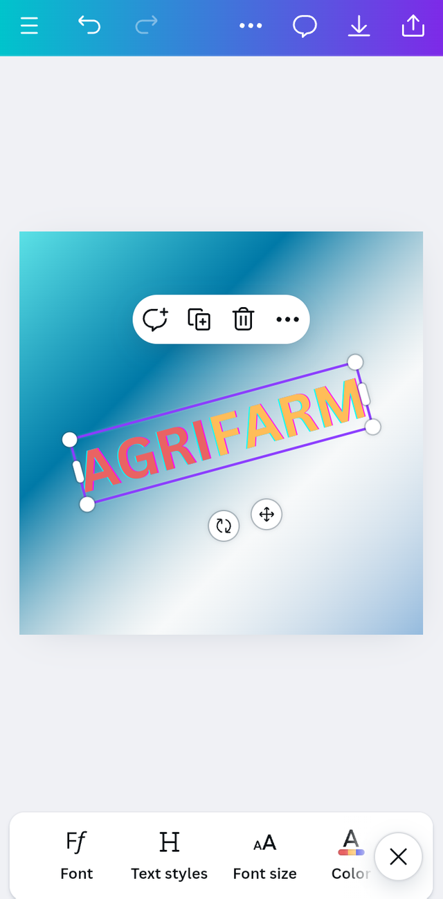 |
|---|
Finally we have prepared our logo design, so creating a watermark logo is not that difficult if it is understood properly and with a little practice. It is easy to create, so finally below is the final look. I will give it to you.
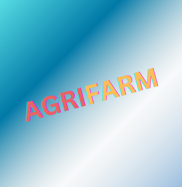
Combination Mark Logo |
|---|
Now we will use the same procedure to design the combination mark logo.
As we already have our Canva app open, we will create our design by selecting Instagram.
First we have to go to element option. Now I will select any element related to agriculture here.
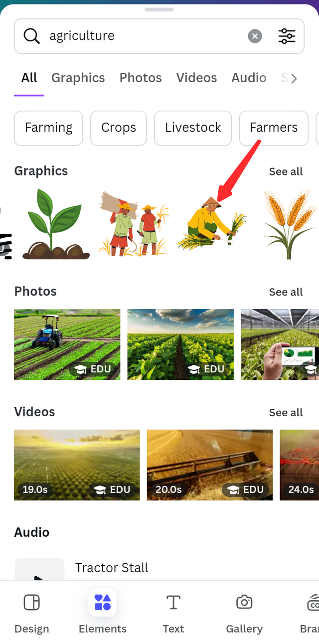 |  | 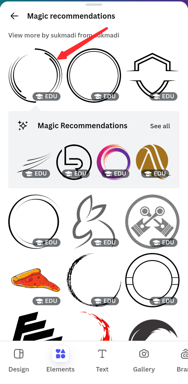 |
|---|
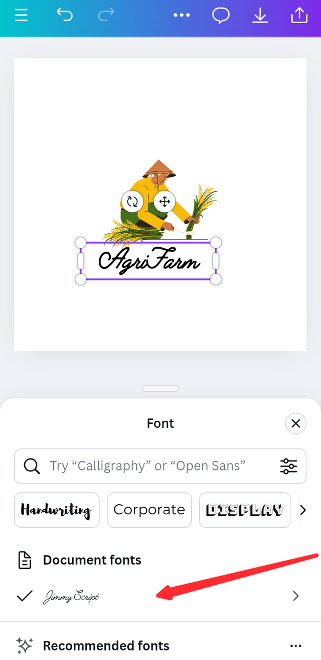
Now I have added text to it which has given it a beautiful design and again going to element section and added a circle to it so we have a beautiful logo ready which I am going to give the final look.

Q.3 - Design a simple flier for your brand and then strategically place one of the logo you made in the flier.
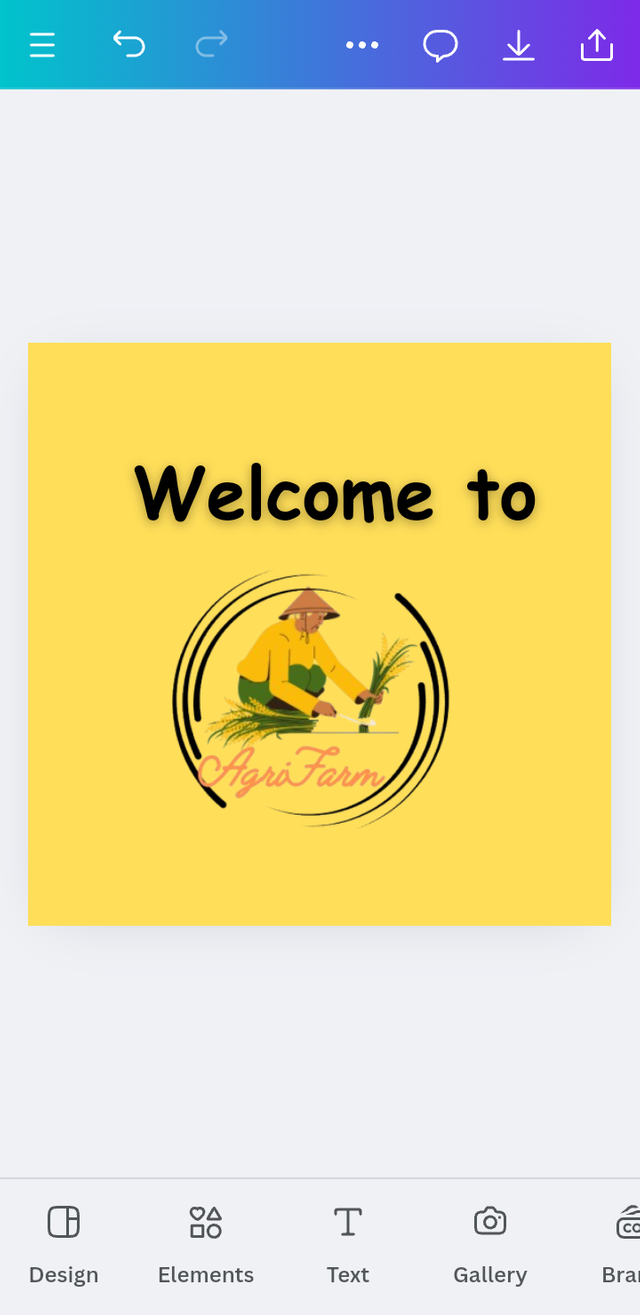
Now I am going to create a flyer using the logo that I have created recently. Now I firstly remove the background from this website.
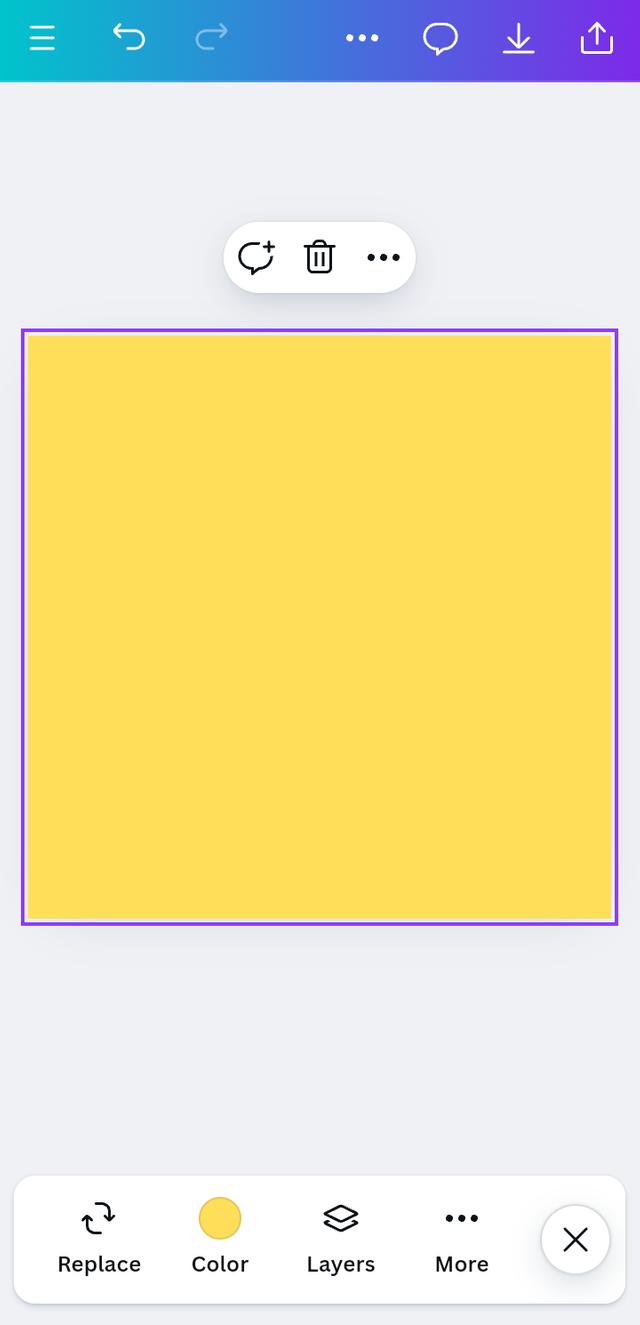
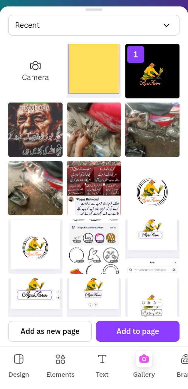
Now I open Canva app from my mobile and select Instagram size and then I give a specific color. Then from gallery I select the logo that I created previously with removable background.
 |  |
|---|
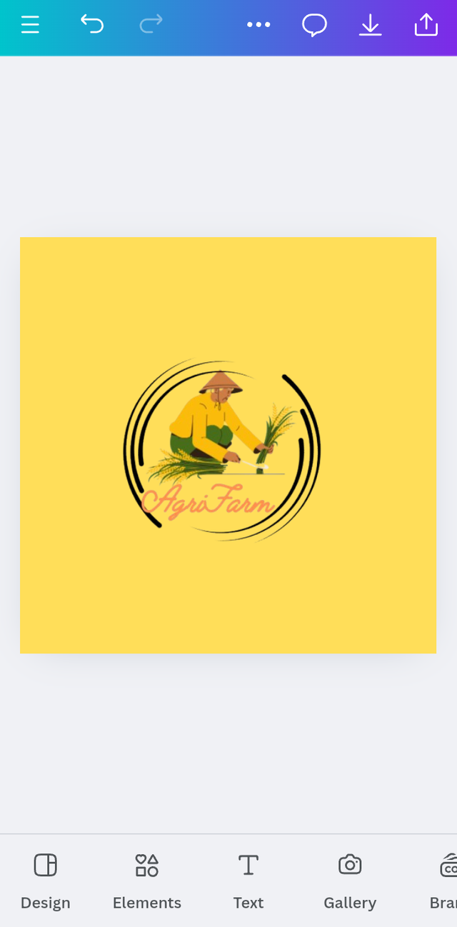
My logo has been placed. Now I go to the text and write "Welcome to"
 |  |
|---|

Finally, our logo is ready that represent my brand Agri Farm. It's my opinion it will be attractive to everyone.
I am inviting; @waterjoe, @chant and @ripon0630
Cc:-
@lhorgic
Thank You
