SLC | S21W2 | Introduction to Logo Design
Hello steemians,
Today I am participating in the SLC21 W2 - Introduction to Logo Design contest, organized by @lhorgic. Passionate about graphic design, I found this challenge particularly interesting because it allows me to practice my skills using Canva, a platform that I appreciate for its simplicity and power.
Discuss Logo design based on your understanding about the topic.
Logo design is a key element in the process of creating a brand identity, as it is a visual symbol that represents in a condensed and memorable way the essence of a company, product or service, and this through carefully chosen shapes, colours and graphic elements, so as to be both recognisable and distinctive, while conveying the values and mission of the company.
It is not enough for a logo to simply be pleasing to the eye or aesthetic, it must also be designed in such a way as to effectively communicate the image that the company wishes to project, while being in line with the sector of activity and the target audience to which it is addressed.
Designing a logo therefore begins with a clear and in-depth understanding of the company, its objectives, its history and the perception it wishes to create, because this logo will play a fundamental role in how consumers will perceive the brand over time and it must not only reflect the current image of the company but also be able to evolve with it without losing its strength and relevance.
Discuss extensively the role and impact of logo to a brand.
The logo plays a central role in the construction and sustainability of a brand’s identity, as it serves as a visual anchor point allowing consumers to instantly identify a company, product or service, through a graphic representation that summarizes in a few essential elements all of the brand’s values and universe. It has the power to create a lasting first impression on consumers, and often, it is the logo that determines how a brand is perceived from the first contact, whether it is an advertisement, a product or a visual communication.
This first visual contact, whether conscious or unconscious, will initiate an emotional relationship with the public, by playing on graphic elements such as colors, shapes and typography, in order to arouse specific emotions, whether it be trust, energy, security or pleasure, depending on the image that the brand wishes to project.
A logo also has a major impact in differentiating a brand in an often saturated market, as it allows the company to stand out from its competitors and occupy a unique place in the consumer's mind. Thanks to a distinctive and well-thought-out graphic design, the logo becomes a true symbol of the company, a visual cue to which consumers will associate specific qualities such as reliability, quality, innovation or friendliness, depending on the image that the brand wishes to convey.
Explain and demonstrate visually the do's and don't when it comes to Logo design. You can do more research to be outstanding and kindly ensure not to use my specimen logo.
The principles to follow and avoid in logo design are numerous and must be addressed in detail in order to understand the impact of each decision in the creation process. When talking about what to do in logo design, it is essential to always keep in mind that simplicity is a major asset, since a simple logo is not only easier to remember but also more adaptable to different formats and media, making it a key element for the success of a brand's visual identity. Another good practice is to ensure that the logo is unique so that it can stand out from the competition and remain recognizable in the minds of consumers, which helps to strengthen brand awareness and establish a consistent and reliable brand image.
When discussing the negative aspects that should be avoided in logo design, we point out that it is necessary not to overload the design with complex details that may make the logo difficult to read or recognize, especially when displayed in a small size or in contexts where clarity is essential. An overloaded logo can also cause reproduction problems and lose impact when printed or displayed on low-resolution media. In addition, it is strongly recommended not to use stock images or existing graphics, as this could give an impression of inauthenticity and weaken the visual identity of the brand by making it generic and interchangeable. Also the logo should be recognizable even in black and white or grayscale, ensuring its flexibility and compatibility with different media and contexts.
| Bad Logo | Small Logo |
|---|---|
 |  |
Design a simple logo with the knowledge you have gotten from this lesson by assuming that a client gave you a job to design for his brand (business).
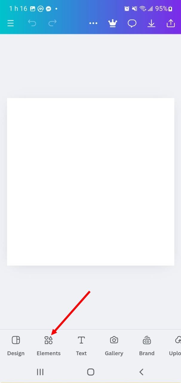
I start by opening the Canva app and navigating to the homepage. I then use the "+" button at the bottom of the screen to create a new design. In the search bar, I type "Logo" and select a 500 x 500 pixel template to create a logo in standard dimensions. Once the template is selected, a blank canvas appears where I can add design elements.
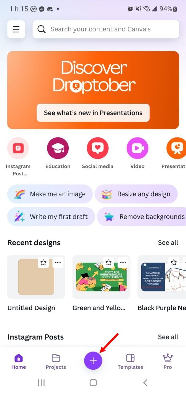 | 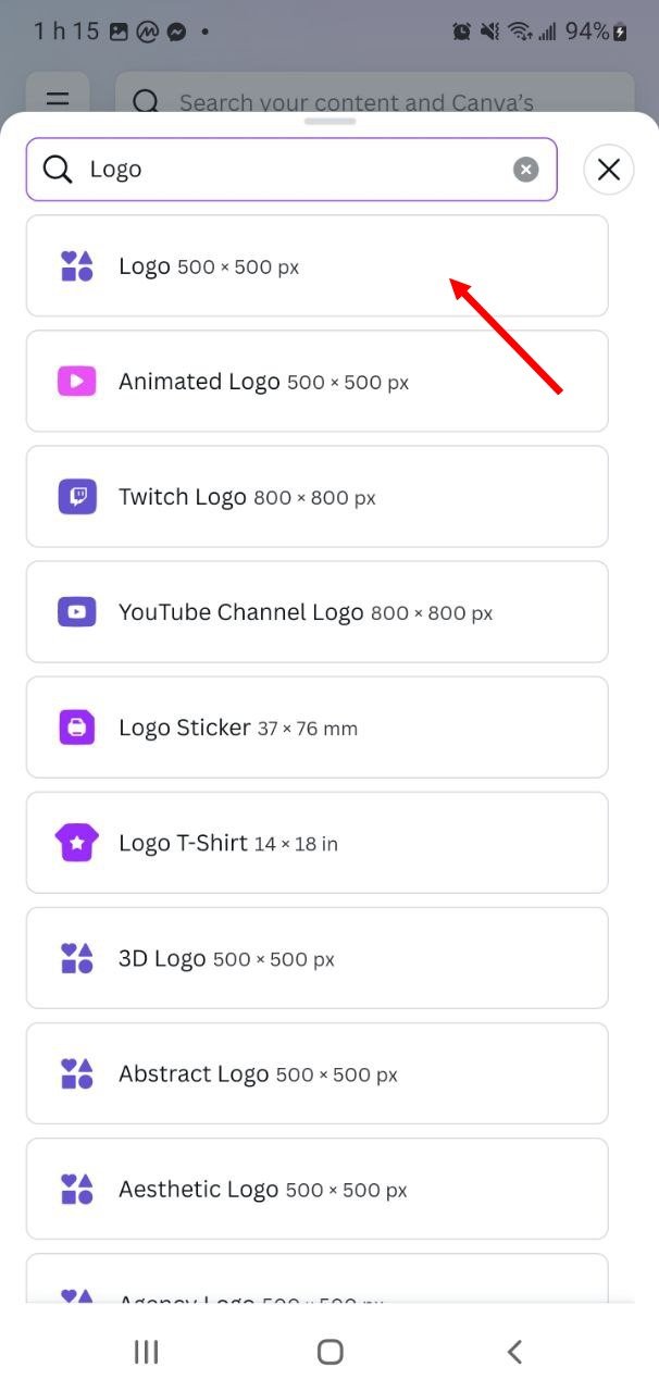 |  |
|---|
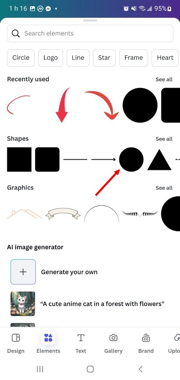
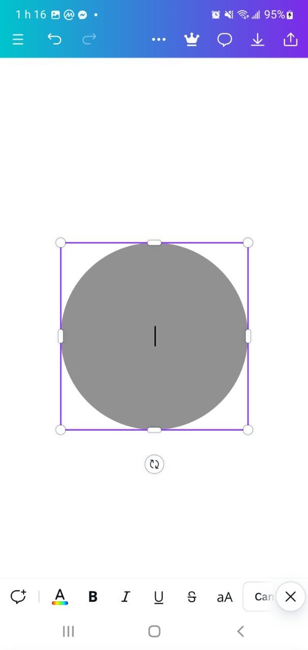
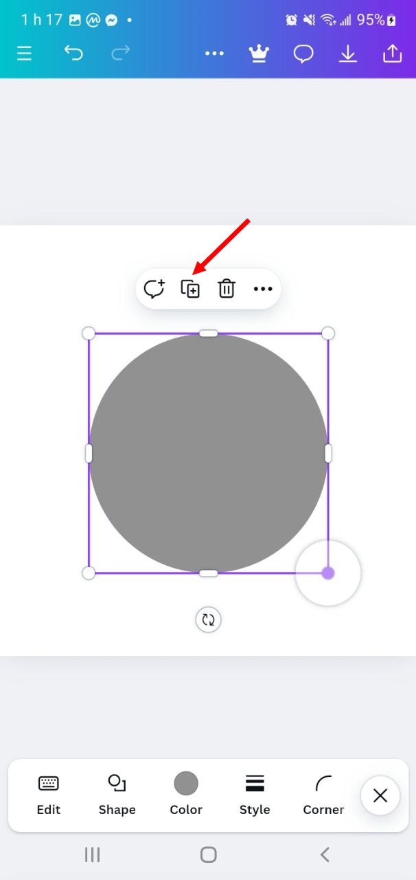
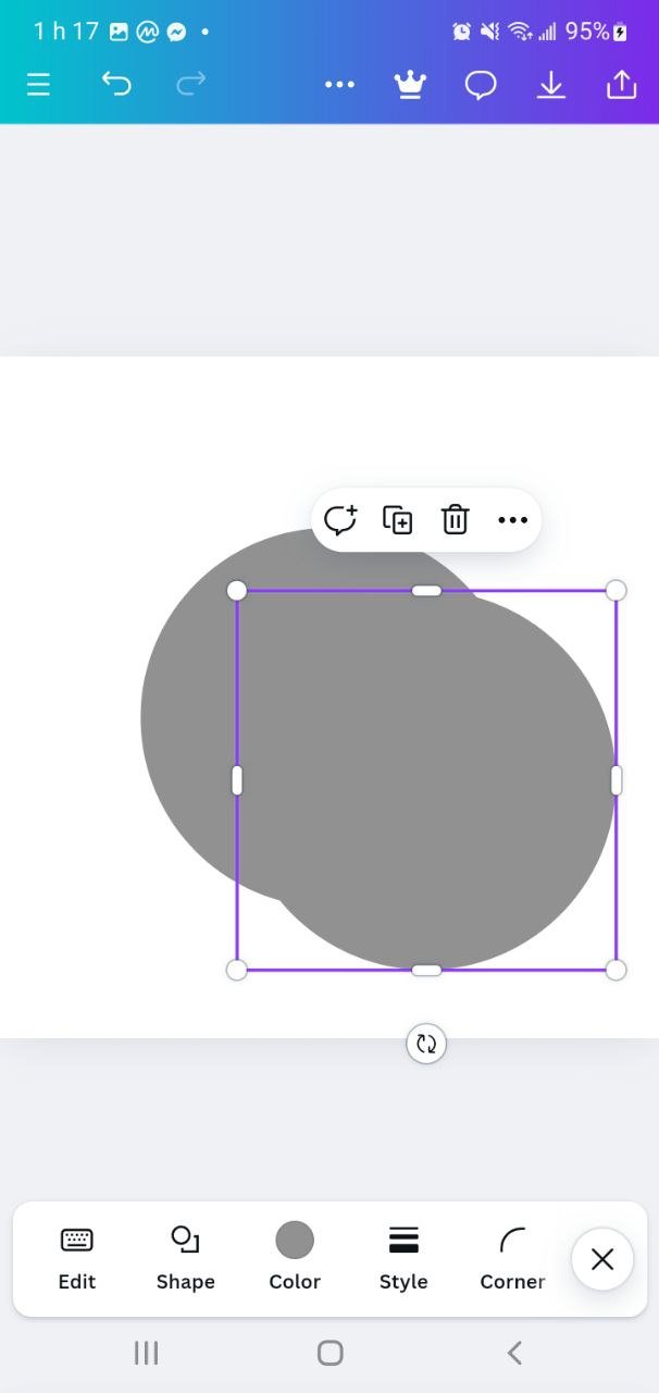
I go to "Elements" to access the available shapes and tools. To build the logo, I first add a circular shape by selecting a circle from the shapes menu. This circle will serve as the basic frame of the logo. After positioning and adjusting the circle, I use the duplicate option to create a second circle. I position it so that it partially overlaps, symbolizing one of the letters in the logo.
 |  |  |
|---|
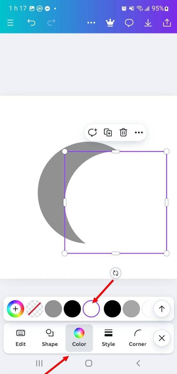
I change the color of one of the circles to create a visual contrast between the two shapes and thus distinctly represent the letters "G" and "T". Then, I make sure that the circles are aligned to obtain a balanced result.
 |  |  |
|---|
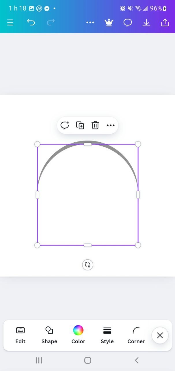
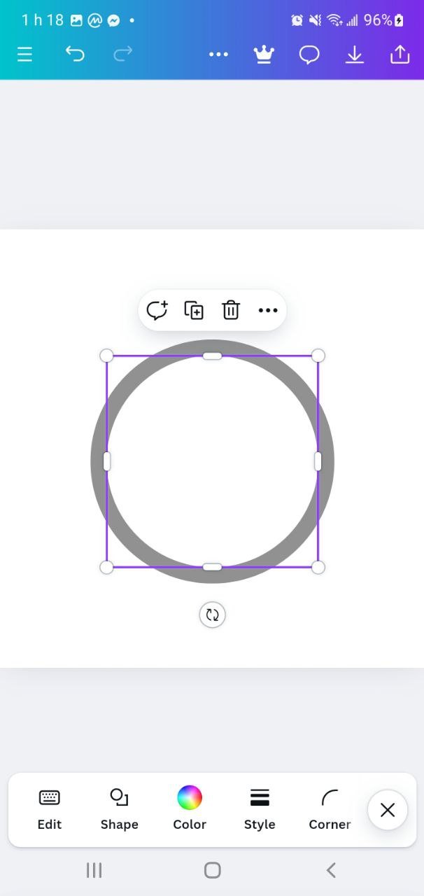
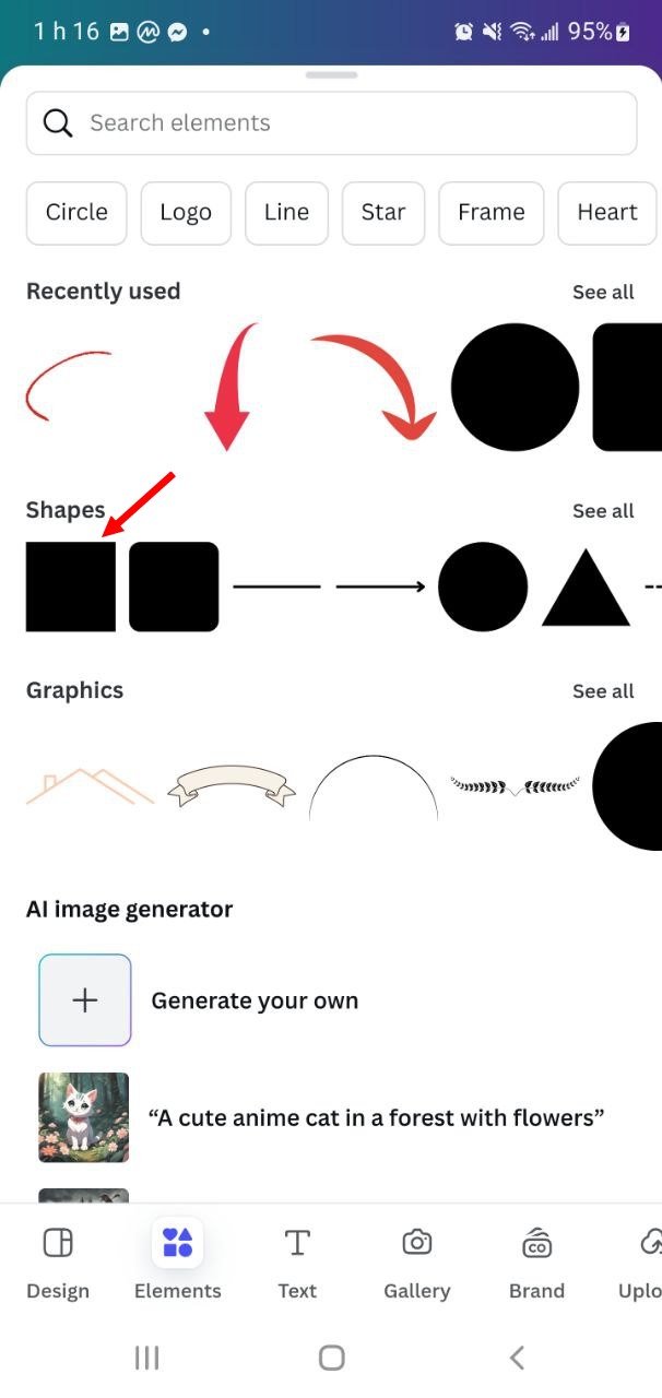
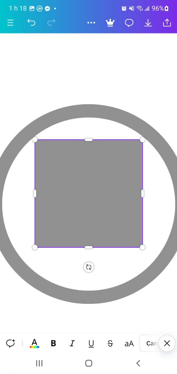
Next, I select a square from the shapes menu and adjust it to represent the horizontal part of the letter "T". I position the square in the bottom part of the main circle to form the top of the "T".
 |  |  |
|---|
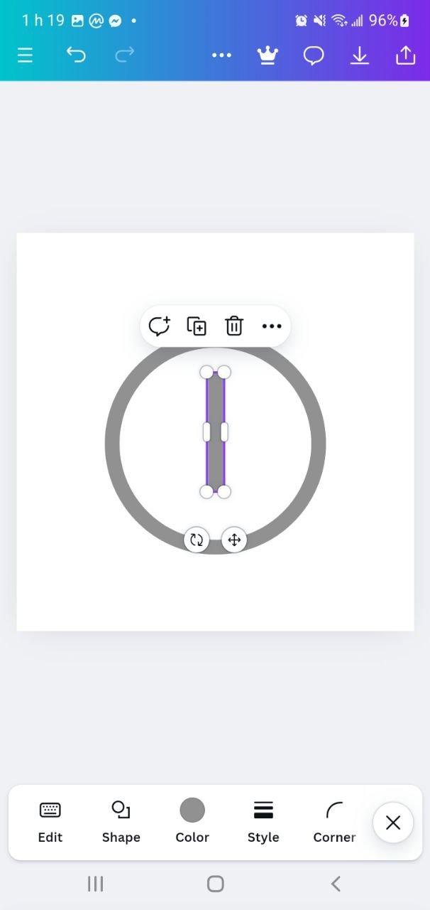
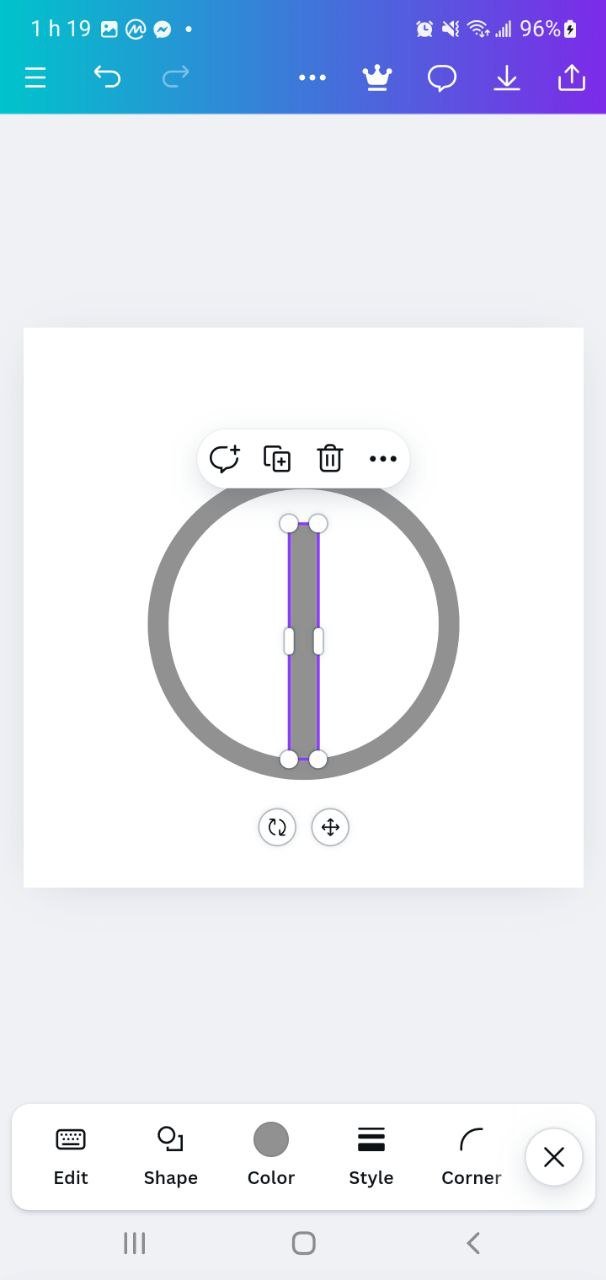
I then add a vertical line by inserting a narrow rectangle and aligning it to the center of the circle to form the letter "T". I adjust the position and size of the rectangle so that it fits well with the square.
 |  |  |
|---|
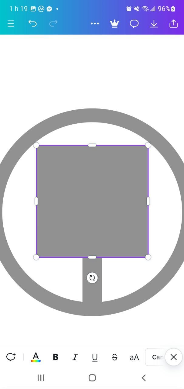
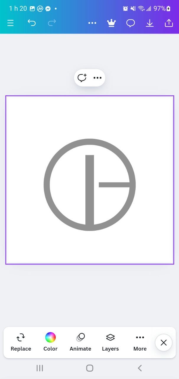
I duplicate or create a new thin rectangle and place it horizontally to create the crossbar of the "T". By checking the alignment of all the elements, I make sure that the "G" and the "T" are clearly visible in the circle.
 |  |  |
|---|
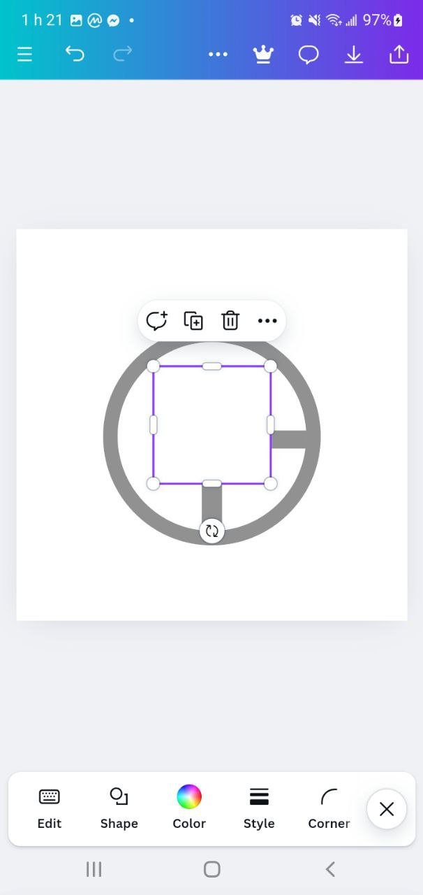 | 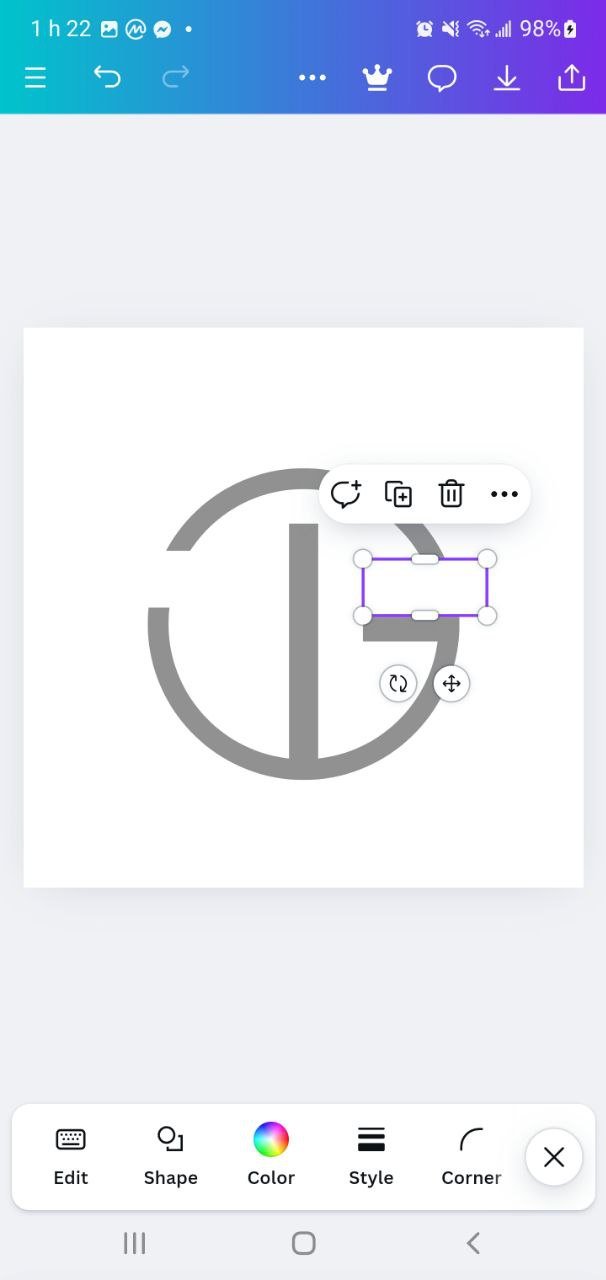 | 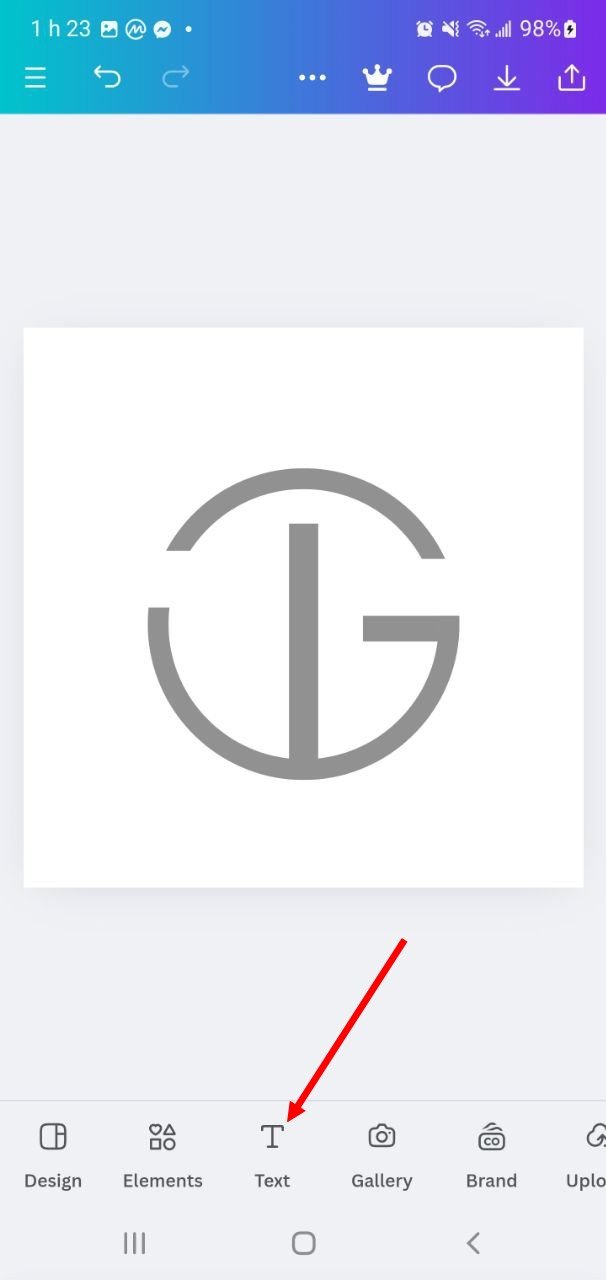 |
|---|
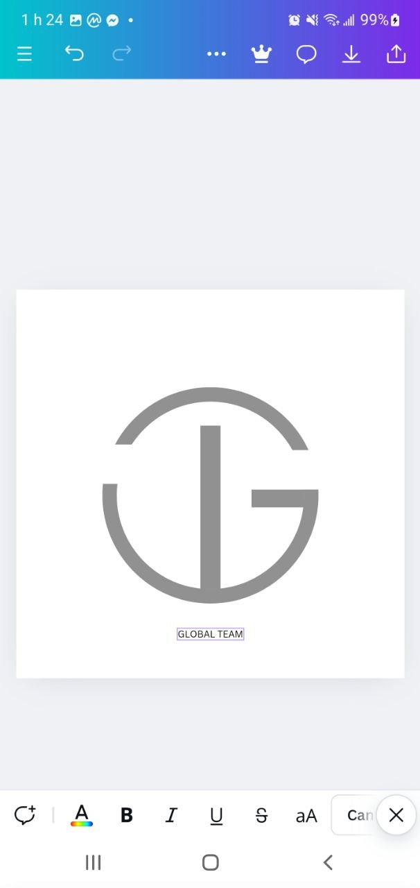
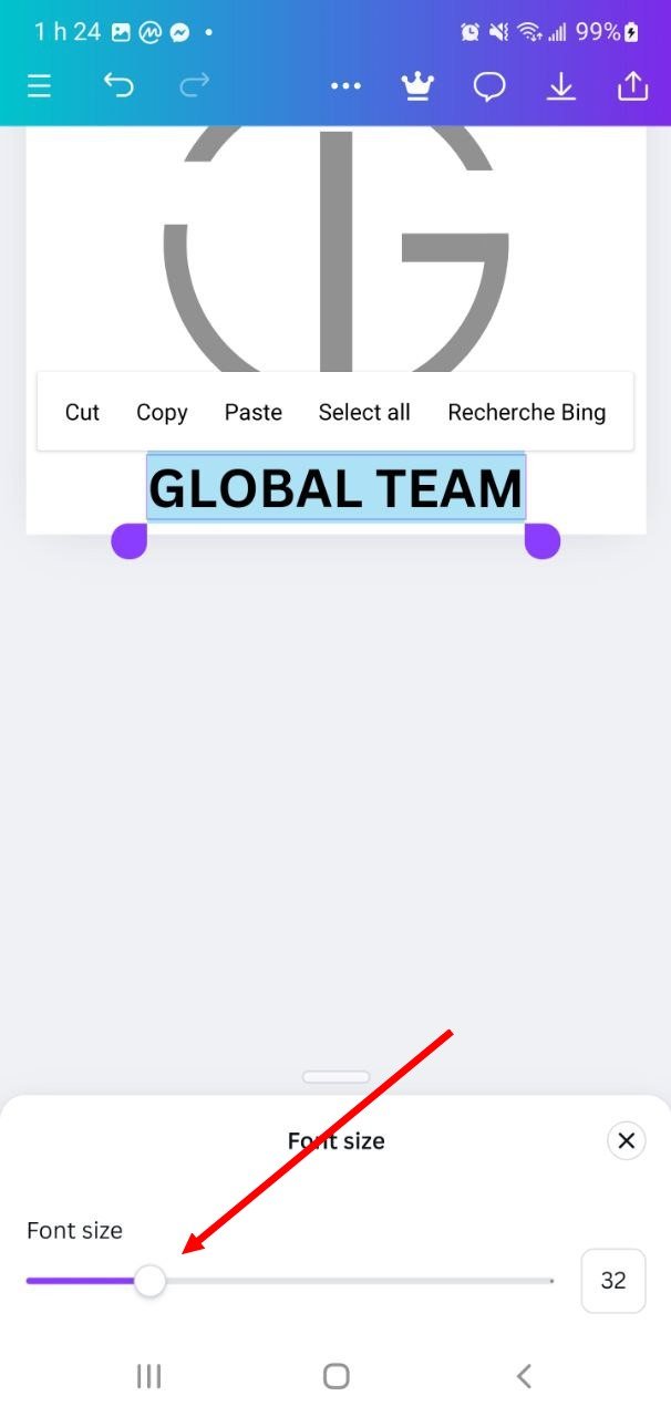
After adjusting the elements, I go to “Text” to add the brand name “GLOBAL TEAM” below the logo, using a sans-serif font for better readability.
 |  |  |
|---|
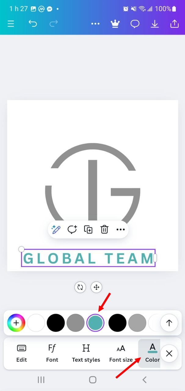
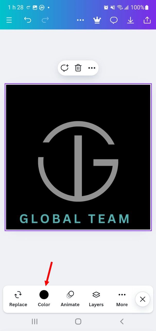
Finally, I experiment with colors to bring the look together. I opt for a black background and a subtle teal green text color that emphasizes the name without detracting from the logo. Once the final adjustments are made, I save the logo with a compact and versatile design, ready for different branding applications.
 |  |
|---|
Thank you very much for reading, it's time to invite my friends @cruzamilcar63, @mvchacin, @adeljose to participate in this contest.
Best Regards,
@kouba01


Hi, @kouba01,
You did a great job in logo design course. The concept of your logo and its role in branding is very well defined. Do's and don'ts for more visual clarity What works best Your design is great and it's interesting to try the brand name in white. Congratulations on a job well done and best wishes for more success.