SLC | S21W 3 | Logo Design - Part 2
Canvas source Logos are a representation of a brand and are the visual cornerstone of any company's branding. Below is the breakdown of different types of logos, when they should be used, and when they should not be used.
• Wordmark Logo ; A Wordmark is a logotype that consists of text, usually the full name of the brand in a custom-designed font. Simple and brings clarity. Classic examples include Google and Coca-Cola. The Wordmark can be used when the name of the brand is original and memorable enough to be recognized at first sight; new companies should also start building a strong brand name presence.
But if a brand name is long or complicated, then a Wordmark may look cluttered and less memorable, and that is less effective in concise visual branding.
• Letter Mark Logo; Lettermarks, otherwise known as monogram logos, are the first letters of a brand name, such as HBO or IBM. These make longer names into memorable and compact visuals. Such a type of logo is excellent when the brand name turns out to be lengthy to fit another logo form. It's also perfect for brands that have an established recognition, whereby initials alone are more than enough to immediately associate them.
However, they may not work well for new companies who don't have name recognition since just initials may lack meaning and context.
• Image Logo; A Pictorial Mark is an icon-based logo, using a recognizable image to symbolize the brand—think Apple's apple or Twitter's bird. It works best for a brand that has strong identities that can be represented visually. This will work when one single image can say something about the brand's ethos. For a new brand, however, picking an image with instantaneous recognition presents a challenge in the sense that they do not have brand history that makes an image-based logo instantly meaningful.
• Abstract Logo ; Abstract logos employ geometric shapes and symbols instead of recognizable images to represent a brand, like Nike’s swoosh or Pepsi’s circle. These logos are excellent for conveying a unique identity through abstract forms, providing the flexibility to create a one-of-a-kind logo that doesn't rely on cultural associations. They’re best when a brand wants a distinctive image unbound by existing symbols.
However, they require careful design to ensure the abstract shape captures the brand’s essence and isn't ambiguous or confusing.
• Mascot Logo; Mascots are logos that feature illustrated characters, usually playful and colorful, in order to represent the brand as a 'spokes-character.' This type of logo works great with brands targeting family or children's market, like KFC's Colonel Sanders or Planter's Mr. Peanut. It is extremely effective in creating emotional connections with people and engaging audiences. However, mascots may not be so effective for formal or luxury brands since their cartoonish nature tends to be perceived as too informal and less sophisticated.
• Combination Logo; A Combination Mark is a combination of text and images, integrating wordmark or lettermark with a pictorial or an abstract element. Examples include Doritos and Burger King. This logo type has the advantage of being versatile; where the icon or text may be used independently when needed. Perfect for brands that are looking to have flexibility within their branding. It should be avoided if the integration becomes complex or busy, thus taking away from the clarity of the message.
• Emblem Logo : Emblem logos contain text within a symbol or icon, usually circular in shape, like a badge or a seal or a crest, as in Starbucks or Harley Davidson. They exude a sense of tradition and authority, so perfect for schools and government agencies and luxury brands. They can also become indistinct when small in size due to their complexity, so not ideal for any brand needing small logos or a minimalist aesthetic.
Pick any two (2) of the Logo types discussed and then practically demonstrate how to make them, showing your detailed process. |
|---|
I am super excited to share with you my favorite types of logos: Wordmark and Combination logos. So, let's dive into what makes them cool and how they come together in the design process.
Each has its special mix of text and images, which creates memorable brand visuals that really pack a punch and are super flexible.
Let's check out the creative journey!
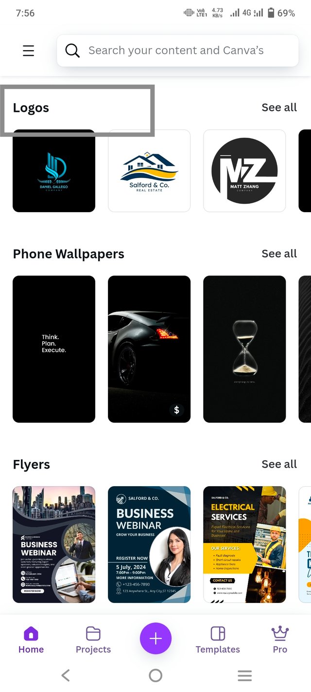
To create a Wordmark logo, the first step is to open a design platform like Canva. Start by typing “logo” in the search bar, and browse through the various templates available.
 |  |  |
|---|
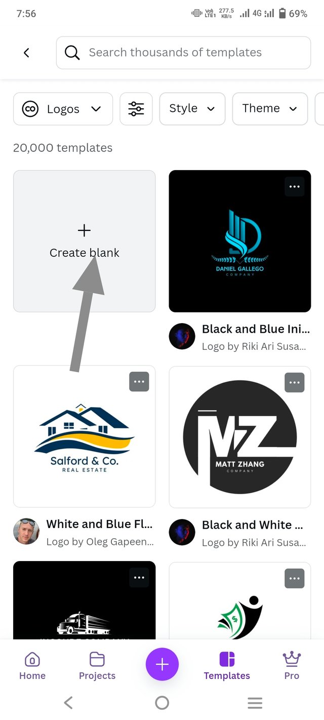
After choosing the template, open a blank canvas by clicking on "Create a New Design." This blank space is where your unique logo will come to life. It's best to start fresh, ensuring that the design truly captures the essence of your brand.
Let's say I'm designing a logo for a shopping market named "Clara Shopping Markete." Here's how I'd approach it:
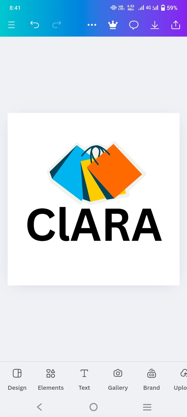
Choose a Canva Header Text: Begin by selecting a bold and clear header text template suitable for a shopping brand. This helps in establishing a strong visual presence.
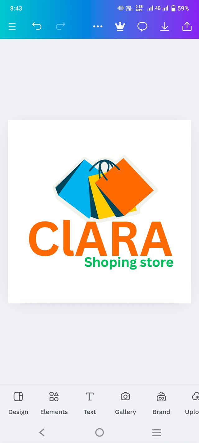
Adjust Colors and Fonts: Choose colors that reflect the market's vibe—maybe vibrant colors for a lively and approachable feel. Experiment with fonts, opting for a modern, clean typeface to maintain clarity and impact.
Add Relevant Elements: Incorporate design elements that represent the market, like small shopping icons or a subtle basket graphic, to enhance the logo's appeal without overpowering the text.
Fine-tune Minor Text: Adjust any minor details, ensuring text alignment is perfect and everything is visually balanced for a professional and polished look.
 |  |  |
|---|
Consider the personality you want your brand to convey, as this will influence your choice of font and color.
 |  |
|---|
When designing a Wordmark logo, remember that the font is everything. Experiment with different typefaces, sizes, and styles until you find one that matches your brand's identity.
 Final Outcome Final Outcome |
|---|
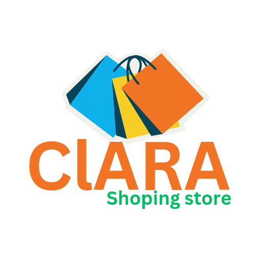
Don’t hesitate to play with colors that align with your brand's aesthetic, and keep the design clean and legible. A Wordmark should be memorable and instantly recognizable, using typography alone to make a statement.
Here's a step-by-step guide to creating the "Clara Shopping Mall" logo that I designed.
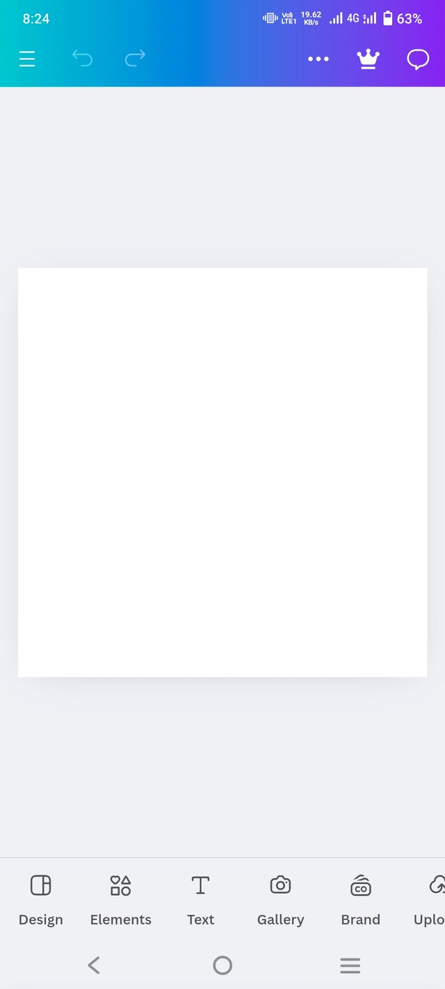
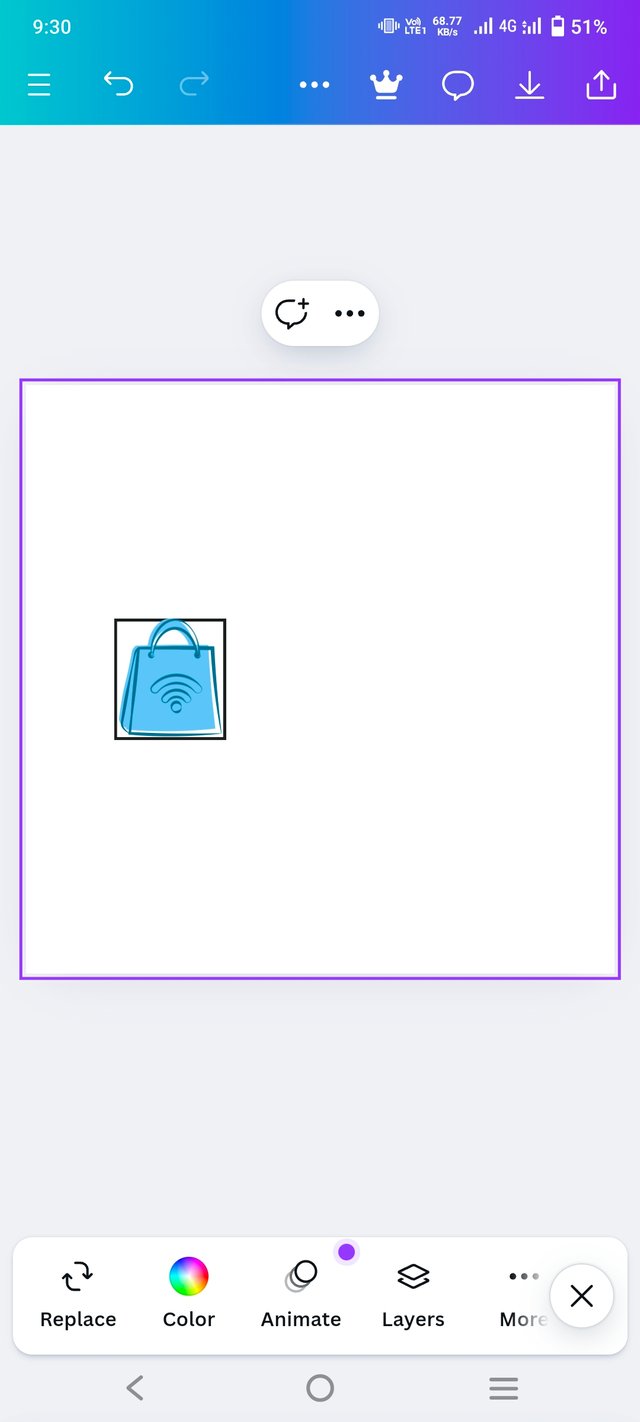
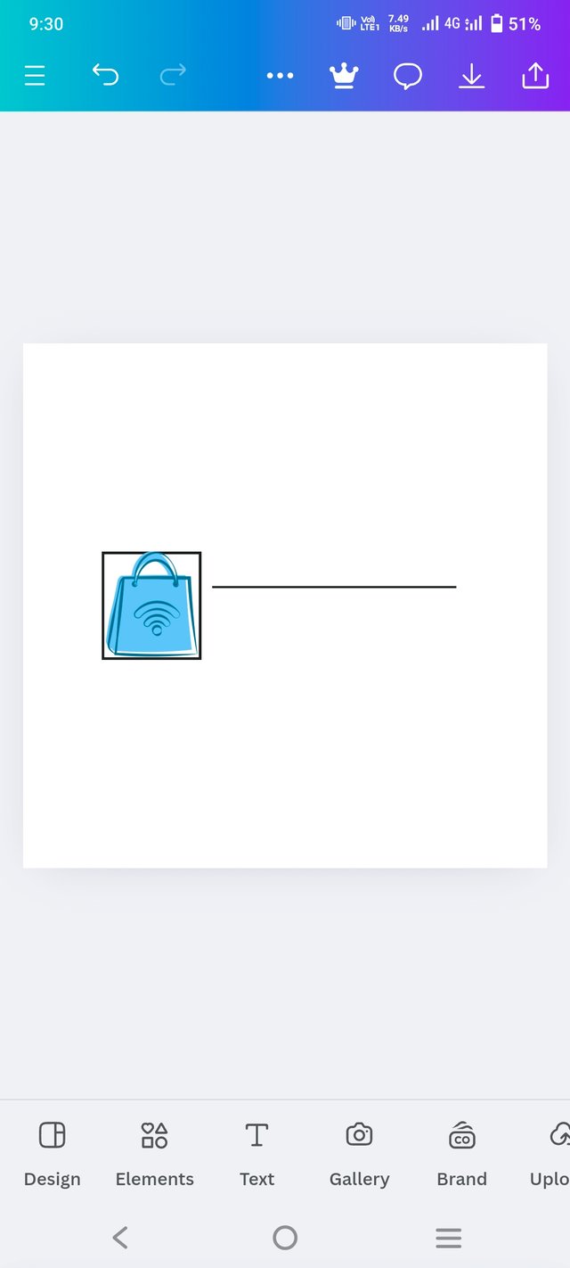
Step 1: Selecting the Canvas.
I started with a blank canvas from Canva to begin the logo design. That clean slate allowed me to focus on adding just the right elements for a shopping mall brand.
 |  |  |
|---|
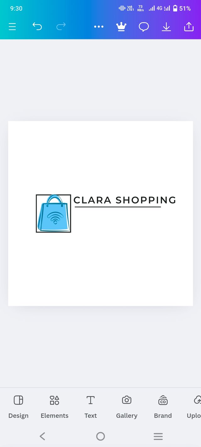
Step 2: Adding the Main Text
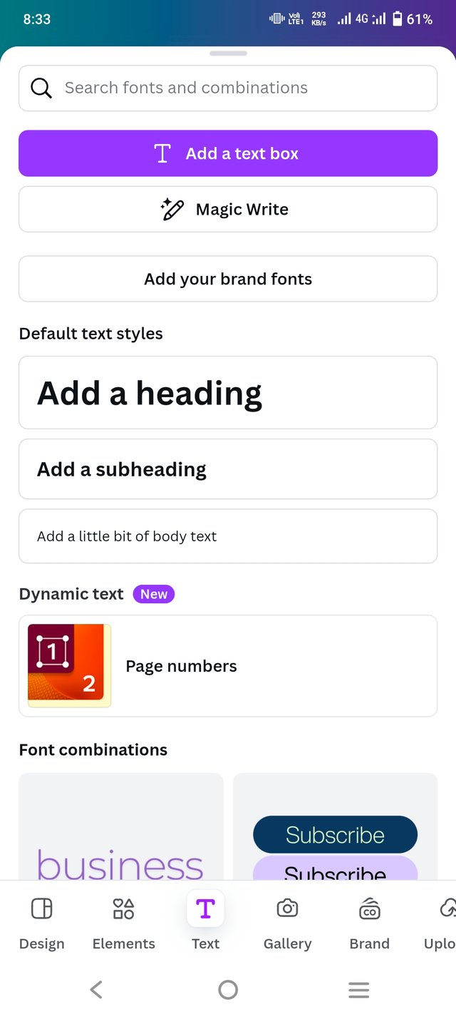
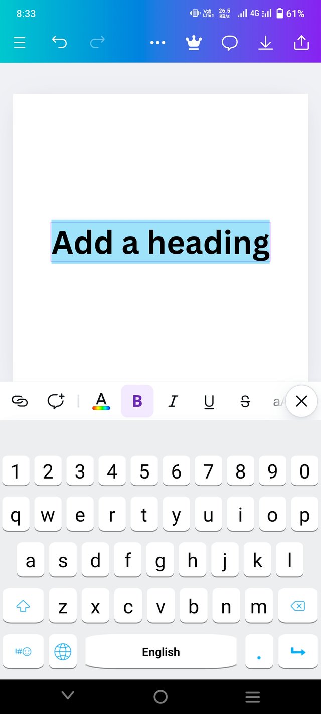
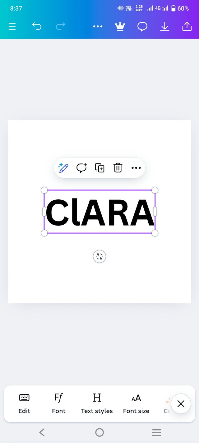
I used the header text tool to put in the main name, "Clara Shopping Mall." I chose a really nice, clear, and bold font to make sure the name pops. The font style was adjusted to have a professional feel, fitting the whole shopping scene. I kept "CLARA SHOPPING" in black for clarity but made "MALL" stand out with yellow to make it more attention-grabbing.
 |  |
|---|
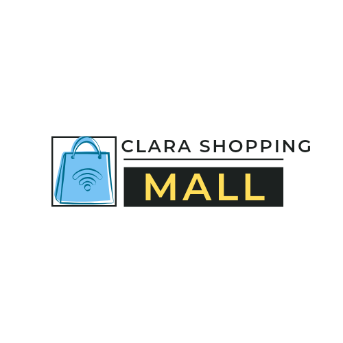
Step 3: Add Some Pictures
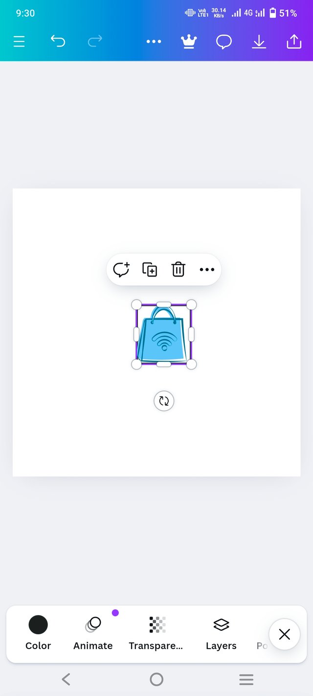
So, to really drive home the shopping vibe. I stuck the icon in a square outline on the left side to keep things looking balanced. I picked of bag element because it makes the logo fun and fits right into the mall scene. Alright,
 Final outcome Final outcome |
|---|
Step 4: Final Adjustments
Final Touches Ensured all elements were aligned and readjusted the text to fit so that it was still readable. Lastly, touched up colors to make sure they looked good aesthetically, in order for it to come off as a sleek, modern logo befitting the identity of the shopping mall.
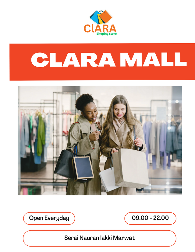
Design a simple flier for your brand and then strategically place one of the logo you made in the flier. |
|---|
kind Regards
@artist1111
Adieu, folks!
May the winds of fortune
carry you to greatness!
May the winds of fortune
carry you to greatness!
