SEC20/WK5: Graphic Design Hands - On practical

Graphics design
Hi everyone. Welcome to this week's engagement challenge. Happy to be participating on this week's challenge. It's really interesting as I am adding up to my skills on graphics design. Let's make it work on this one team. Let's begin.
There's been a lot of lessons on graphics design in which we get to learn about the various basics every graphics designers needed to make it work. Talking about things like hex color combination. Laying emphasis on the main character in our typograph.
Other things we should take note of is the balance in our design, making sure all elements are in line and there's no one of them out of balance. With emphasis already mentioned, we have to take note on hierarchy as much to have a perfect design.
Lastly I have made some mistakes in elements spacing and had a number of corrections from my trainer. Which I believe I would be applying in this task to come out with better better results. Let's analyze this image below.

Recreation procedure.
My task is to reproduce this design above. There are a key things I will have to take note of to make sure I come out with the exact design while making details of all principles.
Step 1.
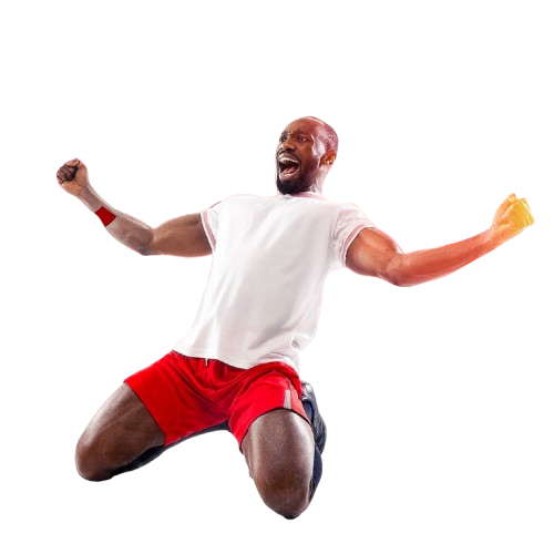
I have been provided with this free image to used as a start for my design. I'm left now to define the other criterias as colors and font used.
Step 2: Design layout
By observing carefully, this design has be made using Instagram background layout of 1080×1080 or any adjustable dimensions closer for this action.
 |  |  |
|---|
| Click + | workspace |
|---|
step 3. Adding image
Here's a detailed step to add the image above on our background.
 |  |  |
|---|
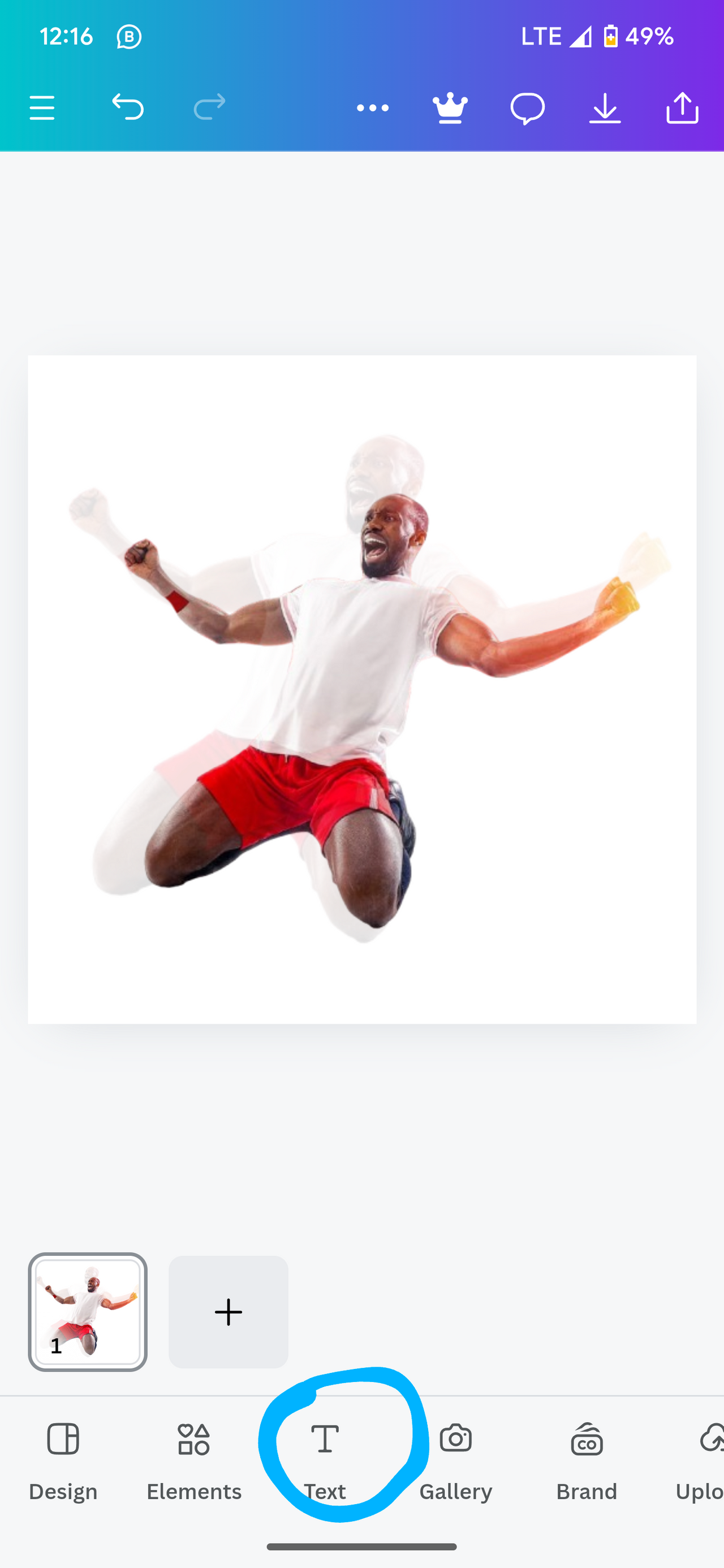
As we can see, our image has been inserted properly. Now I have to adjust and make effects to reflect the image above.
I will begin by adjusting to the same position and size as in the image above.
 |  |
|---|
Image has successfully been position to the same dimension and balance as in the image. Now if I look again closer, I can see there's an image shadow in the background. Let's see it I could pull that one out too.
In order to achieve background image as I see in the image above, I start by duplicating the image to two pieces. Afterwards, I set the transparency to the desired level to match my sample design.
I could only get closer to the above specific when the transparency is set between 10 to 15%. In my work I use 13%.
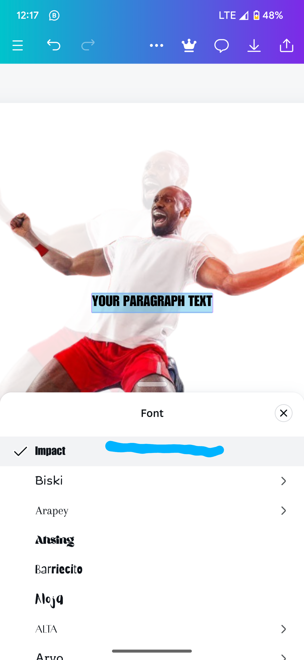
Step 4: Adding typography.
Observing critically, I could say impact Is likely the typography use in this design. So I. Will start by selecting text and then . Selecting impact.
 |  |
|---|
Afterwards, I put in the text on emphasis and make sure it matching the original design. Then I extract the colors and used. Putting my emphasis typograph, I then adjust it till I have good balance and spacing.
First I open another page to extract the color code from the images. I was able to get the following hex codes.
 |  |
|---|
In the main, I was able to add the text and adjust them till the design is looking like this.
 |  |
|---|
After applying the above hex colors and foot notes. Side note as well , I was able to obtain the results in my final stage.
Final Design.
Final Design
Hello @rafk thank you for participating in this week's lesson. We have assessed your entry and we present the result of our assessment below.
Feedback:
I was completely swept off my feet with what you pulled off here. Yeah! This is it, it was as though you really planned to shock me with your entry this week. I want to specially commend you for the effort put into this practical work. Weldone. Your result is stunning.
What I observed was that you forget the part of the rules that says you should change the motivational quote to your own quote. Moreso, the text element "PION" seem to be transparent, I know I talked about being creative and it cool but you never showed or talked about that part as you took us on the journey to your final result. The only place I saw you mentioned transparency and demonstrate it was with the duplicated background image.
In all, you did beautifully well and I must commend your effort, you came prepared for real. I hope you keep up with the energy level.
Regards
@lhorgic❤️
Upvoted! Thank you for supporting witness @jswit.
¡Holaaa amigo!🤗
La transparencia es un efecto fascinante y, me he dado cuenta que cuando no estamos muy sumergidos en el diseño gráfico cometemos el error de sectorizarlo en un solo contexto pero, no me queda la menor duda de que, después de esta clase comenzaremos a utilizarlo con mayor amplitud porque podemos hacer maravillosas piezas gráficas con este efecto.
Te deseo mucho éxito en la dinámica... Un fuerte abrazo💚