"SEC20/WK5: Graphic Design Hands - On practical 2"

Hi Steemit family!
I hope you are blessed I am good. I am feeling honored while taking part in challenge hence its easy and learning of new things is definitely there I found it very informative. Although I have been using Canva for long time but I really happy to explore new features.
My homework task
Well!!!! In order to start my homework, i have to complete design given by respectful professor. I have already can a app just login it and opened work space by selection of 1080*1080 in order to present my design beautiful.
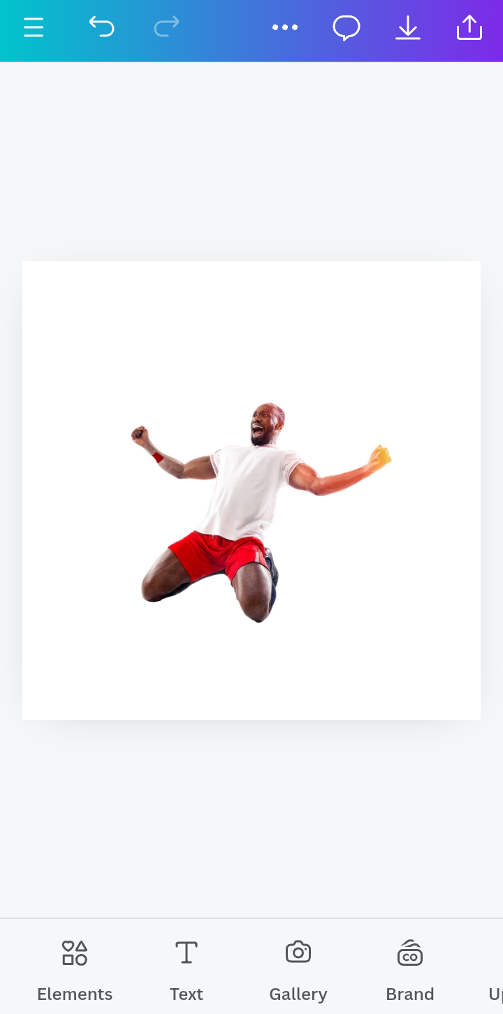
Step 1; I opened workspace and Also insert background image in it. I have download it in my gallery but just clicked on gallery and inserted image given by respectful professor. I used the dimension of 1080×1080 size.
 |  |
|---|
Step 2; Noe, I would have set background effects.
I have to transparent the image thats why I clicked on transparent as I clicked you can see the image become transparent.
Then I adjusted the ratio of transparent at 10 and you can see in the picture below its done.
Moreover in next step I adjust the size of image and try to covered the background ratio.
 |  |  |
|---|
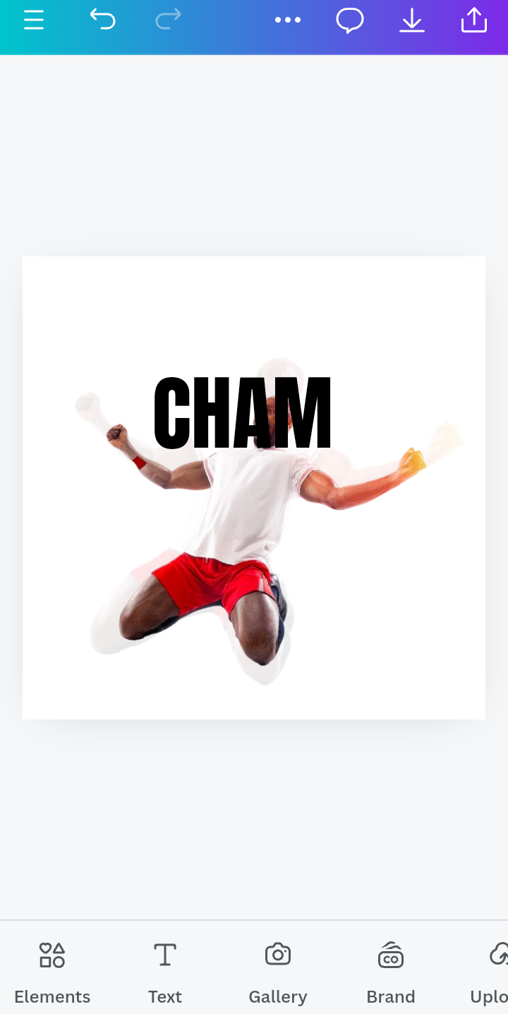
Step 3; Now, come the stage of addition of text, I click on font and then start type.
Well!!!! As in assignment we have to write the text CHAMPION hence it should divided into two words the CHAM is first word I wrote it first and select Anton for font style you can see its results in the pictures below.
Them I set the spacing for letter that was set 0.8. In next step I adjusted the font size that was 210. These are well apply the results are shown below.
 |  |  |
|---|
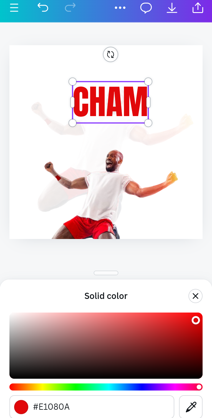
Step 4; Now I will adjust the text color and also position the image
Hence I have added image 1 and 2 by follow the same method as I added image 1. For the set of text position I just clicked on position and its done.
I found the position of image behind I wanted to adjust it on the forward side I did it by a click of forward option and its done.
I have selected text color by clicked on wheel and used #E1080A hence its red in color and corelate with the image color.
 |  |
|---|
 |  |  |
|---|
Step 5; In step i would adjust the color for second image did it and adjusted too.
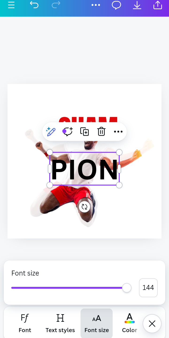
First, I typed the remaining text PION I would used same font style as for CHAM that is Anton.
I have to select text color I used the wheel and by the help of color code #1C306 I done it with yellow ones.
Now I have to adjusted the size of font and enlarge it till 300 and did final alignment of it.
 |  |  |
|---|
Step 6; I have to add quote for my champion.
 |  |
|---|
I wrote quote " champions are not the ones who always win's the race, champions are who get out there and try by Simon Sinek"
I mentioned my user name @drhira too.
 |
|---|
 Original Original | Replicate |
|---|
Now, I will discuss what principle I have used for this assignment
For Color combination; As you have seen in my homework, I have 3 colors white, red and yellow. I guess these are nice combination, I preferred white in background. The red color for text and contrasted it with yellow ones. It was looking perfect in my view.
How i did element space; I have seen I have follow it step wise and did spaces well, it was set 0.8 moreover I adjustment of size of font so that my text looks quite good and balanced.
How i did alignment; I have done up to my best to set the allignment of the text its quite obvious in my task.
The apply of heirachy; I applied the transparent in image similarly I used it in font, it makes my task just more attractive.
What was my Emphasis; the main aim was to champions which should be with proper color which makes in accordance with image.
Is it Balanc?; yeah its balance and i guess i try it upto my best level while making it equal.
I woukd like to say specially thanks to @lhorgic you really made me enabled to learn something new and useful.
I would like to invite my friends @jannat12, @m-fdo and @iqrarana786 to take part in the challenge.
Hello @drhira thank you for participating in this week's lesson. We have assessed your entry and we present the result of our assessment below.
Feedback:
Let me start by commending you for the effort put into this practical.Your work came out cool, However I have few things to point out to point out
Comparing your result with the sample result, you can tell that there are slightly differences such as the "PION" not looking less in size compared to the "CHAM" .in addition, both sizes aren't portraying the sizes used in thr sample image. Lastly, You could have also reduced the size of the motivational quote for better output.
Thanks for talking about the principles you engaged in making this design and how you engaged them.In all, you did beautifully well and I must commend your effort. I hope you keep up with the energy level dear student.
Regards
@lhorgic❤️
Thank you so much for review and kind suggestions. I will follow it.
💯⚜2️⃣0️⃣2️⃣4️⃣ This is a manual curation from the @tipu Curation Project
@tipu curate
Upvoted 👌 (Mana: 0/6) Get profit votes with @tipU :)
Upvoted. Thank You for sending some of your rewards to @null. It will make Steem stronger.