SEC20/WK5: Graphic Design Hands-On Practical 2
Hello Everyone
I'm AhsanSharif From Pakistan
Greetings you all, hope you all are well and enjoying a happy moment of life with steem. I'm also good Alhamdulillah. |
|---|
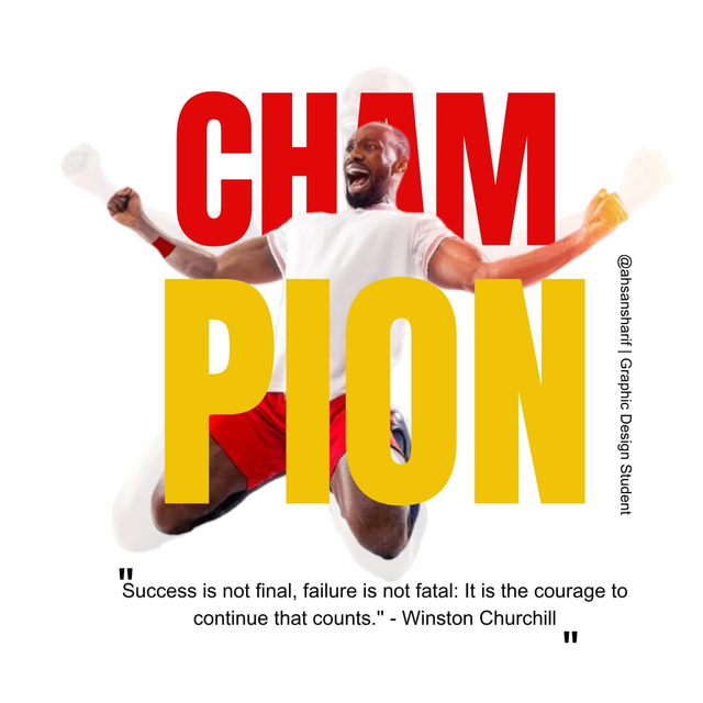
I hope all my friends are enjoying this course, I am also enjoying it. Now I am moving to my final design which I made today below is the design. You can see it. I am thankful to my teacher @lhorgic who introduced us to the principles of color combination and graphic design here.
Replicate the design |
|---|
First I will create a design similar to the one shown in the example. I will try my best to use the same color combination and font etc.
 |  |
|---|
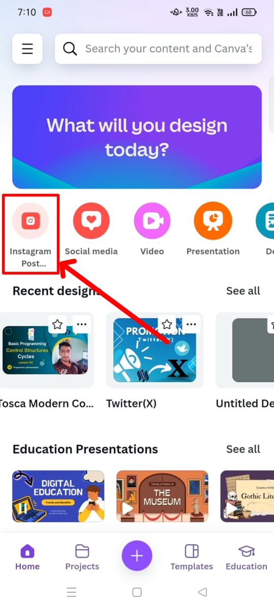
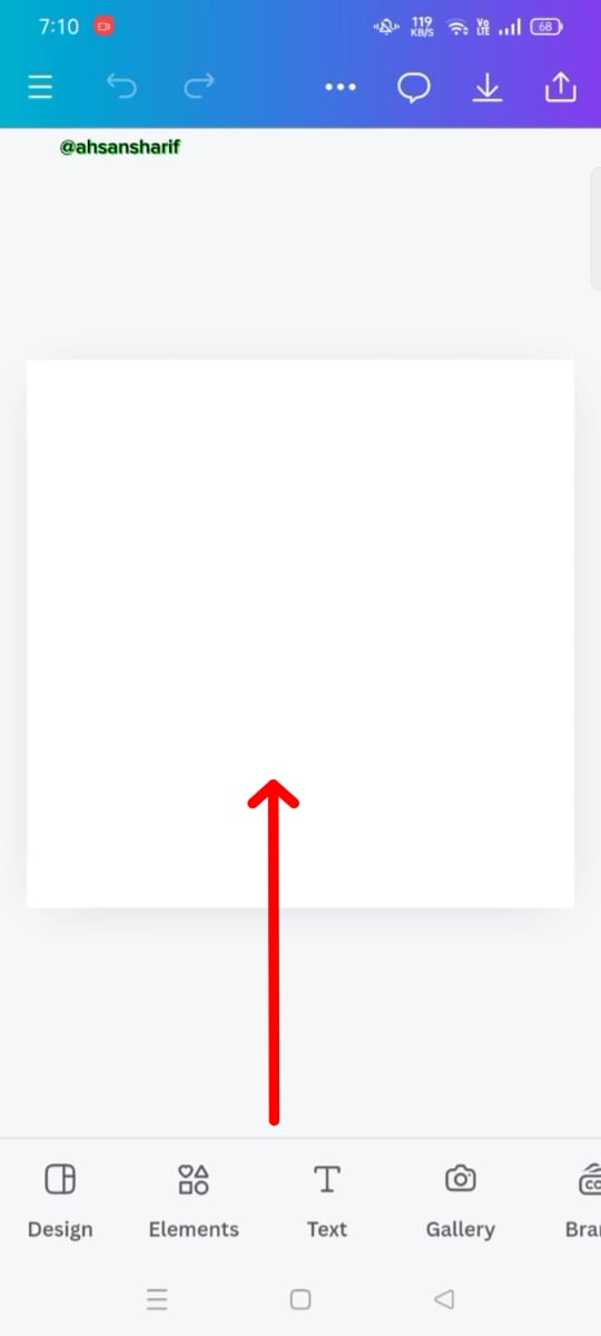
This is our first step in which we have to take a blank draft. I'm taking a draft with an Instagram post that we can use on social media. For this, I have chosen it to create a clear image of me.
 |  |  |
|---|
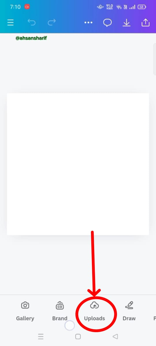
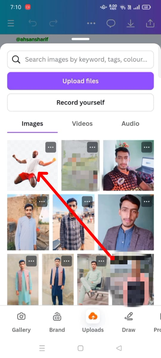
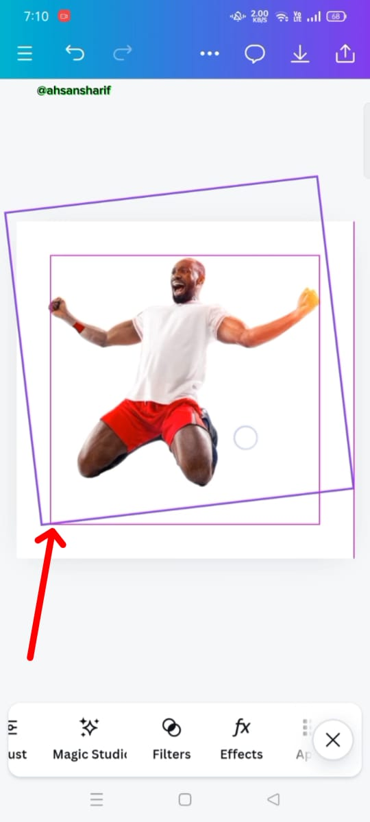
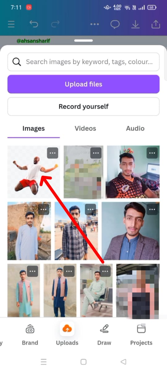
The next thing we need to do is to add our downloaded image from the below uploads folder and after adding this image we have to set its position.
 |  |
|---|
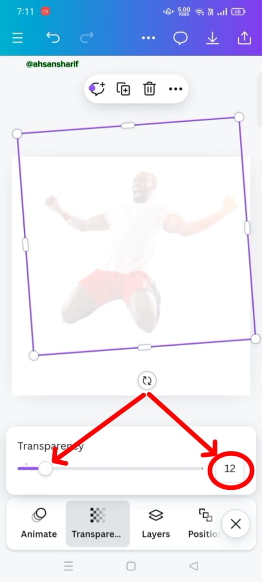
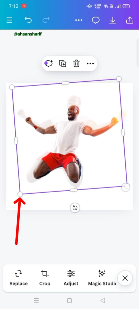
When our image is now set in its correct position, then we need to reduce its transparency, as previously it was at 100, so I have brought it down to 12.
 |  |  |
|---|
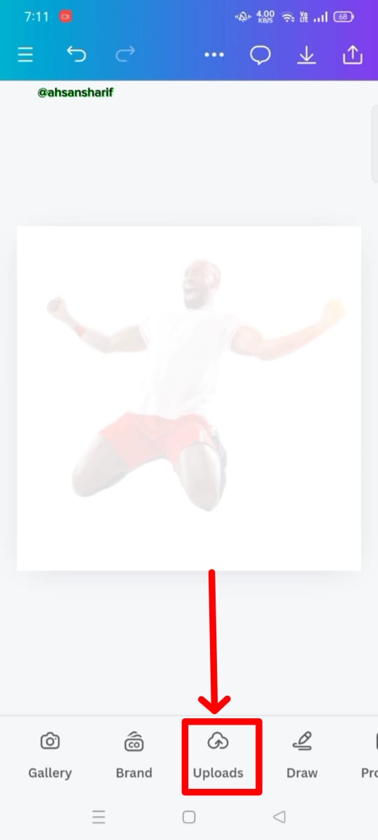
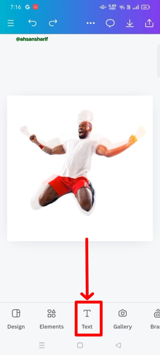
In this step, we again have to add our image from the uploads folder and set it to its position.
 |  |  |
|---|
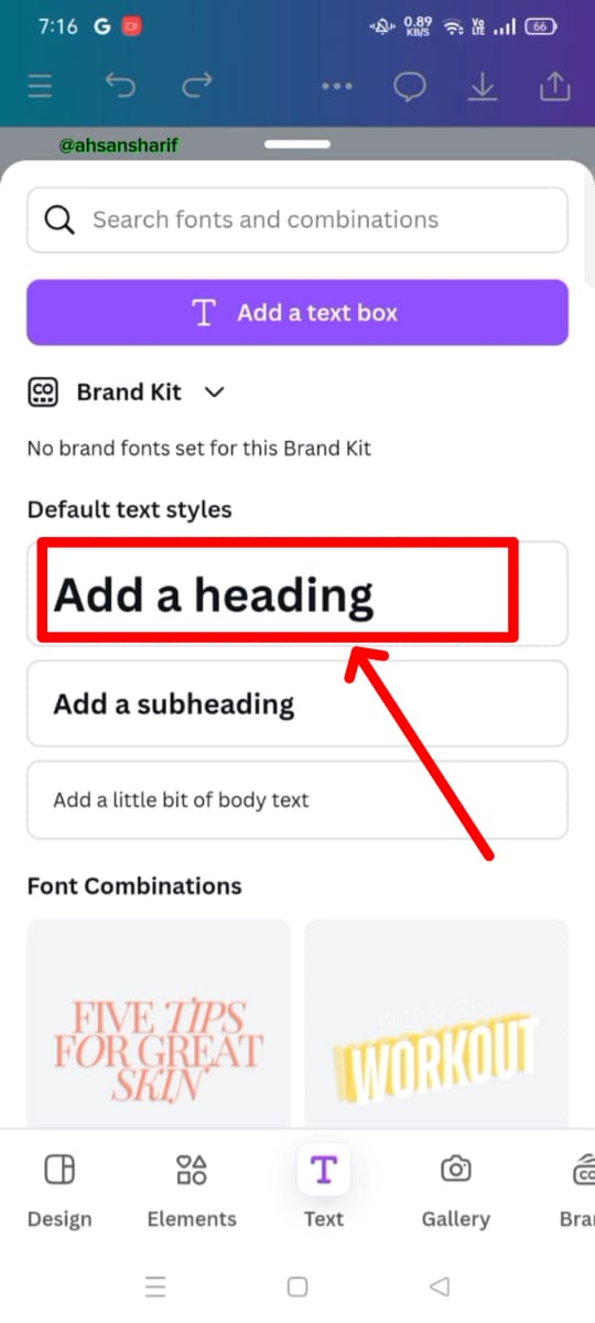
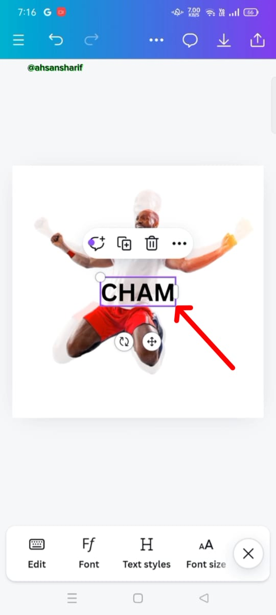
Now we have to select the text from the text field. In which we have to select the first big heading and write CHAM in it.
 |  |
|---|
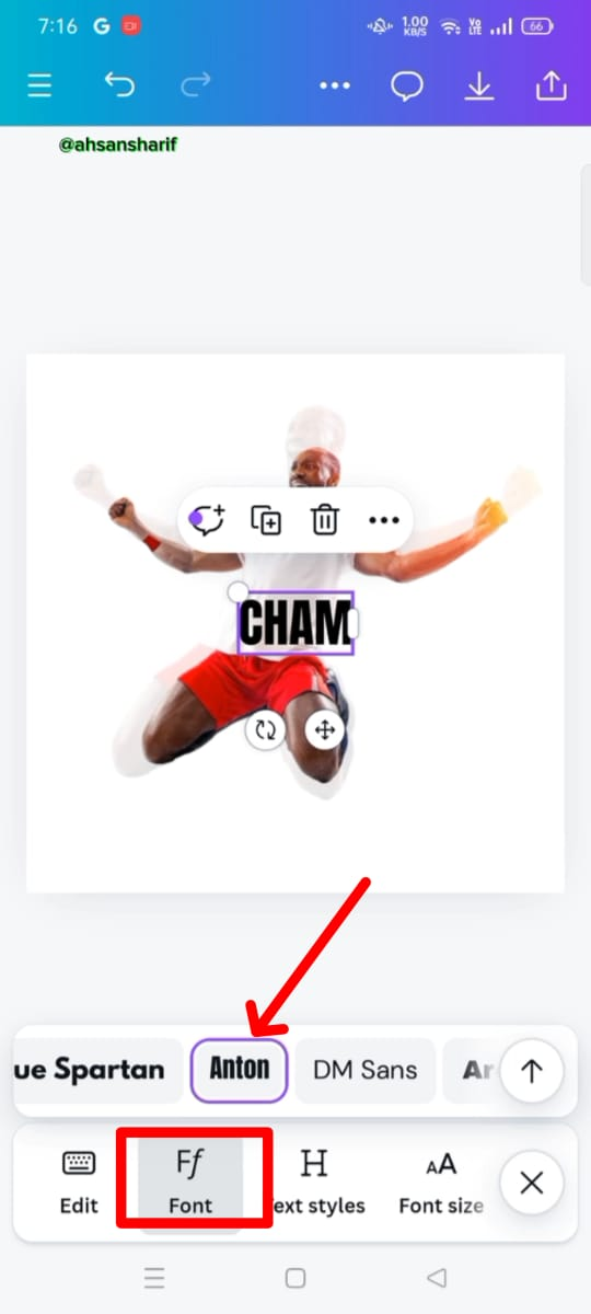
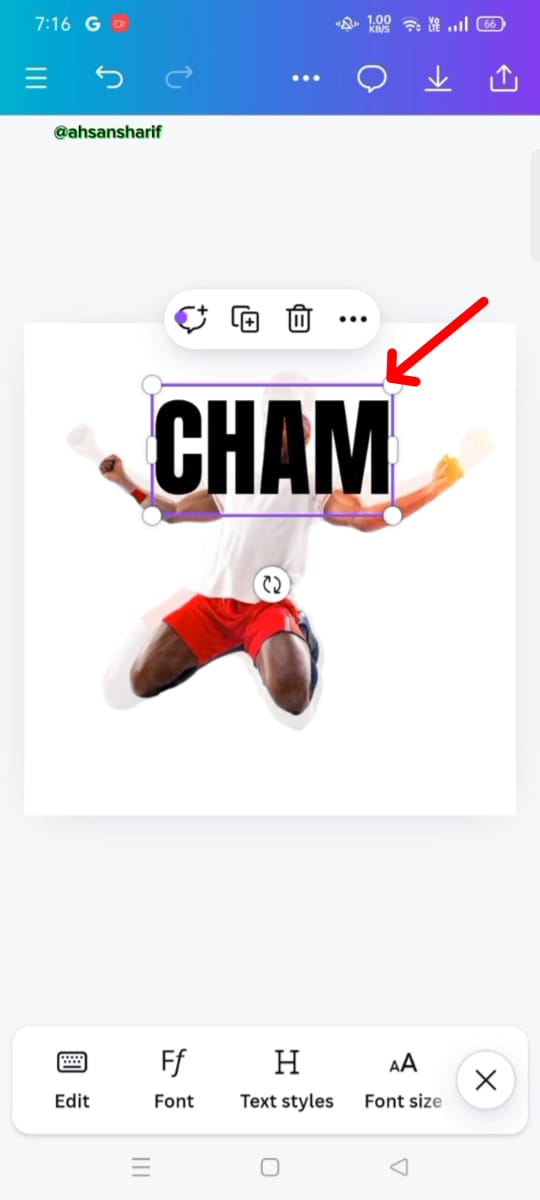
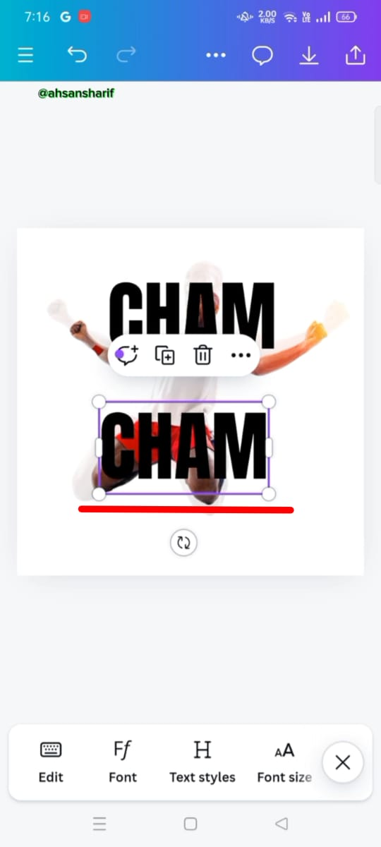
Now we have to set the font of this text, the font name is Anton. After setting it we have to set its position where we need it.
 |  |  |
|---|
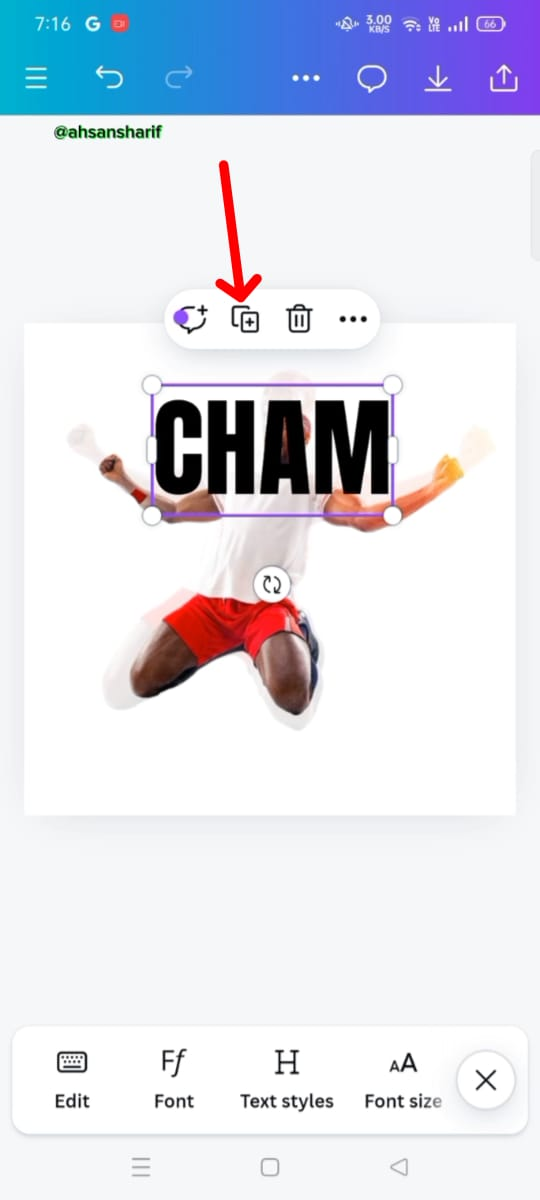
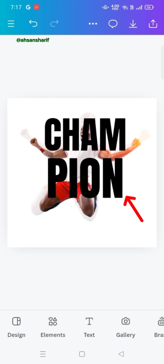
Now we have to make a copy of the given text. When we select this text, a plus option will appear above it. From there, we have to make a copy of it and write PION in this copy text.
 |  |  |
|---|
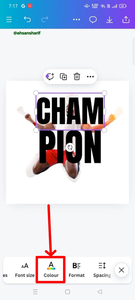
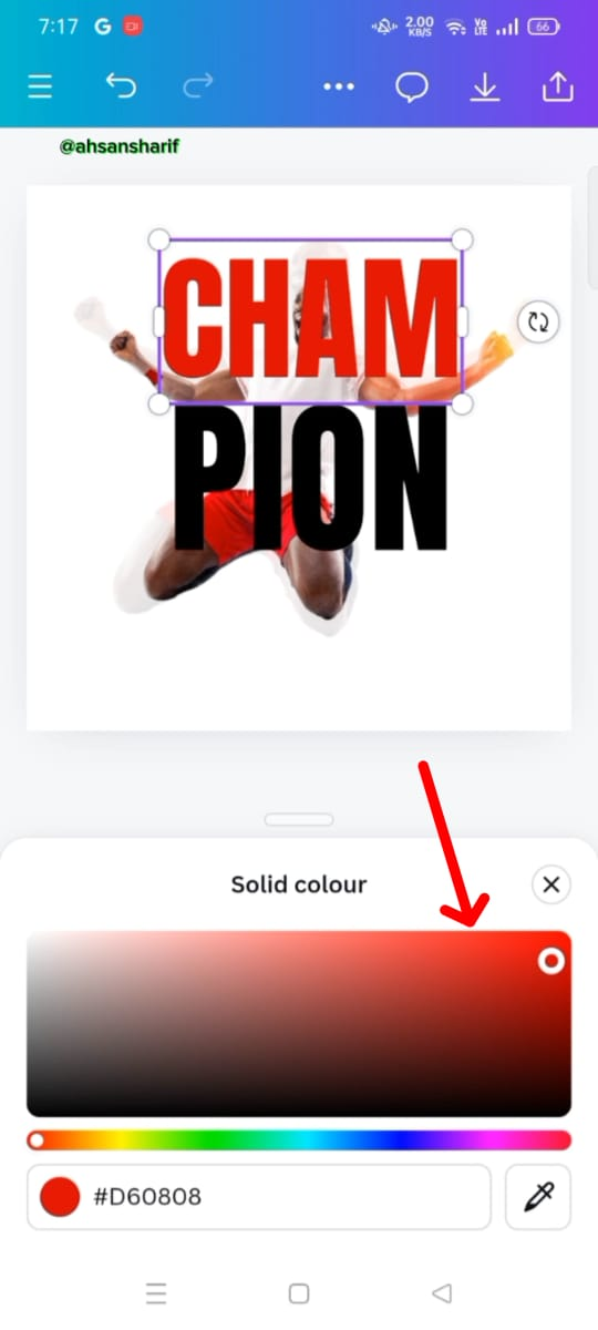
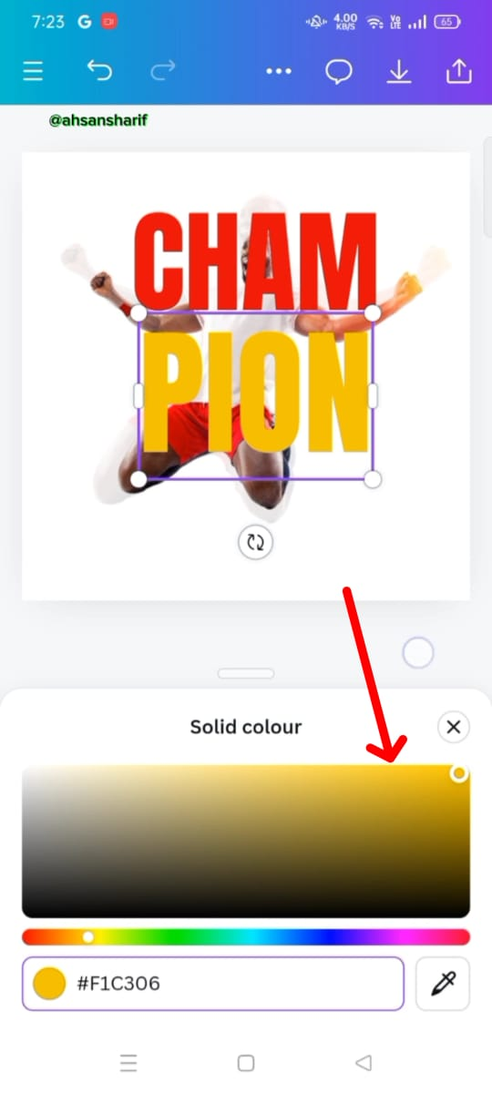
After setting the text precision, now we have to color it. First, we will give red color to CHAM and yellow color to PION whose codes are also given below.
 |  |  |
|---|
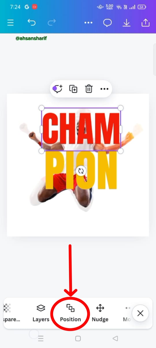
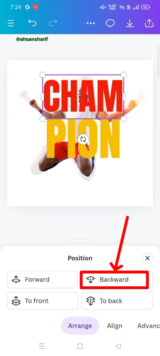
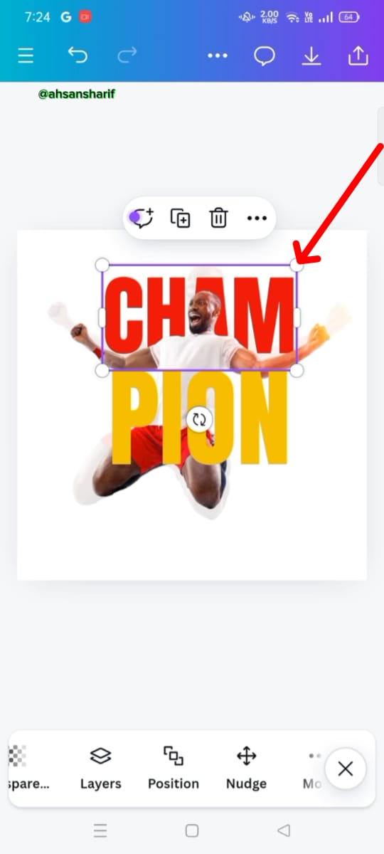
Now we have to set the position of the first text we have which is red. We have to go to the position folder below and back it up. So that it moves to the backside of the second image.
 |  |  |
|---|
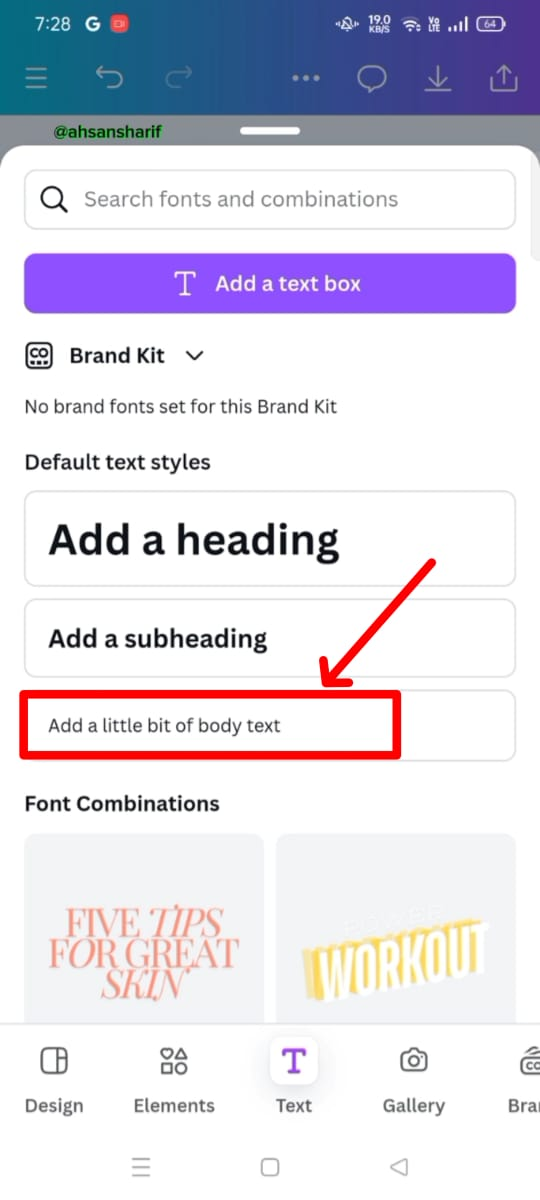
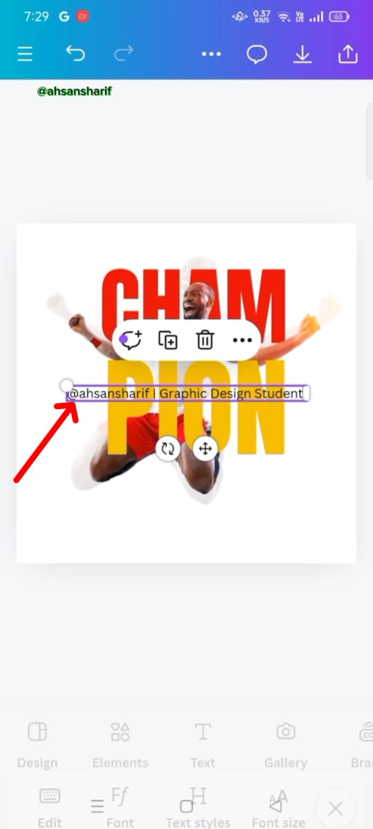
After setting the position, now we have to add another text, we will select the smallest heading from the text field below. In it, we will write our username and graphic design student.
 |  |  |
|---|
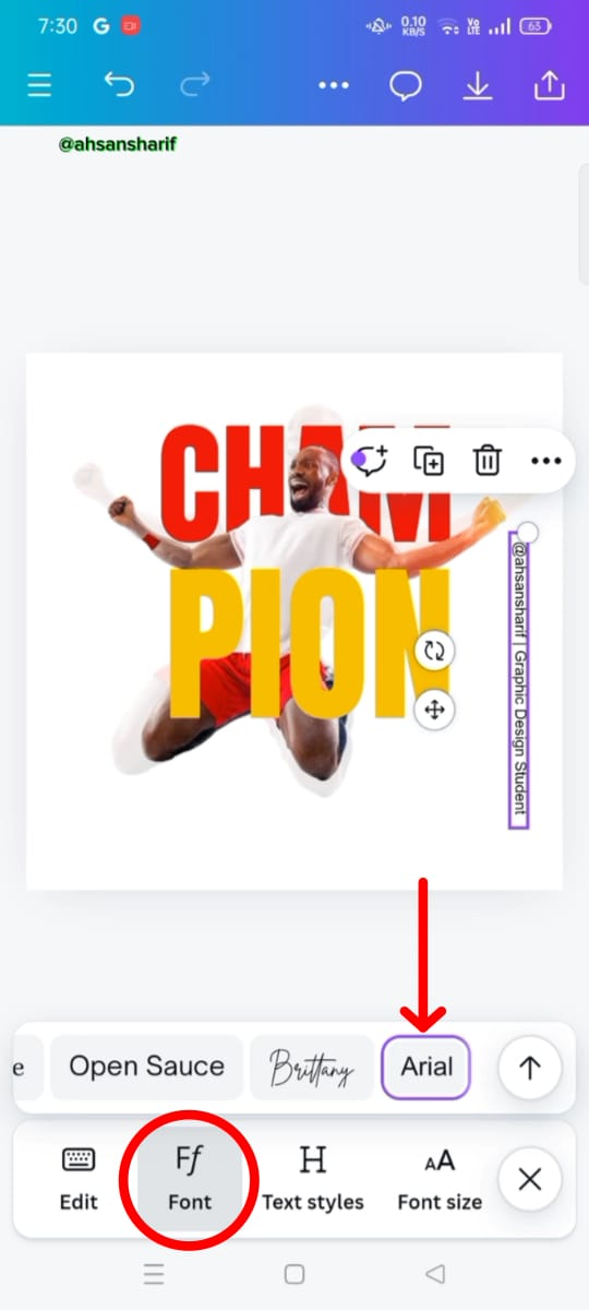
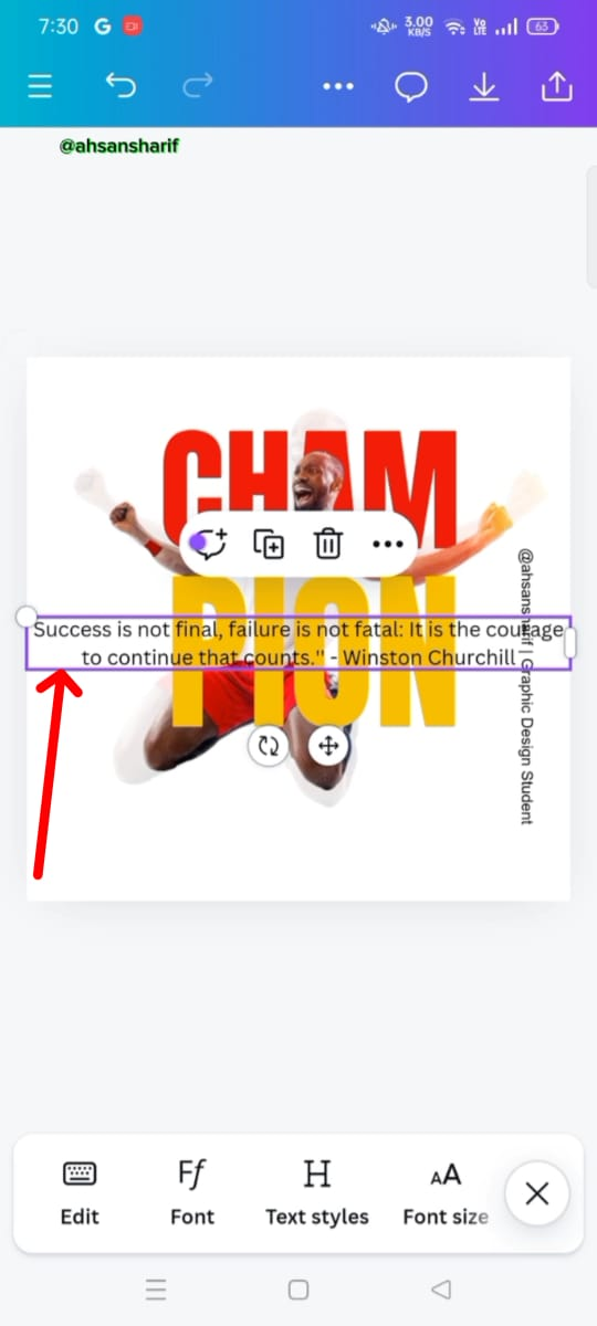
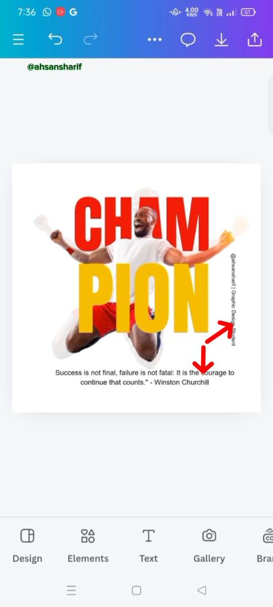
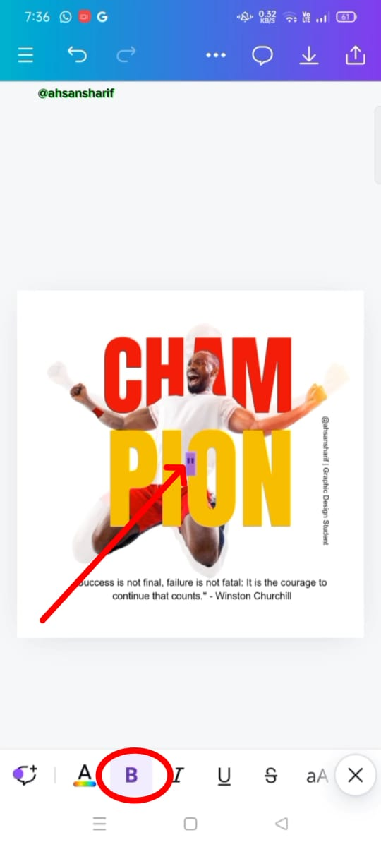
Now we have to set the font which will be Arial. Then its position will be placed on the right side. At the same time, we have added our quotient to Champion Related. Which I edited by Winston Churchill. And then its position has to be set.
 |  |  |
|---|
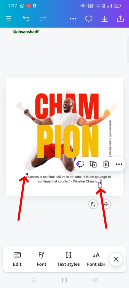
Both are to set the position of the text field. The first text we have to place on the right side from top to bottom is the second text we have to place on the bottom side which is just below the image. After setting the position of both we now have to add quotation marks around our quotation. For this, we have to take the quotation mark and set it with the help of text.
 |  |  |
|---|
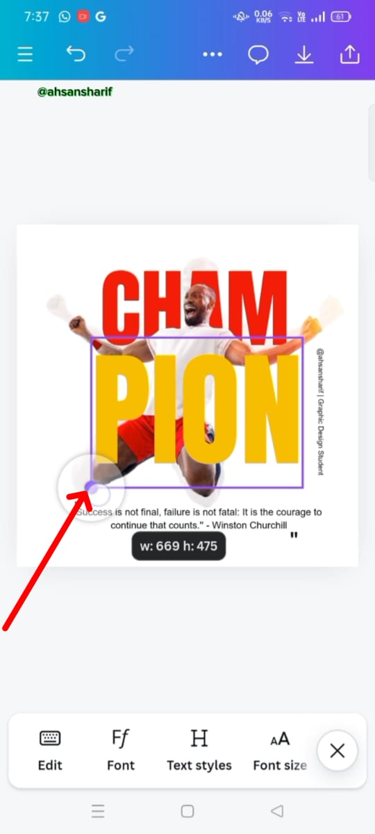
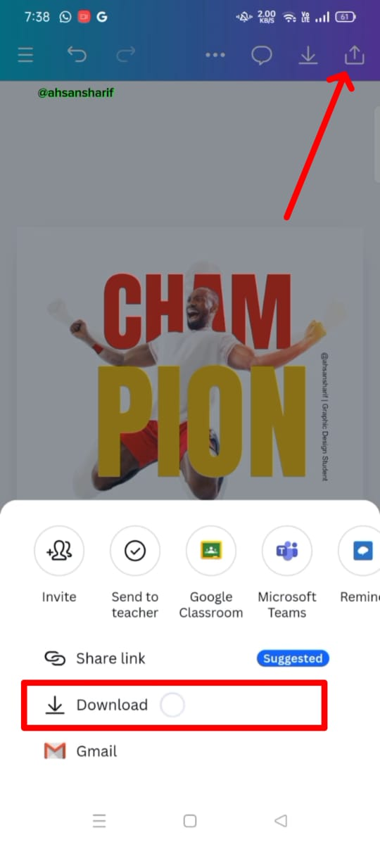
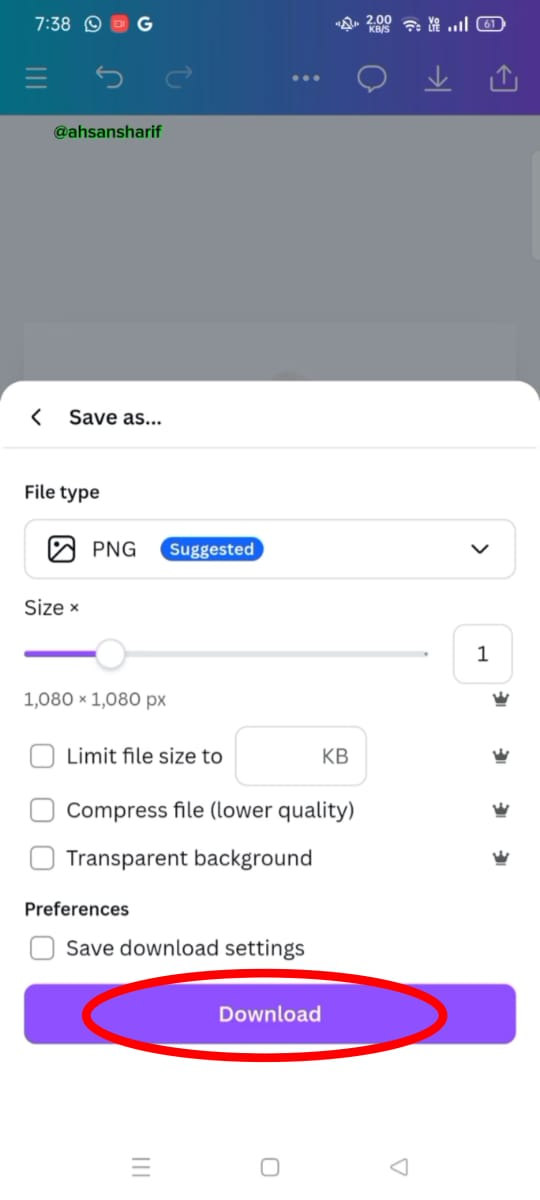
Now in this step, we have to set the PAN text a bit which was a bit small. We have to maximize it and set its position and then we have to download our banner from the top right side download button.
Here Is The Final Output
Here I have shown the output of my final banner. As you can see I have tried my best to make this as same example as possible.

Here Is The Video To Design This
Here's a full video of my making the design that I recorded so I can show you how I made it.
Principles |
|---|
I have adopted many principles while creating my design and following these principles, I have made my design attractive.
Balance:
I have made sure that nothing is out of balance in my design. I have kept all things in balance as the Yellow color I have kept for PION and the Red color I have kept for CHAM. And so they are given a balanced font size, nothing is out of balance. Along with the text, the image is also balanced by, one image that has less transparency and the other one that has more transparency, which is balanced.
Element Spacing:
I have set their alignment to make my design attractive as you can see here I have kept both the CHAM and PION together. Nothing is out of balance and weather is the font size, both given the same and set to the same position. So it makes my design as beautiful as possible to make it easier for the reader and the viewer.
Design Size and Dimension:
I used a draft from an Instagram post to create my design which is 1080 by 1080. And it makes sure that all of our stuff comes across here, our images and text come across clearly. And they are very good for social media platforms.
Avoid Edge to Edge:
While creating this beautiful design, I have taken special care of my margins. I have kept the images and text on both sides. And it makes my designs feel more spacious. This is the design that saves our design from cut-off at the time of printing.
Color Combination:
I have improved my color combination which looks more beautiful with red and yellow colors. This champion brings more life to the design and creates a positive energy. With the help of these codes, I have found the color the codes we have given here fill our color. I have tried my best to create my design by choosing the colors given to us.
Emphasis:
I have applied this principle to my designs better as I have bested the color. As for Cham color, I have given red color so that they can highlight the importance of our whole design.
Hierarchy:
Following this principle I have added two types of images in my design, one is a transparent image and one is a normal image. Just above the transparent image, I have placed a cham of red color which highlights our design approach.
Thank you so much for staying here. I do my best to perform this task. I hope you all guys like it. I invite my friends @ruthjoe, @rumaisha, and @ashkhan to join this challenging task.

X:
https://x.com/AhsanGu58401302/status/1845374959427911711
Upvoted. Thank You for sending some of your rewards to @null. It will make Steem stronger.