"SEC20/WK1: Introduction to Graphic Design and Principles."
 |
|---|
Graphic design huh? Count me in.
Graphic design has been an intriguing subject to me maybe because it doesn’t come naturally to me and I must say that am always amazed when I see beautiful designs, I am always wondering how people are so gifted to create such beauty and I had always wanted to learn a little even if it’s the basis of graphic design.
Thanks to this engagement challenge as my dream is coming through already. So it’s with utmost enthusiasm that I partake of this seasons edition of the engagement challenge and I must say a big thanks to @lhorgic for this opportunity to learn.
Question 1: What is Graphic Design? |
|---|
Graphic design can be defined as the art of putting together visual elements such images, shapes and colours to relay a message or communicate information effectively.
Our everyday life is actually a form of graphic design cos we are always trying to create visual contents to pass across information to people daily on our blogs, social media, doing one form of editing or the other all in a bid to pass across information and that’s the main objective of graphic design.
A graphic designer is a visual communicator and his job description covers a wide range; from branding, to advertising and marketing designs, visual identity designs, web designs, infographic designs, user interface designs, motion graphic designs, textile and surface designs, publication and editorial designs, packaging designs and etc. A lot of people are making a living from graphic designing. It’s a field worth exploring.
Question 2: Pick any three of the principles of Graphic design and talk about them based on your level of understanding. |
|---|
There are many principles of graphic designs but am going to talk about three;
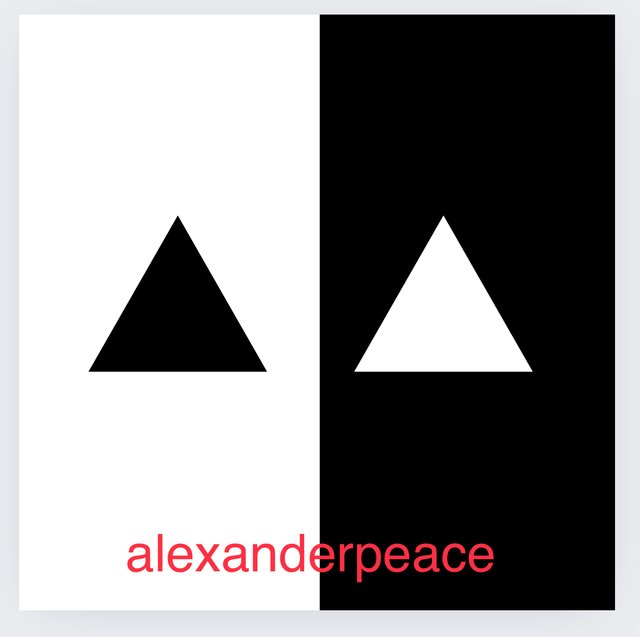
- Contrast: Contrast simply shows the difference between two visual elements that are placed closed to each other in a design. There are contrast that has to do with color while some points to difference in size, type or alignment.
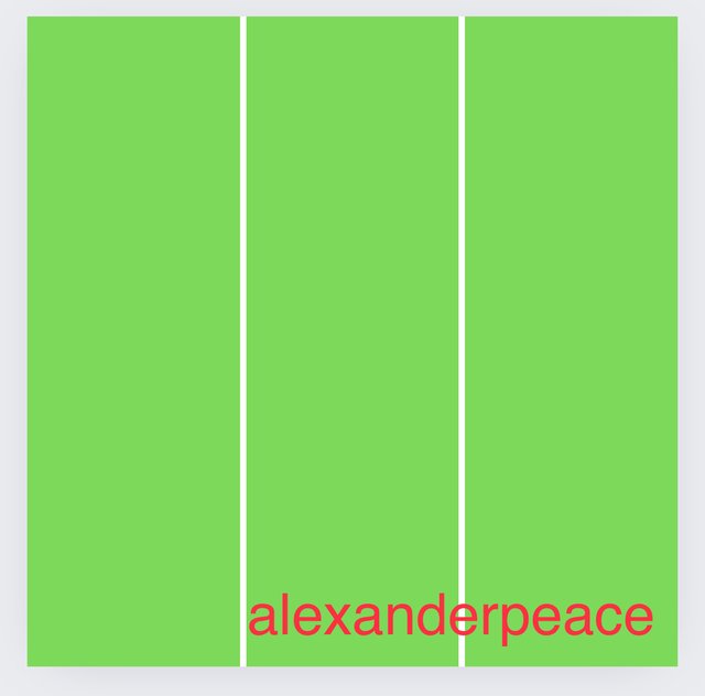
- Balance: Balance in graphic design is used to add gravity and visual weight to a design. It points to to how visual elements and aspects are distributed in a design. In balance there must be equal distribution of the elements in the design, non must outweigh the other or be underweighted. All must be equal just as the name implies.
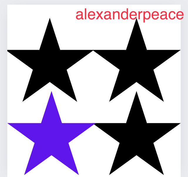
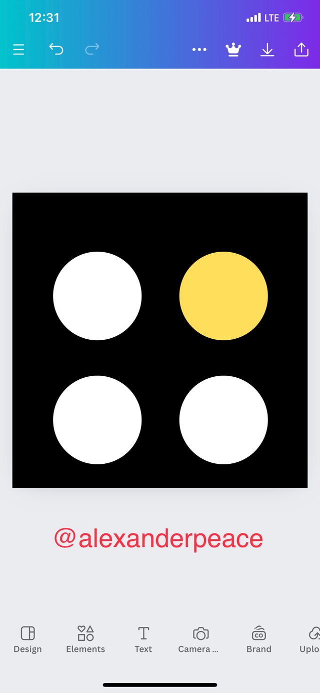
- Emphasis: Emphasis comes into play when a designer wants an element in a design to stand out from others. When emphasis is used in a design, one can easily get the message the graphic designer was trying to convey at a glance.
Question 3: Practically show us how to make the graphical image below. |
|---|
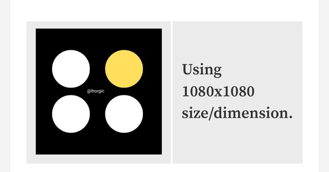 |
|---|
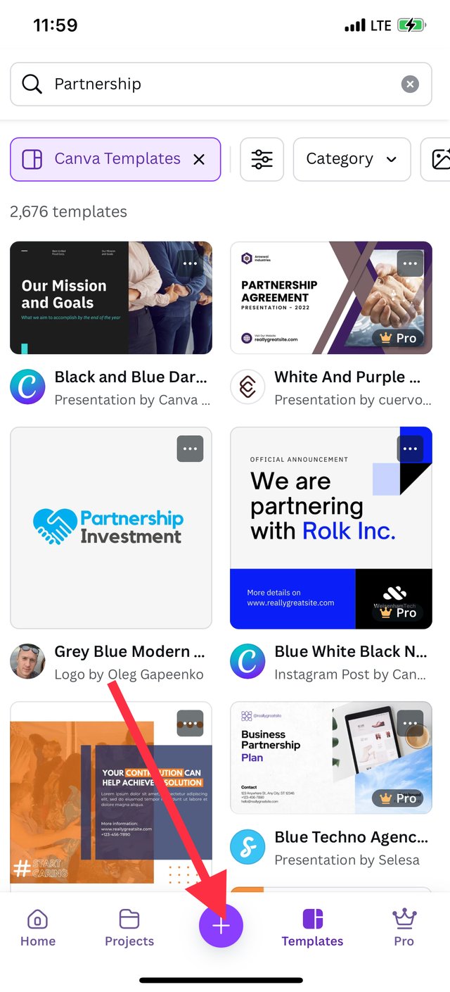
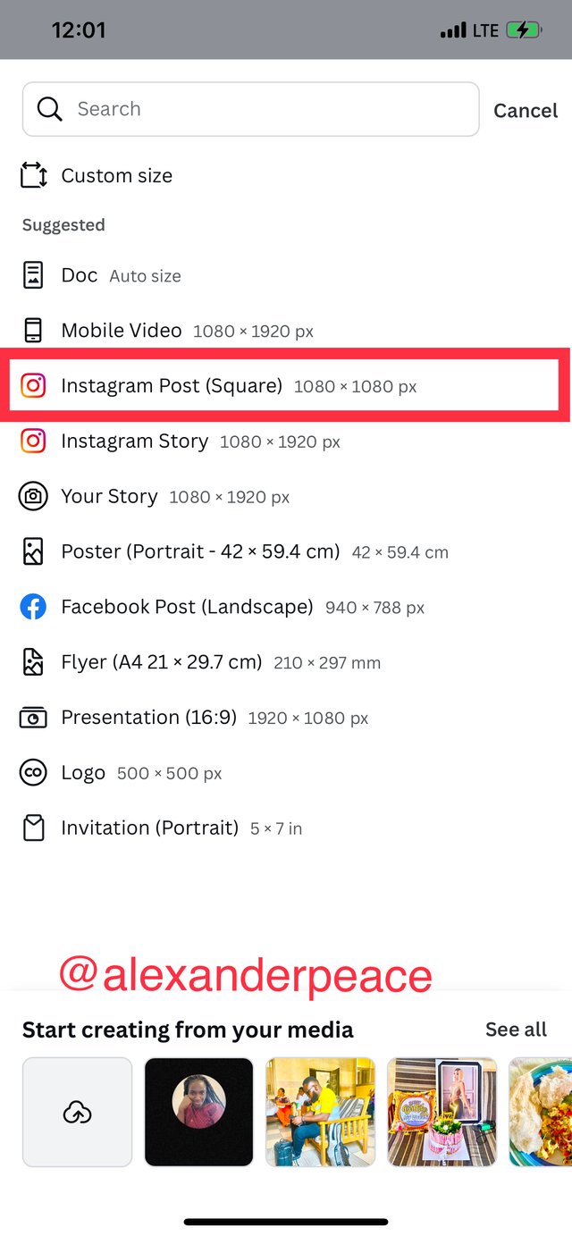
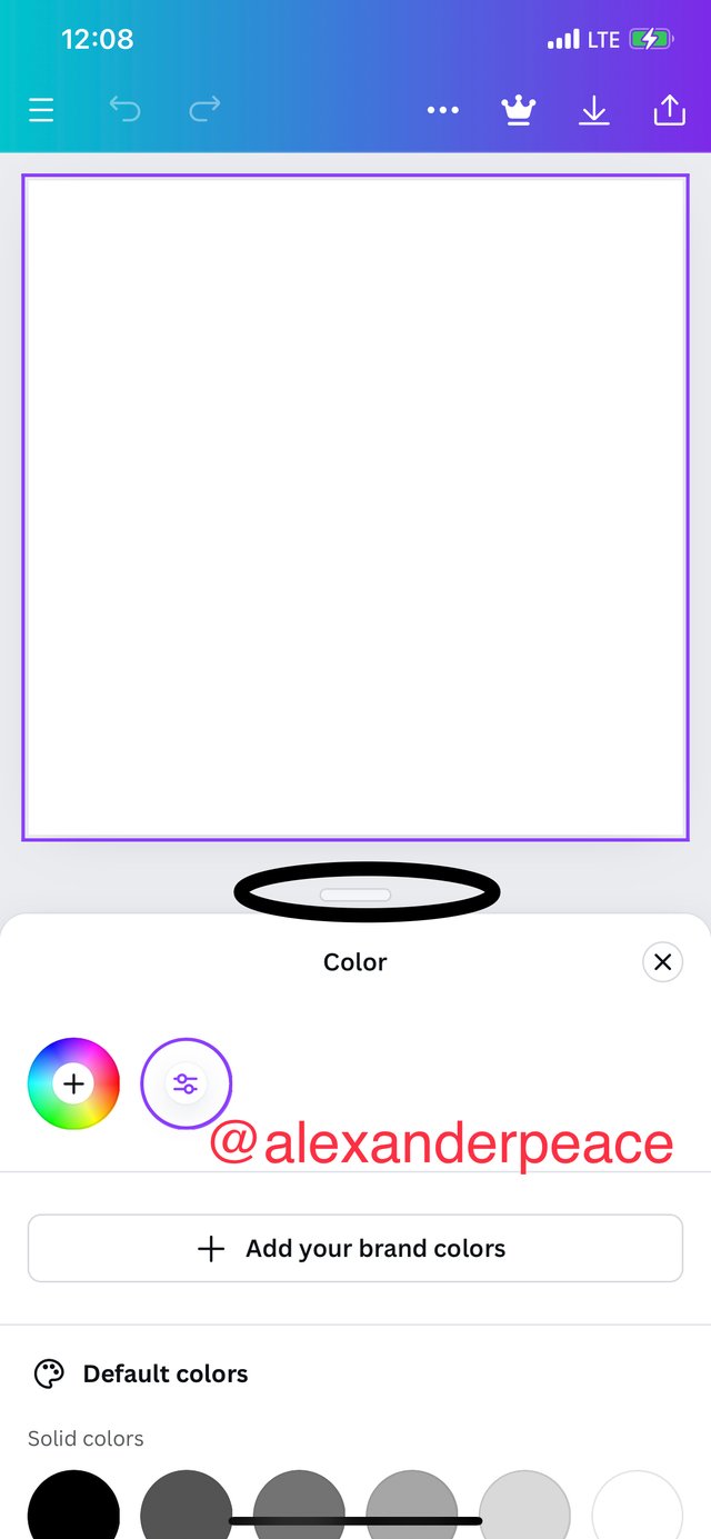
Step 1: In logged into my Canva app and clicked on the + icon. I selected Instagram post (square) 1080*1080 pix and the white background showed.
 |  |  |
|---|
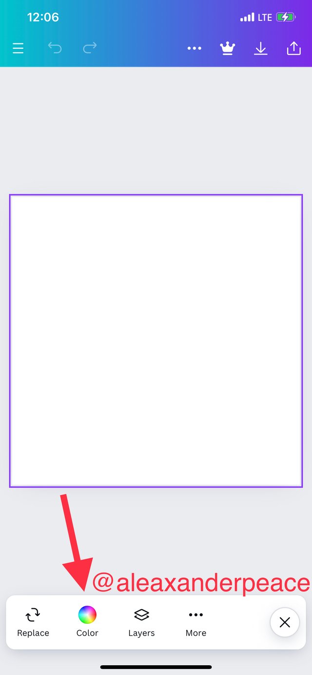
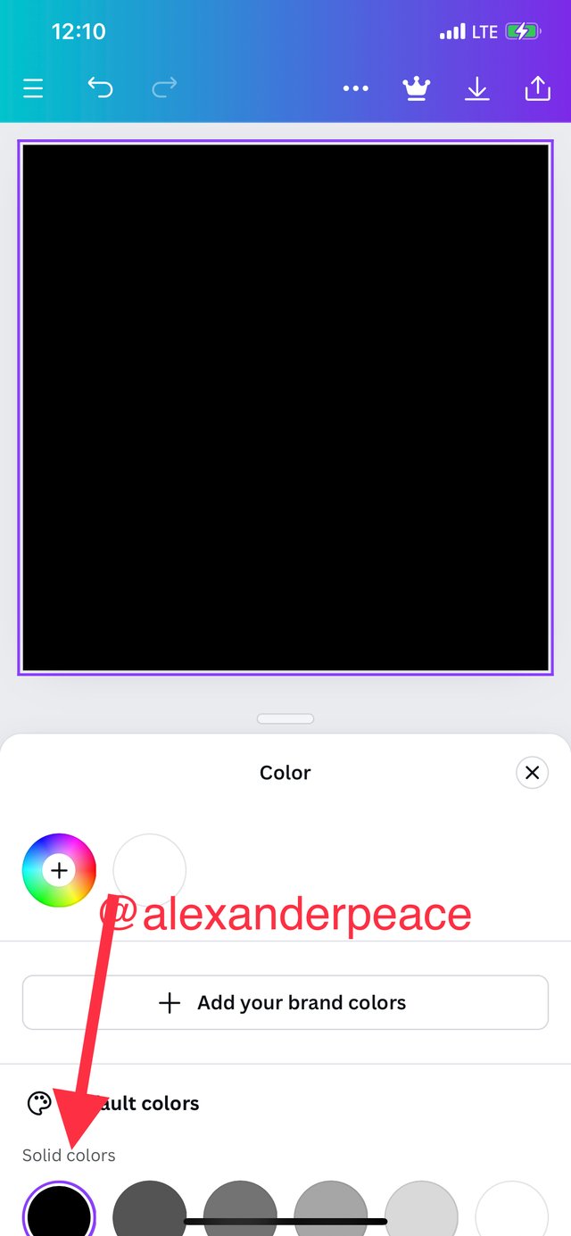
Step 2: I clicked on the colour icon and dragged up the bar to reveal the colors and selected black color as indicated by the arrows.
 |  |  |
|---|
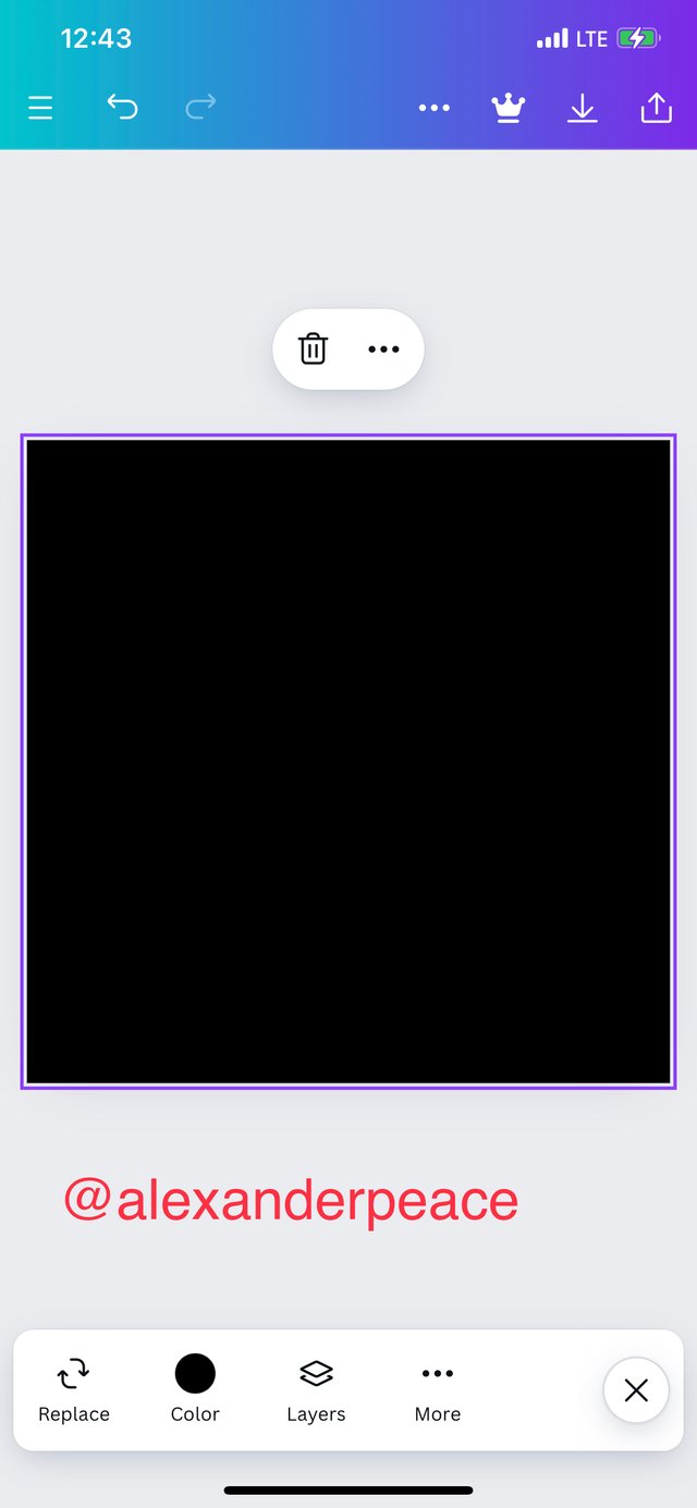
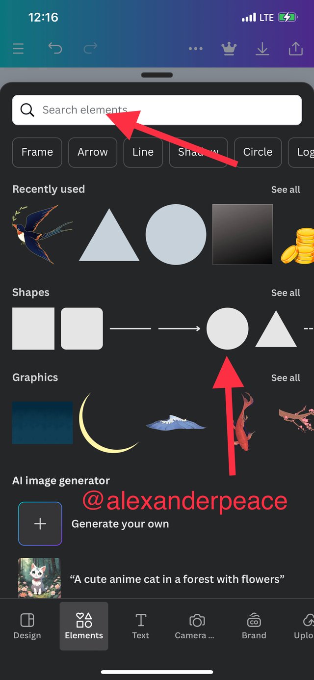
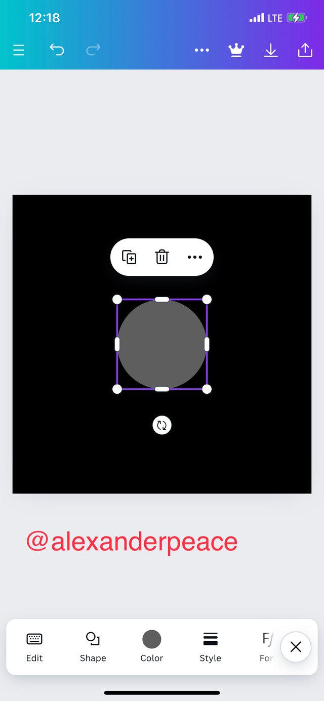
Step 3: I proceeded to click on the elements icon as shown by the arrows, I selected the shape I wanted which is the circle shape and it was added to the background as shown by the screenshots.
 |  |  |
|---|
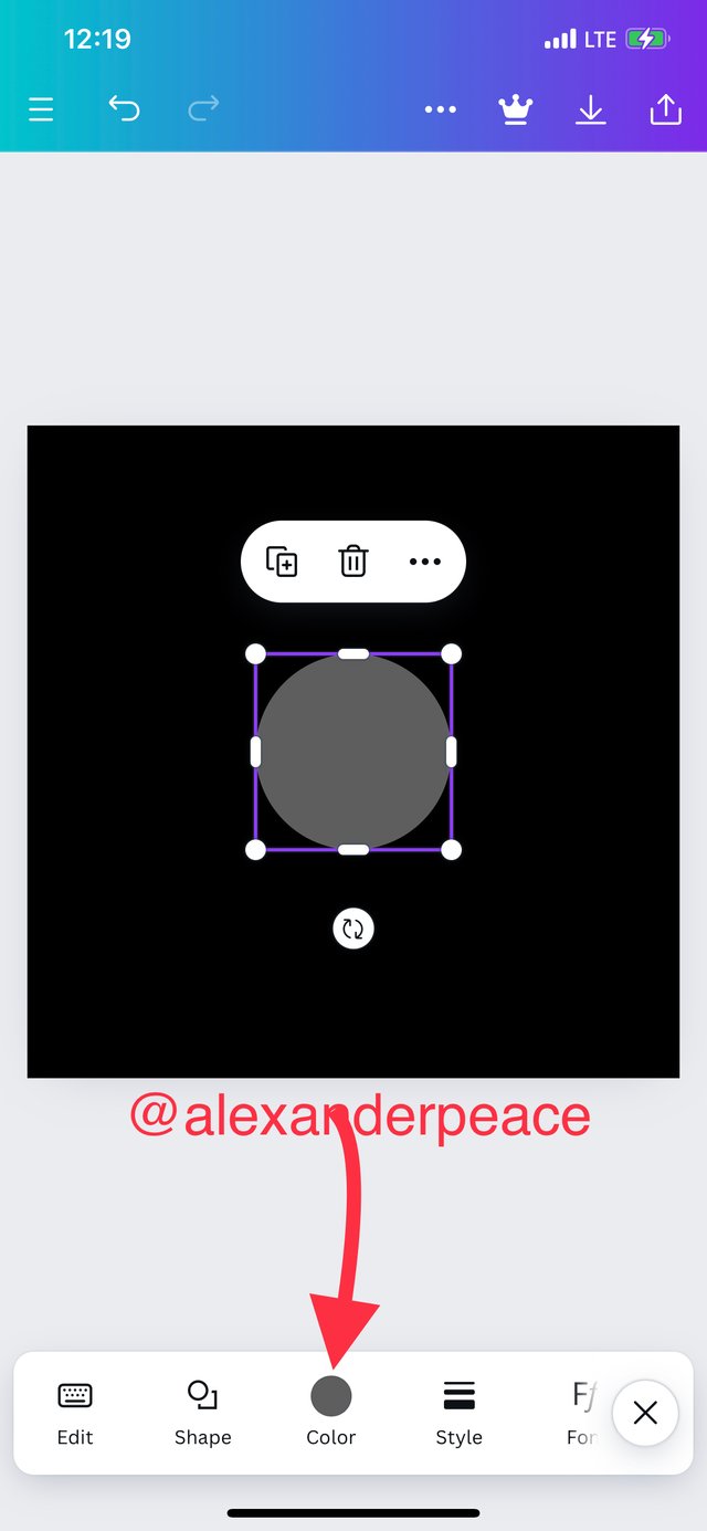
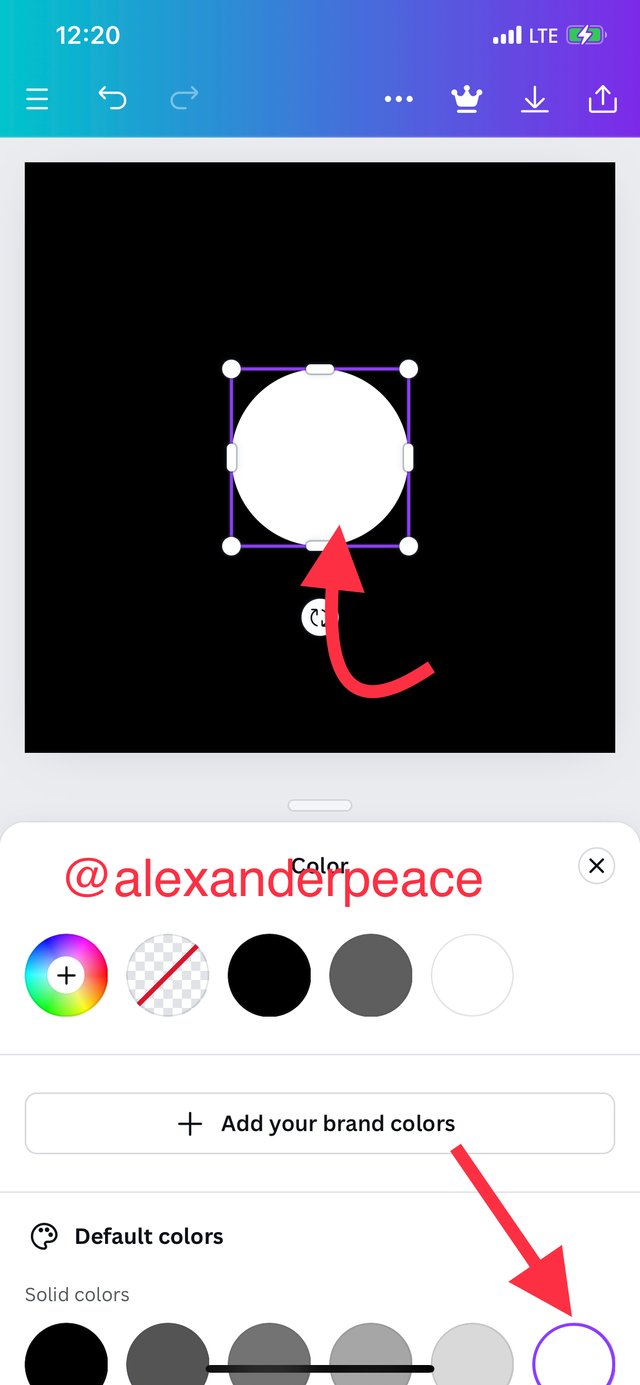
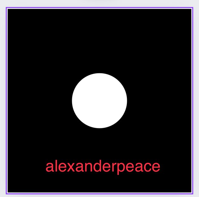
Step 4: I proceeded to change the color of the shape by clicking on colour and selecting white.
 |  |  |
|---|
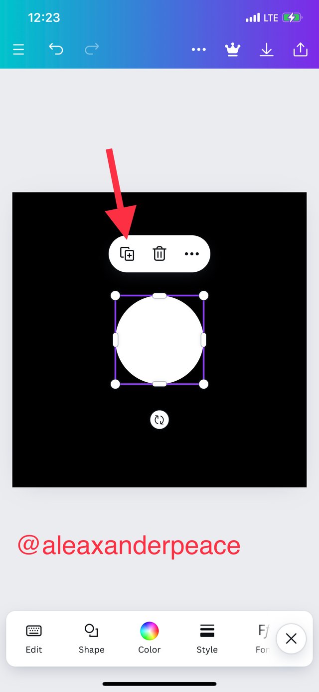
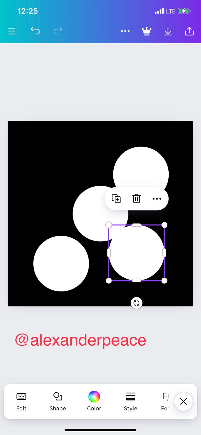
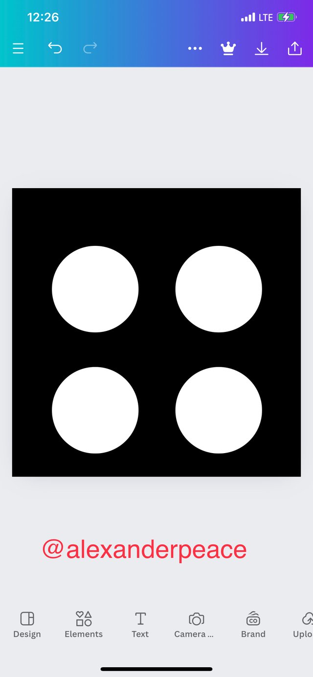
Step 5: I duplicated the white circle by clicking on the circle and then on the + icon in the box and drag the different circles into desired positions.
 |  |  |
|---|
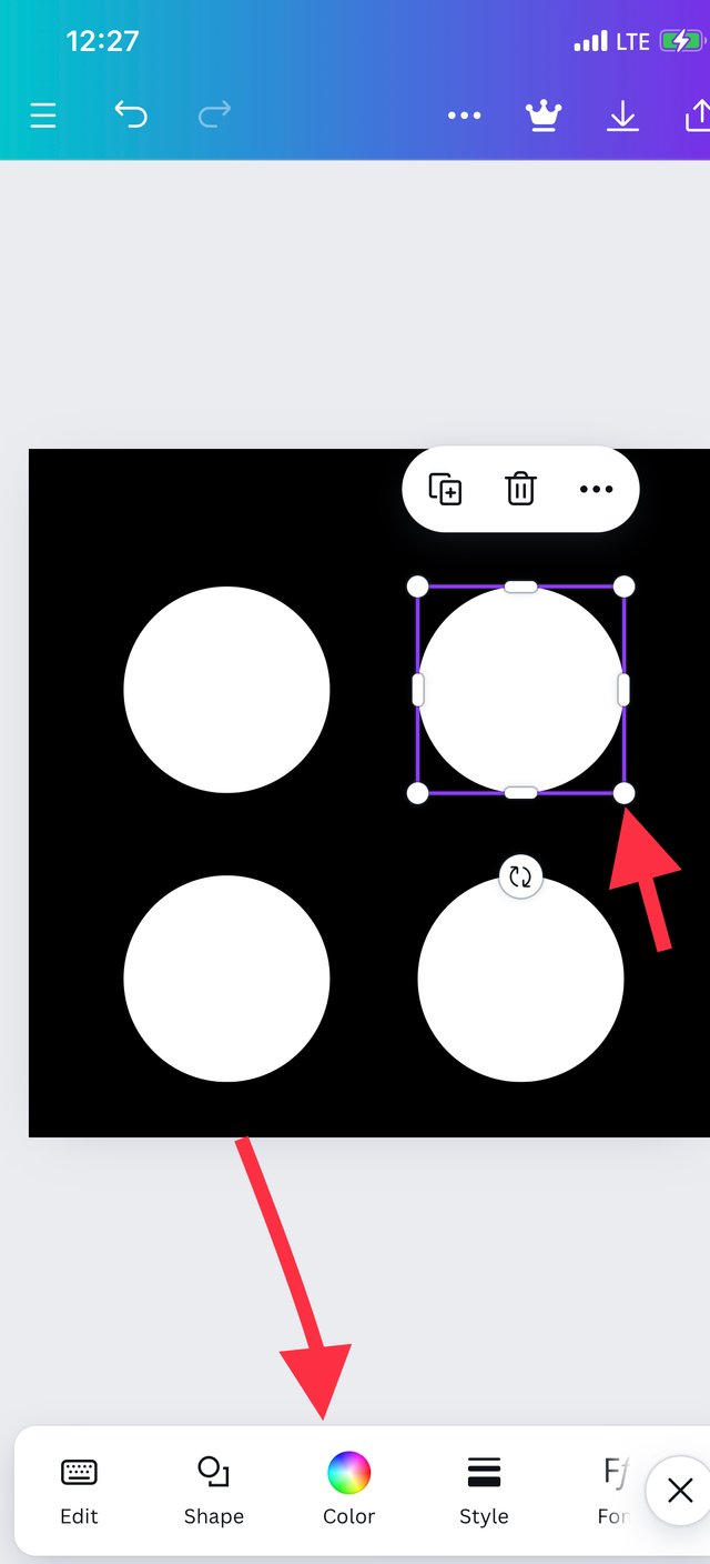
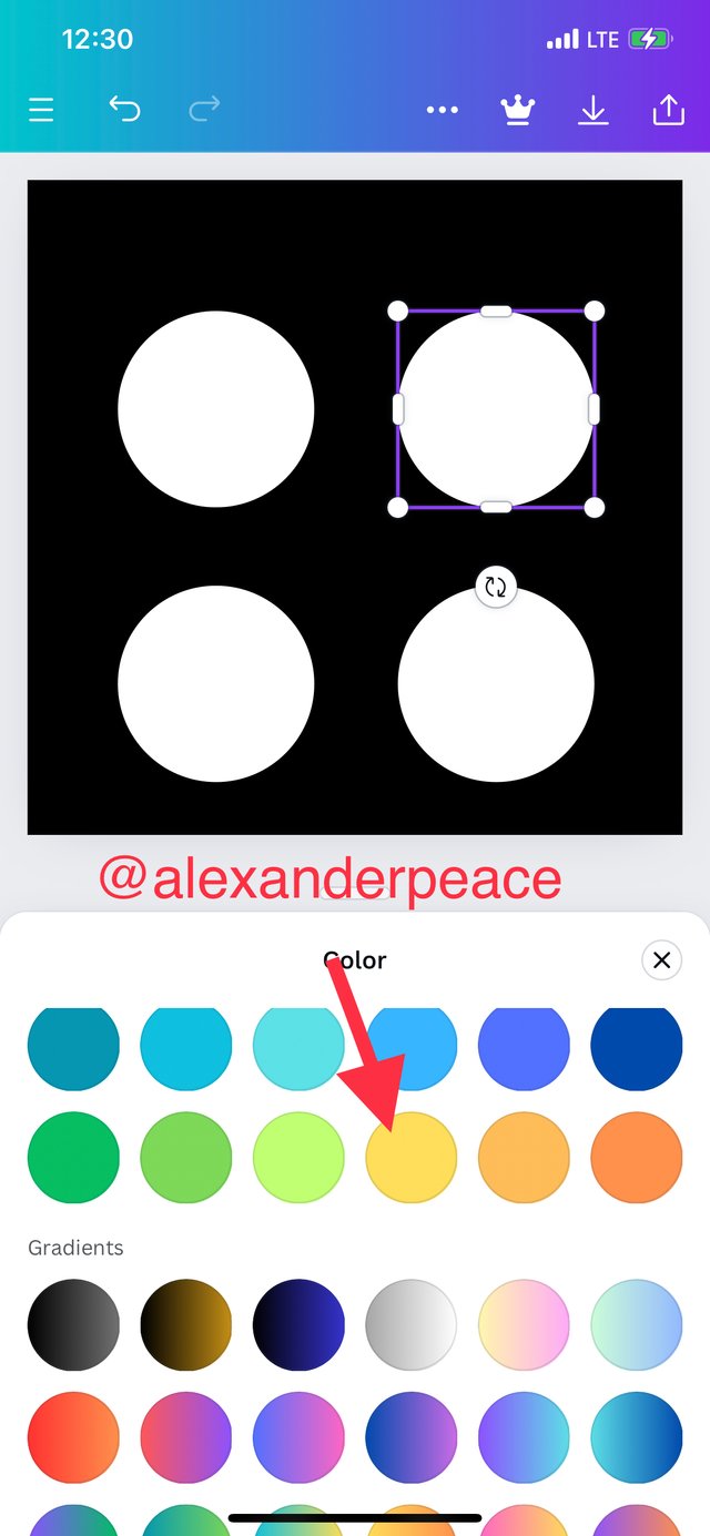
Step 6: I clicked on the circle I wanted to emphasize, clicked on the colour icon, selected yellow color and I got my final result.
 |  |  |
|---|
Am really glad to participate in this class. I enjoyed doing the assignment. It took a lot of hours of work than I expected maybe because am a newbie in the field and just getting to find my way around graphics but It’s totally worth it and I enjoyed every bit of the learning. Thank you so much Teams Devs.
I ask @jovita30, @bessie20 and @ngozi996 to join the engagement challenge.
Hello @alexanderpeace thank you for participating in this week's lesson. We have assessed your entry and we present the result of our assessment below.
Feedback:
• You have clearly defined Graphic design the way you best understand it, and I appreciate the remarkable effort you put into it.
• Your selection on the principles of design is nice coupled with your comprehensive explanation and visual illustration.
• Finally, your practical is quite detailed and comprehensive, you must have taken your time to work diligently on this...to get this result. Weldone
Regards
@lhorgic❤️
Wooow. Thank you so much sir for the review. Pheeew. Took over seven hours of work ooo. Am so glad am learning. Thanks for teaching us. I love the class.
Thank you, friend!


I'm @steem.history, who is steem witness.
Thank you for witnessvoting for me.
please click it!
(Go to https://steemit.com/~witnesses and type fbslo at the bottom of the page)
The weight is reduced because of the lack of Voting Power. If you vote for me as a witness, you can get my little vote.
Upvoted. Thank You for sending some of your rewards to @null. It will make Steem stronger.
I always try to remember to point out that paint.net is 100% free and, with plug-ins, does everything Photoshop does. This is a good thing for those just starting out and not having the money for a decent program.
This post has been upvoted/supported by Team 7 via @philhughes. Our team supports content that adds to the community.
Note taken. Thank you @philhughes for the support 🌝🤗🙏
¡Holaaa amiga!🤗
La línea comunicacional que se desprende del Diseño Gráfico es muy interesante analizar ya que, a través de él el lenguaje visual ha logrado llegar a masas que anteriormente no se tenía acceso además de que, por medio de un diseño la educación eficaz también es posible de lograr.
Te deseo mucho éxito en la dinámica... Un fuerte abrazo💚
Well said. Thank you friend for stopping over. Hugs and best wishes