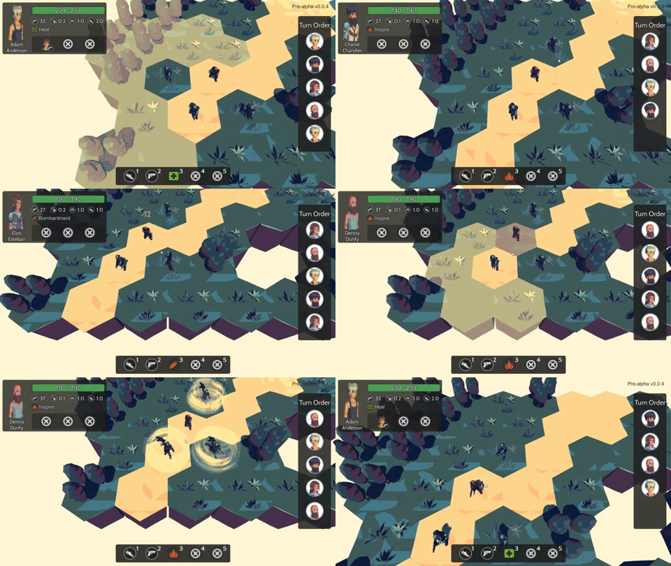
Bright Red Skies - Screenshot Saturday
I just posted a monthly devlog yesterday, but for the sake of consistency I'm still going to do a screenshot Saturday as well lol. So, almost done being able to read and write to a file, all of the data needed for all the scenes, but in terms of stuff I can show here's what's been done this week:
Camera moves to the next squad:

First cutscene prototype:

If you want to stay updated, checkout and follow me on:
I like your color choices in this as far as the hues go. It looks a little dark but that may be just my preference. I don't know about the theme or atmosphere of the game so maybe the darker shades fit with that though.
True, I do think it might be a bit dark in some places like I think the character models on the hexes are both dark so they blend in with each other. But currently a lot of my assets are placeholders so if I get serious about this game I'll probably get models that work together better