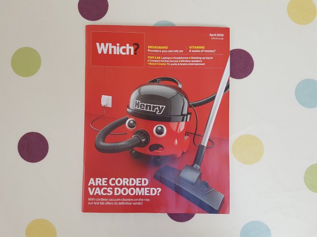
I saw this on the table today and I just thought it was a fun magazine cover idea. It's clever how they made the vacuum look like it has a personality. The colour is bright and eye catching and the type and layout are clear and well organised. Henry is just cute!