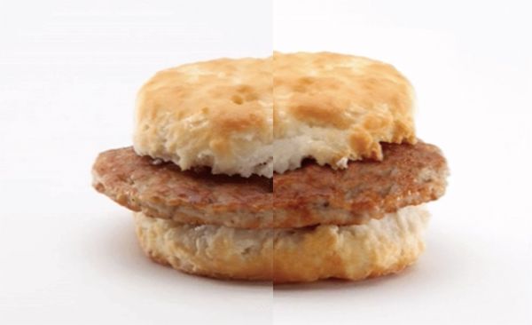
What McDonald’s Menu Items Look Like Before And After Image Retouching
It’s no secret that photos of menu items undergo retouching to make them look more presentable and appetizing. Similar to many other food brands, McDonald’s applies these edits to its ads.
Sometimes, they appear a bit too mouthwatering it seems. In 2012, McDonald’s Canada was inspired to produce a behind-the-scenes clip after one customer asked, “Why does your food look different in the advertising than what is in the store?” The video took viewers through the photo shoot, food styling and image enhancing process for its ‘Quarter Pounder with Cheese’ burger.
Though these images might look more realistic today, some curious fans might be keen to see just how much post-processing goes into McDonald’s food ads.
Business Insider recently revealed before-and-after visuals via a collection of GIFs, which you can view below, after it reported that McDonald’s had apparently “uploaded unretouched photos of food to its website alongside retouched photos.”
While Business Insider awaits for McDonald’s to respond to its request for comment, see the ‘Big Mac’, ‘Sausage Biscuit’, ‘Cheeseburger’, ‘Egg McMuffin’, ‘Baked Apple Pie’ and more, via before-and-after retouches below.


Hi! I am a robot. I just upvoted you! I found similar content that readers might be interested in:
http://designtaxi.com/news/398022/What-McDonald-s-Menu-Items-Look-Like-Before-And-After-Image-Retouching/
what does photoshop and marketing from a company do. follow and upvoted
This post has received gratitude of 0.54 % from @appreciator thanks to: @steemforfun.