SEC S20W6 - Custom Fonts, Stacks and UI Widgets
Hi everyone!
You are warmly welcome to the 6th week of Steemit Engagement Challenge Season 20, the last week of this season. Here you will learn:
- Custom font
- Stack
- Snackbar
- Dropdown
- Date and time
- CircularProgressIndicator
.png)
Custom Fonts
Fonts are the part of every application and Flutter provides by default fonts. We can use those fonts without any additional work. But sometimes these are not enough and we have to use custom fonts to meet the design requirements. Custom fonts allow to style the text of the app beyond the default system fonts. It adds a unique look to the application.
How to Implement
- Add the font files to the
assetsfolder in your project. - Define the font in the
pubspec.yamlfile. - Apply the font using the TextStyle widget in your app.
- We can also use font packages from
pub.dev.

As a custom font I am adding this google_fonts: ^6.2.1 package to my pubspec.yaml file. Then in order to use the custom fonts on the screen we have to add the custom font styles in the text.

In this way when we add any custom font then we have to call the class of that custom font to access the properties of the font class. Here you can see how we can access the custom the fonts to use in the application.
 |  |
|---|
You can see there is a lot of difference in the default font style and custom font style of Google. Custom font style is making the text widget to look more beautiful. In this way you can use any custom font according to the requirements of the design.

Stack
Stack is an amazing widget which plays a great role in the development of the complex user interfaces. The main purpose of Stack is that we can overlay widgets on top of one another. In this way we can control our layout in a good way and we can meet the design requirements.
Sometimes we need to use content on each other. We want to display an image and the text on it then we can use Stack. It helps us to maintain and manage the complex user interfaces.
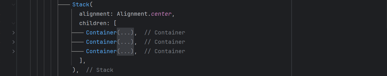
The syntax of Stack is just like the Column widget which we have discussed in the previous lectures. It accepts children and in the children we can use different other widgets. In the above example I have used 3 containers. And in these the first container is at the bottom and the second container is on the first container and similarly third container is on the second container. In this way we can use multiple widgets on each other with the help of the Stack.

This is how the user interface will look of the above code where I have used 3 containers. The stack is holding all the containers in one place on each other. We can manage the position of the widgets according to our needs. I will give some other examples as well from which you will understand it how can we use it in different ways.

In the example 2 there is a beautiful sun set image which has a text over it. It is representing the practical design and usage of Stack in banners and cards.
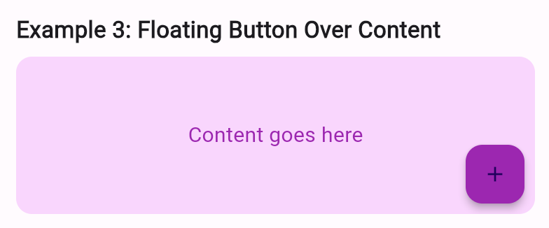
In this example 3 it is showing a real world scenario where the floating button is used over the main content. So in this way Stack allows us to overlay widgets on one another and to manage the complex user interfaces.
Snackbar
Snackbar is a lightweight notification and it pops up at the bottom of the screen. It informs the user about the actions such as submission or errors while performing the action. It helps us to inform the user about the real time action of the user in a pop up. It is very simple to implement it and we can display any notification.


Here you can see how we can implement a snackbar in the application. ScaffoldMessenger.of(context).showSnackBar() is the start of the snackbar implementation syntax. We always call a snackbar using ScaffoldMessenger.of(context).showSnackBar() and then we use its properties such as the background colour, inside content and the action of the snackbar. The action property works like a button and we can implement onPressed() functionality in it. We can define behaviour, shape and duration of the snackbar according to our requirements.

Dropdown
In many applications we use a dropdown menu to choose one option from the other option. It is widely used widget and it makes our user interface look more beautiful and attractive.
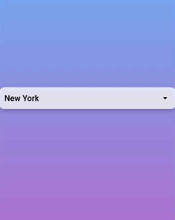
Its syntax is very simple. First of all we need to intialize a variable which will store the value of the selected option from the list. Then we have to use DropdownButton which will be clickable and when we will click on it it will perform further action. In the body of this button we will set the value property to the selectedValuewhich we have defined recently.
And in the onChanged() property we will pass a string with the newValue. And we have to call setState() to update the sate of the screen to how which option is selected. We will update the sate by adding the newValue to the selectedValue if newValue is already not there. The in the next section of the items property we will define all the options from which the user can select any one option. Then at the end we have to return DropdownMenuItem string.
Current Date and Time
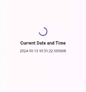
Sometimes we have to display current date and time in the application. In Flutter we can fetch current data and time of the user and we can display it on the screen were we want. There is a dedicated class DateTime. This is useful for timestamps, reminders or any app that deals with time.
 DateTime now = DateTime.now();

Text('Current Date and Time: $now');
In this way we can fetch the current date and time in the application. It has different attributes and we can use them according to our needs. We can manipulate the date and time format with the help of the external packages as well.
CircularProgressIndicator
CircularProgressIndicator is used to show a loading spinner. It is used when the app is fetching data or performing a long task. We can manipulate this CircularProgressIndicator by changing the motion, colour and the style of the CircularProgressIndicator.
This is the syntax CircularProgressIndicator(); . This is a complete class. It has a number of properties such as value, backgroundColor, color, Animation and the color of the Animation.
This is how we can use CircularProgressIndicator and DateTime in the application.
Today all the user interface widgets have been completed which are commonly used in the daily basis mobile applications. And I am sure now all the students who have attended the lectures will be able to design all the complex user interfaces with confidence. Moreover my services are always here if anyone find difficulty in the creation of complex user interfaces then I will try my best to guide you as much as possible.
Homework Assignments
Create a simple app that displays the title of your app and a welcome message using a custom font.
Create a profile screen, place a circular avatar on top of a background image using Stack. Add a name and a badge icon to this layout using Positioned.
Create a form with a button. When the button is pressed, display a Snackbar with a confirmation message
Create a settings page where users can select a theme for the app (e.g., light or dark mode) from a dropdown menu
Create a home screen that shows the current date and time. Add a refresh button to update the displayed date and time when pressed.
Create a button that, when pressed, shows a
CircularProgressIndicatorfor a few seconds (simulating data loading), then hides it and shows some content on the screen.
Project:
- Create a Weather Application which includes Custom Font, Stack, Snackbar, Dropdown, Current Date and Time and CircularProgressIndicator.
Note: Please use an IDE and your own mobile phone to complete all the tasks. And present video of the tasks by making gifs. You can make gif of the video using Ezgif.
Contest Guidelines
Post can be written in any community or in your own blog.
Post must be #steemexclusive.
Use the following title: SEC S20W6 - Custom Fonts, Stacks and UI Widgets
Participants must be verified and active users on the platform.
The images used must be the author's own or free of copyright. (Don't forget to include the source.)
The participation schedule is between Monday, October 14 , 2024 at 00:00 UTC to Sunday, October 20, 2024 at 23:59 UTC.
The publication can be in any language.
Plagiarism and use of AI is strictly prohibited.
Participants must appropriately follow club status such as #club5050 or #club75 or #club100.
Use the tags #flutterdev-s20w6 , #country (example - #Pakistan, #Nigeria), #steemexclusive in your first 4 tags.
Use the #burnsteem25 tag only if you have set the 25% payee to @null.
Post the link to your entry in the comments section of this contest post. (Must)
Invite at least 3 friends to participate in this contest.
Try to leave valuable feedback on other people's entries.
Share your post on Twitter and drop the link as a comment on your post.
Rewards
SC01 would be checking on the entire 16 participating teaching teams and challengers and upvoting outstanding content. Upvote is not guaranteed for all articles. Kindly take note.
At the end of the week, I would nominate the top 5 users who had performed well in the contest and would be eligible for votes from SC01/SC02.
Important Notice: The nomination of the top 5 users is solely based on the quality of the post. So focus on the quality and creativity of the post. Also ensure your quality engagement.
Flutter Mobile Application Dev Team (mohammadfaisal)

X Promotion: https://x.com/stylishtiger3/status/1845344637830975523
THE QUEST TEAM has supported your post. We support quality posts, good comments anywhere, and any tags
Thank you @sduttaskitchen
https://steemit.com/hive-145157/@sergeyk/sec-s20w6-custom-fonts-stacks-and-ui-widgets
my entry: https://steemit.com/flutterdev-s20w6/@akmalshakir/sec-s20w6-custom-fonts-stacks-and-ui-widgets