Introducing Edge
Today we are thrilled to be able to share the branding for Edge.
Edge represent the culmination of months of work, and synthesises everything that we know about edge computing, together with the core principles of our network in to a coherent and powerful brand.
The core components are presented below, and you can access a full introduction to the brand here: https://brand.edge.network
Logo concept

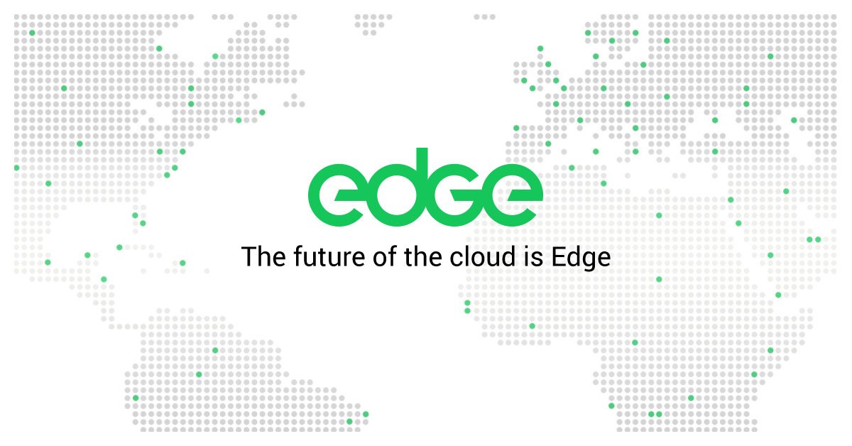
Edge levels the playing field. It enables everyone to contribute, be part of, and access a network that exists all around us in the devices we use day-to-day. Edge simplifies the complex, and by decentralising the network creates a level of equality and functionality that surpasses any current offering.
Our logo is derived from these ideas, communicating them in a balanced, aesthetically engaging mark. It displays uniformity and simplicity. A perfect circle denotes equality, clarity, ease of use and accessibility. The circle is also a representation of the individual nodes which make up the network.
Reference to the ‘power symbol’ communicates the idea of democratising computational power, bringing it closer to the user utilising it in the devices that surround us. It's green because it is always on.
The ‘e’ is edge.
Icon
![]()
The Edge icon is the foundation of the logo. It is developed from a perfect circle conveying equality and balance. The mark reads as a lowercase ‘e’, whilst also referencing the power symbol.
Using a refined line weight it is both bold and elegant, and it is instantly recognisable The colour is striking and engaging and will ensure standout amongst the plethora of cryptocurrency brands.
The Edge icon is a standalone symbol used in isolation when the wordmark is not appropriate or relevant, for example as a currency symbol.
Wordmark
![]()
The Edge wordmark is the primary logo for the brand. The wordmark is constructed using the ‘e’ icon. The ‘g’ is the same shape flipped and rotated. The ‘d’ is derived from the same circular shape. This creates an even, balanced mark which conveys the brand ethos in a clear and elegant way. The four linked circles can be seen as nodes, connected across the edge network.
Congratulations @josephdenne! You have completed the following achievement on the Steem blockchain and have been rewarded with new badge(s) :
You can view your badges on your Steem Board and compare to others on the Steem Ranking
If you no longer want to receive notifications, reply to this comment with the word
STOPTo support your work, I also upvoted your post!
Vote for @Steemitboard as a witness to get one more award and increased upvotes!