Dyslexia Layout Suggestions
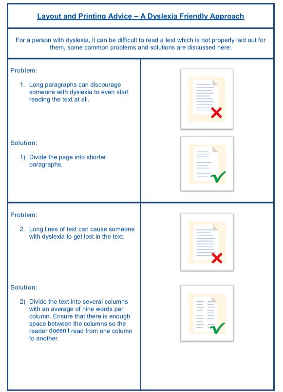
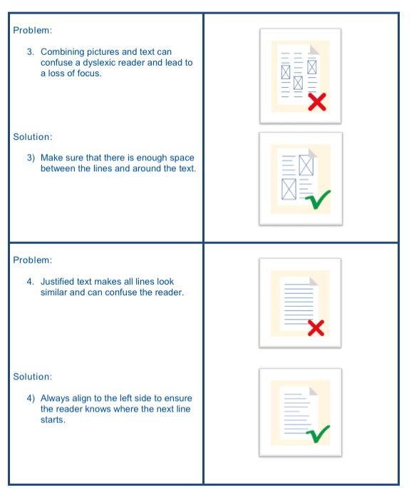
As a practitioner of adult learners with learning disabilities I thought I’d share some tips on how to lay out learning resources in a way that appeals to the dyslexic brain.
Research has shown that reading from a screen with back-light is more tiring for the eyes than reading from paper.
Therefore, it is advised to always print out long pieces of texts if you expect tj dyslexic learner to attempt to engage with it. Preferably print on matt, off-white paper. (Off-white paper will reduce the contrast between the black
letters and the paper which is much less of a strain on the eyes.)
To enhance the contrast further, dark blue letters are most preferred.

