You are viewing a single comment's thread from:
RE: @daltono joins the DPorn team to help put the D back in porn
Thank you!
I believe the updated logo will do a better job of getting users hyped about DPorn taking over.
Thank you!
I believe the updated logo will do a better job of getting users hyped about DPorn taking over.
yes he is cool - I just don’t understand the purpose of the 2 strips - it seems to me they spoil everything - if you remove them - then it's more organic - my opinion - but I'm not an artist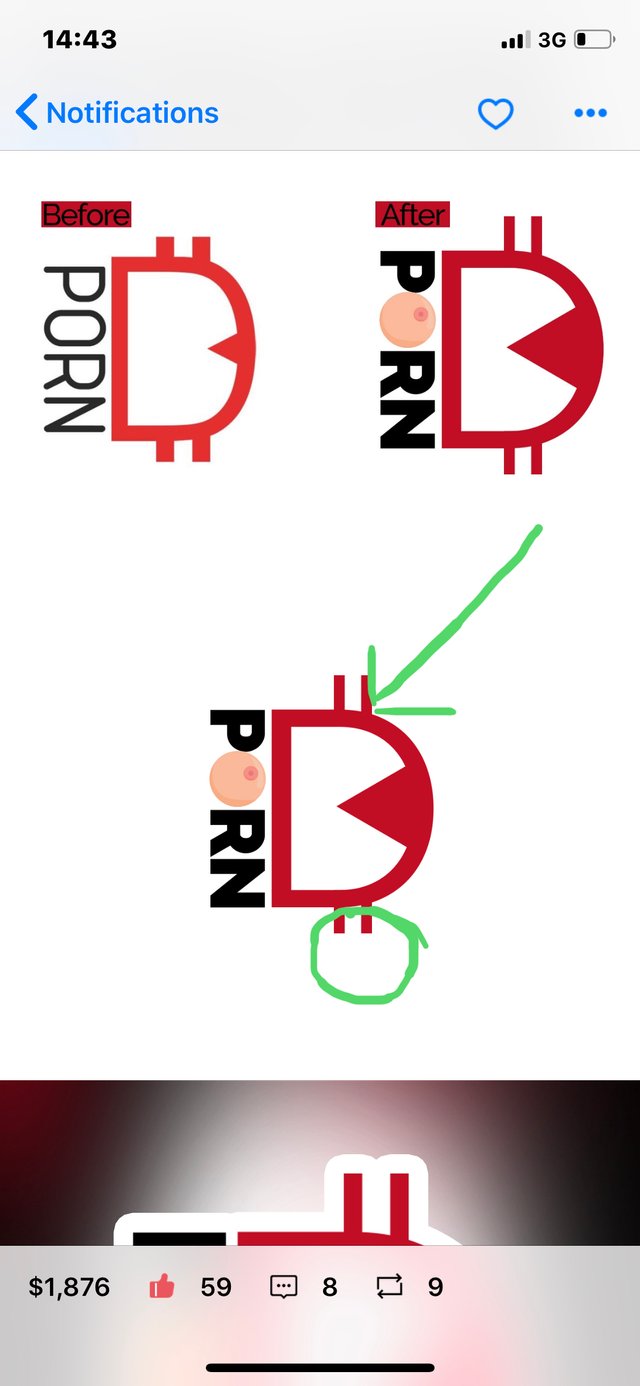
Probably to denote the money aspect. Like in € ¢ $ I guess.
Otherwise it looks like a pretty painful D for the lady 😂
🤣 ahaahkha - it’s a pity that I don’t know how to play it, otherwise I would join the team of my dreams 👻
Posted using Partiko iOS
You are correct.
What about you, do you think the lines make the design look bad?
She said she’s not a size-Queen... she prefers a proper needle-D.
Thank you for your opinion. I love receiving feedback.
The strips are to mimic the look of Bitcoin I believe.
Knowing that now, do you still not like them? I will do some close comparison of the logo with and without the lines.
Again, thanks for your valuable input.
I figured out the logo - I now understand what every detail means - but you can do a survey for example on @dpoll / I think it will be interesting and also more people will know - now I have more incentives to sway our community ⚡️👍
Posted using Partiko iOS
That’s a great idea. I’ll setup a new DPoll today sometime.
👍✅
Posted using Partiko iOS