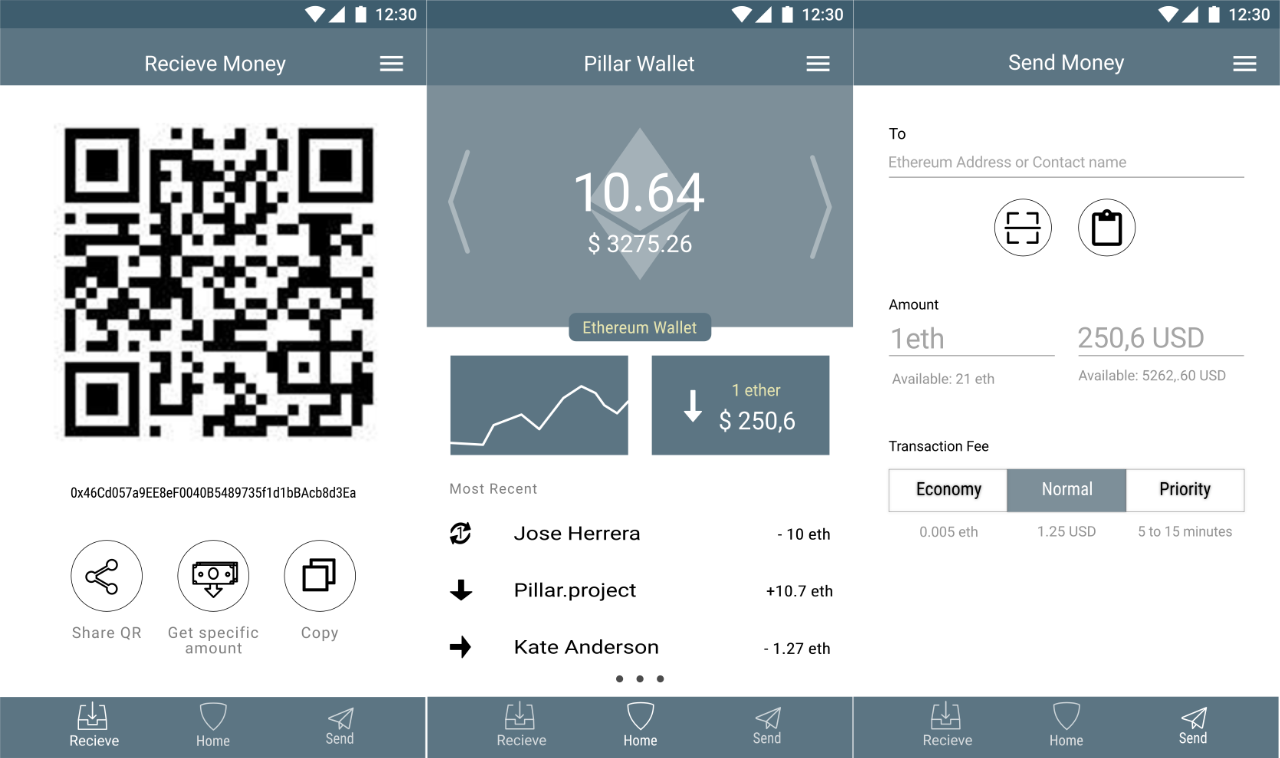
[Design Process] Pillar Wallet - Clickable Prototype and a Summary
Designing a Pillar wallet was lots of fun. Creating a meaningful product and solving problems in the crypto/blockchain space is a dream come true for me.
In this post I'd like to summarize everything together, give you a click-able prototype and link to other things for more details.
The Problem
Pillar Wallet Team wanted to create a simple Ethereum wallet that enables users to send and receive Ethereum, capture the user's email address and be secure. There was a big focus on security and usability. This was especially true when sending money as it's easy for newcomers to make mistakes doing that
Later on, the wallet should allow multiple currencies so I took that in consideration for the design.

Image Source(direct link to img)
Approach
The main judging criteria were ideas and reasoning behind a solution to the problem. Therefore my focus was on researching what the actual problems are by interviewing the users, coming up with solutions and then testing them with the identified users.
As there was no need to create every single screen or state not all the screens are finished or made pixel-perfect.
The Process
Due to a limited time and other time constraints some compromises had to be made.
The User research was mostly interview/dialog based and there were some assumptions inserted into few user personas based on past interactions with people. Creating User stories was also limited to few problems and few interactions.
Also, the final interactive prototype does not show all the flows even if the starting points are present in the UI.
However, as the goal was to show the thinking process and it was not required to show the final product this is deemed acceptable for this project.
All this showed me that proper prototyping and testing can take lots of time if the goal is to do it properly but that there's also possibility to follow Pareto (80/20) principle when doing it (as in anything in life) and get some really good insights. Therefore UX and design thinking process should be followed even if budgets are small.
The Results
The final idea solves quite a few identified problems
- Making it easy to send crypto and know whom you're sending it to (Contacts + True Caller-like functionality)
- Educating users about different transaction fees and highlighting when the user sends money to a smart contract address
- Making Users secure their wallet without overwhelming them with confusing terms by utilizing patterns they're already accustomed to
- Easily request and receive payments
- Nudge the Users to secure their wallet more once they receive funds and protect them based on the risk profile of their transactions
- Showing only the most important information that matters to the users (eg. in Most Recent transactions)
You can click around with the final submitted prototype here
To read about specific screens or other parts of the process in more details check out these posts
As this was lots of fun I'll be working on this more whenever time permits.
Give me any feedback so I can improve.
Thank you.
Join me on the journey of learning and improving in Design. Together we can learn faster.
Design Thinking
An account dedicated to human-centered design with a dream of making crypto and block chain usable for an average Joe with a dream of working on crypto-related projects full-time.
You can look forward to
- Learning Resources and Material
- Design Breakdown and Critique
- Inspiration
- My Learning Journey
- My Work
- Other people's great work (resteemed)
and some surprises plus any suggestions from the audience.
Unless specified otherwise (eg. unless I use different license) all the content is licensed under CC BY-NC-SA

Sneaky Ninja Attack!!
You have been defended with a 32.47 % upvote!
To help keep my Jōki (蒸気) power strong I rely on the townspeople of Sōsharumedia (ソーシャルメディア).
I was summoned by: @designthinking.
I have done their bidding and now I will vanish...
woosh