6 Tips For Building Website wireframes
Try creative editor the easy and efficient design application. Create professional social posts, promotions, presentation slides, email headers and more.
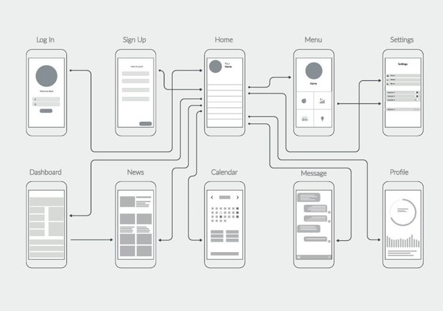
Creating wireframes is an integral part of the website design process. These skeleton outlines might seems easy to create, but they require careful thought and planning to get right. Here are a few tips for designing website wireframes of your own.
- Make it clear
A wireframe’s purpose is to help a web development team work towards the same goal. Management might rely on the wireframe to estimate the amount of money and work required to build the website, and programmers often use it as a blueprint to guide their code. Writers and content creators also rely on the wireframe to help them understand the amount and type of content to produce. Even if you’re working alone, planning everything out beforehand can make the design process run smoothly because you have an outline to start with.
Because the wireframe is a communicative tool, you should make sure that it’s clear and well-labeled. Be sure to include explanations of anything that might be confusing, and ensure that everyone involved understands the plan.
- Keep it simple
While it’s important to know what a wireframe is, it’s equally important to know what it is not. The wireframe is a basic design layout that, as the name suggests, provides a bare-bones approach to website design. It usually consists of little more than boxes, lines, and labeling, since the actual images, content, and text haven’t been created yet. Avoid using your wireframe to plan out color schemes, incorporate branding, or start other phases of the design process that are better left for later
- Consider functionality
The single most important characteristic of a website is its usability, so make sure that you make your wireframe user-oriented. Don’t put important buttons in hard-to-find areas, and make sure nothing will get cut off at the edges. It’s also very important to consider what kind of device you’re designing for — a wireframe for a mobile-friendly website will look very different than a desktop wireframe.
- Figure out information flow
While the wireframe is mostly a visual tool, be sure to take information flow into account. Your frame design should create hierarchies and groupings that can organize whatever content comes later. Make sure that you know where the most and least important information on the screen should go, and that it’s easy for the user to move from one grouping to another without getting lost or confused.
- Think aesthetically
While the attractiveness of the website isn’t the first thing you should be worrying about, it’s definitely a high priority. Make sure that you apply basic graphic design principles to make your wireframe the blueprint for a visually pleasing site.
- Look for useful resources
There’s a wide variety of design tools out there that can help you create a wireframe, ranging from basic online programs to powerful software suites. Choosing the right tool for your needs is an important part of the outline process.
If you need inspiration, vector elements, or examples of design layout for your wireframe, creative has thousands of images that can help you out. Browse our collection today to get started.


Hi! I am a robot. I just upvoted you! I found similar content that readers might be interested in:
https://www.shutterstock.com/blog/building-website-wireframe-tips
Hello to all love steemit friends. Now we became the 2017 followers. Thanks you all the Steemit members very much. In the same way we will continue to work

Steemit members are welcome.