You are viewing a single comment's thread from:
RE: A great example of dashboard visualization.
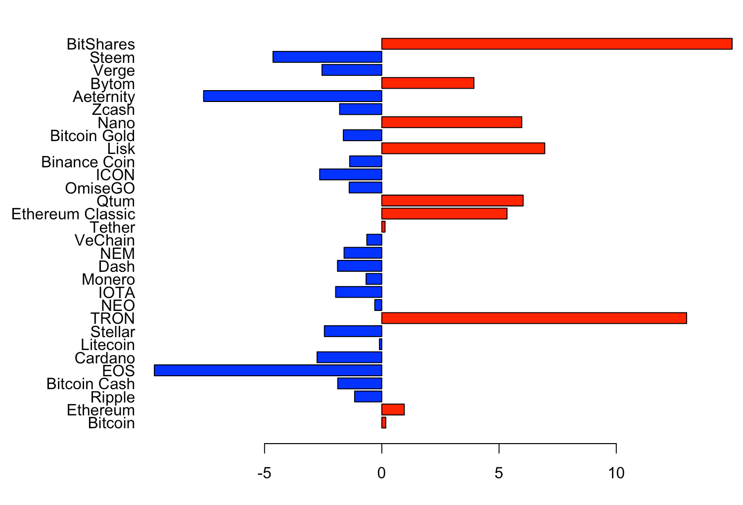
This is a first test for our experiment ;-) showing the change in 24h for the data of yesterday from coinmarketcap. The problem is finding a way to visualize the data in an original way and/or combine it with other data.
very cool! I have in mind a few ratios that are interesting to monitor on a daily basis. The dashboard you shared in the post is great. However, not sure how complex to pull that kind of dashboard might be :)
Collecting the data is not hard.Don't know about the dashboard but for now I can create a report with all the different graphics in .pdf or .html with a reporting tool called R. Just sent you a demo on Skype.