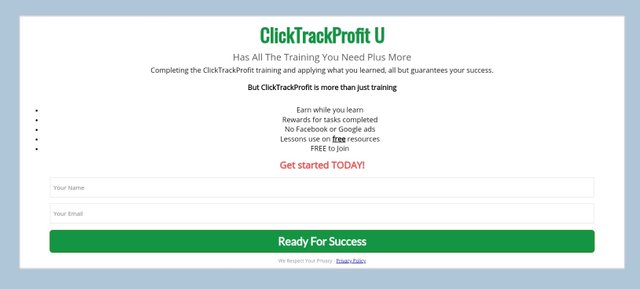
That is a great video Bob, but the first view does no have any red, your call to action is green, and to be honest I would just skip the second page and put the signup form directly under the video, and the second page has some formatting issues too, this is how it looks for me.
So what I would do here is this, take this part and put it directly under your video, then you would have a fantastic LCP.


Thanks for the feed back. I will make another version of the page and do some split testing. The buttons are green because everything I have read says green buttons get clicked the most. I really appreciate the detailed feedback.
Yeah when I talked about the red I meant that there is no call to action in red like you have on the second page, the button itself should be green, fully agree about that, stay awesome.