Bitcoin: Time Compression, Causation And Feedback
Time Compression
I have presented my case for the point of view that Bitcoin is a log scale phenomenon many times. However, if this happens to be your first time reading one of my articles, or any article on Bitcoin for that matter, consider the charts below.
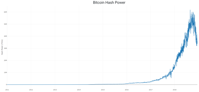
Source: Blockchain.com and author's charts Here's the hash power of the Bitcoin network in linear scale. Not very meaningful, is it? But when we flip the Y-axis to log scale... Source: Blockchain.com and author's charts That's better, isn't it? Look at all the information that we just couldn't see before, like what happened in 2011 and 2014. For the sake of my regular readers, we'll move on from this topic which I feel like I may have beat to death. However, further examination has shown that there may still be some life left in this log-scale horse. So, today we're going to talk about an interesting stat that we can pull from the Bitcoin network, total transactions. What are total transactions? When you hear me talk about total transactions, I'm referring to the running total of all Bitcoin transactions that have ever been transmitted and confirmed on the Bitcoin blockchain. This number cannot go down, because it's a running count. If there are 10 transactions sent per day, then the number grows by tens. If there are thousands, then it grows by thousands. But, if the number stops growing, then Bitcoin is actually dead. Now then, since the total transaction count can tell us if Bitcoin is still alive, and we know that it grows faster as the frequency of transactions increases (and slower if they decrease, of course), I have suggested that there are two novel uses for this piece of data. An inquisitive follower on Twitter noted that since Bitcoin's price has tended to increase over time, you could find a positive correlation with anything else that increases over time: This is true and a valid concern. However, I believe we can do better than simply snapping a trend line on a data set over time. Let me show you what I mean. Source: Blockchain.com and author's charts You've probably seen this chart before. But, there's another thing you may not have noticed. This chart has a Y-axis in log scale, and yet the X-axis is in constant time, which is linear scale. Do you see how the chart seems to curve off to the right? The data is actually following a log curve in log scale. What does this mean? See the chart below for a helpful illustration of this curve. Source: Awe and Wonder via Medium Is there in fact a way to look at the X-axis in log scale? And if there was a way, is it useful or any better? I have good news, there is a way and I think it's very useful for a number of reasons. Do you remember how I said the total transactions could be a proxy for time? Let's put those on the X-axis and the price on the Y-axis, just for kicks. Source: Blockchain.com and author's charts The total transactions here are set to display in log scale, and notice that the chart is now more of a straight line, rather than a logarithmic curve? Now, scroll back up to the price chart that I posted above (the one with the white background) with time as the X-axis. Do you notice something else that's peculiar? I'll give you a hint, the chart gets compressed as you move forward in time. Bitcoin is not just getting bigger, it's getting faster as it grows too. Measuring this in linear scale time forces you to do one of two things, draw a curve like Awe & Wonder has done, or compress time as well if you want to run a linear regression model. I have chosen the latter here, and to check that this relationship is actually stronger, I did a little test. I ran a regression analysis on the log price over linear time, and then compared that to the log price over log total transactions. The results confirmed my suspicions.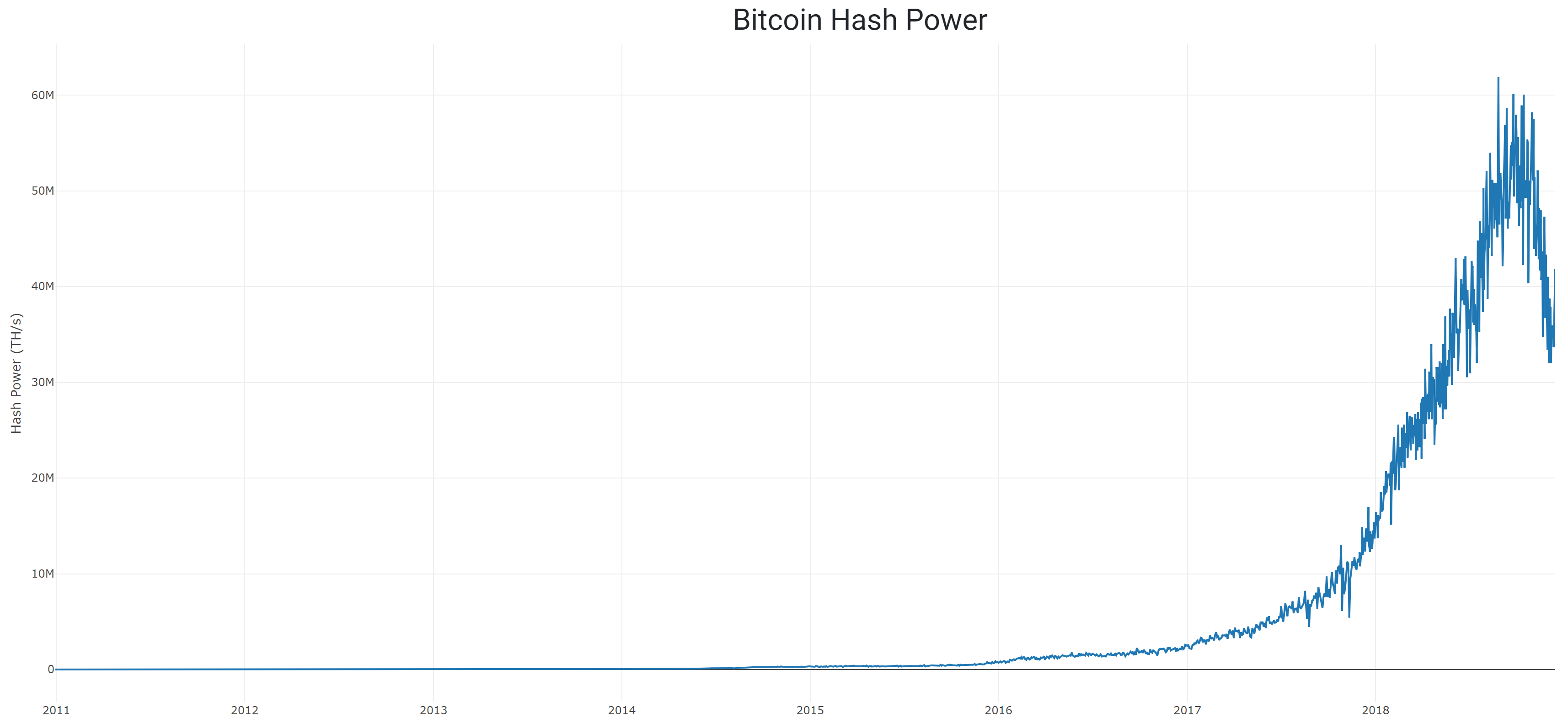
| Log Price / Time | Log Price / Log Transaction Count | |
| R2 | 0.866 | 0.922 |
This may not seem like a huge difference, but if my theory is correct, the log/log relationship will strengthen over time while the log/linear time relationship grows steadily weaker. (You can't very well fit a linear trend line to curved data.)
So, time is speeding up?
Exactly! But this shouldn't really surprise you, since every year we produce more data than the year before, and computers have been increasing in price/performance exponentially for more than 100 years. It's almost like we're being sucked into a technological singularity...
Causation
One of the things that I hear the most is, "your models don't prove causation." Thanks for that. In fact, I can guarantee that someone reading this will post exactly that in the comment section. Yes, for the millionth time, correlation does not imply causation. However, I contend that there is much more subtlety in the world than we realize.
I really liked this chart, so I imported it into my new charting library. When I did that, I noticed several things. See below:
Source: Blockchain.com and author's charts First of all, you may have noticed that there seems to be a giant cluster of points near the bottom right of the graph. Second, you may have noticed that the green and red dots seem to change direction since around the start of 2018. Both these things can be explained by the simple fact that my data set contains points from every 48 hours from 2009 up until 2017. Starting around the end of 2017, I have data points every 24 hours. So, that means there's twice as many points this year, which drags the "tip of the spear" down. For now, I plan to leave this as-is. But, at some point in the future, I may make an adjustment to account for this disparity. The third thing I noticed was that there's no purple in the top left. Why is that? Well, normally my charts don't go back to 2009, because I'm looking at the price, and there simply wasn't one back then. But, that raises a new question. Let's zoom in on the top left quadrant of the chart. Source: Blockchain.com and author's charts I have conveniently placed my mouse over the first point in time where we have a price for Bitcoin (according to blockchain.com). That date was August 18th, 2010. The question I have for you is this: "why did the number of daily transactions, hash power, unique addresses in use, and the running count of all Bitcoin transactions increase between January of 2009, and August of 2010?" It's a simple question. So, what's your answer? The Bitcoin network grew steadily for 20 months before there was a price, why? We've beat the living heck out of the causation horse, haven't we? The growth of the network couldn't possibly drive the price, could it? Stranger things have happened. After all, Metcalfe's Law was used to successfully predict the revenue of Facebook and Tencent. Perhaps the value does come from the network? Source: Journal of Computer Science and Technology, 2015 Have you ever been at a concert, and the musician got the microphone too close to the speakers? What happened? If you've ever had that terrible experience then you know what I'm talking about. The sound coming out of the speakers goes back into the microphone, which goes back into the speakers. No sooner does this happen then that original noise (usually a high pitch squeal) comes back out of the speakers louder than it was the first time. This sound gets louder and louder until someone turns off the sound system, or the microphone gets repositioned, or everyone's heads simultaneously explode. So, what caused the feedback? Was it the microphone or the speaker? If you said "actually, feedback is a system; it's not caused by one or the other, both the speaker, the microphone and a certain combination of settings and positioning are required to create the feedback loop," then you'd be 100% correct! The Zen monks picked up on this ages ago when they asked "does the fish move the water, or does the water move the fish?" Likewise, with Bitcoin, I think the only rational way to understand Bitcoin's price action is as a part of a system. Let's return to the topic of the miners and the price for a moment. The Bitcoin Miner-Price Feedback Loop Source: author's diagrams One of the pillars of Bitcoin's security comes from the huge amount of hash power of the network and the globally distributed mining network. These miners are incentivized to mine Bitcoin and to act in the best interest of the network. As they do this, the system gets more robust, which raises confidence, and attracts more users. Since we know that there are a limited number of Bitcoin that can ever exist, an increase in the user base pushes up the price, which in turn attracts more miners. I hope that I have challenged you to think in new ways about Bitcoin. Is it always proper to think in linear scale time when Bitcoin is a logarithmic phenomenon? Is the Bitcoin price action the cause of the network's growth, and the sole determinant of the hash power? Or, is the price simply a piece of the puzzle that we can come to understand and model by studying and understanding the system itself?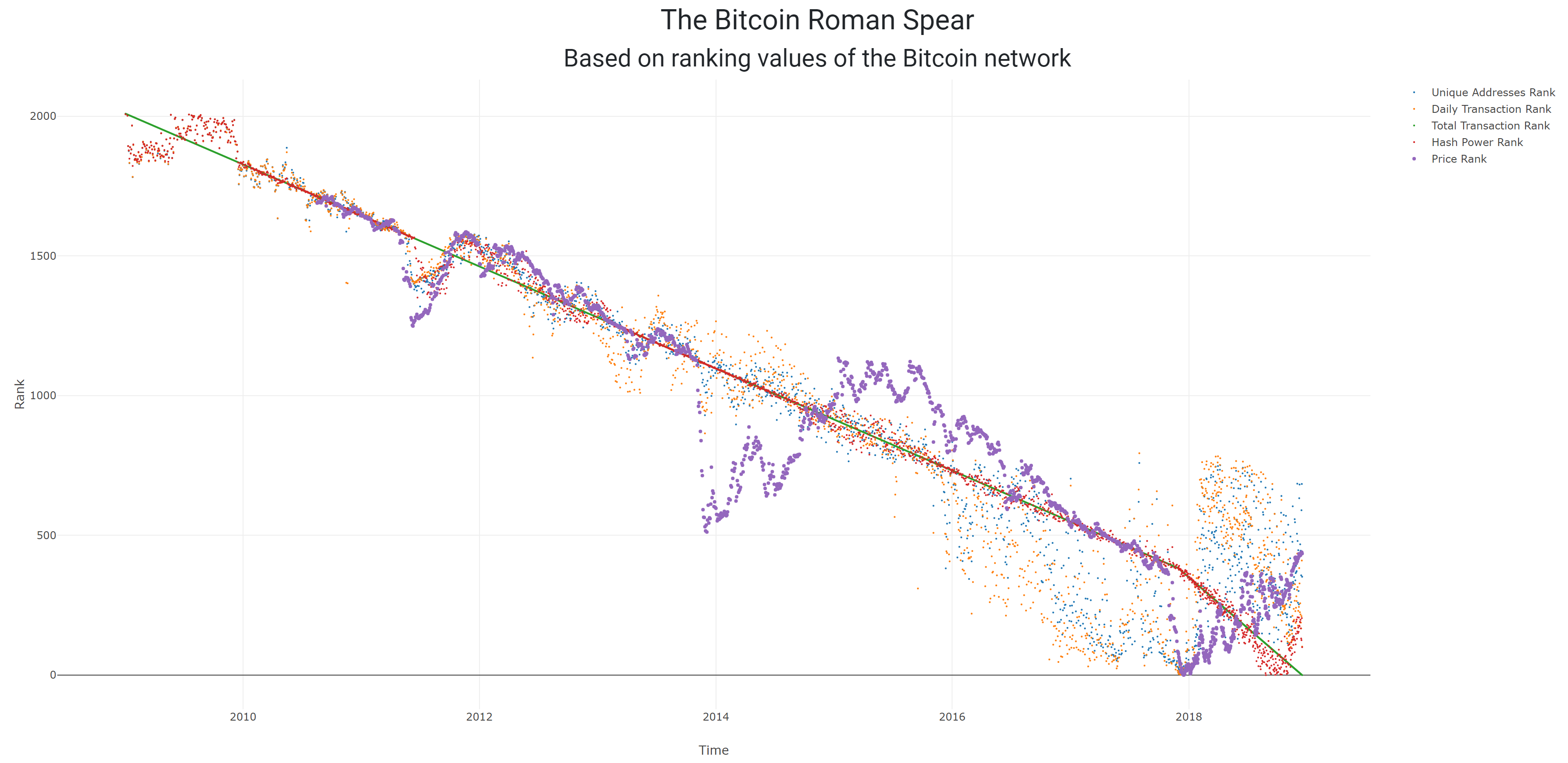
Feedback Loops
Conclusion
Posted from Cryptotreat Cryptotreat : https://cryptotreat.com/bitcoin-time-compression-causation-and-feedback-loops/