Hair of the Vampire That Bit You: More amigurumi experiments
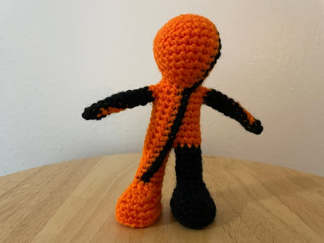
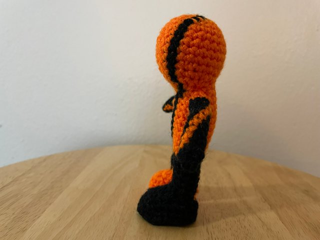
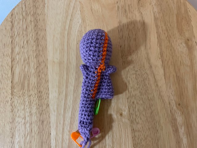
One of the persistent questions I've had in my previous amigurumi figure experiments is how much of the asymmetries I've been seeing are due to the "twist" effect of doing continuous amigurumi rounds, so I decided to do an experiment with a mostly solid-color figure but with the first stitch of each round in a different color so I'd be able to clearly see how things lined up on the final figure. I decided to use my orange yarn as a base, and then since it was October I decided to use black as the contrast color since that's the traditional Halloween combo. I also decided to reverse the colors for the three sections of the pattern that start from joining on.
From viewing the completed figure it looked like the "center" of the head wasn't lined up exactly with the first stitch of each round, but it looked like a constant offset. But the neck looked like it was putting the head out of alignment. So I decided to try another experiment adding an extra stitch into the neck, and that seemed like it was working.
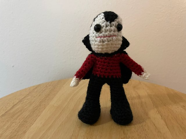
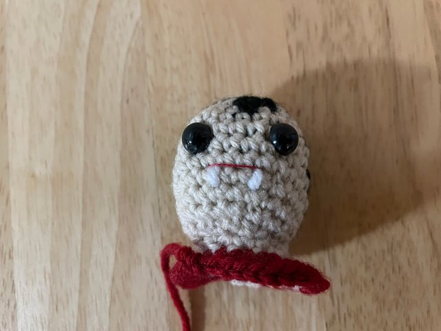
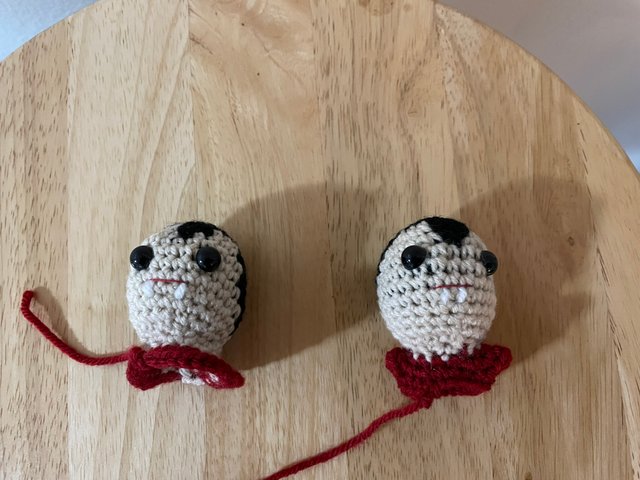
I felt like I had a good handle on how things would line up so I figured I should try another pattern, but one with some more interesting color changes. Having Halloween on my mind and my previous caped superhero figures inspired me think that a vampire character would be a good choice, I could map out color changes for the head to achieve the classic widow's peak hairstyle of a stereotypical vampire. My first attempt seemed to be working OK, but as I was working below the neck I noticed I had the wrong number of stitches and couldn't figure out where I had made a mistake.
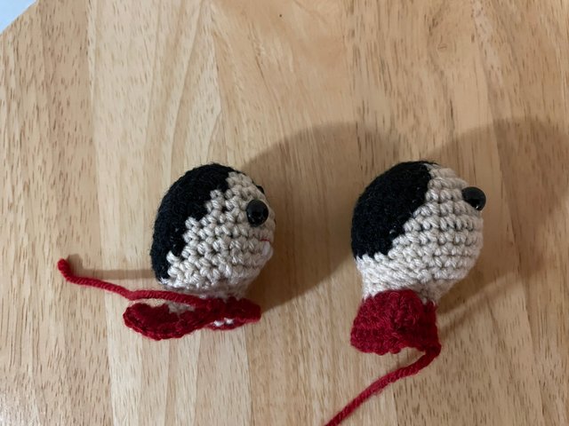
As I was thinking about changes I might want to make when I restarted I noticed that part of the challenge was caused because I was doing both color changes and inserting increases to create the round shape of the head and that was making things complicated. But thinking about increases and color changes at the same time gave me a eureka moment: if I did a decrease in one color right next to an increase in a different color that would give me a half-and-half "diagonal" pixel of color between two solids, which would give me more shape control than having to treat each stitch as a single square pixel.
My second attempt incorporated this idea and I got much nicer looking color transitions between the fleshtone face and the hair.
Unfortunately I made another mistake I couldn't figure out on that one, so I needed to start over again. One of the other issues is that I didn't like how the black yarn I was carrying behind was showing through the tan yarn I was using for the face. The tan yarn is a slightly thinner yarn in a different style from the black, so I decided to try a matching style for the face and see if it would work better. Unfortunately the brand doesn't carry any colors that I think work well as a fleshtone, but vampires are traditionally very pale so I decided to try an "ivory" color. Overall I think it worked out OK, but there is still a little black showing through (probably inevitable due to the extreme contrast between the black and the light tone of the face), and the white fangs don't read super clearly. Also, as I was working on it, I was very frustrated working with the black yarn -- it's so much harder to see what's going on than with lighter colors. I really need to be careful about getting excited about ideas that use a lot of black yarn.
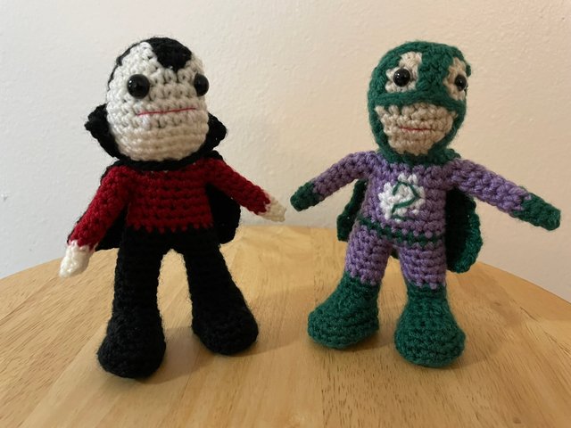
And here he is next to my Superhero 2 figure:
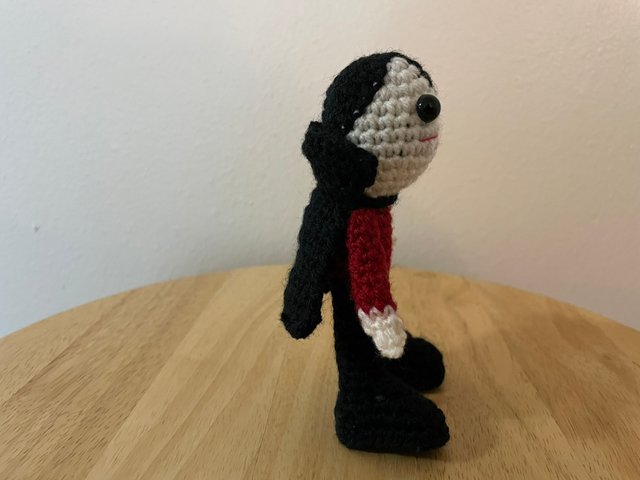
Overall I think it went pretty well. The aggravation with the black yarn slowed things down a bit (it would have been much nicer to have it done by Halloween, but alas that did not happen). I also experimented with some slight changes to how I have the arms and legs connected to the torso, I'm not thrilled with how that turned out (he's a little bow-legged) but it was a useful to learn that. I think the head is also a little off-center over the torso, although it's hidden somewhat by the cape (which I did as a separate piece and squished his head through the neck-hole). I'm most excited by the "diagonal pixel" thing, I think this may have interesting applications for more elaborate color elements than I had previously thought would be possible.
