Coronavirus Analysis (part 2) - Italy, Spain and France - Are the lockdowns working?
Recap of part 1: China
In part 1 of this analysis (https://hive.blog/coronavirus/@miniature-tiger/coronavirus-analysis-part-1-how-long-will-lockdown-last) I looked at the figures from China and the length and impact of their lockdown.
The broad conclusion was that the lockdown was successful with a timeline of the lockdown as follows:
- Lockdown period to peak of new cases: 2 weeks
- Lockdown period to low number of new cases: 5 weeks
- Lockdown period to potential lifting of quarantine: 7 weeks (although many people still sick in hospital at this point)
- Full lockdown in hardest hit areas: 9 weeks
In this post I look at the most heavily affected European countries and compare their lockdown progress to that seen in China.
Italy
In Europe, Italy has been the country most heavily affected by coronavirus so far. Here's the chart of new cases and deaths by date for the country as a whole.
Italy is now into the third week of lockdown. I've highlighted the lockdown date in the x-axis. I've also added the 14 day point, since this is the period of time over which the transmission of the virus should be stopped within a locked-down family unit (at least in the UK, we are told to isolate for 14 days as a family if a family member displays symptoms).
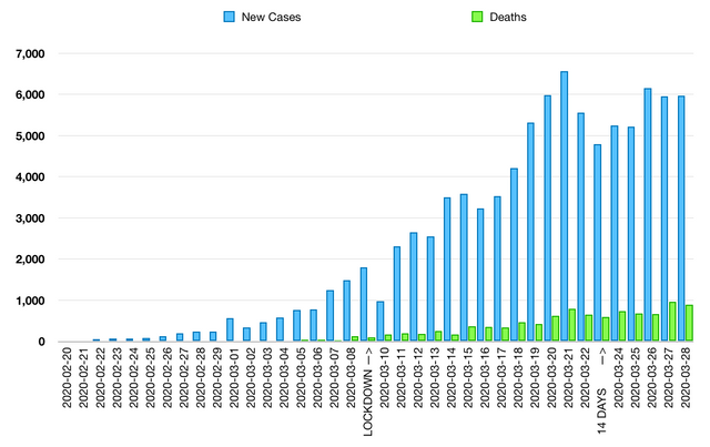
Italy new coronavirus cases and deaths by date
Figures sourced from:
https://en.wikipedia.org/wiki/2020_coronavirus_pandemic_in_Italy
It's not completely clear but, to me, it looks like Italy has reached the peak number of new cases and is potentially starting to descend the other side of the curve.
It's possible that the two peaks here are caused by two populations -Nothern Italy as the initial centre for the spread and a second population caused by people travelling from the north - but the data simply is not granular enough to conclude. It could equally be caused by any number of other reasons.
As we saw in the China analysis, the number of deaths per day (and the number of sick people in hospital) is likely to lag the number of new cases (by a week?) so those numbers could still go up.
Here are the rates at which the total numbers of cases has increased each day:
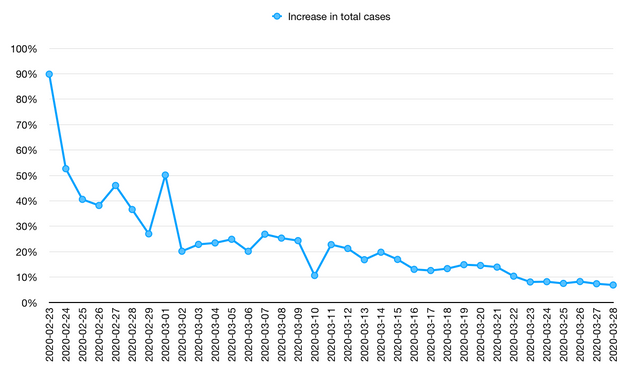
These numbers are trending down. Prior to the quarantine, an increase of 25% of cases per day doubles the total recorded number of cases every 3 days. At the current increase rate of 7% the total recorded number of cases doubles every 10 days. So with recoveries potentially taking 7 days the active number of cases should be coming down.
I'll compare this second chart to the progress of the China lockdown at the end of this post.
Spain
After Italy, Spain is the country in Europe that has been most heavily affected. Here's the chart of new cases and deaths by date for the country as a whole.
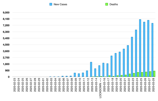
Spain new coronavirus cases and deaths by date
Figures sourced from:
https://en.wikipedia.org/wiki/2020_coronavirus_pandemic_in_Spain
Spain is now at the 14 day point for the lockdown. Only 13 of those days are shown in the chart; today's figures are still moving.
To me, those numbers are clearly flattening. However we will need a few more days of data to be certain of a descending trend.
In the UK, the newspaper subheadlines point out that Spain has seen a record daily increase of coronavirus fatalities in the country today. This is a tragedy, as are all the deaths we see here. But to some extent, this is not news. It is entirely predictable that the number of deaths will increase into the third week of lockdown. I think that the real news is that the new case numbers are flattening and the lockdown could well be working.
France
France has also been heavily affected by the coronavirus, although the numbers currently appear a little smaller than in Italy and Spain. France is at day 13 of lockdown including today. Here is the chart of new cases and deaths by date for the country as a whole.
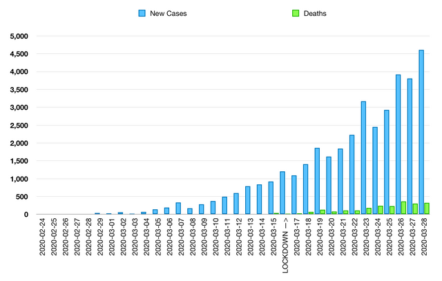
France new coronavirus cases and deaths by date
Figures sourced from:
https://en.wikipedia.org/wiki/2020_coronavirus_pandemic_in_France
It's too early in the lockdown to conclude for France. The pattern of new cases is similar to Italy up to day 12 of lockdown. We will need a few more days of data to see if new cases numbers are going to flatten.
Are the lockdowns working? How do they compare to China?
The China lockdown was successful in stopping the spread of coronavirus. How do the lockdowns in Italy, Spain and France compare?
Here is a chart of the rates at which the total (i.e. cumulative) number of reported cases has increased each day from the start of each country's lockdown (the same line chart that has been shown for Italy above).
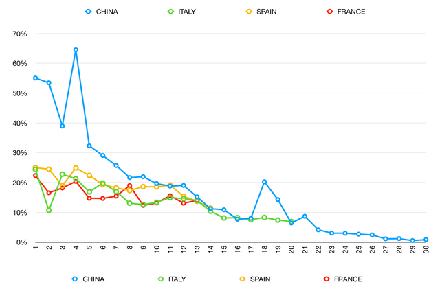
The China numbers start out higher. I think this is because the European countries will have implemented some measures (wash your hands, self-isolate if sick) prior to full lockdown. However after two weeks the numbers are converging around the same point.
To me this is encouraging. In particular the numbers for Italy from day 13 to day 20 mirror those from China, suggesting the lockdown is as effective as that applied in China. For Spain the rate is decreasing nicely towards 10%. For France we will need a few more days of data to see the full picture.
Conclusions
- The lockdowns appear to be working. The number of new cases is flattened in Italy and Spain, although we will need to watch the next week to check that there is a reducing trend. For France we will need a few more days of data to know if the numbers are flattening.
- The number of deaths will keep going up into the third week of lockdown. That is to be expected and does not mean that the outbreak is getting worse.
- The lockdown in Italy appears to mirror corresponding numbers from China over the last week in terms of the rates of total case increase. This suggests that the lockdown timeline for China (5 weeks to a low number of new cases, 7 weeks to potential lifting / lightening of quarantine) could hold.
In part 3 I'll take a look at Germany and explain why everyone else should be too.