150 SBD Bounty: We need a logo for a Wing Tsun martial arts school.
 | 
|
For quite some time, with a break of several years, I am a student of the quite known martial art of Wing Tsun. After my latest success with the logo for @steembay and the winner of the contest @industrialvarez , I heard, that my Sifu is struggeling getting a good new logo for his school. So here we go...
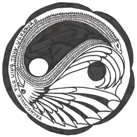
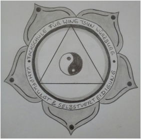
The above shown images are some raw drawings how it COULD be.
There are some requirements to the logo:
clean and clear design:
the logo will be placed on shirts, the homepage and certificates and thus has to work on a white, black and red background with white, red and yellow accent to it.
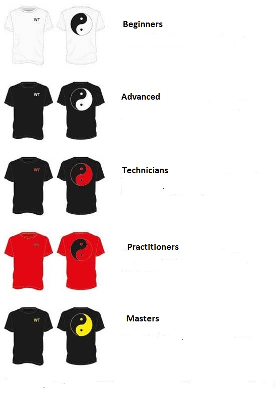
this pic may give you an impression...the logo has to work with and without the needed text which is:
Fachschule für Wing Tsun Würzburg Kampfkunst & Selbstverteidigung
- It has to include Wing Tsun Elements:
Examples: triangle, ying & yang or the plum blossom. Additionally it could include a snake and the crane
The triangle represents the working with angles in WT
The plum blossom stands for the footwork
The Ying & Yang symbolizes the balance between soft and hard reactions to an attack.
Most of the WT moves derive from the martial arts reffering to the snake and the crane zodiacs.
 | 
|
Note for the crane/snake version :
Using the crane and the snake quickly gets much too detailed, which isn't desirable, as you can see here:
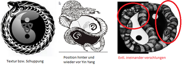
This may give you an impression what works and what doesn't. It's important, that both animals occopie the same space.
On the following images you can see what we came up with, so far, by reducing the animals to their textures (feathers and scales:)
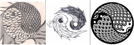

Note for the traditional version:
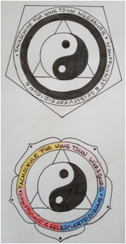
This tends to be too much information and quickly gets overloaded, which is again not desirable. Even adjusting the proportions of our first version does't feel right...
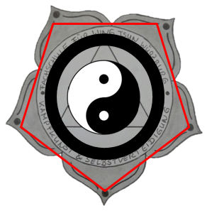 | 
|
Important:
I don't want to earn anything with this post, thus I am giving away the rewards to any ideas that bring us closer to a new logo. I will choose those at my will (or the will of my Sifu). So ANY idea is welcome!
The bounty will go to the person or group, that manages to create us THE new logo and is able to deliver it in .ai or .eps format.
GET CREATIVE!!!
Please consider resteeming, for we need as many ideas and as many good designers as possible!
Ich habe hier mal einen Versuch den ich als Vektrografik gemacht habe.
Dies ist ein genaues Abbild von deinem Wunschbild.
This is on google, i have see it is not original work.
Hi @pollux.one, i will push my luck on my idea. feel free to view it .
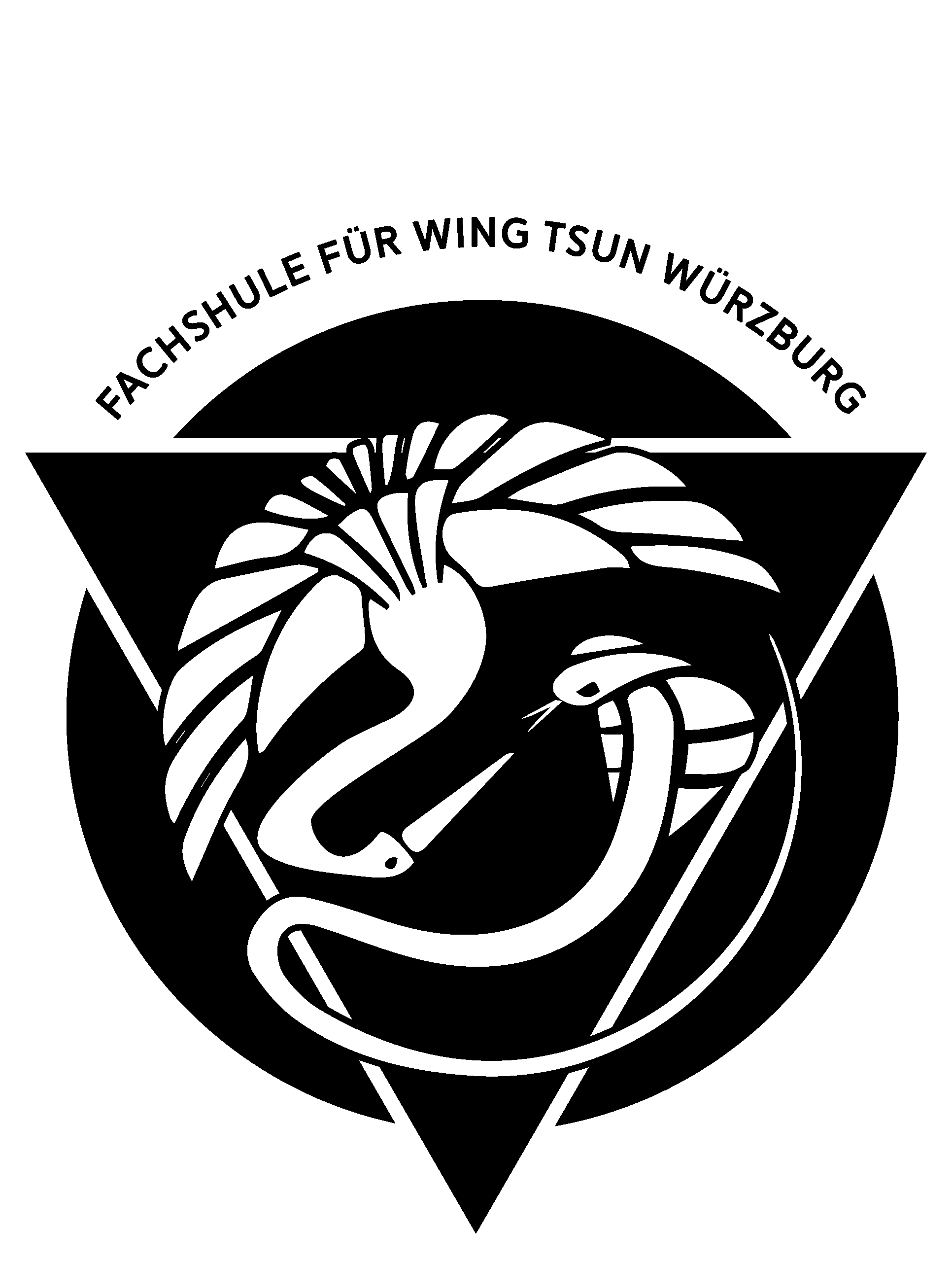
https://steemit.com/design/@roldamn/design-logo-for-wing-tsun-martial-school
Thanks! :)
I like it very much... let's see what my sifu will say about it!
Thanks man @pollux.one , if its approved i could give you the ai right away :)
The hardest part is to solve the crane and snake in the yin yang - this is my solution:
With some different designs:
I would normally charge about 1200-1400 € for a finished vector file, but feel free to use the ideas.
I totally love these ones... can't wait to present them to my Sifu!
(we are getting close with the recent SBD price ;-) )
Haha, OK - SBD the not so pegged currency after all. We'll talk about it if the street warriors fancy my idea.
Here is my entry idea.
Cleaner version
I’ll be submitting one as well, cool project.
I trained many years tae-kwon-do, but now let me share with you my interpretation. (Still work in progress)
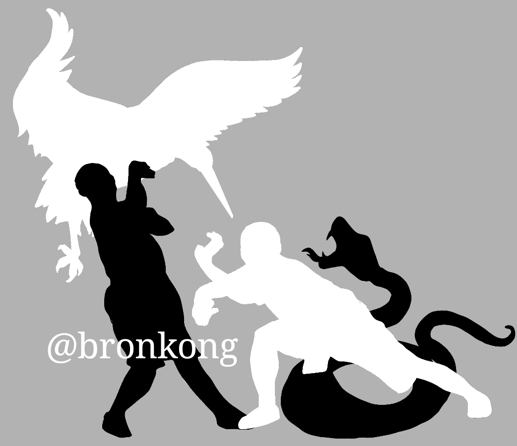
Background and my name will be removed when im finished the illustration.
I tryed to illustrate the fight of the crane and the snake, but also using black and white, you can see the human fighting with the animal.
Edit:
Kannst mir gerne Feedback geben, was dir gefällt und was nicht, bzw was du noch gerne in der illustration hättest. Ansonsten mache ich noch ein paar Entwürfe fertig und optimiere sie für die schwarzen und weißen T-Shirts.
Neue transparente Variante mit Ying Yang Symbol.
Auf grauem Hintergrung, um es besser sehen zu können.
Hab mich mal an einer anderen Version versucht, du meintest irgendwo in den Kommentaren, dass es dir persönlich in diese Richtung besser gefällt. Kannst ja mal deinen Senf dazugeben ;)
hm... schon cool. Der Kranich ist aber sehr detailliert im Vergleich zur Schlange und leider verschwindet der Kopf komplett im Schwarz. Kann nicht mehr dazu sagen, ist nur ein Bauchgefühl. Letztendlich muss es dem Sifu gefallen...
Saludos! este es mi idea, para el logo.

Update Nummer 3: