Comic Update & Some Progress Pics
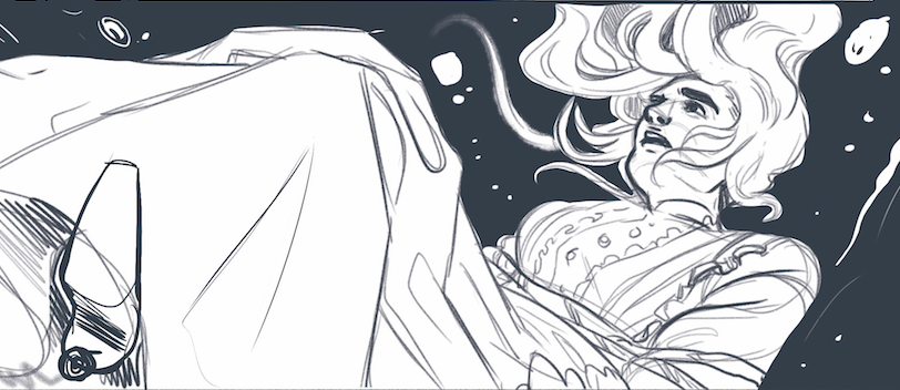
Bear with me as I try to form intelligible sentences after my brain has been fried from a long day's worth of work. But it's been a hot second since I last made a post, so I thought I'd share a little update about one of my personal projects I've set out to do.
I mentioned in this post that I was working on another (ugh, I know, even I'm rolling my eyes) comic set in the mid-late 19th century. The story follows a house servant as she uses the spiritualist movement to break free of the societal expectations of the time...or at least she tries to.
Thumbnails
For those of you who read my other post, you'll have already seen these thumbnails. I wanted to share them again just so you can see how a page can evolve through the various steps.
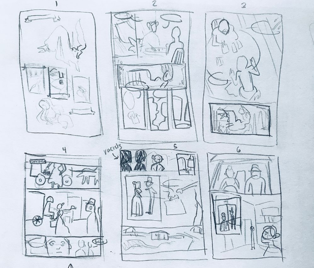
Page 1
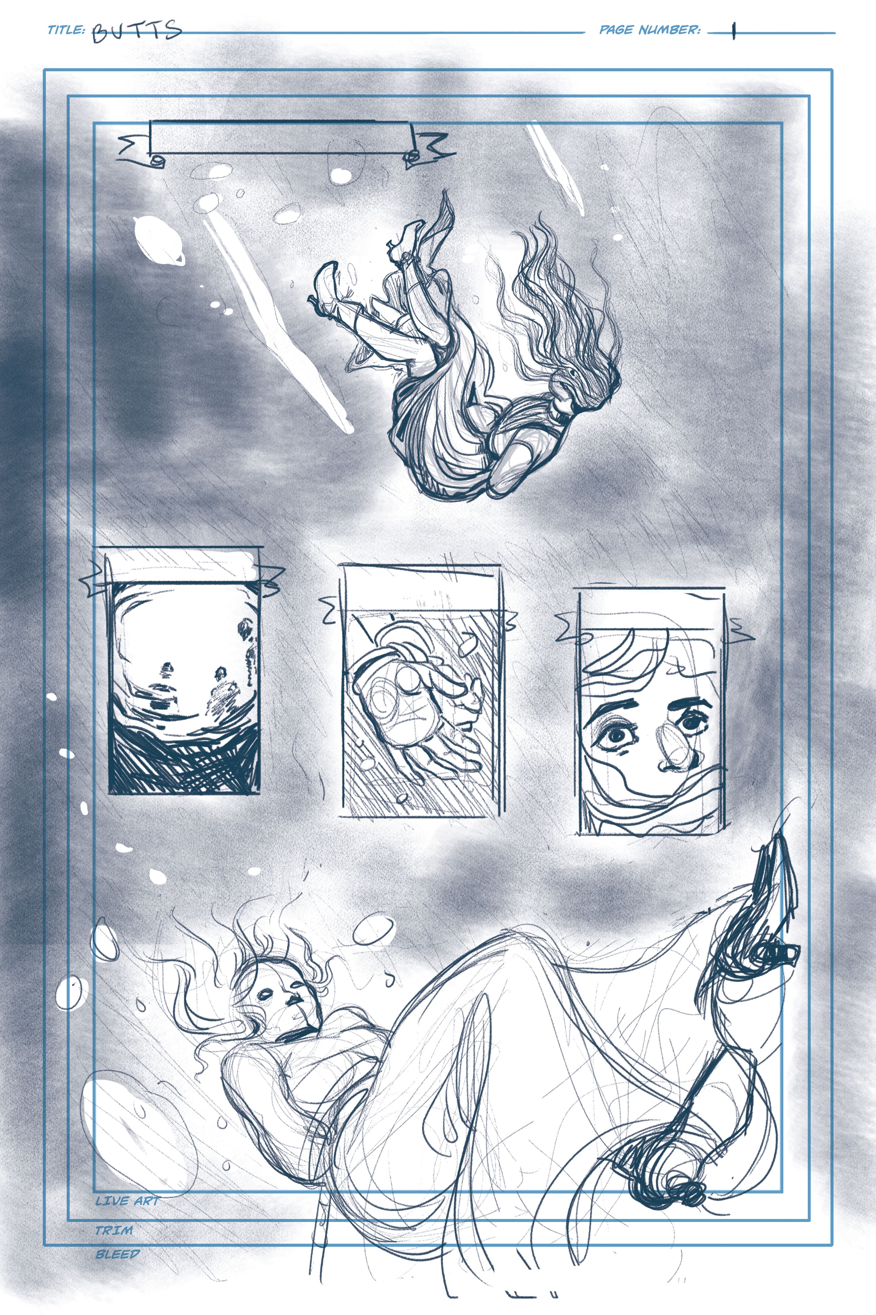
This was my first go at page 1; I wasn't very happy with it. I wanted a lot of empty space around the figure in the first panel but I had to make room for the other elements of the page. Everything felt like it was fighting for attention and the flow wasn't quite working. Her body sinking towards the fourth panel could lead viewers astray as to which panel to read next.
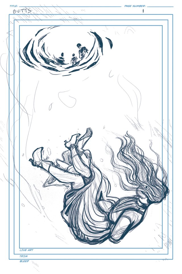
For round 2, I decided that the three panels in the middle weren't really crucial to the story so I took them out and just stuck with the two elements of the body floating down and the figures staring down at her from the surface of the water.
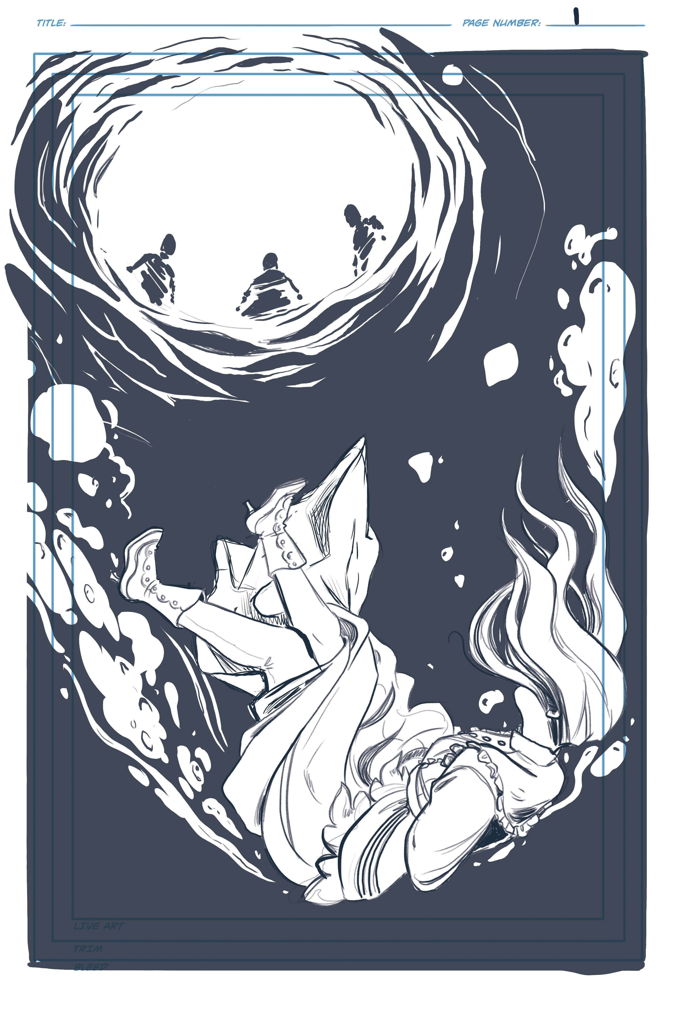
This is where the page is at right now. I've tightened up the sketch and filled in the background with what will be black in the finished stage.
Page 2
While the first page is a good example of how things can change drastically from thumbnails to roughs, page 2 pretty much stays the same.
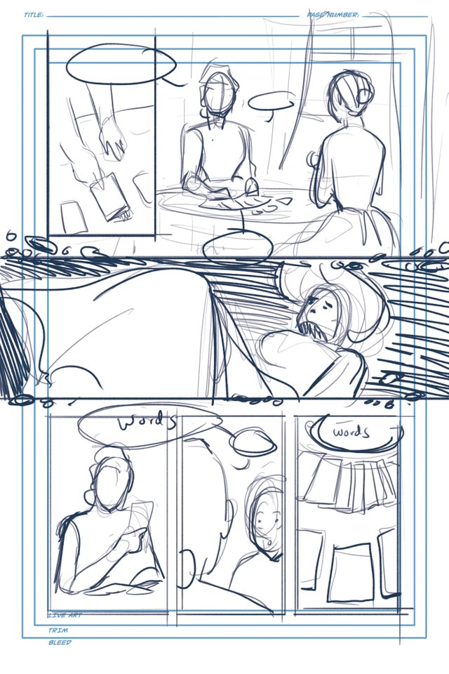
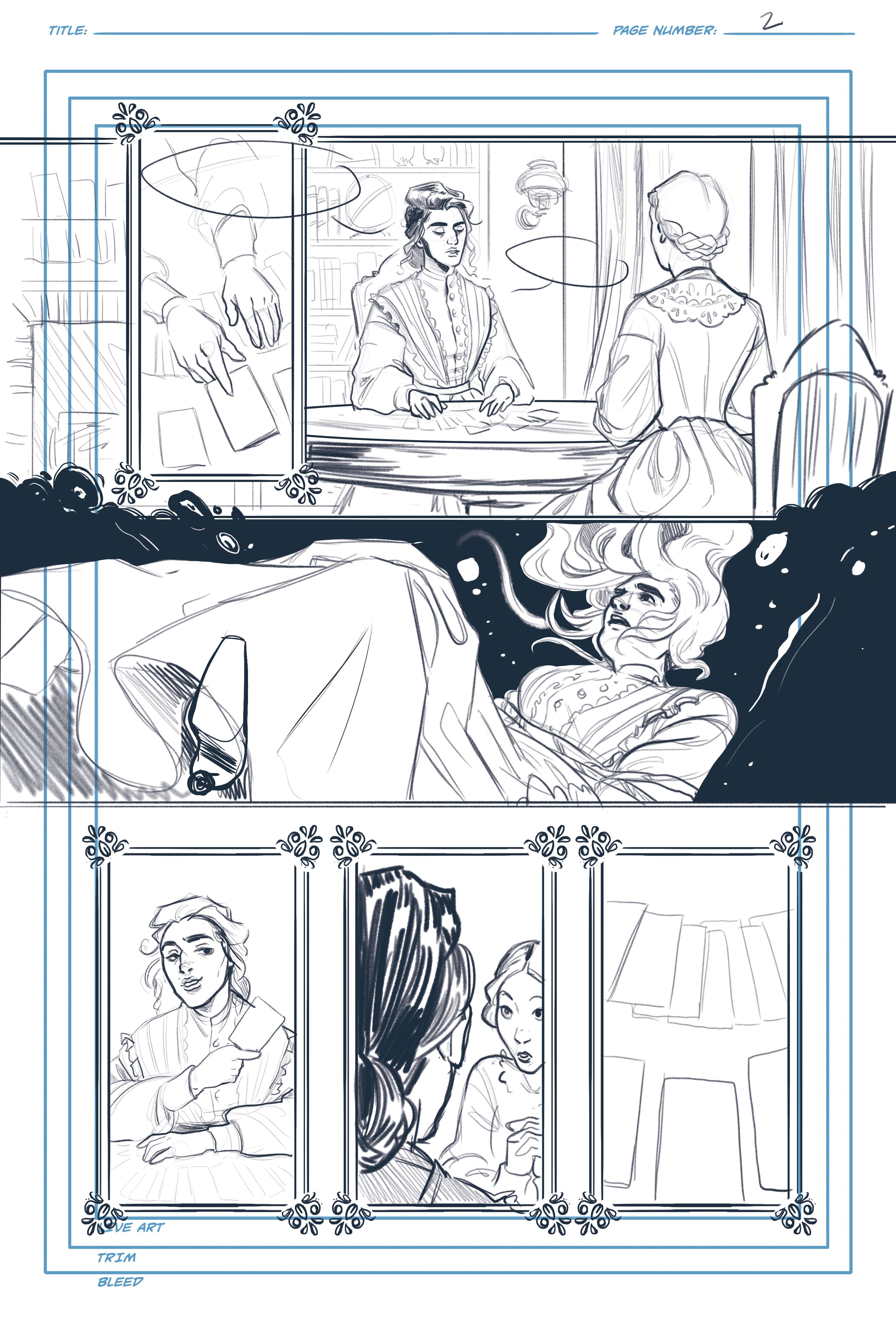
This a tighter sketch; you'll notice I've got some fancy borders going on. The story is going to be told out of order, which easy enough to do in TV shows or books but quite tricky to pull off in comics without obvious title cards. So the panels will be playing a key part in distinguishing the different parts of the timeline. The panel borders will virtually be their own character.
That's all for now
I do have one more page ready to share but that was SUCH a struggle that I'll talk about that in another post. Thanks for reading!
If you'd like to keep up with more of my work you can check me out at the following:
Instagram: @la.fumettista
Tumblr: http://la-fumettista.tumblr.com/tagged/art
Twitter: @TheresaChiechi
Website: https://www.theresachiechi.com/
I’d definitely be interested in reading this story! Wow, I freaking love seeing how your first page evolved. I’ll have to keep an eye out for the updates to this.
Awww thank you so much :')
Wow, these drawings are absolutely amazing- can't imagine doing these, visualizing concepts and the details as well. Keep up the good work. -
Thanks so much!
for this one you gain a new follower, true art it's forms a great story.
The pages are looking great. I love the panel borders delineating different times/places. Comics are an interesting art in that the more you learn, the slower you produce at times! Every new layer & nuance of page layout and storytelling just makes it a more difficult (but more rewarding) puzzle to solve.
It's definitely a labor of love. But it is really exciting and rewarding when you are able to get what's in your head onto paper. Thanks for the feedback!
@OriginalWorks
very nice
Wow nice work. This just blew my mind right now. You are indeed talented @la-funmettista
Thank you for the feedback :)