Graphic creations - Poker table skins
Good evening, steemians!
For this new post, I've decided to present you one of the facets I mentioned in my presentation, that is to say my passion for graphic design while staying within the theme of my last post about CoinPoker.
In fact, as part of their Bounty Program, they decided to organize a competition to create poker table skins for their application in order to involve the community and advertise, and with the possibility of winning up to 4 ETH for the best and a little less for the next few.
You will easily understand that being already a fan of their poker platform and passionate about graphics, I couldn't miss this opportunity.
The contest takes place in 4 weeks on facebook (unfortunately), the first 3 weeks the 3 creations with the most votes (you should have understood the unfortunately here) win a prize and their place for the final of the fourth week.
We are currently in week 3 but I will present you all the creations that I submitted since the beginning.
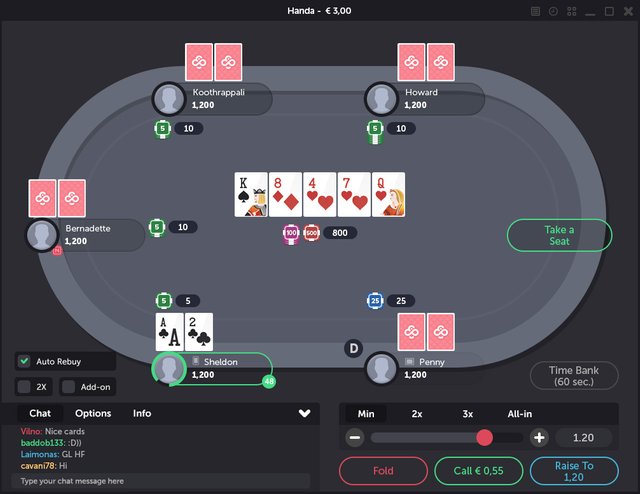
But before we start, here is the basic interface of the game:
Week 1: Very keen to participate, but not too much inspiration
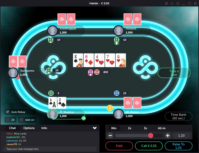
Personally when it comes to changing the interface of a software or app, I've always preferred sober and restful creations for the eyes, but with my job and years, I've often noticed that most people prefer what pops, what throws away, with colors.... so I start on the first theme that comes to mind because of the general shapes of the basic interface, Tron!
The ingredients will be, colors, blue and dark grey, neon effect and grid in the background and addition of the CoinPoker logo in reference! Simple and quick to do, it will take the temperature of the competition.
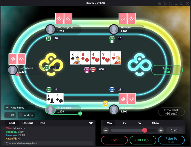
I had also made a nice vs. bad version with 2 colors, but I didn't submit it, thinking that I could only submit one creation per week:
Unfortunately, I didn't get enough votes to be on the podium that week, and that's when I realized that the number of facebook friends was just as important if not more important than the quality of his creations in this kind of competition.
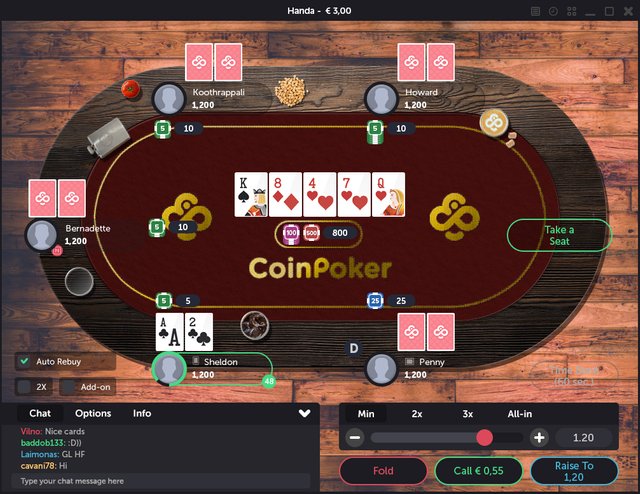
Week 2: I want to start on the theme of poker origin, old Western saloon atmosphere!
The ingredients will be, old dirty parquet flooring, wooden table, cloth carpet, embroidered logo and accessories placed on the table (in the beginning I was gone on the fact of putting weapons, bottles of alcohol... but the rules of the contest did not allow it so I made soft).
A few neat little details, like the CoinPoker logo drawn in the coffee moss, unfortunately again, it wasn't enough to get me up on the podium, especially since the CoinPoker team forgot to publish my creation on the day before and it didn't happen until the next day.
Week 3: This time I will create the skin I could use to play with personnaly.
And so if you have read the beginning of this article, you will know that it is going to be a sober skin, beautiful, detailed but sober so as not to tire the eyes and allow the player to concentrate on the essential, that is, the game, I declined this creation in 3 versions of different colors (3 levels of sobriety let's say we will).
Glossy white & light blue:
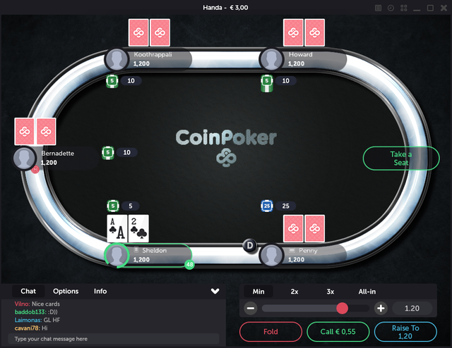
Glossy & dark purple:
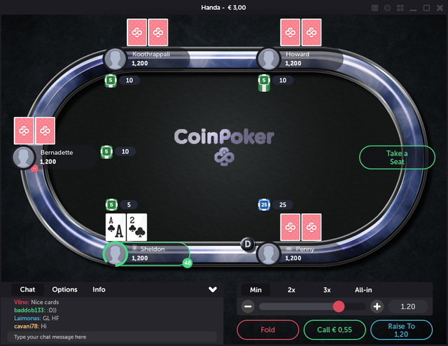
Smoky black:
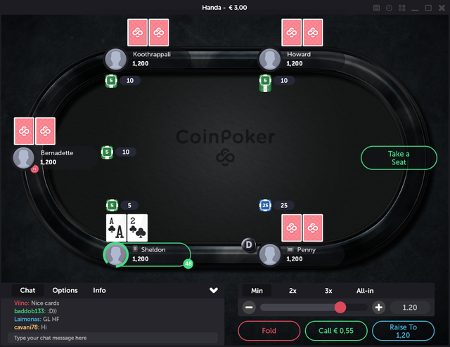
Here, I'm curious to know what you think about it, I hope you like it and if so, you can support me by voting here (with a like facebook) for my last 3 skins still in competition this week, I would be very grateful! You will also be able to see what the other participants have proposed in order to compare, there are some very beautiful achievements this week.
Cool! I follow you.
Hey are you still around? Want to make some poker table skins for us?
Congratulations @nabesteban! You received a personal award!
Click here to view your Board of Honor
Do not miss the last post from @steemitboard:
Congratulations @nabesteban! You received a personal award!
You can view your badges on your Steem Board and compare to others on the Steem Ranking
Vote for @Steemitboard as a witness to get one more award and increased upvotes!