Tutorial Series - Formatting Great Layout of your Steemit blog Posts
Hello again Steemians,
My last post "Top 7 Reasons to Love Steemit" is very much liked by the my fiends and followers here on Steemit. They liked the content so much apart from that they admired the formatting style of it. I am flattered to see that response.
I am being asked to post a tutorial in this regard. So here it is. I am sure you will love this one too.
The Editor of Choice
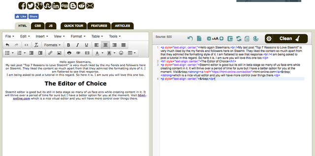
Steemit editor is good but its still in beta stage so many of us face errs while creating content in it. It will thrive over a period of time for sure but I have a better option for you at the moment. Visit html-online.com which is a nice vitual editor and you will have more control over things there.
Why Formatting is inevitable ?
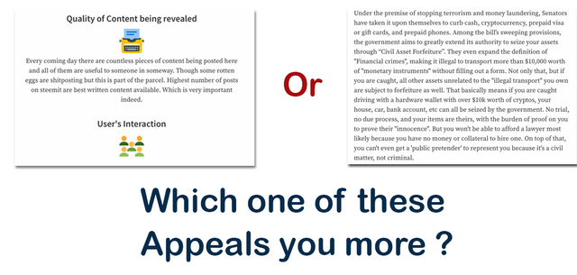
It looks interesting when you visually appeal toward you content. Visuals got more attraction and you must keep this in mind that your reader/follower is most likely to interact/upvote/resteem after consuming a post with nice visual appeal. Following are two images first one I took from a post on steemit and 2nd one is of my own post. Just see which one is appealing to you ?
Where to find stunning Icons ?
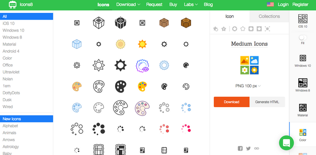
There are many free icon stores you can get icons from but I found icons8 simply amazing. You must check it out. Just go to the icons8.com and search your keyword you want icons for. You see results select one, choose 100 pixals setting and download it. Use it and don't forget the most important thing that you have to mention icons8 as a source of your icons in your post everytime.
Top Things to remember when formatting your post.
- Make it personal when you create images or screenshpts.
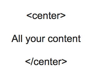
- Keep your content in the center setting, Just put center tag in the start and closing center tag at the very end. Just like this one here

Thanks for the helpful post. I learned some new tricks.
Awesome to hear that @whistlejacket, As you have liked it please share by resteeming and upvote. Do follow for future posts @shawshank
Thanks
Great quick guide! As a new steem user I loved the simple interface when I published my first entry earlier, but as I browsed I started to notice all those nifty layouts and icons people were using and wondering how it was done.
@ilyastarar here comes to tutorial. Might have missed something. Please mention and I will update.
Thanks for the support.
very helpful, thanks!
Thanks @cryptokash for liking it. Share it with your followers and don't forget to check my blog @shawshank
Cheers
I will..
This is perfection! Not once did I ever think about formatting. But I'll look more into it. Nice work!
Your words are worth alot to me. Awesomeness of Steemit.
Thanks for liking my work.
Both of the tools, (icons8 & online html editor) are great! I didn't know about any of these before! :P Thanks for sharing your personal favorites! (Y)
That's why I shared, friends like you can be benefited. Do share with others.
Cheers