A beginners guide to trading on Crypto exchanges Part 1 (read candle sticks)
Hi All,
I haven't been long in the crypto field. But i do know that it is a difficult start.
I had no experience trading or reading charts or whatsoever .
I response to this I decided to start a howto series on trading on Crypto Exchange.
The first part will show you how to read the candle sticks on a basic chart.
When you go to www.poloniex.com (for ex) you are greeted with the following page:
Just click on the exchange button on the top left to go to one of the Coins.
Let's take DASH for example. To select this currency you can go the right of the page and fill-in DASH.
Ok so far so good.
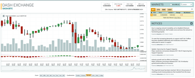
The first thing you should notice is the bar on the bottom.
It currently has 30 minutes selected for the candlesticks.
This means that every candlestick represents 30 minutes!
Now we move on to explaining the green and the red candlesticks.
The green candlestick indicates that the price has increased in the timeframe that is selected. (in this case 30 minutes)
If you look at the first green candlestick you can see a fat part and you see lines expanding on the top and bottom.
The bottom of the fat candle stick is the STARTING price of the defined period.
So in this case the start price of DASH during this timeframe was around 0.0697
The top of the fat candle stick is the CLOSING price of the defined period.
In this case it was around 0.0702
Let's now discuss the needles on the top and bottom of this first green candle bar.
The bottom line indicates the LOWEST price in this 30 minute timeframe.
In this case it was around 0.0696
The top line above the fat candle stick indicates the HIGHEST price in this 30 minutes timeframe.
This was around 0.0705
Let us now discuss the Red candles.
In the above screen we see a transition of a green candle to a red one.
The red one indicates a drop of price during the timeframe of the candle (30 minutes)
The top of the Fat red candle stick indicates the STARTING price.
The bottom of the Fat red candle stick indicates the CLOSING price.
Just as with the green candles the lines represent the LOWEST and HIGHEST price during those 30 minutes.
So far the first howto introduction.
I'll add this section on a regular basis with new information on how to interpret the graphs of all pairs.
I will explain you things like bolinger band, ema, and so on.
I hope you learned something from this :)
See you soon.


Hi! I am a robot. I just upvoted you! I found similar content that readers might be interested in:
https://www.thebalance.com/how-to-read-a-candlestick-chart-1031115
Thank you for the lesson.
Very clear article and easy to understand.. tnx a bunch...
Hi, when can we expect the next part? looking forward to it ;)
Very useful. I always thought this is one of the least intuitive ways to display data.
Poloniex is not an ideal platform for beginners, but once you get the gist it's a great option.
My suggestion for beginners: Switchain for exchanging and Bitdeck for checking the trends for each coin.