#BASICS GRAPHIC DESIGN: grids for character design
Hi Steemians, Nicole aka @thepaperplane here.
I'm here again with the follow up post about grids. In the latest one, which you can see again here.
Grids are a way of organizing yourself, but to popular belief they are not only used for informational purposes, but are utilized to create illustrations, typography, posters aaaand characters!
My main focus on this post will be
#GRIDS FOR CHARACTER DESIGN
Last week I was talking with my fellow designer friends about learning the basics of motion graphics, so I could make them a video for Instagram stories (to make people laugh, not even for a commercial purpose). I had decided I was going to illustrate my friend, and make her walk from one side of her phone to another, and then come back and wave. Very simple, indeed. But of course, first I had to design her character to represent her in the best ways. I succeeded, and ended up doing portraits of them, even me!
Now, as I’m writing this post, I realized I never got to introduce myself properly, because I didn’t want a picture of myself to be running around the internet. But now that I have made my own portrait, what a better way to show myself than that!
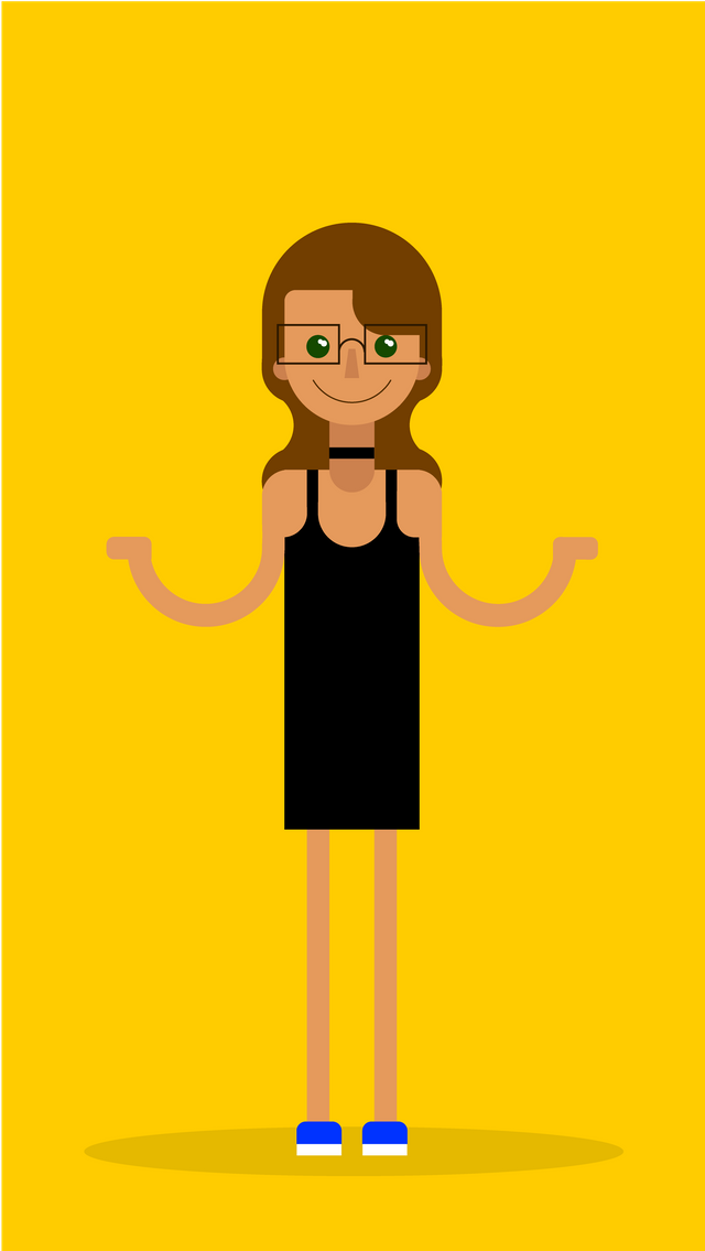
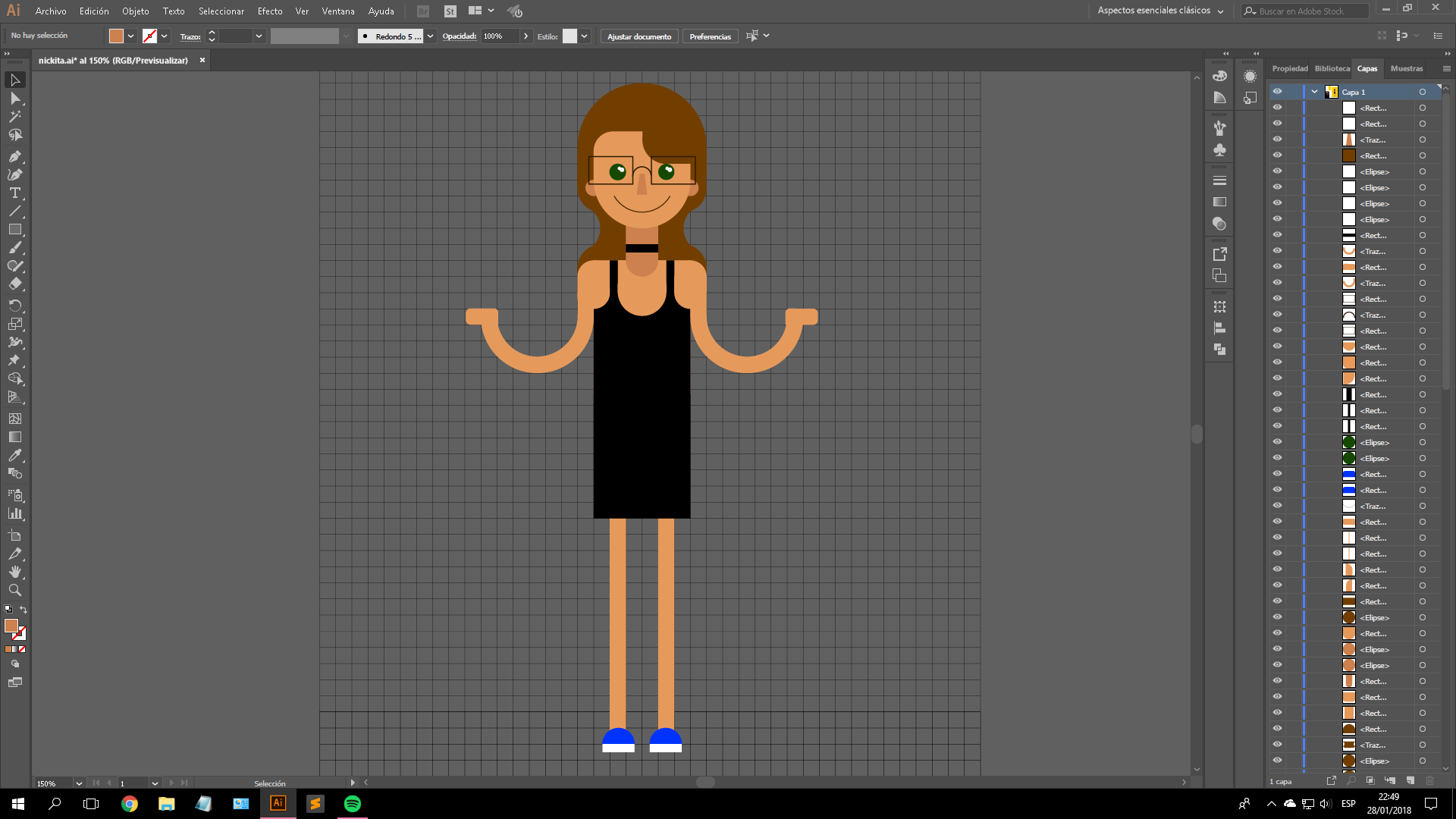
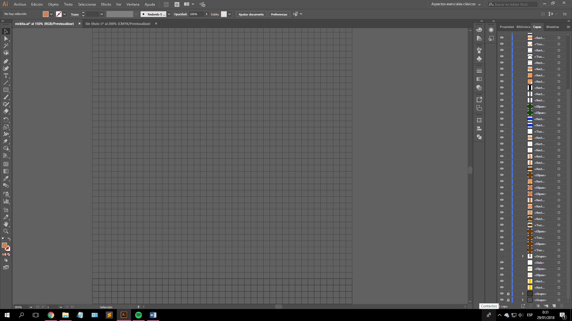
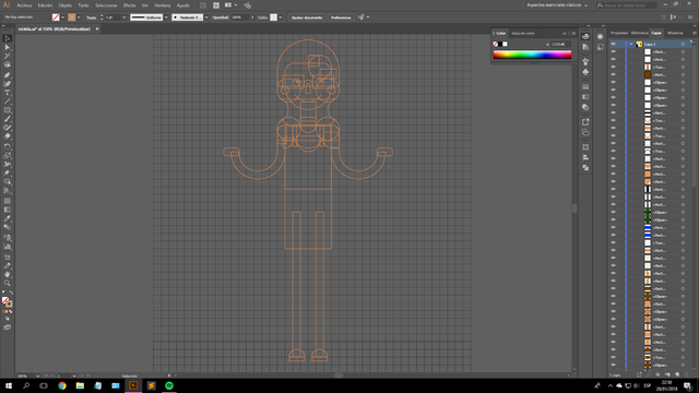
This illustration was made with rectangles and circles on illustrator, using a cuadricular grid to start with. Adobe Illustrator is great, because it provides a tool to create your own grid (I made my own with 40 divisions both vertical and horizontally.
Then I started constructing the illustration using basic shapes such as circles, squares and rectangles to construct the basic shape before filling it up with plain colors.
As you can see, the circles are always contained between divisions, they never surpass them. It gets a bit messy because doing the hair and the way the shirt is made complicated things haha. Luckily, the finished product looks great, and I swear, is like a carbon copy of me ;) without the shades… and curves, and everything haha.
To finalize this, I made myself a yellow backdrop and tadaaa!
This one was made to fit the Instagram stories size, so me and my friends could write something above the hands.
Everybody loved the final result! They had so much fun, sent us laughing emojis reactions and congratulated us for the accuracy on the clothes.
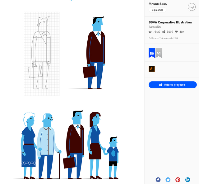
Designing a character within a grid is the easiest way of starting and moving up in the scale. This portrairt is just one of the ways to design a character.
Here is an amazing example by Mauco Sosa
.png)
.png)
.png)
Congratulations! This post has been upvoted from the communal account, @minnowsupport, by thepaperplane from the Minnow Support Project. It's a witness project run by aggroed, ausbitbank, teamsteem, theprophet0, someguy123, neoxian, followbtcnews, and netuoso. The goal is to help Steemit grow by supporting Minnows. Please find us at the Peace, Abundance, and Liberty Network (PALnet) Discord Channel. It's a completely public and open space to all members of the Steemit community who voluntarily choose to be there.
If you would like to delegate to the Minnow Support Project you can do so by clicking on the following links: 50SP, 100SP, 250SP, 500SP, 1000SP, 5000SP.
Be sure to leave at least 50SP undelegated on your account.
Wow, so much useful information in this post.
Haha, this I gotta see! Anyways, thanks for sharing the process that goes behind creating yourself. Haha, and I love flat designs.
I guess for a beginner like me, I can surely use your guideline her to start. Thank you for showing the process. :)
Good job, I would like to learn how to use Adobe Illustrator
Thanks for sharing. This really helped
Nice post! I will follow you from now on.
Congratulations @thepaperplane! You received a personal award!
Click here to view your Board of Honor
Congratulations @thepaperplane! You received a personal award!
You can view your badges on your Steem Board and compare to others on the Steem Ranking
Vote for @Steemitboard as a witness to get one more award and increased upvotes!