#BASIC GRAPHIC DESIGN: GRIDS
Hi Steemians, Nicole aka @thepaperplane here.
As you should know, I’m studying graphic design in my local collage. Through the years I have come to understand thanks to the great amount of work my teachers have put me through haha, that we designers have a few “tricks” up our sleeve, for making our designs stand out, be beautifully harmonized and work, providing the solutions to the problems our clients ask us to solve.
That’s why I thought of bringing this knowledge to you, maybe you’re thinking of pursuing a career in design (it could be anything, from graphic, fashion, architecture to industrial or web) or would like to know how a few of our basics to start making beautiful designs.
#GRIDS FOR INFORMATIONAL PURPOSES
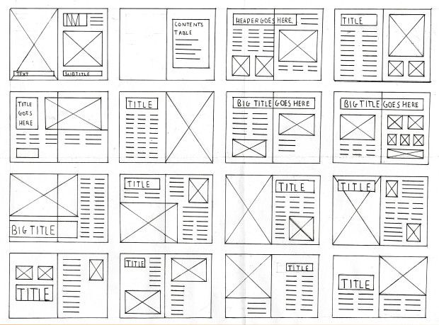
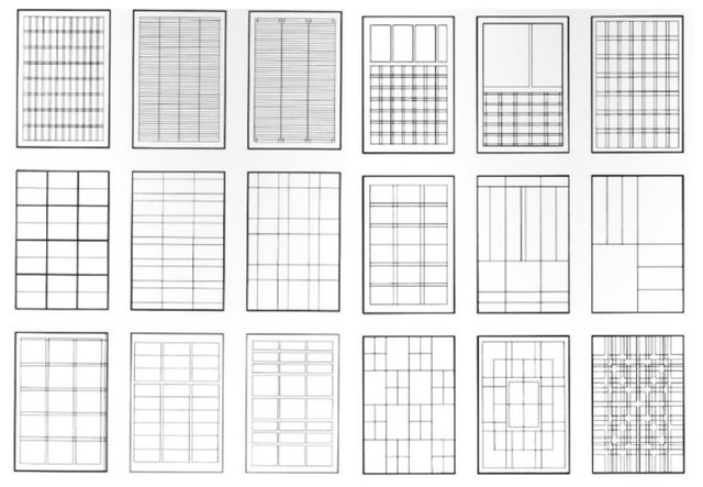
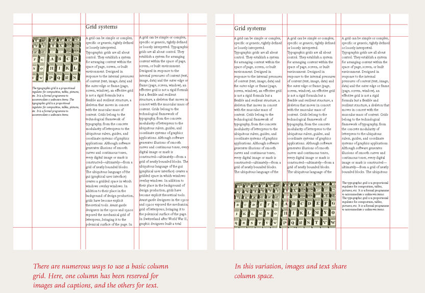
The grids are layouts that provide structure, order and harmony to our information. It helps us make the reader go where we want them to go, we direct their attention from a specific point on a page to another, without making it too confusing. When people get confused, or don’t really get where you are trying to lead them, that’s when you know your design has failed, more so if you are making information design.
Source
There are a lot of ways you can design your own grid, but among the most popular are the ones using:
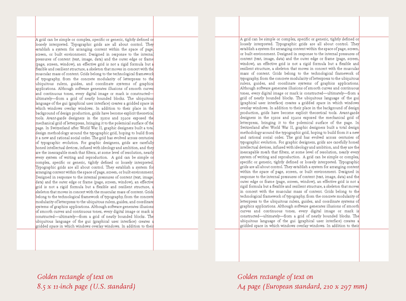
The golden ratio
“In mathematics, two quantities are in the golden ratio if their ratio is the same as the ratio of their sum to the larger of the two quantities.” -Wikipedia
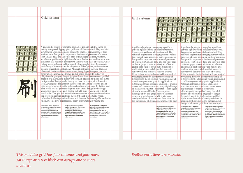
Modular grid
It means that the same module repeats itself without changing its shape. It ALWAYS stays the same
Coulumn grid
These are the most common; they vary from one to infinite quantity. The more columns you add, the more dynamic and flexible your grid becomes. You may remember seeing this kind of grid being used on newspapers or magazines
The magazines that are on your coffee table, or the printed newspaper you used to read on the morning during breakfast is also designed with the help of a grid. How on earth then would that pages inside a magazine, beautifully organized in identical rows and with a picture that is just the right size be made?
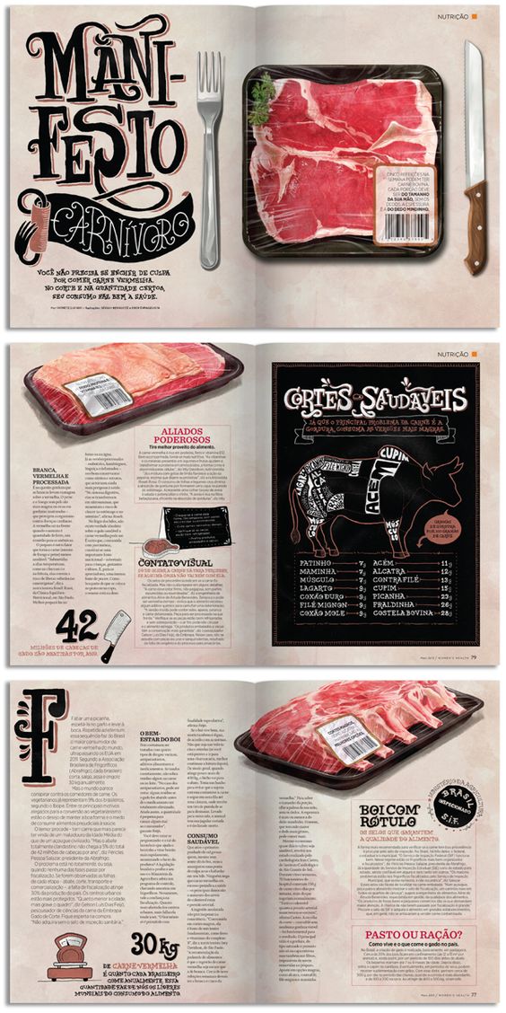
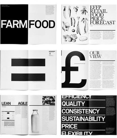
Grids are not only used on printed works
but on web design and apps also like instagram or tumblr. It has made the work faster and more productive, having boundaries set that work and don’t look strange.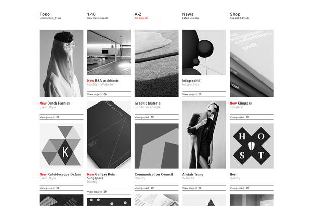
As always, thank you so much for checking this out!
Remember
if you are in need of a banner, talk to me over at discord where my username and number is @thepaperplane#4990; or here in a comment to work something out! ;)

Thanks for the breakdown, i'm cruising the grids now.
we all are, everyday of our livesss

Very well explained! ;)
thank youuuuuu♥
You got a 1.19% upvote from @bid4joy courtesy of @thepaperplane!
Congratulations! This post has been upvoted from the communal account, @minnowsupport, by thepaperplane from the Minnow Support Project. It's a witness project run by aggroed, ausbitbank, teamsteem, theprophet0, someguy123, neoxian, followbtcnews, and netuoso. The goal is to help Steemit grow by supporting Minnows. Please find us at the Peace, Abundance, and Liberty Network (PALnet) Discord Channel. It's a completely public and open space to all members of the Steemit community who voluntarily choose to be there.
If you would like to delegate to the Minnow Support Project you can do so by clicking on the following links: 50SP, 100SP, 250SP, 500SP, 1000SP, 5000SP.
Be sure to leave at least 50SP undelegated on your account.
wow graphics and designing
i wish i took that course. might
nice post! following you and upvoted :D
รับออกแบบบ้าน แบบก่อสร้างโดยมืออาชีพ