This is my entry for @juliakponsford's Art Explosion Contest. The theme this week is surreal, which is one of my favourite themes. I love thinking outside the box and how surrealism explores the eccentric and plays on the subconscious mind. Things could look like other things depending on the viewer's perspective. There's so much potential with this theme. I decided to draw this by hand and try to confound the senses.
The Entry
The Process
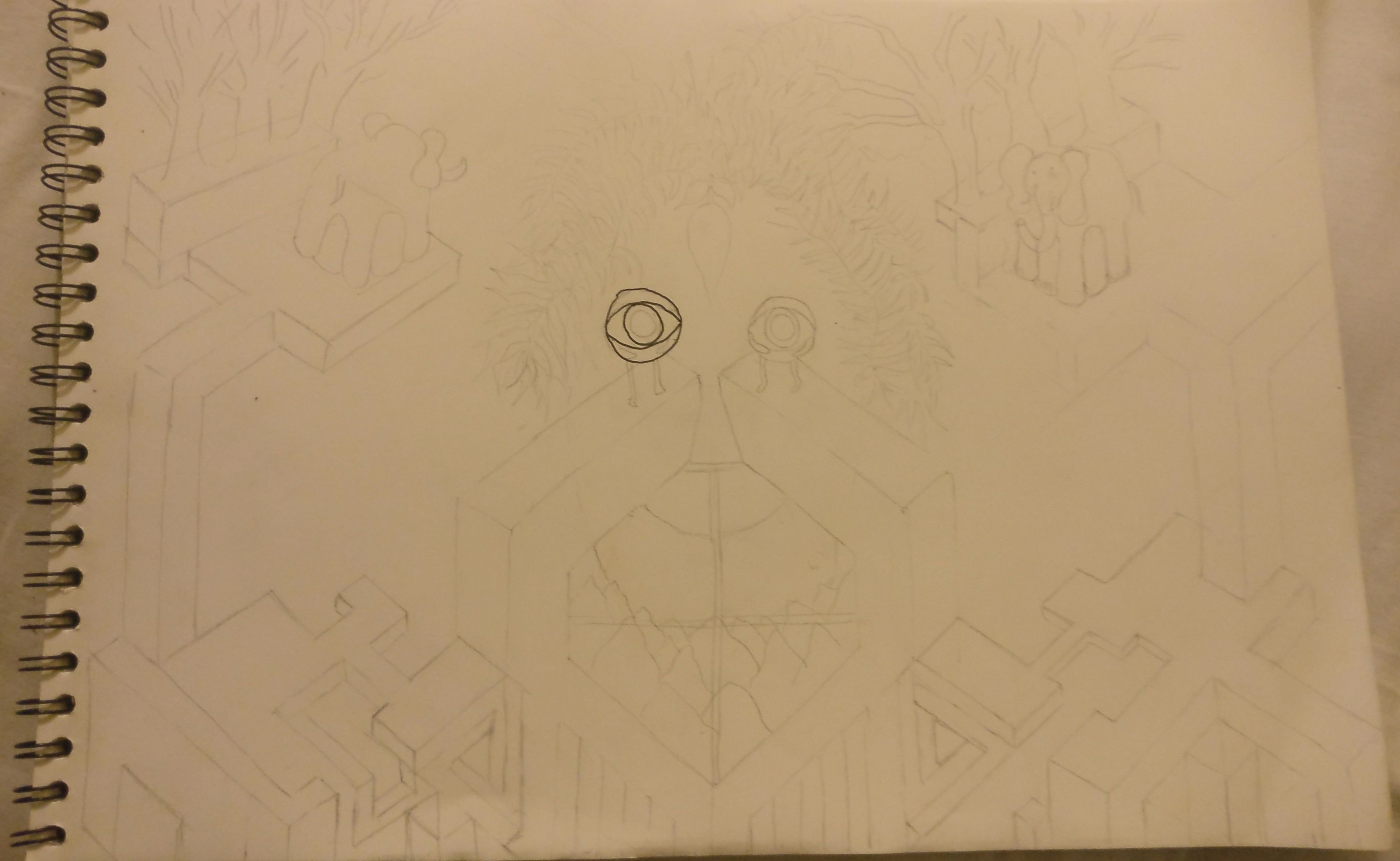
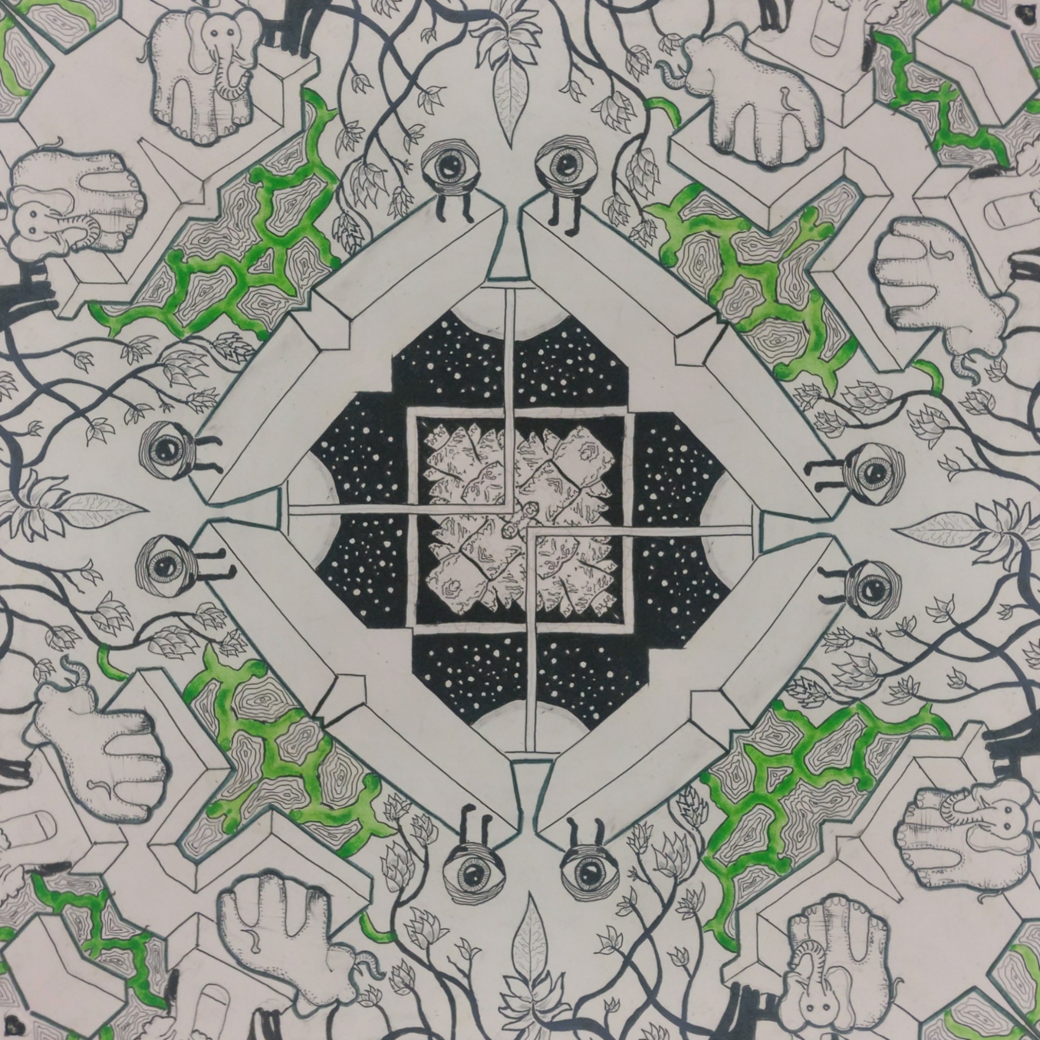
I start as always, with a light pencil sketch. Isometric lines can be surreal when applied at the right angles to create some optical illusions that defy physics. I start with drawing some impossible geometry. I just let this flow with the angles to fill up the space. I knew I wanted to form a face from the various individual elements, so I add some eyeball people and vine like things for the eyes and hair, and draw a moon over a mountain range for what could be a smile and beard. Do you see him?
I then slowly start inking over the pencil lines and add detail.
I finally add some colour to make everything stand out more, and add a few finishing touches. I'd orginally drawn the elephants because I thought I could make their legs look like illusions, but that didn't really work out so I covered them up with an image I made using Mirror Lab.
Mirror Lab never fails to produce some amazing images. Just for a a little more fun, I combined some of them to make a surreal mashup.
That was my surreal contribution to this week's Art Explosion. Hope you enjoyed it!
Haha, that's good to know though I'm really just doing these contests for fun. The entries this week really blew me away. Selecting must be so difficult for you.
Thanks :) Well, I only have 6 colours so I didn't have much of a choice to begin with. I thought the green would kinda go with the vine like things so I chose to use it. Illusions are fun. Ideally I'd have done more intricate pen stuff, but the colour fills up the page faster and provides a nice contrast.


Thanks soulturtle you were the last one in right under the wire 😊
Haha, that's good to know though I'm really just doing these contests for fun. The entries this week really blew me away. Selecting must be so difficult for you.
That centre really draws you in. And I love that you chose green! Any reason?
Thanks :) Well, I only have 6 colours so I didn't have much of a choice to begin with. I thought the green would kinda go with the vine like things so I chose to use it. Illusions are fun. Ideally I'd have done more intricate pen stuff, but the colour fills up the page faster and provides a nice contrast.