[ Game Art Series ] Character Painting from a photo of a friend.
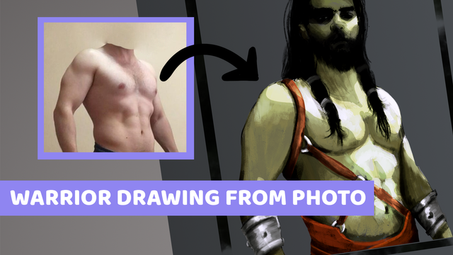
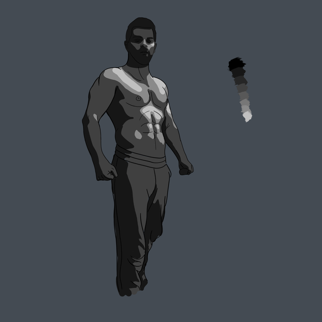
Welcome to another post where I have no idea what I am doing , and try to learn as much as I can in the process. For this drawing I use my friends athletic body for a reference. I am still learning about the muscles and anatomy of a human body, because of that this painting is highly depends on the reference image.
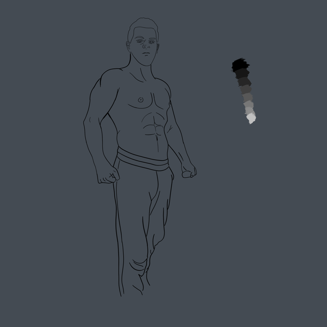
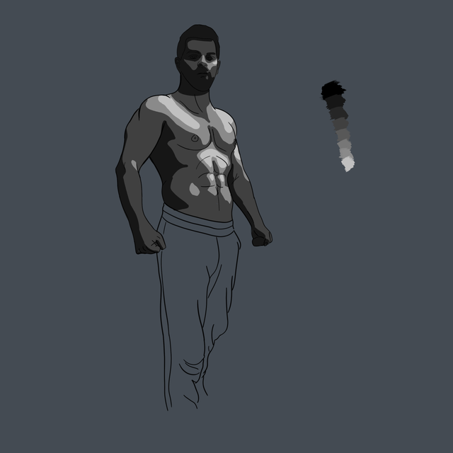
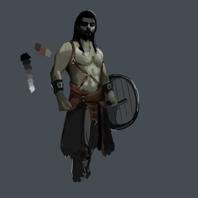
After drawing the line art , to see shadows and highlights of the body better I applied some effects on the image. You can experiment with different settings and see whats best for your eyes. Since I am colorblind my settings probably wont be good for your eyes. Anyway ^^ I use gray colors to show the dark and light areas of the body first. This step helps me in the painting process to pick the right colors for different part of the body. You might skip this step if you have a good eye for the color shades. Normal vision people can see 1 million shades of colors while I can see only 100k ^^
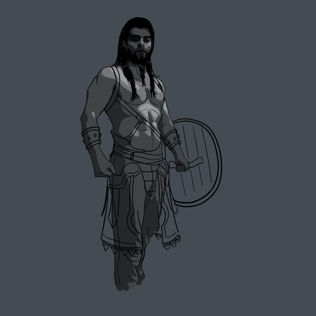
I experimented with different armors , leather straps, belts , knifes , swords , shields etc. This is the part where I think what to do. Because it's a journey I didn't plan what to do in the beginning. I decide as I go. I experimented with different armor types and draw something I am happy with.
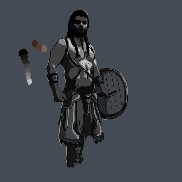
Armor parts also need shadows and highlights like the body. When i'm painting the armors I'll need those to guide me. Again you can skip this step and straight go to the painting stage and use the reference image shadows as your guide. It's up to you, everybody has different style and needs for a drawing. There is no absolute rules in art ^^ Be free and create your own ways.
You can see my colors are already picked from darkest to lightest. I can't use Photoshop Colorpicker screen, it's too complicated for me. I pick my colors before I paint and stick with them. Sometimes I use darker or lighter of the mid tones.
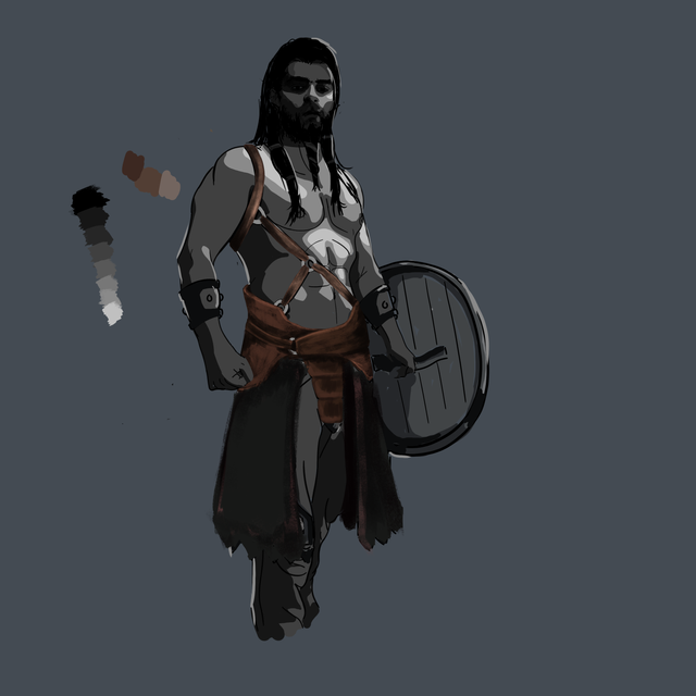
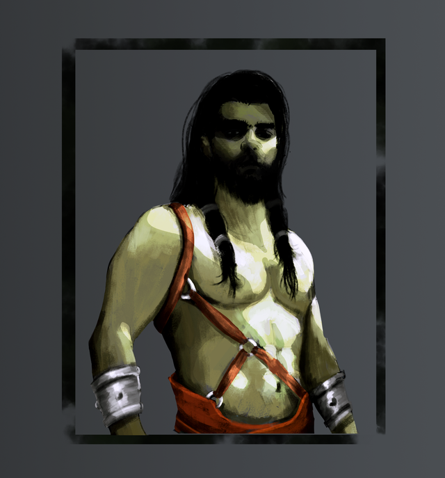
The body is a bit tricky you must pay attention to every bit of shadow and highlight to give them a three-dimensional feel. All the muscles are made out of shadows and highlights. Every brush strokes can mean something here. And colors as well. You see, I messed up on the right arm biceps muscles there ^^ But its ok, mistakes are there for us to learn. I'll be better in the next painting for sure.
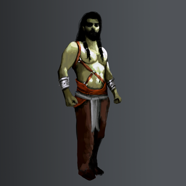
I don't know why but I don't like the shield at the end and decided to leave it. And since this character is for a browser game NPC the shield will not be visible anyway. I finish the painting with more highlight and shadow and some other stuff. I increased the saturation. To my eyes the world is pale. All the colors are not saturated. So I tend to paint what I am used to seeing in the world and normal vision people will find my paintings pale. So I always give the painting increased saturation effect.
And here is the result. It's not perfect but he is a fearless warrior. You better watch yourself.
Isometric 2D Game Assets Painting - Wooden Block
Hello @ruen, thank you for sharing this creative work! We just stopped by to say that you've been upvoted by the @creativecrypto magazine. The Creative Crypto is all about art on the blockchain and learning from creatives like you. Looking forward to crossing paths again soon. Steem on!