Daily logo design #40
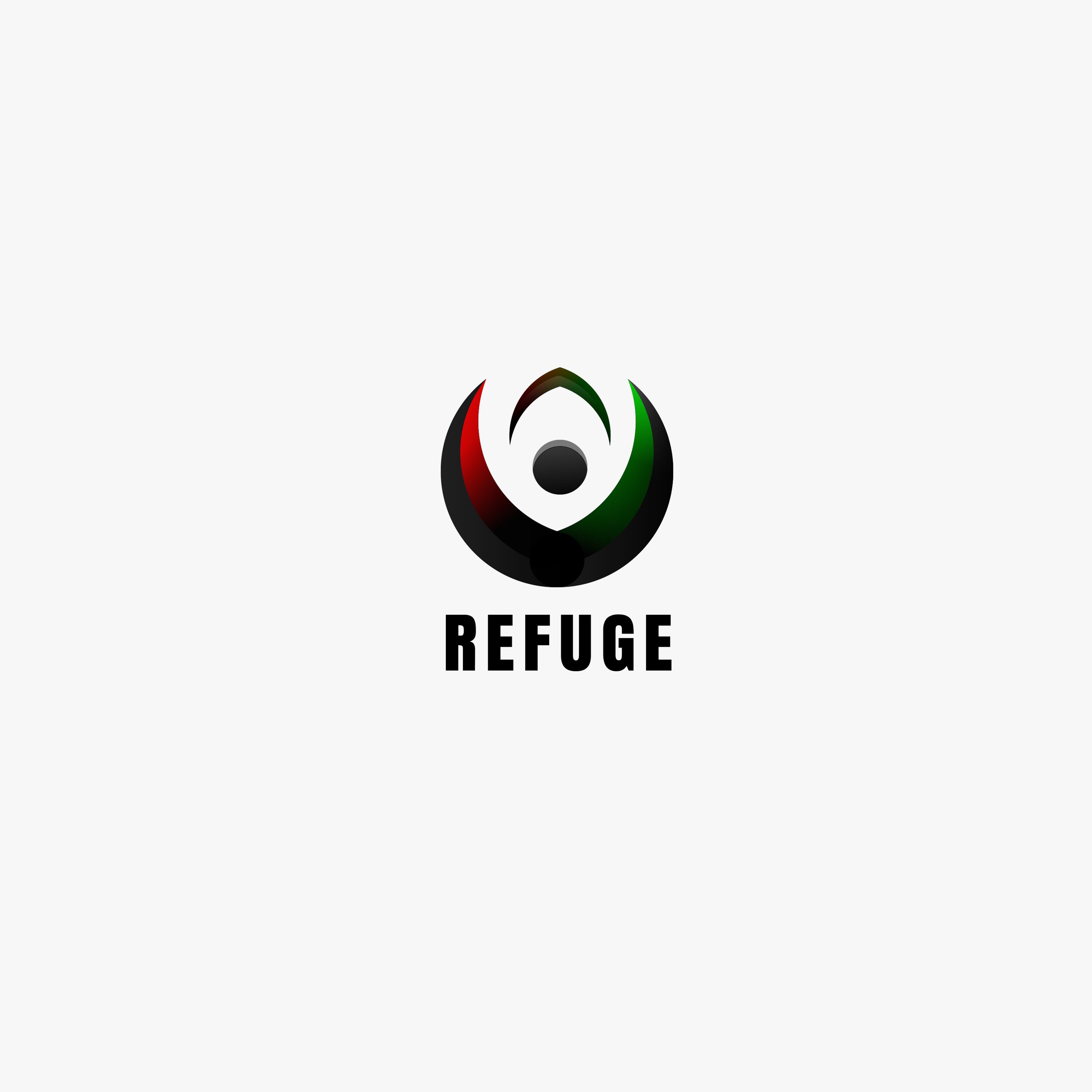
Tried my best to combine 3 of the colors, red, green and black as requested by the contest holder. @_@
Company name: REFUGE
Industry: Non-profit organisation
Link to the contest: Click me
Brief Description:
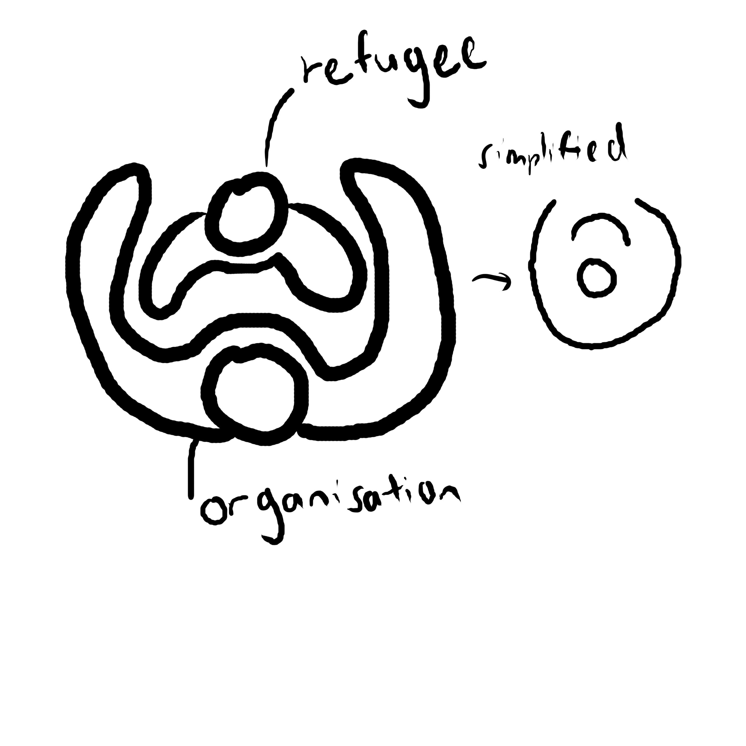
- The logo shows a larger organisation (the circle as the head while the U-shaped curve as the arm) protecting a smaller group (the smaller U-shaped curve).
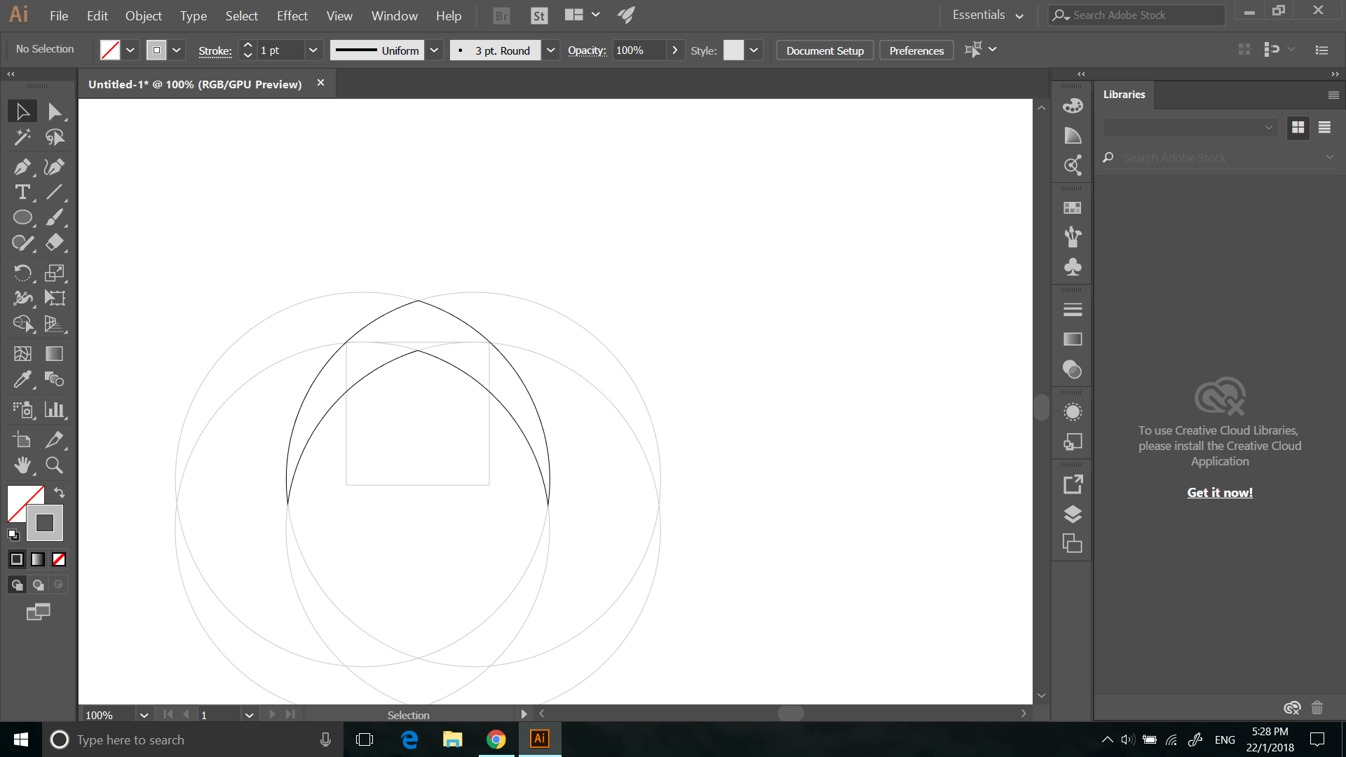
Process
Sketch and idea. In top-view, a larger person is protecting a smaller person with its arm. This symbolizes the non-profit organisation protecting the refugee and giving them a place to stay. Simplified by combining their heads together.

)
.png)
.png)
.png)

