Zelda: Breath of the Wild Collaboration (First Artwork for 2018)[Process Drawing]
@keeperofthewoods and I decided to work together to create a new piece of art to kick off the new year. We both used our strengths in this epic collaboration. I illustrated the character in the foreground while she used her photoshop skills to create the background. We decided to theme the pieces after the Legend of Zelda: Breath of the Wild.
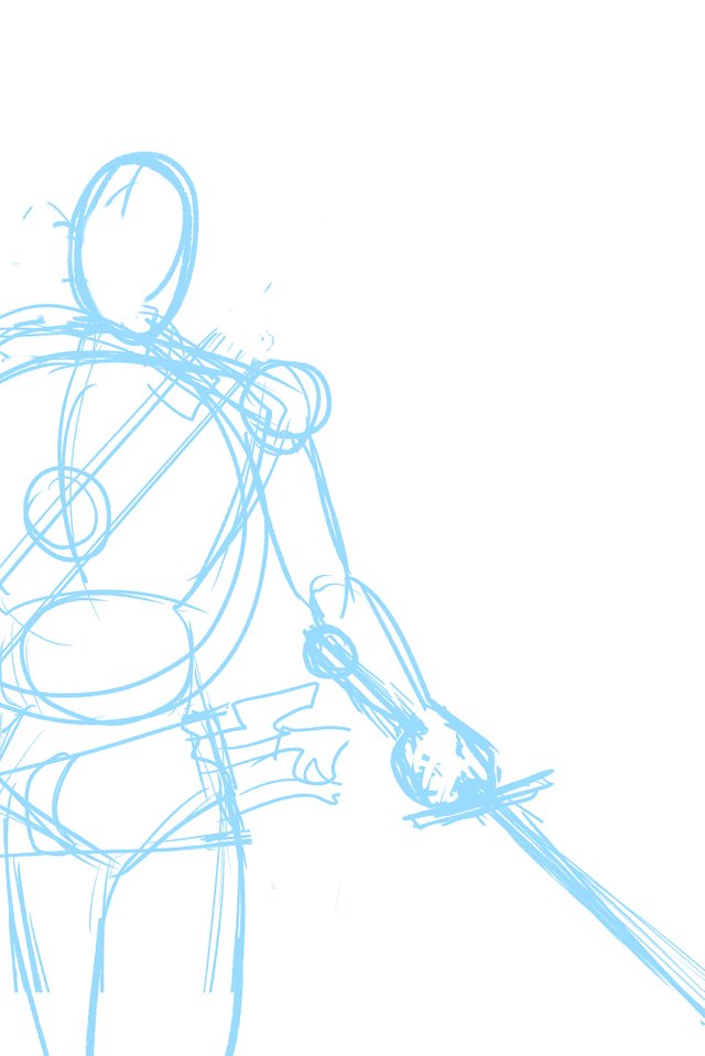
The Wire Frame
She rendered the background first, which resulted in a really detailed forest-type temple made to look like a watercolor painting. Therefore, I thought it would look great if I drew Link as he's walking toward the doorway. Because of the perspective, Link's body would be largely out of panel and because I didn't want him to block the view of temple, I have him in the corner. It's the first time I've ever drawn Link from behind.
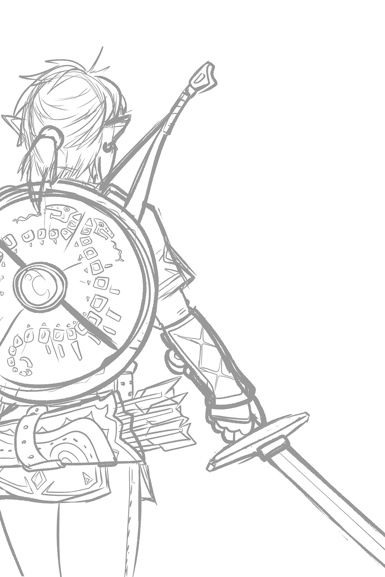
The Sketch
I used a screenshot of Link from within the game in order to get the detail correct in outfit and gear. This also marks the very first time I've drawn this incarnation of Link, from Breath of the Wild. I can draw the Hero of Time by memory, but I wanted to get this drawing just right so I did my research. I played around with the placement of his hand, holding the sword. I wasn't sure what I wanted to do with it at first, but in my final sketch I drew it in a way so it doesn't block anything important from the background (such as the door).
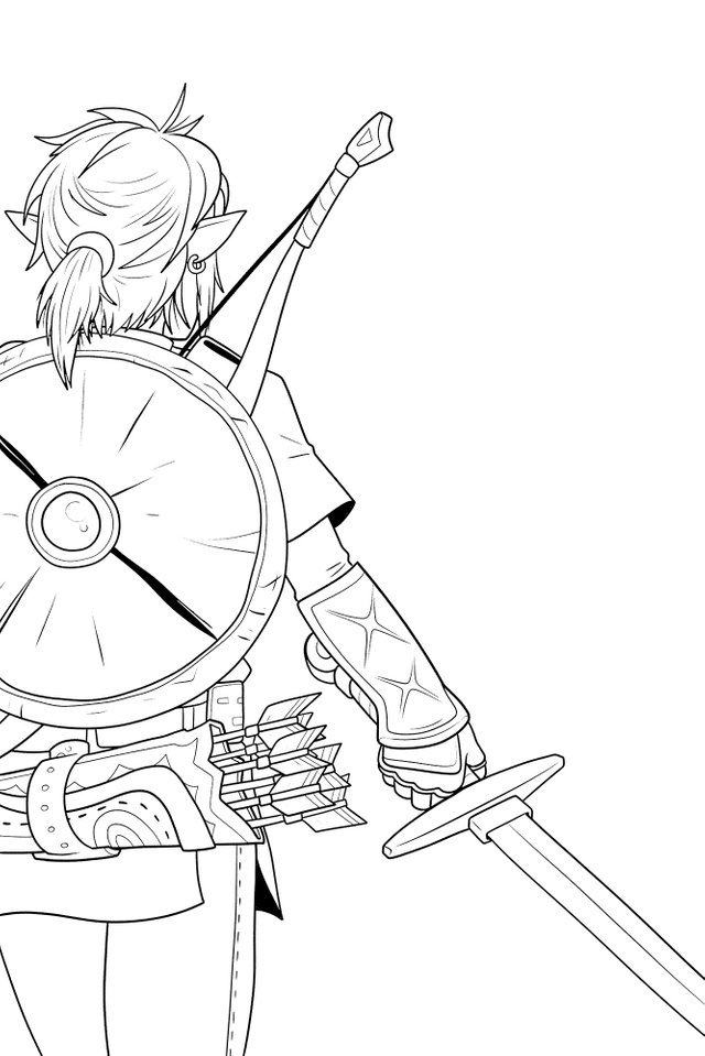
The Line Art
Another first for me with this piece is using the new "Real G-Pen" from Clip Studio Paint to draw my line art with. The difference between the G-Pen and the "Real" G-Pen is that the first is smooth and uses a round brush shape while the new brush uses a grainy brush and the lines drawn have a texture to them, like ink on watercolor paper. However, my resolution was so high that when scaled down, the lines look just as smooth as my other work so the effect is lost. I might not do it again unless I use bolder strokes.
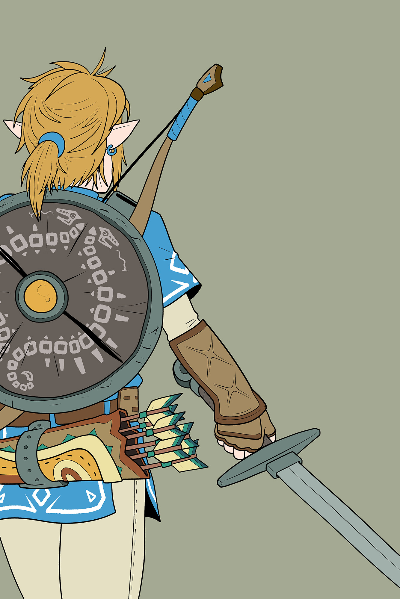
The Flat Colors
I gotta say, the blue tunic is a departure from Link's usual green garb, but it has grown on me and I really hope we see it again in future installments of the series. Although this isn't the first time we've seen Link without his hat, I also like how messy and full of volume his hair is. I'm not usually fond of male ponytails, but I think it looks good since not all of his hair is pulled back, he has plenty of bangs and loose strands.
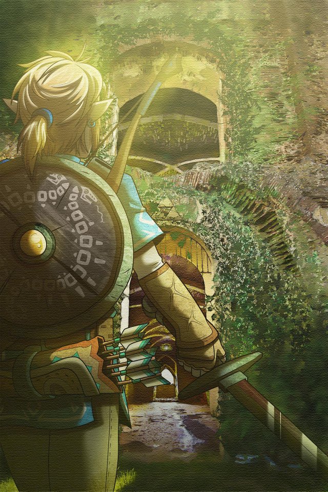
The Finished Illustration
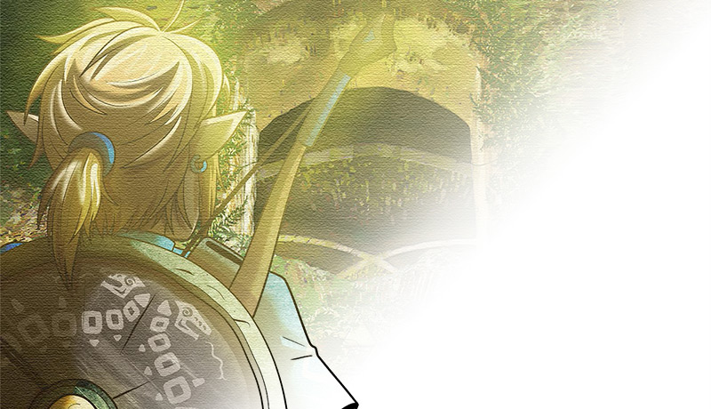
Here is the completed illustration set against the lovely background, courtesy of Shiloh Silveira @keeperofthewoods. I gave Link a texture to match the look of watercolor in the painting. When I first added the shadows on Link, I used my usual cel-style. While it was fantastic, it looked like it came right out of a Studio Ghibli film. The contrast was too strong for such a detailed background, so I decided to put in more time and effort into the shading, using the blend tool and multiple layers and gradients.
If you want to read about how Shiloh put the background together using multiple photos and a neat water coloring process, you can read her post about our collaboration here. Be sure to follow her and upvote her work. She's a pretty fascinating person and very likeable.
"She's a fascinating person and very likeable". Aww thanks. Awesome job! The picture is epic and I'm honored to have it along side my photo manipulation! I think we should definitely do a project like this again! It was pretty fun. What do you think we should do next?
What about Harry Potter, eh?
That would be awesome!
This illustration is brand new @originalworks
I really liked seing the steps and what an amazing transformation from the back basic flat colours to the finished piece, really wonderful. I just found you as well and I love finding other artists on here. I am now happily following. :)
Thank you. Your work is really impressive, too. I shall follow in return.
beautiful. Tbh, I like the flat artwork the most.
Impressive stuff mate! I'm in awe of people who can do this sort of thing!