Spider-Man v Venom Marvel Comics Fan Art [Process Drawing]
I took on a commission last year to illustrate everyone's favorite web-swinging hero facing off against the popular symbiote infected villain turned anti-hero. The popularity of the Spider-Man and Venom rivalry has, in my opinion, even surpassed that of Spidey and his long time arch-nemesis, the Green Goblin. It's like a yin and yang balance, both with similar sets of powers but with such contrasting methods of using them.
Venom represents raw power and negative emotion while Spider-Man is nimble and uses his abilities for the greater good. In the 90's animated Spider-Man series, Venom was shown to have the power of web shooting like Peter, but in recent years this has been replaced with a messy black slime effect instead of the more controlled white web. I think this was done in an effort to differentiate him more from the hero, while still staying true to his original power set.
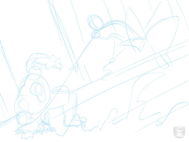
The Wireframe
I really struggled with coming up with a composition that showed both characters from the front, but engaged in battle. While it's not strategic to have your back against your enemy during a fight, I decided to make Spidey in the middle of a web maneuver where he would essentially hook onto Venom using his web and swing him away like a catapult.
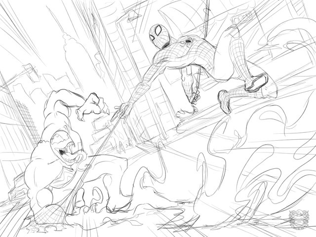
The Sketch
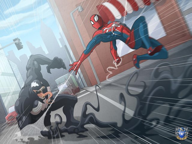
I wanted there to be a lot of movement in this illustration Venom would be hunched down close to the ground because his arm would be shooting the black slime in attack. Meanwhile, Spider-Man would be simultaneously swinging around and shooting his web at his foe. Lastly, there would be a focus lines to create a zoom effect for added flair.
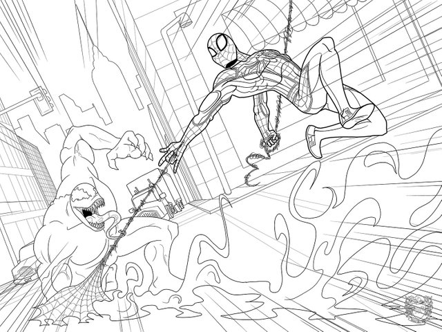
The Line Art
I originally sketched Spider-Man's classic suit but would later turn it into the modern look from the PS4 Spider-Man video game. Drawing cities is not my forte. I really go with a minimal look like you see in cartoons. Looking back, there should be more cars, traffic lights, newspaper stands, and maybe a pedestrian or two looking in awe.
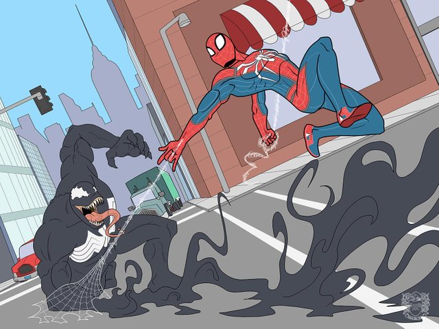
The Flat Colors
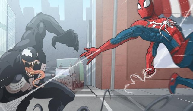
Spider-Man's suit looked really busy with all of the line details from his suit, so I decided to color these so they would be softer, an accent to the suit as opposed to hard break-up lines. Likewise, the web coming from Spider-Man would need to have white lines to stand out from the rest of the colored image.
The Finished Illustration
I was happy to draw some of my favorite Marvel characters again. I think Spider-Man's pose is stiff and awkward. I could do better next time. Other than that, I am generally happy with how it turned out. My style is not well suited for actual Marvel Comics, but I really do love drawing those heroes and villains. Let me know if you have a request for your favorite superhero!
Oh yeah, and prints are available for sale as well. Cheers!

Hi @jamesartville that is amazing action moment, like how you showed the way of working on the characters, it is always good to plan the position of the characters and their relationship to the format and each others. I like the effect of moving, because of slightly blurred lower part and the legs of spider-man it looks like he is in a great speed. Impressive work!
I appreciate your detailed feedback. I'm glad you like it!
Support of Visual Artworks and Photogrpahy on Steem by @stef1 and @art-venture , rewarded by the Steem Community Curation Project ( @steemcurator08 ).