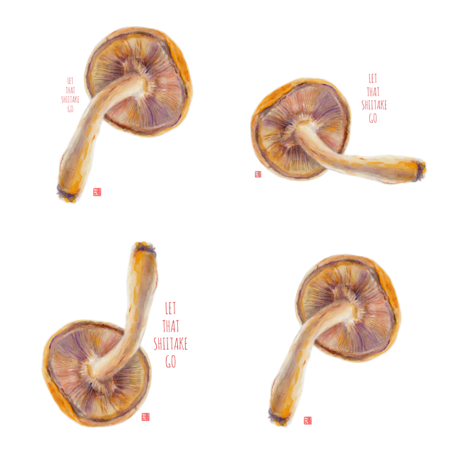
Let That Shiitake Go! …vote with your reply and be entered to win a print of your choice!
My shiitake mushroom painting final result….
I’m pleased with the effect of layered, translucent, complementary colors.
I start with an India ink wash, and then begin to build layers of watercolor. I keep a paper towel and a test strip of rice paper by my pallet to check strokes, values, and colors.
Laying down the first layers with a light ink wash…
Then comes color!
Sometimes I turn the painting upside down to get a different perspective.
Which design do you like best for greeting cards and prints?
Do you like it with text, or without text?
Your comment automatically enters you to win a 10" x 10" (or smaller) print of your choice from my store. I appreciate your input.
If you enjoy my process posts, watch for my next post, when I show more SPAM painting process pics.
Thanks for visiting! It's great to meet you.
Let’s stay in touch! I'm fairly new to Steemit and still
learning the ropes.
Check out my daughter’s work @christiesnelson
She turned me on to Steemit! Thanks Christie…love you!
You can find more of my work below…
@connieluebbert
Internationally Award Winning Artist
http://www.connieluebbert.com
Instagram: @connieluebbert_art
https://www.facebook.com/connieluebbertartist

Very nice, I love the haziness of it, I'm hoping that's not just my monitor going bad lol. It's almost as if I could reach out and grab it, but from a dream. Nice warm colors, makes it even more inviting. Thanks for sharing.
Thank you for your take on my painting…I like your “dream” and “inviting” interpretation very much!
Of the four designs at the bottom, do you have a preference?
(You’re entered to win a free print...so far odds are great that it’s you! hahaha)
I like the bottom right, sans print. I think the fungus speaks for itself. :)
A man after my own heart…a minimalist.
Very cool 😀
Thank you!
Of the four designs at the bottom, do you have a preference?
My fav is top right. It’s easy going! 😀
thank you!
Thank you!
Magic art (:
Thanks so much. Love your work.
Of the four designs at the bottom, do you have a preference?
Thanks for your comment.
I'm a designer too and i like to work with text (simple fonts etc) But if my design is able to give the message without the need of writing, my preference is always the simplest visual expression. So i choose the 4th (bottom-right). all of them are good but, my opinion is the 4th is the most dynamic one..
Thanks! Yes...I'm a big "negative space" fan.
Congratulations @connieluebbert! You have completed some achievement on Steemit and have been rewarded with new badge(s) :
Click on any badge to view your own Board of Honor on SteemitBoard.
For more information about SteemitBoard, click here
If you no longer want to receive notifications, reply to this comment with the word
STOPBottom right is my favorite. The simplicity of just the 'shroom just does it for me. :) Beautiful work, as always!