Pg. 1, Panel 3
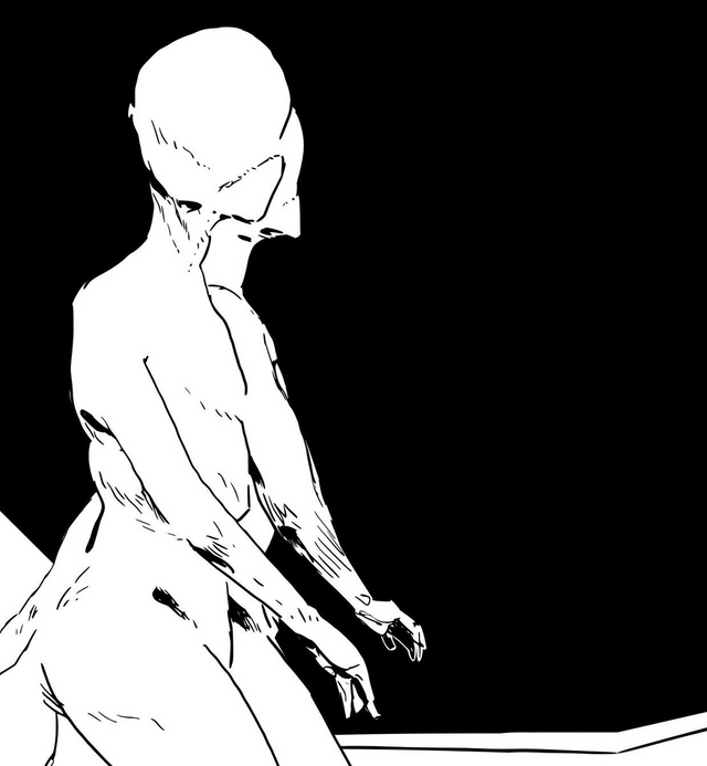
This is a close up of my panel. All of the artwork is converted to vectors. The figures are drawn in raster via Mischief, copy and pasted into Inkscape. There, it is converted and the black background is blocked in.
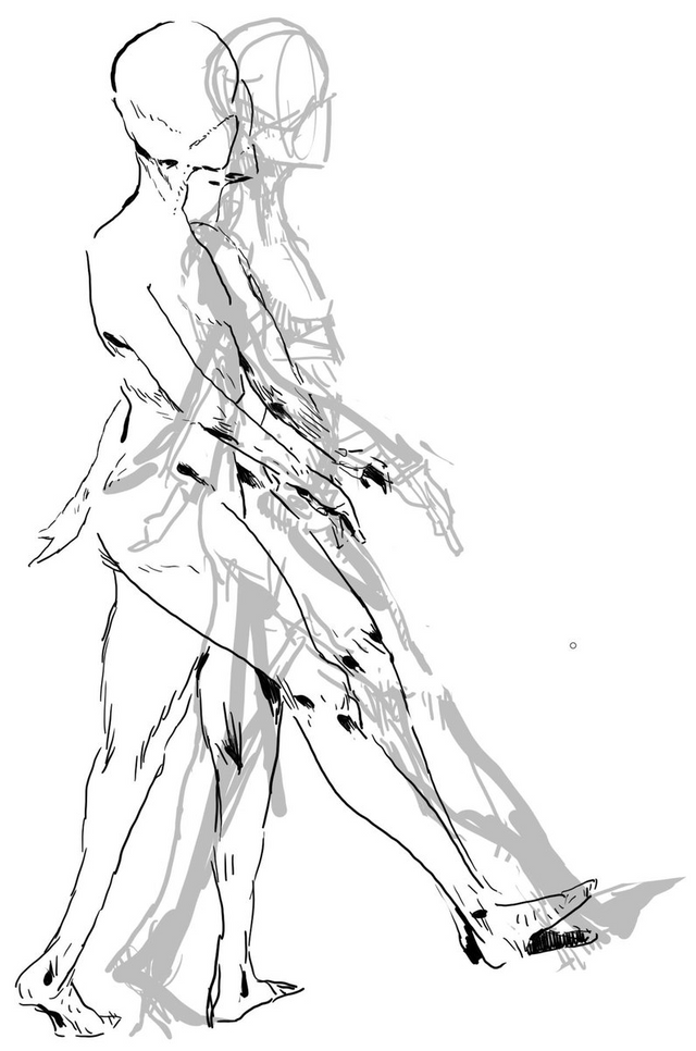
You can see the work in progress here. This is multiple layers with a sketch in the background in lower opacity. I moved it to the side to make it clearer.
The challenge for me is to get a consistent thickness of line when I place this work inside my comic page. Since I am no longer drawing within the context of the entire page, I don't have an intuitive sense of what fits. The advantage of drawing like this is that with elements separated, I can focus on making them look good on their own.

