Aldesign : Login App UI Design Exploration
The look of the login page is one of the sacred things in the interaction of a user to the system, because it can be an image for the branding of the product. Various kinds of treatments can be done from the most simple display as well as a rather complex look. but most login pages are designed with very minimalist so as not to complicate the user to enter into the application. The most common thing today is the use of the login button with facebook and / or google plus to facilitate the user to login and register an application. Some applications use mobile phone number to login and register, and use OTP (confirmation number) sent via sms to facilitate the process of confirmation of active or inactive number of mobile phone.
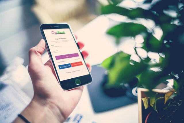
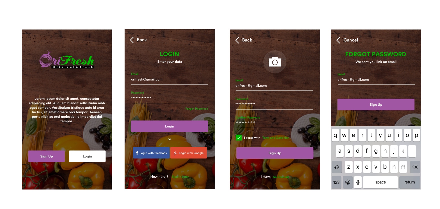
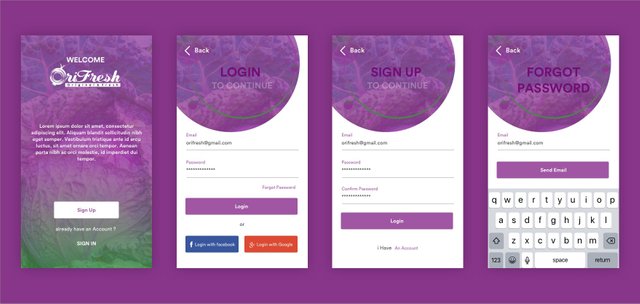
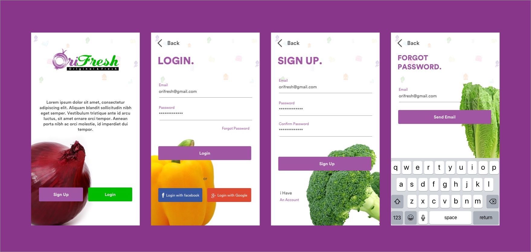
In this short article, I am a little trying to explore a login view of a product called orifresh. The goal is to provide a "fresh" branding of the product and "easy" to users who use it. Here are some Views :
Option 1
Option 2
Option 3
That's some of the results of the login design that I have done for this product. Thank you for looking, which one do you like ? :)
Aulia Rahman
Dribbble| Behance| instagram
Need UI/UX design for your Website / App ? you can contact me on Discord


