Are you a fan of Hagrid? I AM ! Concept Art for a Challenge !
Hi Everyone !
(All the images are my own creation and so I own the rights of them)
Before we get started, I also made a video with the whole process for this one! So if you want to sit down with some popcorn (sweet pop-corn of course!) and enjoy it, scroll to the end of the post and hit play !

First of all, we gotta always make a lineart, this is the way we assure ourselves that the base is solid enough to start the painting process.
For this one I used the classic way:
- Shape exploration (So we can have the shape language to communicate the idea).
- First sketch (now we have to define few elements to have an idea after the shapes on it).
- First clean up (damn! Time to clean the mess!).
- Second clean up. (If you thought with the first clean was enough... no no, It's time for Mr. Muscle!).
And for this particular artwork:
- Sketch of the creatures over the character
- Clean up
And there you go ! The base seemed solid, everything right on its place. Always remember about the use of grayscale, this is very important since we want to use one element a-time.
The story-telling and design of this character was actually easy since this is a fully developed character. What I mean by this is that the story behind him is already developed and all the feelings about him are already discovered.
This is one of these times where we can help A LOT to the general mood of the artwork by working with color psychology. Even tho' it was already solved since the design from the movies I decided to accentuate these little things:
The character is warm and friendly, protector and righteous. He casts the image of the father of all the creatures and Harry itself. So we can (and should!) definitively play with a warm palette.
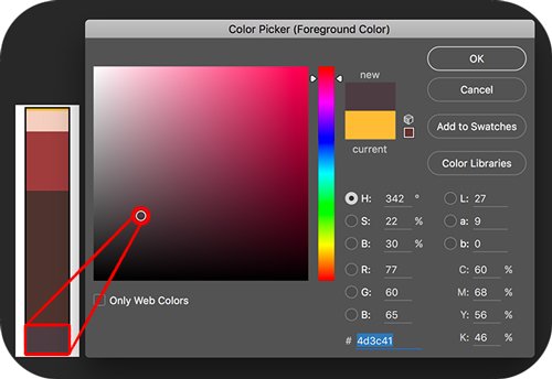
Red, reddish browns, some desaturated violets and some grays to neutralize the whole gradient of reds (these grays will actually get some bluish feeling because of the contrast with the warm).
We can even make an analysis of how the colors interact with each other (which is super useful for understanding the intentions of color and how the atmosphere is made).
This is called Color Spectrum and we can make it from any scene in movies, picture or other people's artworks. If you are curious you can even do it with mine !
Let's say that you already did with this particular artwork...
At the left you can see how the spectrum speaks by itself:
Warm colors everywhere: even the brown is working as warm. This actually gives the feeling to the viewer that desaturated colors (but still in the warm side of the palette) feel colder than the rest. Even tho they aren't (see next pic).
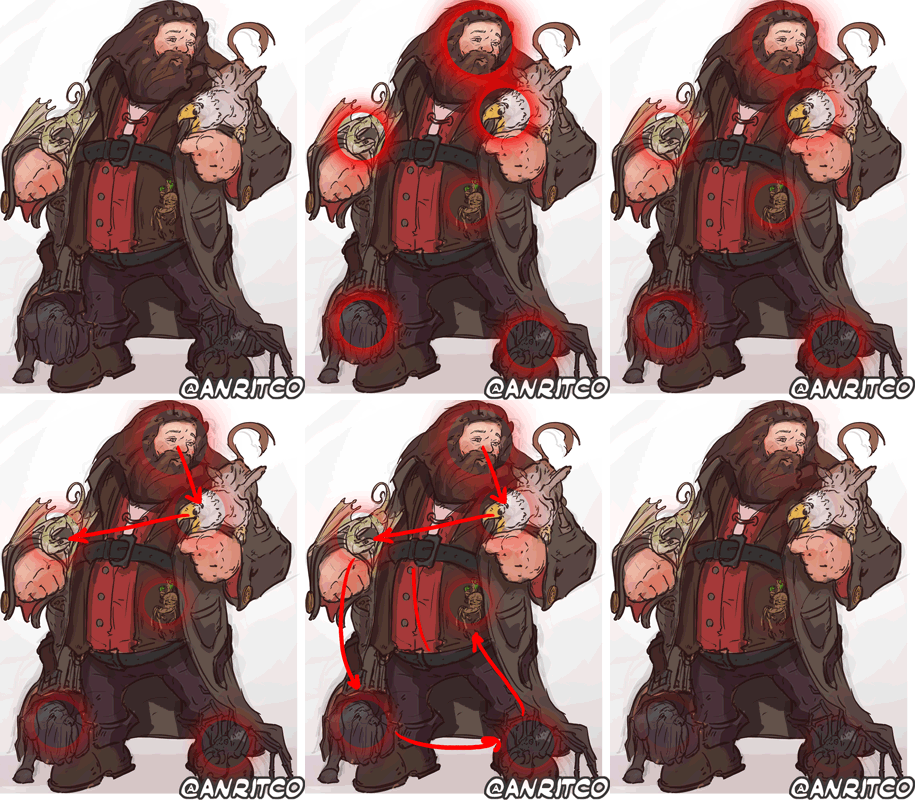
Pick up the accents: given by the high-value pink and yellow, these are working as highlights on the whole artwork. These are also working as focal points and give direction to the whole thing.
Speaking about focal points in this type of artwork it's pretty easy: Everything goes to the face, because there's where the eyes are at. So our eyes will always look for having some contact with the person in front of us before anything else.
And we don't have only one guy here but the artwork is actually full of characters. Different creatures on the canvas create this particular "path" for the eye:
It goes from the face, to the guys, to the rest of the body and comes back to the beginning (and repeats). This way we make sure that the spectator will stay as long as possible in the painting finding more and more details.
Finally, the direction of the body and shapes in general help a lot to give more dynamism to the piece. Preventing it from being boring and repetitive.

(Sorry for the heavy size of the gif)
At the end I decided that it would be good to add some really big contrast somewhere such as the bottom, that raging green against the whole structure of warm colors. And it worked pretty well ! This is because when we give some base or background to our characters, they feel like the are not flying, which is awesome because we also give to them some context and even more storytelling (which I love).
Remember that you can check the youtube video with the whole process in like 20x speed (I don't really remember how much faster it is, but it s only 6 minutes with really cool music from Harry Potter OST).
What are you waiting for? Go and check it ! =)


The Harry Potter world and art are a wonderful fusion! Keep drawing! Followed!
This post received a 1.3% upvote from @randowhale thanks to @ericwoelk! For more information, click here!
Great post, and precious how to!
Your posts are my favorite, seriously.
Thanks man! I really appreciate it! :D
All secrets revealed :D i have to see this step by step when i get home, thanks for sharing knowledge ;) this one is amazing
Hahaha I really hope it will be useful for you ;)
If you have any doubt please let me know =)
EDIT: I will start doing some Photoshop tutorials soon, maybe it will be useful !
It will be very useful for sure :)
Your work always astounds me - you are so so so talented. I just love seeing your stuff. Harry Postter is one of my favorite books/movies ever and you definitely captured the essence of Hagrid while maintaining your own style. I love all of your analytical decisions and they definitely stand on their own! Great work - great post - I love the .gifs! Upvoted and resteemed :)
Woha, I just wrote you such a long reply and it vanished :(
Okay here we go again: Thank you so much for your support @j-vo! Harry Potter's universe is one of my very favorites ! Actually I was thinking about doing a personal project about "how would Hogwarts be if it was placed in Sudamerica, Eastern Europe or Asia?" And so redesign the different roles of the school, masters and head of the institution depending of the myths and history of the place that it is located!. Such as if it was in Asia, dragons would be completely different, masters would dress completely in another way and would have completely different magic artifacts, potions, spells, etc.
Amazing work. illustration is so attractive and beyond that, I love this beautiful posting. Definitely worth upvoting.
Thanks a lot @doramee !
Yup, amazing as always @anritco andale vamos!
Hahahah Arriba !
Thanks mate ;)
Awesome post! Love your style and love how in depth you went with your process. Thanks for sharing!
It looks like Hagrid indeed! :D i love it <3
Thanks a lot @xxvjs ! I saw that you are from Poland ! I am actually living in Krakow, and your country is just AMAZING ! I've chosen it to be my home for the following years!
I'm glad you like it here ;) If you area bout to stay in Poland for a while, you must visit Wrocław!
I hope one day I will ! Actually I am starting to plan traveling from here to there now that my agenda is much more flexible. Are you from there?
Yes and I highly recomend it!
ahhh tremendo tutorial!, leí por ahí que hablas español, que bueno encontrar ilustradores digitales!, yo sigo estudiando y estudiando este mundo, pronto estaré creando cosas geniales, aunque me falta mucho para hacer un MEGA TUTO como este lol!, que buen contenido, te sigo y upvote de agradecimiento :)
Jaja si, hablo español! Soy de argentina ! Estuve viendo tu blog y esta muy bueno! Te recomiendo usar el tag #art en tus posts como primero ya que ayuda a otros encontrar tus artworks ;)
Excelente @anritco, ya veo que eres de Argentina, además de ser un gran maestro de la ilustración también eres todo un estratega de marketing y seguidor de lo bueno ;) no hay tiempo que perder, sigamos creando, hasta otro post, gracias por la recomendación!