Golem Logo contest - 100 SBD prize guarantee - update
Hi Steemians, I would like to write an update of my previous post Golem logo contest
Golem logo contest has started. Some of the designs are very nice but I still see that few of the contestants haven't read description properly. First of all let's describe once again what the target of this contest is.
What is Golem
Golem Trader is algorithmic trading company. We do provide liquidity on the crypto-currency exchanges. The main thing is that Golem is not a small single trader project. It is a company with huge size of traded volume. We do trade volume in scale of millions of dollars on daily basis. The logo design will be on the pilot web page.
Why logo contest on Steemit
Yes, good question. The companies like us do invest from hundreds to thousands of dollars to designs. Reasons why I have chosen Steemit over the logo design sites are these:
- I am a really big fan of Steemit
- Designs of "project curie logo contest" were awesome
- Steemit needs to get connected with real businesses and this contest is my contribution.
Prize
I have decided to invest 100 SBD to this contest. My idea was to invest this money only to attract people to participate. My expectation is that you will increase the budget by your own. There is an option that some of the Steemians may support this contest by Up-votes. My part is done. The prize money are on the account.
Resteem
First of all , I would like to thank all Steemians for resteeming the previous post. I hope that you will do the same for this one.
This is crucial thing for successful campaign on Steemit. Resteeming is one of the requirement for contest participants. This action will increase prize budget. All SBDs from ALL of my POSTS about logo contest will be added to prize pool. I will keep posting updates about contest every day till 5th October. It will be extra awesome if some of the Steemians will support my posts by resteeming and up-voting as well.
Description
The description of the target in my previous post was as follows:
The only requirement is that logo should be simple. Single color or 2-3 color combination. I like shades of blue, steel blue, black and white. You may or may not use sign "Golem Trader" in logo.
Correct name
Golem Trader or Golem are the names we would like to see on the design. Not "Golum" or "Golem traders" or "Golem trader Inc." please be aware of this.
Design, Brand, Identity
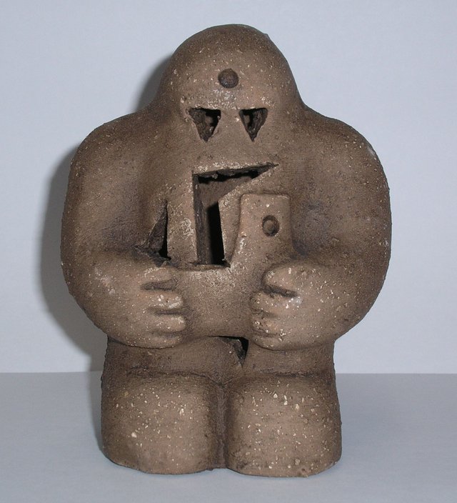
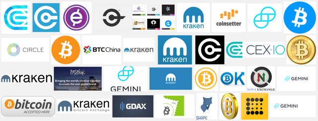
Please do respect that we are company who interact with other companies. We do algorithmic trading so our partners are exchanges. Not the clients who like fantasy games. This is the reason why I pointed out way how the designs should look like. We expect this:
not this
Continuation
I would like to thank you for participation on this contest. I would like to thank also for up-voting and resteeming. I am really happy that I see cool designs already. Many thanks all of you.
You can post your work below this update or below previous post. It is up to you.


Not to be confused with http://golemproject.net.
What do you think about this?
Awesome! I am in! Quick question: Since this has been updated, are you extending the contest window? If so, what is the end date for the contest?
Also, so we don't waste your time, can you go to this website and give us a reference code for the "Steel blue" color you like the best? Thanks.
http://www.colorpicker.com
the end date is same as before. 5th October. I just want to post updates , because is better chance to increase prize pool. I am sure if contest is visible enough some of whales can support you to get higher prize than 100SBD.
http://brand.dackpartner.se/colours#midnight-blue
do not worry about steel blue . just pick the colors you think are best. here is the link above of original steel blue, so you was right on your first set of logos. Frankly, that color is not probably best option. I made a mistake. You are the designer so pick your preferred colors. shades of blue. dark blue, navy blue. whatever you want.
Sounds good. Thanks so much for replying!
thank you . this is really cool
I'm glad you liked it!
But I love this guy:

LOL - me too!
:D
Hi! My version:
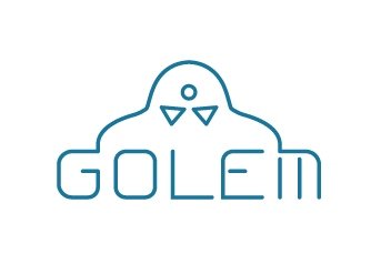
Three variants little bit different in forms. And on the blue backgrounds are similar logos for visualisation.
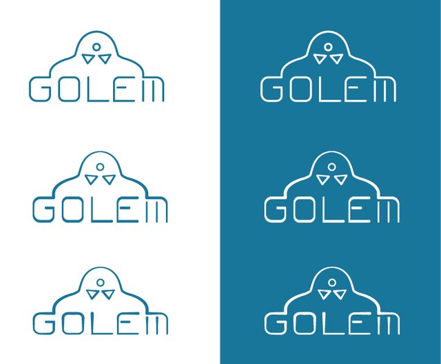
Сreated together w/ @ubik
yes , this is my original idea. I wanted make designers think this way and work on this till perfection
hi @airmike! we'd be happy to finalize it for you, if you leave your comments. maybe you think the word "trader" should be included or different color? .. it is quite simple for now but we actually intended it and worked on the forms to make it appear this way.
Hey there @airmike

So I was playing around in photoshop and put these together for your consideration. :)
A.
B.

C.

D.

thank you
Hey airmike, I've designed a simple, flat logo that's very flexible to work with. You can have me add text to the logo, you can add text below, above, or on either side of the logo and it would still look good. Changing the color is easy to do if you'd like me to do that. This is a rough draft so if you need me to improve anything, just ask.
hello everyone! Since I always start my work with a hand-drawn sketch I will do that here too. This is result of 2 hours sketching and solutions given are actually elements from the Golem figure which make "G" letter shape. As you see, the shape is really suitable for branding because it can be used in different sizes and colors.
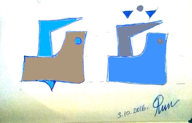
On the bottom is my signature and date which confirm that idea is mine and that is created today. If you choose this solution you will get your logo in any format you want and in right proportion with vector drawing.
interesting