Hi @yazujizr, thank you for your contribution.
I am a really big fan of flat and material design. honestly i really like this RSS Reader logo. However, I personally find this logo a little bit unoriginal, in case you didn't know it, bellow is the original RSS icon.

(Source)[https://en.wikipedia.org/wiki/RSS]
However, i did find your logo is more compelling.
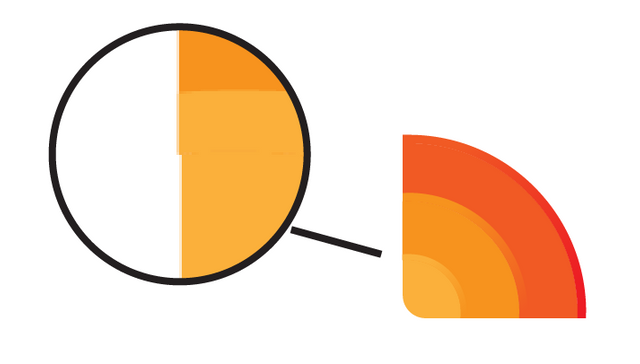
Technical wise, it seems like some shapes was not aligned correctly as you can see bellow. this kind of details are not visible in small size, but you will notice it if you zoom in on the logo.
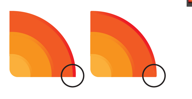
Also, i think all the corners should be rounded as it make the logo feels more fluid and alive.
In your presentation, you said that I wanted the RSS Reader, a self-designed program, to be more functional. I don't think you can make the project be more functional by changing the logo, maybe you should reword those phrase if you really want to expand and improve your design portofolio.
Still on improving portofolio matter, i don't know if it was intentional or not the tittle/headline of each image is not aligned properly and made it hard to read.
Your contribution has been evaluated according to Utopian policies and guidelines, as well as a predefined set of questions pertaining to the category.
To view those questions and the relevant answers related to your post, click here.
Need help? Write a ticket on https://support.utopian.io/.
Chat with us on Discord.
[utopian-moderator]
Thank you for your review and referrals. This logo is a reinterpretation of the old RSS logo. This way we can look at the originality.
I didn't see this mistake, I thank you again. I couldn't see him check that much. The importance of what you do is once again revealed.
I'il take your advice.
Thank you for your review, @nilfanif!
So far this week you've reviewed 1 contributions. Keep up the good work!