SEC S19W4 || Organization using CSS (Box-model,Display, Position, Flex)
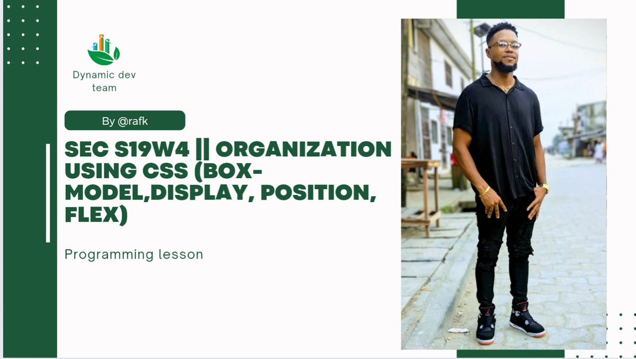
Hello everyone, greetings to you all, welcome to this week's engagement challenge which is week 4 so far. I am so interested and excited To be participating in this week's engagement challenge brought to us by day dynamic dev team.
Using CSS, we are able to organizes web page elements using the box model, treating each element as a rectangular box with content, padding, border, and margin.
Add to this, the display property determines how elements are positioned. This could be in the form of a block, inline, flex. By using the position property, we can specify the positioning method Such as; static, relative, absolute, fixed.
In the case of a precise placement, Flexbox gives a an amazing layout system for organizing elements within a container, providing control over alignment, distribution, and order. Incorporating these tools, we can create well-organized and good-looking appealing web designs.
solution to practice work
Explain Difference between in-line display and block display,?
- Inline display: with inline display, elements are displayed in line with surrounding content. They do not begin with a new line and do not possess width or height set. They strictly respect horizontal margins and padding. Inline elements make use of
span, a, or em
(<p>This is a paragraph.</p>
<span style="color: red;">This is inline text.</span>
- Block display: With Block display , elements start on a new line, take up the 100% of width available, and can be assigned widths and heights. They respect all margins and padding. Commonly used block display include; div, p, and header.
<p>This is a paragraph.</p>
<div style="background-color: blue; width: 150px; height: 50px;"></div>
What's the difference between Margin, Padding and Border?
- Padding: paddings are use to define the space that an element possess, that is between the content and its border. It creates space around the content within an element. Padding are essential box model style use by developers with special properties such as padding; left, top right or bottom.
div { padding: 20px; Padding: top; }
- Margin: margins defines the space outside an element, between it and other elements. It precise the distance between elements. Margin could be align either; left, right ,top or bottom.
div { margin: 20px; }
- Border: this property gives the style, width, and color of the border around an element. It could make use of properties such as border-width, border-radius, border-color and style.
div { border: 2px solid black; }
Define Position property
The position property use in CSS identify the positioning of an element within a given document. It defines how an element is positioned with respect to its normal position, parent element, or the viewport.
It exist in five main values positioning property;
- static: from it name we can say it doesn't move. This element follows the default position according to the normal profile of the document.
div {
Position: static;
}
2• relative: This element is exist in its normal position. Using properties as; top, right, bottom, or left. It can altered its position without affecting the document.
div {
Position: relative;
top: 5px;
left: 10px;
}
3• Absolute: This element is positioned relative to its nearest already existing ancestor. if there are no positioned ancestor co-existing, It's displaced from the normal document flow.
div {
Position: absolute;
top: 20px;
left: 50px;
}
4• Fixed: This element is positioned relative to it's viewport, and it remains in place even if the page is being scrolled.
div {
Position: fixed;
top: 0;
left: 0;
}
5• Sticky: With the element, it act in the same manner like relative and become fixed when it reaches a specified offset, that's the top or bottom of the page.
div {
Position: sticky;
top: 0;
bottom: 0;
}
Differentiate between Grid and Flex display properties?
Display flex and display grid are two most powerful display tools use in CSS layout. Each is designed to function unique from the other. It's but true they both help in display but their mode of display is different. Lets discuss their differences.
Display flex is designed to arrange elements in a single row or column, responsibility for simple tags such as navigation bar and other simple alignment.
It make use of key properties such as display: flex;, flex-direction, justify-content, align-items, flex-wrap.
*.container {
display: flex;
flex-direction: row; /* Default is row, can be row-reverse, column, or column-reverse */
justify-content: space-between; /* Aligns items horizontally */
align-items: center; /* Aligns items vertically */
}*
While grid display is use for more complex alignment and algorithms with precision control over it elements. It use in design multiple rows and columns.
It make use of key properties such as display: grid;, grid-template-columns, grid-template-rows, grid-gap, place-items.
*.container {
display: grid;
grid-template-columns: 1fr 2fr; /* Creates two columns, first is 1/3 width, second is 2/3 width */
grid-template-rows: 100px auto; /* Creates two rows, first is 100px, second is auto-sized */
grid-gap: 10px; /* Adds spacing between grid items */
}*
practical work.
Recreate a web page with unique design.
Here I'm task to recreate this webpage in my own unique style. Making sure I apply my box model, display, flex and position base on the knowledge I have acquired so far.

Step 1.
Introduction of header 1.
Image in this section should be zoomed for proper viewing
HTML
 |  |
|---|---|
| Input | output |
Step 2.
Apply CSS code to the above HTML file
 |  |
|---|---|
| Input | code |

Output
Step 3.
Applying a second header.
HTML code
 |  |
|---|---|
| Input | output |
Applying CSS code
 |  |
|---|---|
| Input | code |

Output display
Step 3.
Inserting the navigation bar
 |  |
|---|---|
| HTML | CSS |
 output
Step 4
Post content area.
 |  |
|---|---|
| HTML | input |

Output
Applying CSS code
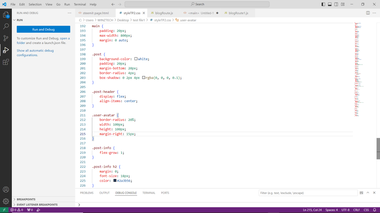 |  |
|---|---|
| CSS | input |

Output.
Here's an overview of the Web page display.

Final layout.
Display video.
Vidéo display
To make it the more promising, I made a video which will have you see the screws and the various actions On the web page.
To conclude, I will say you was an amazing topic to work on, and perhaps I faced some challenges. But nevertheless, I still managed to come out with what looks presentable for the exercise. I enjoy the walk brought to us by the team and I am waiting for the next task to carry out.
I'm now invite the following person to join me. Participate in this contest. @chant @fombae and @wirngo
Credit to: @rafk
Thank you, friend!

I'm @steem.history, who is steem witness.
Thank you for witnessvoting for me.
please click it!
(Go to https://steemit.com/~witnesses and type fbslo at the bottom of the page)
The weight is reduced because of the lack of Voting Power. If you vote for me as a witness, you can get my little vote.
Upvoted. Thank You for sending some of your rewards to @null. It will make Steem stronger.
Hello dear friend
You done your task work perfectly. All the questions explain deeply with examples that help us to understand better. Practical work is outstanding and similar to source given. This is the best use of css in you layout. CSS is my favorite part of web development coding. I wish you more success.
Hey @rafk, hope you are good and having a good time at steemit. Good to see you participating in the contest, that's a detailed explanation of CSS concepts, including the display properties, positioning, flexbox, and grid. Great job. Your recreated web page looks great, and it's awesome that you've included a video to showcase the interactive elements. I'm happy to see you inviting others to participate in the contest. Good luck to you and the other participants.
Thanks friend
Your write up is well explain and formulated examples .I wish I could the time to be participating in crypto academy assignments. It’s need patience , commitment and time .Goodluck with your entry and keep up .
That's right my dear. Thanks 🙏
That's right my dear. Thanks 🙏