👨💻 #Proposal-89: Change Log - Ukrainian Translation & Lightboxes (Modals or Overlays)
With over 50 files changed, this release is the largest that I've worked on since my original proposal was approved last year.
This post documents the key parts of this update.
Please view this post on Steemit Dev so that you can open images in a clearer resolution.

💬 Ukrainian Translation
Implementation required a complete Ukrainian translation file (src/app/locales/uk.json), as well as its associated counterpart (src/app/locales/counterpart/uk.js) which defines how dates, etc. are formatted.
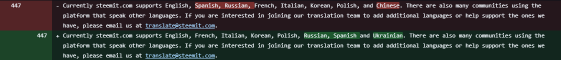
There were an additional 34 instances of language that had been hard coded in English which required updating (to use the existing tt() function. One of these had even been hard coded within the CSS - which is certainly a novel way of managing page content.
This meant that all language files required updating:
src/app/locales/en.json (English)
src/app/locales/es.json (Spanish)
src/app/locales/fr.json (French)
src/app/locales/it.json (Italian)
src/app/locales/ja.json (Japanese)
src/app/locales/ko.json (Korean)
src/app/locales/pl.json (Polish)
src/app/locales/ru.json (Russian)
The hard coded language required changed as follows:
| File | Language | Screenshot |
|---|---|---|
| src/app/components/cards/PostSummary.jsx | Pinned |  |
| src/app/components/elements/ContentEditedWrapper/index.jsx | edited |  |
| src/app/components/elements/MuteButton.jsx | Unmute / Mute |  |
| src/app/components/elements/SidebarLinks.jsx | Trending Communities |  |
| src/app/components/elements/SortOrder/index.jsx | Muted |  |
| src/app/components/elements/Voting.jsx | Downvote (x3) Submit |  |
| src/app/components/modules/UserRole.jsx | Please enter a valid username. Please enter a username without "@". The user already has that role. Username Roles Save Role Permissions + Details |    |
| src/app/components/pages/CommunitiesIndex.jsx | Rank Subscribers New subscribers posters posts Create a Community |   |
| src/app/components/pages/CommunityRoles.jsx | Account Role Title User Roles Updating User... Add User |  |
| src/app/components/pages/PostsIndex.jsx | My communities |  |
| src/app/components/pages/Topics.jsx | My Friends My communities Explore Communities... Community Subscriptions Trending Communities |   |
I mentioned above that some text had been hard coded into CSS - this meant that this file: src/app/components/elements/SubscribeButton.jsx needed the implementation of a hove state, with associated text.


This language inclusion also provided an opportunity to update the FAQs - adding the Ukrainian language and removing Chinese which is no longer available.
The final part to document is the code to actually include the language option!
Starting with its presence in the burger menu (as well as reordering the existing options in alphabetical order):

And finally, its inclusion in the config and translator file (admittedly, I didn't gain a deeper understanding of how these work):


🖼️ Images Lightbox
I'm particularly proud of this implementation and the level of complexity overcome in doing so. On the surface, this was a straightforward change but images aren't always included in a post in the same way and many (those which are simply an image URL pasted into the Markdown area) aren't picked up by the existing "image scraping".
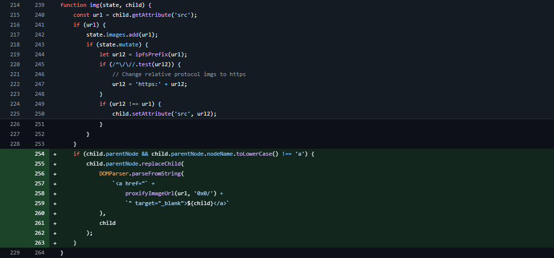
The first scenario that I wanted to handle was where users have already implemented a link around an image through code. I didn't want to add another a tag when one already exists (line 254 below).
If there wasn't already a link, I wanted to add one - being sure to "proxify" the URL so that phishing or other dangerous URLs couldn't be included in an image tag.
src/shared/HtmlReady.js
You'll see in the code above, that I've implemented the target=_blank attribute which would open an image in a new tab by default. This was the original implementation which still acts as a default if the JavaScript doesn't load for any reason.
For this to work, it also required the acceptance of the 'target' tag, which will only ever get set to _blank as we'll see later.

src/app/utils/SanitizeConfig.js
Whilst this will add an anchor tag around images Condenser currently picks up, images pasted directly into markdown are displayed as images but not picked up within the image array. These are parsed as standard text.
So instead of using the existing function to "linkifynode", I'd first check for the presence of images.

src/shared/HtmlReady.js
The new function tests the current node being traversed and searches for an image reference (.jpg, .jpeg, .png or .gif) and if it finds a match, converts the standalone URL into and img element and subsequently wraps this in a link. Both of which are then included into the DOM. If no image is found, the existing linkifyNode is called.

src/shared/HtmlReady.js
Now that all images are wrapped in a link, we can apply the appropriate styles and attributes to these links;

src/app/utils/SanitizeConfig.js
The existing code simply searches to see if a link is external and adds the 'noopener' / 'nofollow' attribute to it, along with a title tag to say you're leaving Steemit.

I've now updated this part of the code so that if you're leaving Steemit (URLs that don't start with steemit.com nor root relative), they'll open in a new window with the 'postImage postLink' classNames added. Theses classNames target any child elements that are images and adds an icon overlay (see image to the right).
All non-image links display the same.
Where an internal image is identified (cdn.steemitimages.com or steemitimages.com), we only add the 'postImage' className and a different message (image title on hover).
Now that the images and links are ready to appear in the overlay, I expanded the existing 'Modal' functionality so that images no longer open in a new tab / window, but instead within the existing window.
To achieve this, I followed the existing Modal implementation for things like announcements.


src/app/redux/UserReducer.js
And made this available to the Modal.jsx component:
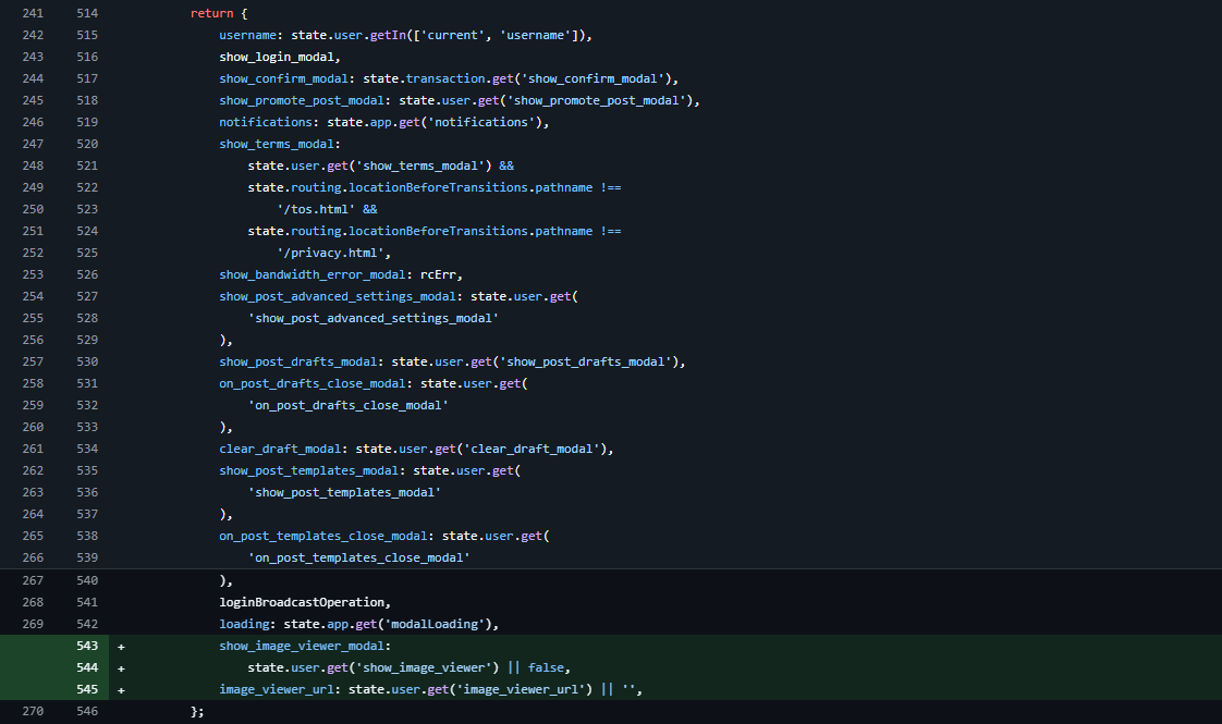

src/app/components/modules/Modals.jsx
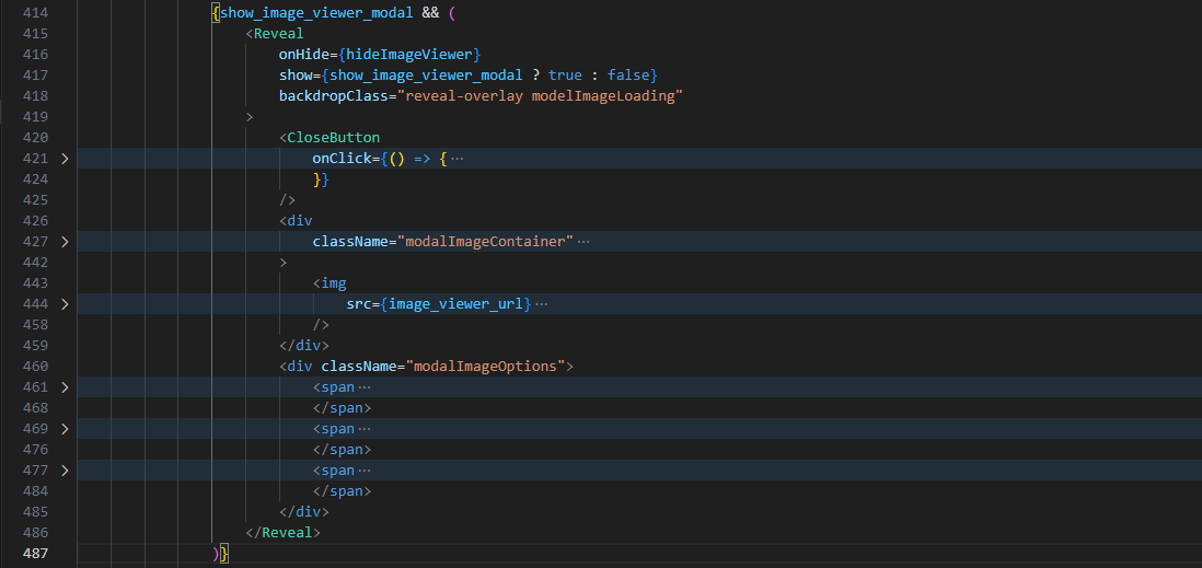
With the Modal Image Lightbox now available, it needed styling and the zooming, loading, etc. functionality added to the component.
The basic structure of the HTML is important here. I wanted the Lightbox to open to the size of the image - which would need to use the existing .reveal container - but only when it contains an image.
Within it, I'd need 2 containers - one to hold the image which would allow the addition of scrollbars upon zooming in, and another containing the zoom controls. We'd also have the close button which would function like all other Modal close buttons.
src/app/components/modules/Modals.jsx
Within the image container, I wanted the functionality to zoom in and out using the mouse wheel and the ability to drag the image around the container once zoomed in. For the mouse wheel to work in this way, I'd need to disable the default behaviour of it scrolling within the container (since there would be a scrollbar present).

src/app/components/modules/Modals.jsx
I wanted the controls to allow the user to zoom in and out, and reset the zoom state with an individual control for each.

src/app/components/modules/Modals.jsx
Each control item required the addition of a new icon -- zoom-in.svg, zoom-out.svg and zoom-reset.svg which needed adding to the icons list:

src/app/components/elements/Icon.jsx
Each of these actions required their own function...
Zooming In

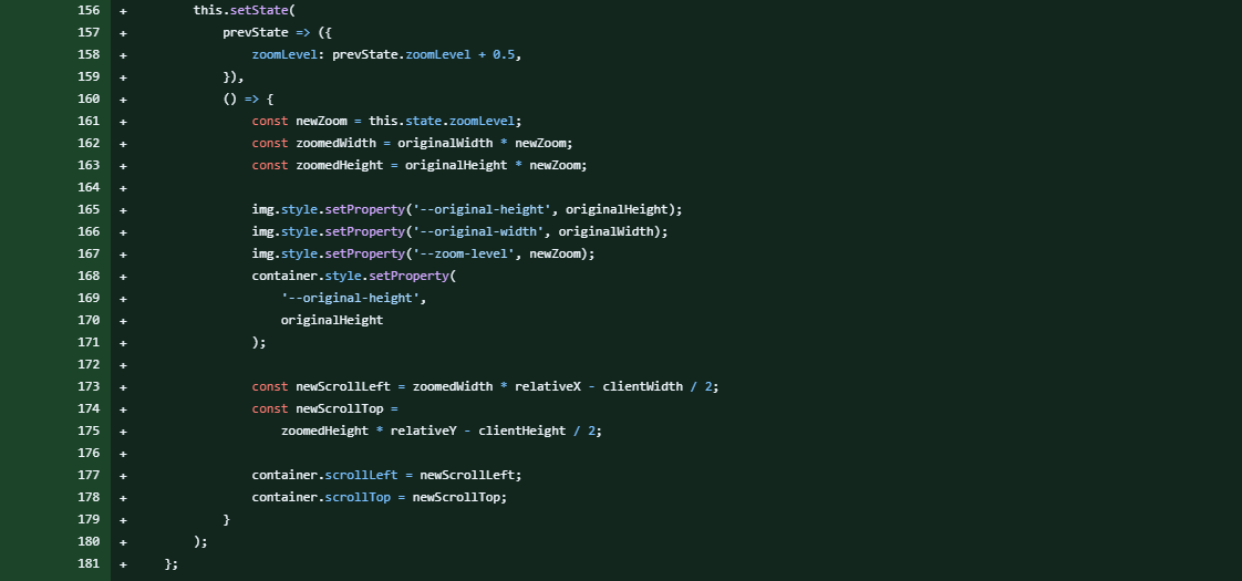
src/app/components/modules/Modals.jsx
The originalHeight and originalWidth variables are used to maintain a consistent sizing ratio with the original image and container.
The container (viewCenterX and viewCenterY) are used to ensure that when zooming, the user is zooming on the centre point of what they're currently seeing. (This might seem like a trivial point, but having implemented zooming without this detail, the experience felt wrong).
relativeX and relativeY are used to help with this calculation.
The zoom-level is the other key attribute that is passed to the stylesheet to define the image size. Since the image size increases to larger than the size of the container, this is when the scrollbars are added.

src/app/components/cards/PostFull.scss
The reason that this calculation can appear as simple as it is, is because of the more complex calculation that is performed when the image is loaded - setContainerDimensions().

src/app/components/modules/Modals.jsx
The reason this function is required after the image has loaded is because the zooming functionality needs to know the dimensions of the image so that it can:
a) Know how big to make its container
b) Keep the image proportions consistent throughout.

src/app/components/modules/Modals.jsx
This is achieved by taking the image dimensions and browser dimensions in order to find the optimal portrait / landscape viewing ratio. I wanted to limit the image to 75% of the screen width and 90% of the screen height (although this is also adjusted for mobile devices in the CSS).
I then needed to add the height of the zoom controls to the calculation (without messing up the ratio) which then sets the containers size within the CSS - this is how the container always hugs the image.

src/app/components/cards/PostFull.scss
You'll see how I've targeted the original Modal wrapper, on the condition that it has a child element of our image container.
Zooming Out


src/app/components/modules/Modals.jsx
The calculations in this function are performed in the same way as zooming in (in future, these functions could be merged to reduce code but haven't been to increase ease of following).
Reset Zoom
This function simply resets the variables stored in the state and removes the CSS class that was handling the zoomed state.

src/app/components/modules/Modals.jsx
Mouse Wheel
This is another simple function that listens for the mouse wheel scroll event (added when we'd completed loading the image) and zooms in when scrolling up (deltaY < 0) and zooms out when scrolling down (deltaY > 0).

src/app/components/modules/Modals.jsx
Dragging
When the user starts dragging (via mouse or touch), handleDragOrTouchStart() stores the initial pointer position and scroll position using class properties. As the user drags, handleDragOrTouchMove() calculates the movement and updates the scroll position of the image container, effectively moving the zoomed-in image.

src/app/components/modules/Modals.jsx
Opening the Images
I almost forgot to include the part which actually loads the image in the Post!
This needs to be done after the component has mounted, once all of the DOM is available to the component.
I wanted it so that a user's custom spacer didn't include a "load in lightbox" icon so set an arbitrary minimum height of 50px.
For these images (identified by the earlier mentioned postImage class), we add an event listener which will launch the lightbox (preventing the default of opening in a new window / tab). As mentioned before, the external links also have the class postLink so these images are ignored and will follow the default behaviour.


src/app/components/cards/PostFull.jsx
Loading Image

Since some of these images can be large and slow to load, I also implemented a loading image.

src/app/components/cards/PostFull.scss
This is actually a background image that's a part of the existing overlay background - but only added when an image is loaded.
To achieve this, I had to update the existing Reveal.jsx component to accept a "backdropClass" variable (with a default value of "reveal-overlay" so as not to upset existing overlays).


src/app/components/elements/Reveal.jsx
The final requirement for this implementation was to ensure that the existing Templates aren't loaded in an overlay and function as they currently do.
I accomplished this by changing the images from being displayed via 'Markdown' and instead displaying them via HTML.


src/app/components/modules/PostTemplates.jsx
The CSS was an absolute nightmare to create so I've only highlighted a few bits in the above.
🏆 Congratulations
Congratulations if you've made it this far. You'll no doubt appreciate why I'm so keen to get as many people as possible testing this functionality.
There will be a part 2
I hadn't appreciated how long this would take to document so I'll have to continue this another time.


You have been quite busy. Wanted to make sure I let you know I voted for your proposal.
Thanks - I appreciate it.
Yes, it's been an intense couple of weeks! I'm pleased with what I've produced and am excited about putting it live soon 🙂
More power to you! 🔋🔋🔋