When Your Own Chart Debunks Your Point (aka @TheDemocrats Posted an L and Deleted It)
Welp… that backfired. 😬
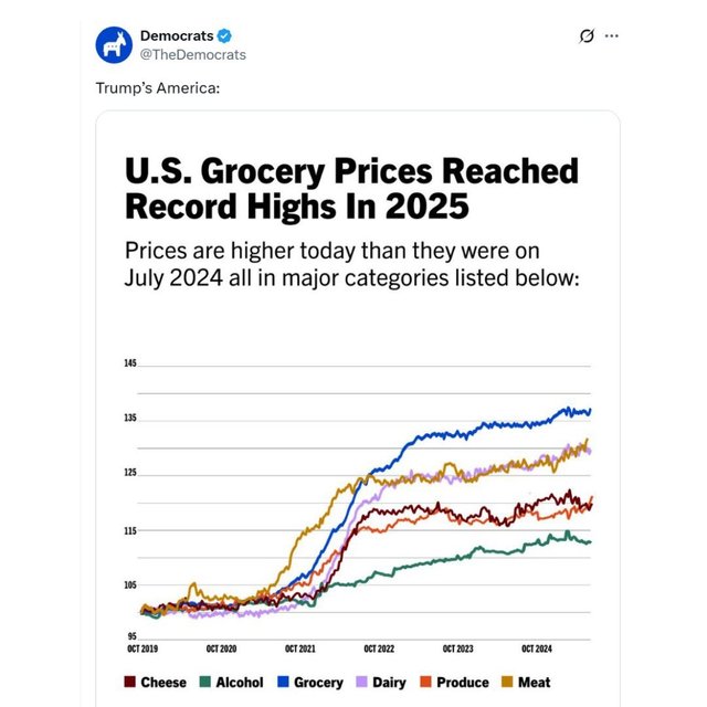
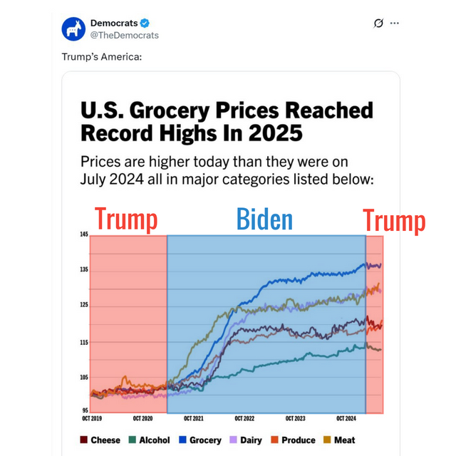
The official @TheDemocratsaccount on X posted this chart with the caption “Trump’s America” — but didn’t seem to notice how their own graph actually works.
The chart starts in 2019 during Trump’s term, when grocery prices were low and steady. Then, right after Biden takes office in 2021, prices skyrocket across every category… and keep climbing throughout his presidency.
By 2025 — the part they tried to blame — the lines flatten out and might even dip slightly. But there’s not enough data yet to say. What is clear? The big jump didn’t happen in “Trump’s America”… it happened in Biden’s.
They deleted the post shortly after.
Total self-own. 🧠💥
Maybe next time… read the x-axis first? 😂
Who’s running the @TheDemocrats account on X anyway?
Yeah… wouldn’t want to be that person today. 😅
Their original deleted post is archived here: https://archive.ph/NTKvn

