SEC S19W4 || Organization using CSS (box-model Display, Position, Flex)
 |
|---|
Friend welcome to another interesting post which is my participation in the challenge organised by @starrchris. In this post I have shared my view on the topic: Organization using CSS (Box-model, Display, Position, Flex). When its comes to web development, organizing of contents is very important as it is the best way you can make your content look more attractive for reading. Let's get dipper into the discussion of the challenge tips.
1. Theoretical Questions |
|---|
Explain the Difference between in-line display and block display,?
As said earlier when it comes to website design and development "in-line display" and "block display" are needed. There are two different ways you can render elements on a web page. They are both used in CSS to control the behavior and layout of HTML elements. Let's talk about them individually.
In-Line Display
By definition:
Elements with an in-line display don't begin on a new line. In this case, they only occupy as much width as needed and can sit next to other elements.
By characteristics:
In-line display doesn't begin with a new line.
The height and the width properties generally don't affect the layout.
You can apply padding and margins, which other elements will still be where they are.
<spand><IMG>,<strongand<a>are common examples of in-line display.
Block Display
By definition:
Elements with a block display begin on a new line and still occupy the full (complete) width available, Stretching from the right to the left as long as the parent elements permit it.
By characteristics:
Block display always begins on a new line
The height and the width when set can affect the layout.
When you apply margin and padding other elements can be pushed away.
<div>,<h1>,<ul>,<li>and<p>are common examples of block display.
At this point let's take a look at the key differences in a tabular form 👇.
| Key Elements | In-line display | Block-display |
|---|---|---|
| Layout | In-line display only takes up as much space it needs and allows other elements to sit next to them | Block display takes up the full width and pushes other content down |
| Usage | In-line displays are used for smaller content that is within those sections | Block displays are often used for larger sections of content |
| Dimensions | Width and height cannot be set on in-line display | Width and height can be set on block display. |
Both in-line display and block display which we have discussed about their differences are essential for controlling the appearance and structure of a website.
What's the difference between Margin, Padding, and Border?
Margin, padding, and border are three (3) different cascading style sheet properties that are used for creating space around elements in a website. Their purpose is beyond controlling the spacing of elements and layout.
Margin
Margin is known as the space that is outside the border of an element. This means the margin helps to create space between an element and other elements on the page. In terms of usage, margins are mostly used to separate elements and prevent them from touching each other.
In terms of properties; margin can be set for each side of an element for example; margin-bottom, margin-top, margin-left, and margin-right.
In terms of effect on the layout: margin can cause a cause element to be pushed further away from other elements. Let's take a look at the next.
Padding
Padding is known as the space between the content of an element and its border. Padding is used for adding space inside an element, around the content. In terms of usage, padding is mostly used to control the space inside an element, providing a buffer between the border and the content.
In terms of properties; just like the way margin is used, padding, can be set for each side for example; padding-bottom, padding-top, padding-top, and padding-bottom.
In terms of effect on the layout: padding increases an element's overall size, as it adds space within the border.
Border
A border is known as a line that surrounds the padding and content of an element. It can have many styles, colors, and widths. In terms of usage, a border is used to visually separate elements or highlight them. Border can also be used to create boxes such as appearances around elements.
In terms of properties: border can be controlled using properties like border-style, border-color, and border-width. Also border can be set for a specific slide.
In terms of effect on the layout: border Increases the total size of an element since they are added outside the padding.
Define Position property.
Position property is used mainly in CSS to specify the positioning method for an element. Just as it is called position property which the word position means putting something in the rightful place.
To this position property determines how an element is positioned in the document and interacts with other elements in the document. position property can take many values, and each of the values alters the elements' behavior in terms of positioning and layout.
Position Property Values
| Types | How elements are affected |
|---|---|
static | Default Value: All elements are positioned static and set by default. Behavior: The element is positioned according to the normal flow of the document. bottom, top, right, and left properties have no effect. |
relative | Behavior: The element is positioned relative to its normal position in the document flow. As a programmer, you can use right, left, top, and bottom properties to move the element from its original position. |
absolute | Behavior: The element is positioned relative to the nearest positioned ancestor. If no such ancestor exists, it is positioned relative to the initial containing block (usually the viewport). |
fixed | Behavior: The element is positioned relative to the viewport, meaning it stays in the same place even when the page is scrolled. Like for example, absolute positioning, the element is removed from the normal document flow. |
sticky | Behavior: The element is positioned based on your scroll position. A sticky element toggles between relative and fixed, depending on the scroll position. |
The understanding of position property is very important as it is the knowledge that is needed for controlling the layout and design of elements on a website, most especially when you are creating complex layouts that you want to pass across different devices and screen sizes.
Differentiate between Grid and Flex display properties?
In creating a webpage Grid and Flex display properties, are two powerful layout systems in cascading style sheets, each offering unique capabilities for arranging elements on a webpage. Although, they both have similar functionalities below is what differentiates them both.
Grid Display
Grid display is designed for two two-dimensional layouts, which allows users to take care of columns and rows. Grid display makes use of grid lines to define the structure of a webpage, with tracks of rows and columns that form the grid. As a user, you can use grid display to define areas that are within the grid so it would be easy for you to manage the different parts of the layout. The properties include the following; grid-template-rows, grid-template-columns, and grid-area.
Flex Display
Flex display is designed for one-dimensional layouts, which are each in a column or a row. It helps to control the layout in a single direction, which makes it best for aligning items along one axis. It makes use of cross axia and main axis which you can control the alignment and spacing of items along the main and cross axia using properties such as; align-items for the cross axis and justify-content for the main axis.
2. Practical Questions |
|---|
Recreating Webpage of @kouba01 Steemit Profile HTML Code of First Webpage
Here, I make use of kouba01 steemit profile page and create a webpage using the design that I like which looks similar to that of his profile page. To get this webpage read I created two different files and named the first file html.Index and the second file as layout.css.
The HTML.index File |
|---|
 |  |
|---|
 |  |
|---|

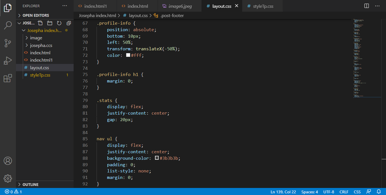
The layout.css File |
|---|
 |  |
|---|
 |  |
|---|
 |  |
|---|

| Output: |
|---|

I am inviting: @dove11, @pelon53, @simonnwigwe, and @dave-hanny
Hey josepha.
Hope you are having a good time at steemit. Glad to see you participating in the contest.
I really like the way you structured your post. You explained everything well and correct. You deserve the praise.
Thank you. Indeed the topic is also interesting.
https://x.com/AkwajiAfen/status/1819094644535206243
Upvoted. Thank You for sending some of your rewards to @null. It will make Steem stronger.
Hello friend
You complete this task very well. Explanation of position with there types are too good. I like your way of presenting this practical work. With the use of video you show the output of your layout. It's not bad your turn is good. I wish you more success.
I appreciate your support. Thank you.