SLC21/WK5: Hands-On Practical
Hello Everyone
I'm AhsanSharif From Pakistan
Greetings you all, hope you all are well and enjoying a happy moment of life with steem. I'm also good Alhamdulillah. |
|---|
Design On Canva
I hope everyone is well and enjoying their lives as our graphic design course is ongoing and we are getting to learn a lot in it. In the first two lectures, we made our logo and made a banner. In this lecture, we will show our activities again. I hope you guys like it.
Let's move to the main point:
I am not re-creating my logo here because I already have a logo that I used in the previous post and made a banner of my own. Now I will use the same logo to create a new banner of my own which will be for the promotion of my software house. Because I have designed this logo for my software house which is called Direct Connect Software House. So with DC, I have presented my software house that logo you can see below.
Final Logo
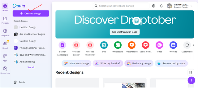
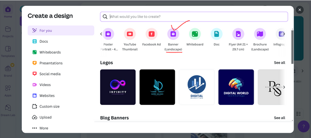
I am not using any other software to create my promotional banner. I will use Canva again here because I have done most of my graphic designing on this software. Sometimes I have done it on my mobile and sometimes on my laptop. So even today I am choosing it for my design. To choose it, first of all, I open Canva on my laptop. After opening Canva, when we get to the main interface, on the left side we have an option of Create a Design. We have to click on it.
Then we will see different types of blank templates, from which we can choose according to our choice. Since I am going to make a banner, I will select the landscape banner here so that I can easily create my design on top of it.
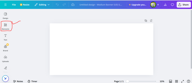
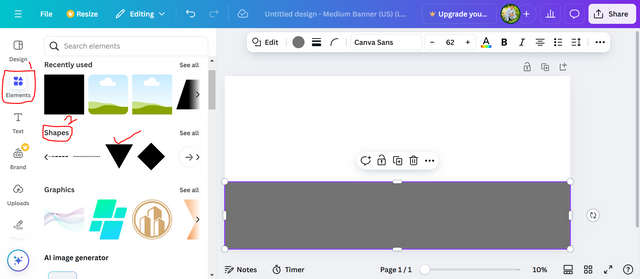
Now we will have a blank template open, the first thing we need to do is click on the Elements option from the options that are visible on the right side. As soon as we click on it, we will see more options.
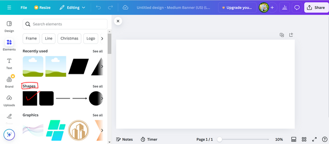
From here we can search for any type of thing that we need on our template, so here I currently need shapes, so by going to the shapes section, I will select the square shape.
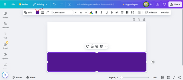
I have enlarged the square shape by grabbing it with the cursor and fitting it under my banner. After fitting it there, now we have to change its color.
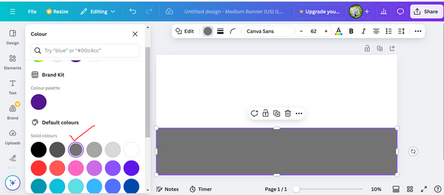
To change its color, we will select it. After selecting it, we will see a colored circle at the top, we have to click on it. As soon as we open it, we will have all the colors shown, so from here I will set the gray color. Its code is Gray737373.
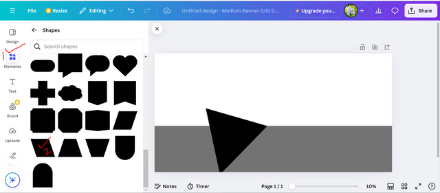
Now I need another shape, so to set this shape, I will go back to the Elements option, and from there, from the Shapes action, I will select the three-cornered shape.
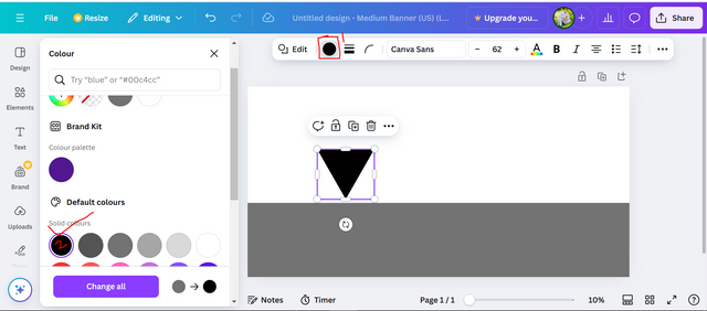
The color of this shape will also be automatically set to gray because we had also set the first shape to gray. But we want to give it a black color, so to give it a black color, we will click on the circle above again and different colors will open for us. From this, we will choose black color, so this shape will become black.
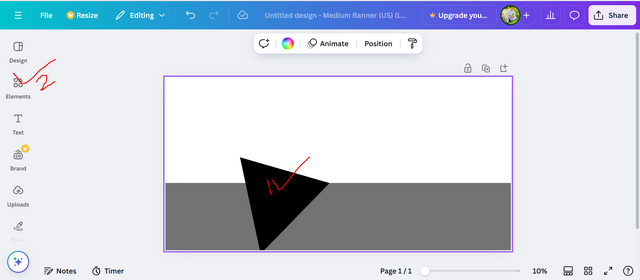
Now if we click on this shape, we will see two arrow marks on one side, we have to grab it and rotate it a little. After rotating it, we have to set it at the bottom of this banner. After setting it there, we will go to the Elements option again.
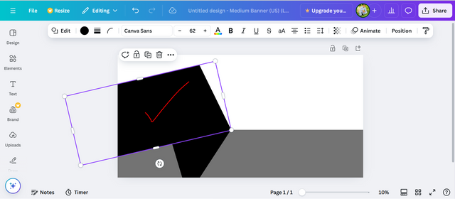
Again from the elements, we will choose another shape which will be the last shape of our design. We will go to the elements options and go to the shape section from there we will choose a rectangle with four corners.
We have also enlarged and rotated this shape a little and set it according to our design. As you can see in the picture below, which side I have set it. We have created a new shape by combining the first shape and this shape.
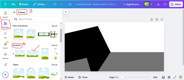
The process of adding the shapes I had to add to my design is complete, now it's time to add a main image. To add the main image, I will first go to Elements, and then to Frames. There will be a device option to choose the frame I want, from there I will select a frame, which you can see below.
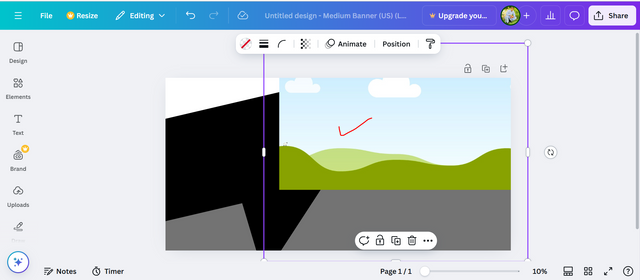
Once we select this shape, I will increase its size a little and set it to the right on the upper side of my banner.
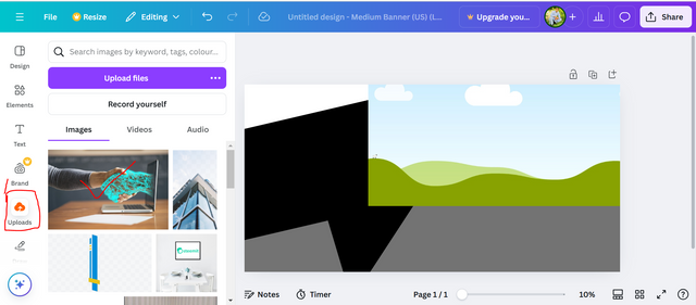
Now we will put one of our images inside this frame, the image that I have already downloaded from Pixabay and uploaded to my Canva. To bring it here, I will go to the upload button. As soon as I go above the upload button, my gallery will open to me, from there I will select this image and set it inside this frame.
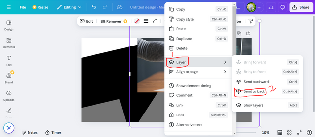
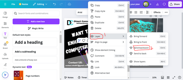
Now our image is coming on top of all the shapes, so we have to set its position. We will select this image, and right-click on it, then I will have different options, from these options, click on the layer button. And more options will open on the side, from them, select the option of send to back, then our image will go to the end.
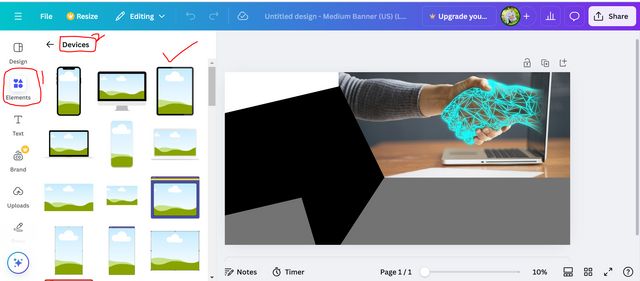
This was our main image, now we have to add three smaller images that will represent our software house. For this, I will go to the Elements option again and open the Devices section there. And from there, I will select the frame that I have marked above.
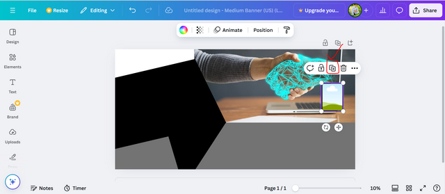
After selecting this frame, I positioned it on the right side above this image. Now, by clicking on it again, a plus button will appear above it. I will click on this button and make two more copies of it.
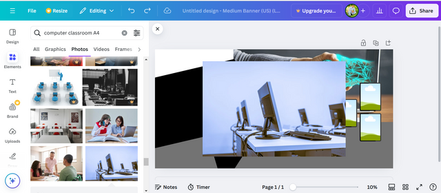
I will set two copies of this frame in such a way that one will be below this frame and one will be in between the two frames. After setting them here, I will then go to the Elements section and search for a picture of a computer classroom. An image will come from there, I will select it and put it in the first frame.
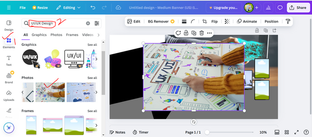
The first image proves that we are showing our computer lab in which we can do various coding. Now we will search for an image again which will indicate our user interface that we are also spreading information about, so we will search for an image of that too and put it in the second frame. In the third frame, we have to select the image already present in our gallery, which will be the building of our software house, and in the third, we will set it.
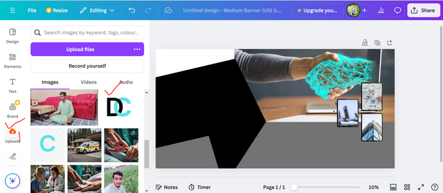
Now it's our turn to add our software house logo, so for that, I will go to the upload section. From there I will select my logo which is already created.
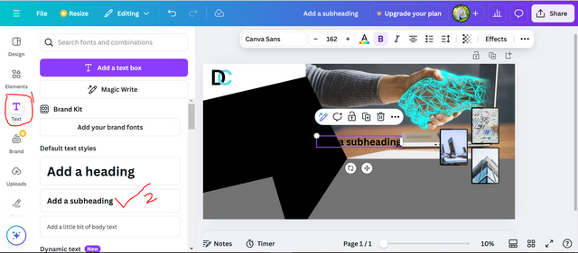
I placed this logo in the top left corner of my banner. And then I went to the text field and selected the second heading.
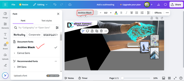
I have chosen this heading for the name of my software house. I have made another copy of it in which I will write only software house. First I will write Direct Connect, after writing that I will set its font to Archivo Black and put it in front of my logo.
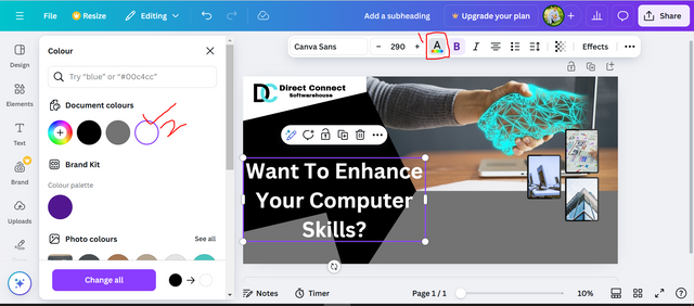
Now I will select a large heading in the text field and write my main heading in it. After writing, I will change its color to white because automatically when we select text, its color comes to black. The background shape we have is black, so we will select white on top of it, so after writing my lines, I changed their color to white.
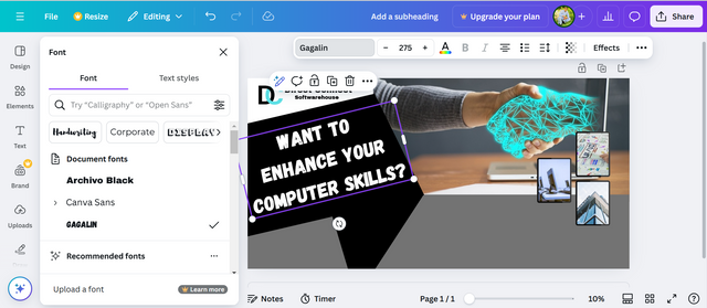
I've rotated my lines a little so they fit our shape, and then I've applied them to the Gagalin font.
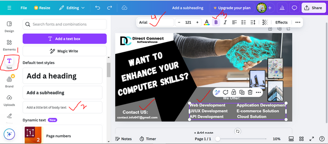
Now we have to write our contact details and information about the courses we are taking. For this, I will go to Simple Text, and from there I will select the text without headings. After selecting it, I will write all my information. After writing the information, I have bolded it and set its font to Arial, which you can see in the image below.
Now is our final step, we set the shape in second place, which was three-cornered, and we have to make its left side slightly white. To make it show a little difference, I took a text and put a slash in it. I made the slash a little bigger and set it to its position. Later, I opened the layer option by clicking on it and sent it backward. After sending it backward twice, it went to the back. And a line of light white color was added to our shape, which is for beauty.
Thus, after a long procedure, I have finally prepared my banner, which looks beautiful. I will use this banner for the promotion and advertisement of my software house.

Final Banner
The principles used in this banner are given:
Contrast:
I have applied contrast in this design of mine by using white color on a black background and other light colors, which makes it easy for other people to see and attracts them to me. Similarly, a hand design that is a bright design is pulling us towards our technological future.
Hierarchy:
I have made the main text (WANT TO ENHANCE YOUR COMPUTER SKILLS?) in this design larger, this is where other people's eyes will start to see the design. And it is the clearest, it makes the main message clear. The services provided by the company below have also been made clear and easy to read, thus providing a level of clear information.
Alignment:
I have arranged all the elements in my design in a proper way in columns, which means that my graphics, including hands and icons, are well-arranged. This ensures that the design looks organized and professional. Similarly, I have written the company's contact details clearly on the left, which makes it easier to read.
Balance:
I have kept everything balanced while creating this design. On one side I have written a large text and on the other side, there are images and information given below it which is nice and clear which makes the structure pleasing to the eyes.
Proximity:
I have put all the relevant things together, such as "We Offer", with all the details on one side and the contact details on the other. This makes it much easier for the viewer to understand the structure.
Visual Interest:
The main image in my design is of a human greeting with some digital technology. It draws us more towards our modern technology and its capabilities. This design gives us a dynamic and futuristic feel, thus my design informs and fits with all things related to my software house and development.
Typography:
I have bolded the text in my design and presented it here with a modern font. Since these are used for our service listings, they are very functional and modern, complementing the tech-based theme well.
These were the principles I kept in mind while creating my design.
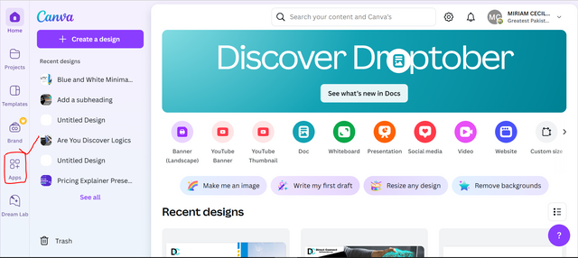
Our task is to promote our banner, so we will promote it outdoors. For this, I am going to create a mockup, so for this, first of all, I open my Canva again. As soon as I open Canva, six more options will appear on its left side. Out of these, the fifth option is the one we have to select, which is called Apps.
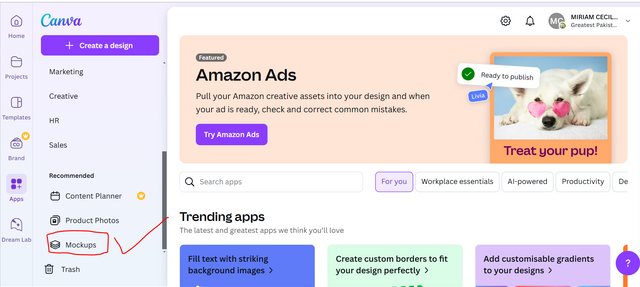
As soon as we click on the Apps button, more options will open next to it. We have to scroll down a little to see these options, and then at the end, we will see a mockup option, we have to click on it.
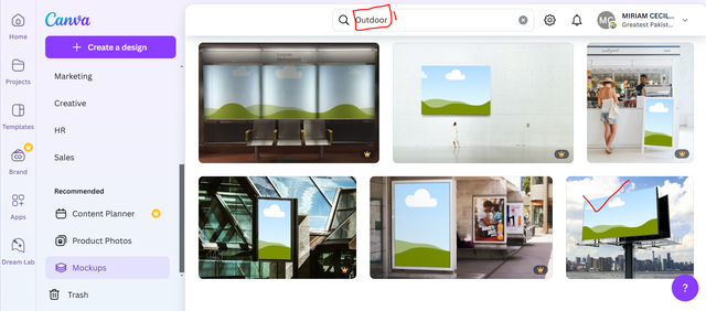
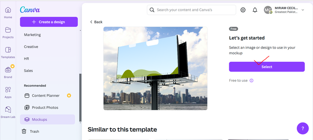
Up we will have a search bar open, in this search bar we have to search for something according to our calculation, so we are going to do our outdoor promotion, so I will write only outdoor in the search bar here. As soon as I write outdoor, I will see different types of outdoor mockups that I have. But I will choose the last mockup because I have the free version of Kanva. The rest of the things are all paid and the beautiful one is also the same mockup, so I will use the free one.
When we open this mockup, we will see a select button on the right side. From there, we have to select our banner, so first of all, we click on it.
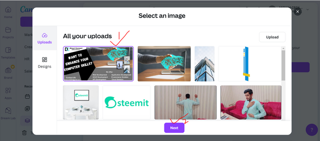
Now the Canva gallery that we have will open. From here we have to select the banner that we have just created. I have already uploaded it here. If you guys don't have it uploaded, you can bring it here with the upload button. I have it here, so I will select my banner and click on the Next button below.
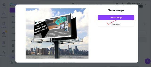
In this way, our banner will be placed in this mockup and we will see a button to save the mockup. We have to click on it, then we will have a new interface open. There we can use it in any of our designs or we can download it. We only have to download it here, so I will click on download.
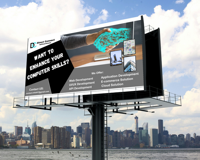
This way our final mockup will be ready and we are promoting it. This is how I created my design and promoted it through a mockup which is listed below.
Final Mockup
I have worked hard to complete this task of mine so that there is no shortage anywhere, so I hope you guys liked this task of mine. Thank you all very much for stopping by. I would like to invite my friends @jyoti-thelight, @josepha, @bossj23, @abdullahw2 to join this task.
Cc:
@lhorgic

Hello @ahsansharif thank you for participating in this week's lesson. We have assessed your entry and we present the result of our assessment below.
Feedback:
Welcome back to class dear student.
Let me start by commending you for a job weldone, the effort put in this work is quite commendable.
I can see you used your already made logo which is quite cool, of course there is no need to create another just as stated in the task.
Your flier looks nice but there are few observations, personally the introduction of colour black into the design seems to be a bit off, it didnt complement the design perfectly, you can tone it down a bit. In addition, the space better your "want to enhance your computer skill" is quit much as well. I also think the font size given to the name of the brand is quite small, it can be increased a bit for better output. Finally your mock up came out well. You have presented beautifully, I wish you the very best
Regards
@lhorgic❤️
Thank you so much for the observation and gave me a suggestion for better design. In future I will work on these suggestions and make a better design. Wish you more success.
You have made a nice design of flyer, I also like the logo and how you made mokup with the design. Thank you for inviting me to the contest, I already submitted my entry, Please check it once. Thank you
Thanks a lot for staying here. Yes recently I visit your post, you work well. Best of luck.
Thank you for publishing an article in the Steem Kids & Parent community today. We have assessed your entry and we present the result of our assessment below.
MODs Comment/Recommendation:
Remember to always share your post on Twitter. This POST LINK is a guide to that effect.
Thanks for the verification 🤠
So exclusive. If I didn't check other pictures, I would have thought the last picture was real and somewhere in your country because of how beautiful you made it look. Thanks for sharing.
Thank you so much for staying here. My pleasure you like my creativity. I wish you best of luck.
¡Saludos amigo!🤗
El logotipo de tu emprendimiento está hermoso... Sin duda alguna ese azul cielo acompañado del negro hacen un contraste visual muy impresionante.
Siempre me han gustado los flyer que hacen alusión a los servicios tecnológicos y este que elaboraste se proyecta muy bien en la maqueta de exterior.
Te deseo mucho éxito en la dinámica... Un fuerte abrazo💚
Thank you so much for staying here. Yes I like the tech gadgets and technology. That's why I always interested in making tech banners. I wish you more success.
Your designing skills are really excellent! Every step is presented so beautifully, which is very helpful for beginners. Best of luck for the contest my friend.
Thank you so much dear brother. I'm glad to see you here. I wish you more success.